Using Curves (Part 2 of 2)
This is the fifth installment in our weekly series exploring mobile photography and Darkroom. Explore the rest here.
This is the second of two parts on Using Curves in Darkroom. Last week, we talked about how Curves works, what it is capable of, and how you can use it as the workhorse and foundation of your post-processing. This week, we’ll focus more on the Red, Green, and Blue channels and talk about how you can use your knowledge to capture the perfect tone and that look you’ve been lusting after.
Just to review, a mental model to think about post processing is to imagine every pixel of your image as three buckets of red, green, and blue light. The unique combination of light in those buckets is what makes up the color of the pixel, and by filling and draining those buckets, you control what color the pixel is.
As we demonstrated in our previous post, Curves can be used to create brightness and contrast selectively in your photo. With access to the individual red, green, and blue channels, you also get the ability to adjust the color of the photo in its various tonal regions (A tonal region is all the pixels of the image that fall within a region of light). This transform is at the heart of post-processing.
Tone
It’s impossible to cover every possible effect that is possible using Curves in this post, so we’re going to focus on a specific type of edit: Natural light response.
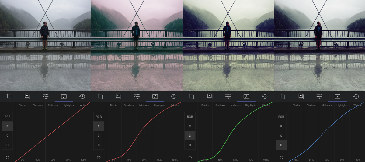
In this type of editing, your curves always have a smooth shape to them, and the Red, Green, and Blue channels all look fairly similar, but vary in subtle ways in different parts. For example, a filter might be more sensitive to red light in the shadows, and less so in the highlights, which gives a subtle two-tone cast to the image. Subtlety is key when editing with Curves, and that’s why Darkroom’s Curve editor is designed the way it is.
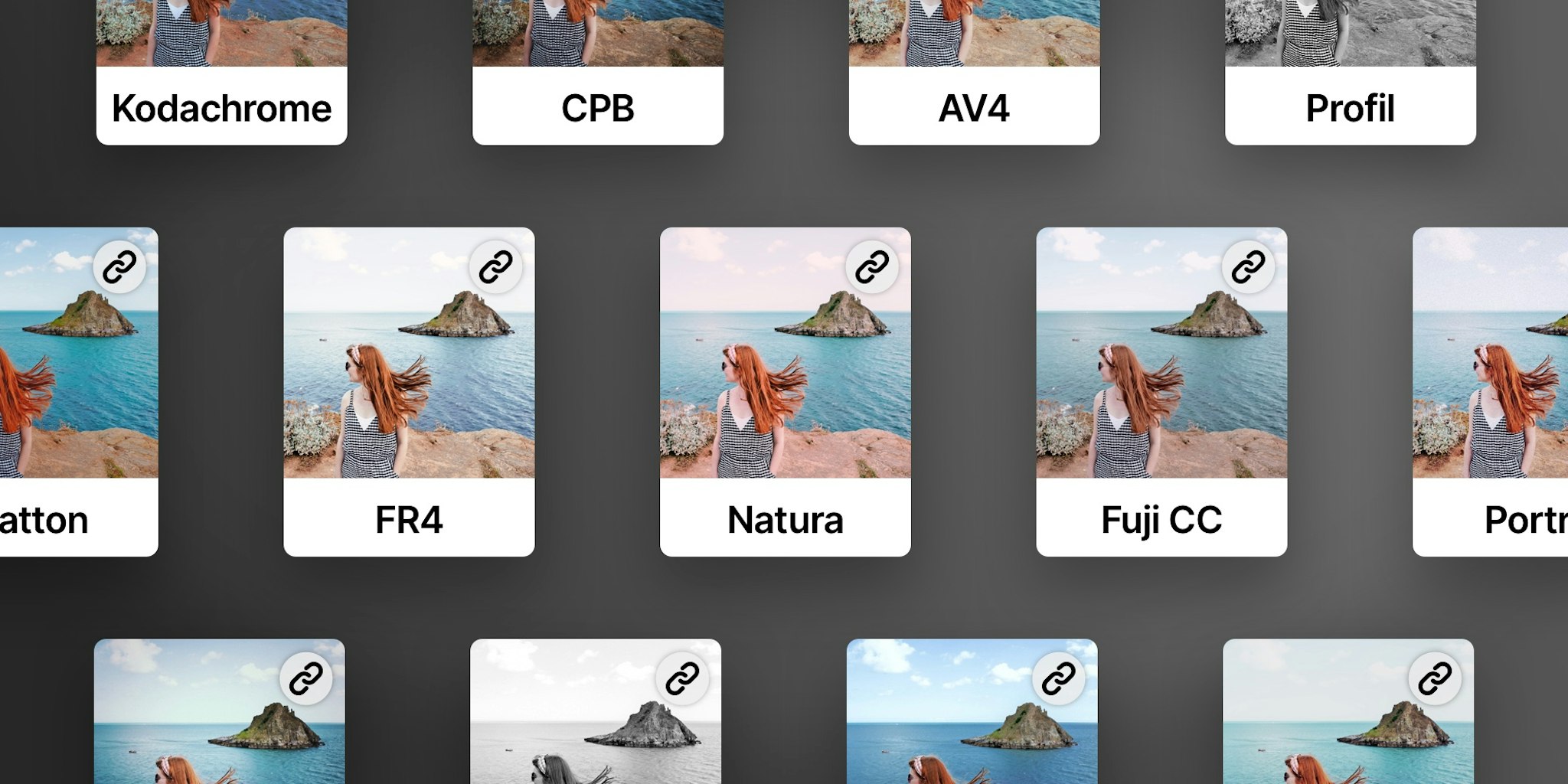
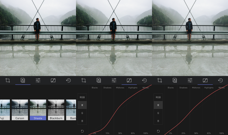
Editing in Darkroom typically starts with a filter, either one of the built-in filters, or one you’ve created yourself. It takes a lot of time to create curves from scratch whenever you want to edit a photo, and filters are how you streamline your process and make it much more efficient.
Once you find a filter you like, explore the different curves of the filter and look at how it influences your photo. Is one of the tones too strong? Try pulling it down. Shadows too dark? Pull them up.
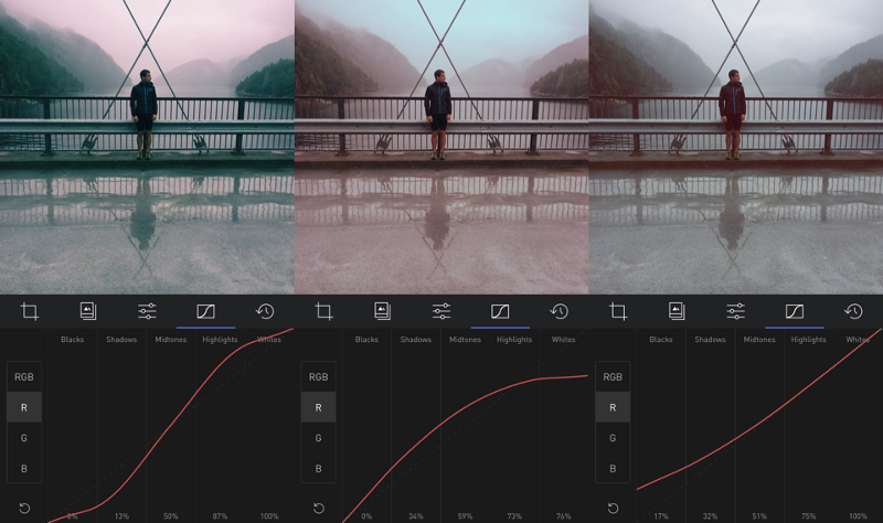
It’s important to remember when you’re playing around with curves that the three color curves normally aren’t adjusted in isolation. In order to increase the contrast of the photo and give it a cast, all three color curves need to be adjusted to an “S-curve”, and the tone comes from the variation of the curve. For example, in our aforementioned example, if your shadows are too dark, you may need to pull the shadows up on all three colored curves, and how you adjust the values between them is the tone of that part of the image.
It takes some practice to understand how changes in the curves adjust your tone, and it takes some practice to develop an eye for tone and how to establish a style that you like. Practice makes perfect here!
Fade
Faded looks became very popular with Instagram and later VSCO. Fade can add a lot of softness to your photo. Technically speaking, Fade is achieved by brightening up the blacks towards gray, and darkening the whites towards gray. In the process, crushing similar values together can simplify the amount of detail in your photo, and help focus the eye of the viewer towards a focal point in the photo.
When adding a fade to your photo, you have two main variables you can control: The amount of the fade, and the strength of the fade. The amount determines how bright the blacks become, and how dark the whites become. The Strength determines how much of the neighboring shadows and highlights the fade picks up with it.
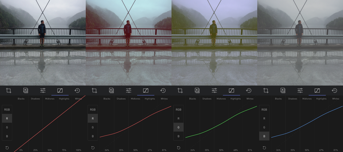
Here’s an example of a standard fade, applied step-by-step.
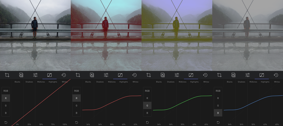
Here’s an example of a very intense fade. Notice how the blacks are so much brighter, and the whites so much darker, and how it affects the rest of the photo.
Here’s an example of a very strong fade. Notice how the gray that’s added to the photo includes a lot of shadows and highlights.
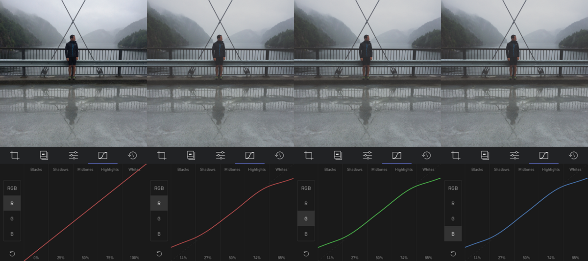
As always, changing one colored curve more than another gives you the ability to add color to your fade. Here’s an example of a hard fade that adds different tones to the highlights and the shadows. Notice the different values for the curves.
A Couple of Tips
Sometimes, when you’ve been editing the curves of a photo for a few minutes, you may find yourself with a weird effect on the photo, and you’re not sure which curve is introducing that effect. By long-pressing on the curve selector, you can individually turn off that curve, and keep every other effect in place, allowing you to narrow down the tools.
Also, as we mentioned repeatedly in this and the previous article, moving the curves together and relative to each other is very powerful. The percents at the bottom of the curve allow you to mimic one curve to another, and when editing, tapping above and below the curve moves the curve in small, 1% adjustments, allowing you to get very accurate results.
Order of Precedence
Curves doesn’t work in isolation in Darkroom. There’s a pipeline of tools that get applied in order, and understanding the order is an important part of combining the tools for an interesting effect.
Generally speaking, the tools are in the order they are visually presented in. Top down within a tool, and left-to-right across tools. For example, if you’re adding a fade, you can combine it with some vignette and that darkens the outer parts of the images down into the tonal regions that are affected by the fade. Play around with the different tools together, see what you come up with!
A Note on Digital Filters and Analog Film
For a century, photographers have used various brands of Film to give their photos a look, relying on the chemical mixture of the film and the development process to affect the colors and give photos certain looks. There was a lot of creativity afforded within the process that photographers built reputations, styles, and brands on top of.
When digital cameras replaced analog film cameras, all that creativity was lost, and digital post-processing mostly involved correcting for mistakes and basic adjustments. Photoshop was the tool to use, but because of its powerful and scope, it was very hard to use and learn. Lightroom came on to the scene, and distilled Photoshop down for photographers, and VSCO launched their very popular Lightroom presets for Lightroom which brought post-processing within the grasp of many more amateur photographers. Along the way, film-emulation became the aspiration of digital photographers trying to capture the nostalgia of classic photography and its looks.
Digital post-processing does not necessarily have to mimic old film stock, but it’s a great source of inspiration and practice.
What makes one brand of Film different from another is how the chemicals in the film strip react to different amounts and colors of light. Curves is how you capture that effect. For example, certain film stock is much more sensitive to green light in low light than red and blue, which gives the photo a green cast in its shadows. Similarly, by pulling up the greens in the shadows, you can recreate the effect.