In this guide, we'll dive into the key considerations for crafting your own presets. We'll walk you through a step-by-step process for developing your unique style, experimenting and refining your preset, and then sharing it with the Darkroom community.
A preset is essentially a collection of editing commands that allow you to quickly attain a specific look or style in your photographs, applied in one go instead having to apply each edit individually. They're an incredibly handy tool, offering a solid starting point and streamlining the photo editing workflow, while ensuring your photos maintain a consistent visual look.
If you are simply wondering what steps to take to practically create a presets:
That’s it, you are done creating a preset.
Now, we made the below quick and easy to follow tutorial video to help you get started with creating a preset. It’s a great way to get a feel for the process and see how it’s done. However, if you are looking for a more in-depth guide, keep reading as there are more considerations when creating your preset. The key of these considerations is to strike a balance between personal style and universal versatility when developing a preset.
Creating a preset solely by experimenting with sliders while looking at a photo can be challenging. It is creatively more effective to begin with a clear goal in mind, so that you can determine when you have achieved your desired result.
When determining your style, it is important to try and analyze your preferred aesthetic and mood. Consider the overall look and feel that you want to convey in your photos. Are you attracted to vibrant and vivid colors, or do you prefer a more subtle and muted palette, or perhaps even black and white? What emotion do you want to impart on your photos, bright and fun, or dark and moody? Do you lean towards a clean and minimalist style, or do you prefer a bold and dramatic approach? Perhaps you want to replicate a specific look that you have seen before? At this stage, there is no right or wrong answer; it is subjective, so focus on what you personally like.
It is very helpful to gather example photos that you admire to create a mood board. This can serve as a reference point as you develop your preset. Platforms like Pinterest and Instagram are great sources of inspiration to start with.
Collecting photos of looks you like, and trying to recreate the look is a well established and great way to learn and create presets. Playing around with the different tools to recreate or match a look is a great way to learn how to create a preset. What you might not have realized, is that when you apply any of the bundled or community presets in Darkroom, you can inspect all the tools to see and learn exactly what tools and specific edits where used to achieve that look! Dissecting or recreating presets offer a fantastic learning opportunity. By understanding the adjustments and choices made in a look, you can gain deeper insights into advanced color grading techniques.
Start by making bold and significant changes. Don't be afraid to push the limits of each tool. Sometimes the most unique and personal presets come from unexpected tweaks and adjustments. Often, we tend to make subtle changes that are not distinctive enough. Once you have an opinionated starting point, it becomes easier to gradually tone it down where necessary.
While it is possible to create a single preset that works on any photo, it can limit your ability to enhance the colors in the photo. That's why we recommend starting with a specific look that you like, and then consider creating variants of that preset that work well for bright/dark or flat/contrasty photos. Having a naming system, which we will discuss later in this guide, allows you to easily identify which preset works best for different photos.
When creating your own presets in Darkroom, it is recommended to primarily use the curves, color grading, selective color, and masks tools for making adjustments. These tools offer a wide range of flexibility and control over the editing process. Use the Selective Color tool to make the blues in a summer sky more vibrant, or employ Masks to subtly darken the background in a busy street scene. By excluding basic adjustments like brightness, contrast, blacks, and whites from your preset, you enable yourself and others to freely apply the preset and separately make photo specific lighting adjustments.
If you don’t do this, your presets adjustments either won’t be applied, as the adjustments already made to the photo are prioritized and will be kept. Or, if you first apply the preset and then make adjustments the additional changes will have less available range.
Vignettes, grain, masks, and even clarity can add subtle yet impactful effects to your photos, enhancing visual interest and directing the viewer's attention. Experiment with vignettes and masks to darken the edges of the frame slightly, drawing the eye towards the central subject. Or consider applying grain to compliment your overall editing style to gain a more vintage look. These elements can add a unique touch to your photos and contribute to the cohesive look you're aiming for.
Remember, the process of identifying your editing style and making creative choices is subjective and personal. It's about expressing your unique vision and creating a visual language that reflects your aesthetic preferences and mood. Enjoy the exploration and experimentation as you develop your editing style in Darkroom.
Continuously experimenting, evaluating, and refining your preset is the only way to truly make it your own, versatile, and over time, gain enough confidence to share it with others.
Once you have your first pass on a set of edits that you like, and you have created a preset of those edits, you will likely want to update your preset whenever you make follow up edits. We have tried to make this as easy as possible. So when you have created and applied a preset, and make any subsequent changes we will indicate that your preset can be updated by showing dot • in front of the name. To actually update it, tap the ••• preset action icon, and use the available Update button to update your preset.
To create a high-quality and somewhat broadly effective preset in Darkroom, it is crucial to preview and compare your edits throughout the preset development process on a wide range of photos. By doing so, you can iteratively refine the preset and evaluate its impact on your photos.
Tip: You can tap-and-hold on your photo to quickly see the original unedited image. Enabling you to quickly visually compare what your edits are doing compared to the original photo.
By continuously previewing and comparing your preset, you can ensure that it delivers the desired visual style and maintains a cohesive look across a range of photos. This iterative process allows you to fine-tune the preset settings, ensuring that it achieves the intended effect while preserving the original qualities of the photos.
Tip: To help in this process it can be useful to create a specific album with photos to test on. And to now end then export a few photos with the preset applied into a separate album. This way you can look through both originals, and previous version to compare changes made over time.
When applying your preset to different photos, it's important to ensure compatibility with various subjects and specifically skin tones. Each photo may have unique characteristics that require adjustments to achieve optimal results. Pay attention to how your preset affects different types of photos, such as landscapes (sky, water, vegetation), portraits (skin tones), or still life shots. Skin tones are specifically very important, so make adjustments if necessary to maintain a natural and pleasing appearance. Be careful not to brighten or darken skin tones (near orange) specifically as that can easily cause unintended results.
It can take a bit of time to develop a preset. It’s actually very good practice to just leave it be for a while to then come back to it with a fresh set of eyes. Either way, have fun with the process, don’t feel the need to rush it.
By now we are pretty sure you have already given your preset a name as you have been developing it. You might have noticed that giving it a short name has helped as there aren’t a lot of characters available.
For the presets bundled with Darkroom we developed a naming convention. Perhaps you will find it useful. This can be especially useful if you want to develop a set of presets. But if you want to develop presets that stand on their own you can also just give them fun short names.
So, what are these Darkroom preset names; C100, I250, etc? The letter (C) represents the set name (Cinematic). The first number represents the main variant (C100), the second number a subtler or stronger sub-variant (C110).
To Share your preset, tap the ••• preset action menu, and use the Share option you will find in the Preset actions options. When you do that we will upload your preset and create a unique URL, which you can then share with anybody.
To further refine and improve your preset, it can be valuable to seek feedback from others. Sharing your preset with the Darkroom community or trusted peers can provide valuable insights and constructive criticism. By gathering feedback, you can identify areas for improvement, address potential issues, and enhance the overall quality and usability of your preset. Embrace the opportunity to collaborate and learn from others to create a preset that resonates with a wider audience and contributes to the Darkroom community.
Tip: Once a preset is shared, you have the flexibility to un-share it, make updates, and share it again, ensuring that all users have access to your latest changes.
In conclusion, creating your own presets in Darkroom allows you to establish a unique and consistent editing style for your photos. By inspecting and learning from existing presets, using the recommended edit tools, and identifying your preferred aesthetic and mood, you can craft presets that reflect your personal vision. So go ahead, unleash your creativity, and develop presets that bring your photos to life in a distinctive and captivating way.
]]>If you're a lover of photography and enjoy editing your photos, you've probably heard of both Darkroom and VSCO. These two apps have become quite popular in the photography world over the years, and both offer some unique features. In this post, we'll take a look at the differences between both apps, and help you decide which one is best for you.
For one, most people now use their iPhone as their primary camera. Darkroom is built directly on top of Apple's iCloud Photo Library, so all of your photos are ready for you to start editing in Darkroom immediately after capture. We even integrate with popular camera apps to make the workflow from capture to edit as flexible, quick, and smooth as possible. So, you won't have to import or upload anything, and you won’t have to manage separate libraries. In contrast, VSCO requires you to import and upload every photo you want to edit into their separate library.
Additionally, Darkroom is exclusive to Apple devices, while VSCO is available on Android. So if you're an Android user, you're out of luck with Darkroom. On the other hand, if you're an Apple customer, which many mobile photographers happen to be, Darkroom has an award winning interface across devices that is focused on reducing clicks and taps and increasing workflow efficiency, making it ideal for those who want to be able to edit photos efficiently on the go.
Ultimately, the choice between these two apps depends on your personal preferences and needs. The good news is that both apps offer trials, so you can test them out before committing to a purchase. So whether you're a professional photographer or just someone who loves taking photos, both apps offer their own unique features and benefits. The choice is yours!
Let’s briefly introduce both applications.
We're a small, independent business that's been around since 2015. From the beginning, we've prioritized creating an exceptional photo editing experience on Apple's platforms that's optimized for people on-the-go. We were thrilled when Apple recognized our efforts by awarding us the prestigious Apple Design Award. Now, you can use Darkroom on your iPhone, iPad, Mac, and Vision Pro and take advantage of the seamless integration with Apple's iCloud Photo Library and many other unique Apple platform functionalities.
VSCO, which stands for Visual Supply Company, has been a favorite among mobile photographers since its launch in 2011, and is a heavily venture capital backed company. As a pioneer in the mobile photography field, they have always focused on providing a complete photography workflow on mobile, from capture to editing to sharing. It's known for its signature filters, which emulate the look of classic film cameras, and its minimalist, intuitive interface. In recent year it has incredibly focussed on building out it’s own social sharing platform. Available on both Android and iOS platforms, they have a wide and diverse user base all around the world. It’s a great choice for those seeking a straightforward, user-friendly editing experience with a wide variety of filters to choose from.
Let's delve deeper into the comparison between Darkroom and VSCO. We'll take a closer look at differentiating of features in both apps, and pricing to help you decide which app might be the best fit for your photo editing needs. Let’s get started.
Filters or presets are a popular feature in photo editing apps, and both apps offer a wide range of options. As already mentioned, VSCO is in particular known for its filter that emulate popular analog film stocks from yesteryear. It’s important to know that their best and most filters are behind a paywall, and you can’t download or install additional community made presets.
This is in contrast to Darkrooms presets. Although Darkroom also provides a set of premium professional created presets as part of Darkroom+, it also allows you to create your own presets, and offers a free option to share them. As such Darkroom has thousands of quality community presets for you to discover, and install for free. Which includes many presets emulating analog film, but also many other independent and creative presets.
At Darkroom, we believe that library management is a key feature that helps people create great photos. We recognize that importing and organizing photos can be a time-consuming and frustrating process, which is why we've made it as easy as possible. Our app is built with busy photographers in mind, and we've designed it to help you edit your photos quickly and efficiently on the go.
So if you're not a fan of spending hours importing, managing, and paying for separate photo libraries, give Darkroom a try! We think you'll love how easy it is to use and how it seamlessly integrates with your iCloud Photo Library.
VSCO has a large and active creative community, they provide a closed social platform for users to discover and share creative content. The app's curated feed showcases inspiring photography from around the world, fostering a sense of community among its users. VSCO Grid allows you to showcase your portfolio and gain exposure within the photography community.
Darkroom is focussed on being the most efficient and privacy first photo editor. Darkroom does offer preset sharing, and has built a platform for people to discover all presets the community has shared. But we have also chooses to not do certain things and deeply integrate with partner companies focussed on being the best in their respective fields. We have partnered with companies like Leica and Halide, to provide you the best and most convenient ways to capture your photos. Similarly we are huge fans of Glass, who have built an independent world class sustainable home for photographers online.
When it comes to editing tools, both apps offer a range of features. However, Darkroom may be a better choice for those who want more creative control over their edits. Darkroom offers more advanced tools, such as color grading, masks adjustments and curves, state of the art highlight and shadow recovery, allowing you to fine-tune your edits to a greater degree. Not to speak of the many library management features such as flag & reject, album & folder creation and search, which VSCO simply doesn’t have.
VSCO, on the other hand, has a more simplified approach to editing. The app primarily offers a range of presets that you can apply to your photos, as well as basic editing tools such as exposure, contrast, and saturation. This makes VSCO a good choice for those who only want to quickly edit their photos without spending too much time on it.
Advanced Masking — Darkroom has advanced masking options that allow you to edit specific parts of your photo with precision. You can use smart masks powered by AI and machine learning to easily select and edit just the foreground or background, the skin or hair on a portrait. Additionally, linear and radial masks are available, and you can even make selections based on depth, luminance, and color ranges. These features are nearly identical in both apps and can help you achieve the perfect edit for your photos!
Shadow & highlight Recovery — Our shadow and highlight recovery tools are at the cutting edge of the industry – for both JPGs and RAWs. And we don't say that lightly! We're a small, independent business, and we put our hearts and souls into making sure every feature is the best it can be. We don't cut corners or settle for "good enough." If we think it's worth doing, we do it right.
Color Grading — We aren't afraid to try new things and incorporate tools from other domains like video editing. One example of this is our color grading feature. It provides a compact and intuitive interface that makes it easy to develop a unique look for your photo. If you're looking for a photo editing tool that's both powerful and easy to use, give us a try!
Darkroom uniquely offers non-destructive editing, which means you can edit photos without altering the original image. This feature is important because it allows you to freely experiment with different editing options and revert to the original image or any specific edit if needed. Image editors like VSCO, but also apps like Snapseed, or Pixelmator, permanently alter the original image with your edits, making it impossible to undo specific edits as every steps is destructively processed. So, whether you're a professional photographer or just someone who loves taking pictures, non-destructive editing is a great feature to have.
Darkroom started off on iPhone, expanded to iPad, then came to the Mac, and is even available in Vision Pro with our compatible iPad app. Each version is tailored specifically to that platform. We owe a lot of our success to Apple, who made a wealth of technology and tools available to us as an independent software developer. We love the Apple software ecosystem, and we prioritize deep integration with it to provide super-tight and efficient workflows that seamlessly integrate with the system and other software. In fact, we use cutting-edge technology like Metal hardware-accelerated rendering, and leverage Apple's AI and machine learning advances, and specific features like Shortcut Automation to provide a level of platform integration that many other photo editors don’t match.
To be direct, the subscription plan for Darkroom is a lot more affordable than VSCO’s, specifically if you want access to all their premium features, in which case it’s nearly twice as expensive. They do provide a more limited option, but well it’s limited. Darkroom also offers a one-time purchase option, and a very feature rich free tier. In contrast, VSCO only has one yearly subscription plan. So if you're looking for a powerful photo editor that won't break the bank, and is easy to try, Darkroom is definitely worth considering!
Go premium with Darkroom+ and enjoy full creative control while editing.
Try all premium Darkroom+ features with export restrictions. Use many quality features for free.
DownloadSubscription that unlocks all tools for just $4.99 per month, trial not included. Share Darkroom+ with your family.
SubscribeSubscription that unlocks all tools for just $32.99 per year after a free 7-day trial. Share Darkroom+ with your family.
SubscribeA one time purchase that's only $74.99 for a lifetime of full access to Darkroom+. Limited family sharing.
PurchaseNote: When you sign up for a trial and you don't want to continue with the subscription, make sure to cancel it at least 24 hours before the trial ends. If you do it later, Apple may charge you the full subscription fee. Prices may vary depending on your country or region. You can manage or cancel your subscription in App Store account settings.
We're excited to introduce automatic preset syncing and backup in Darkroom. Now all your custom and community presets will automatically synchronize across your devices, along with the favorites, arrangement, and even the sets you've chosen to hide. It's a significant step forward in enhancing your photo editing workflow, offering consistency and convenience on your iPhone, iPad and Mac.
Previously, Darkroom's preset management across multiple devices was a manual process that disrupted your creative workflow. Now all your presets are always accessible, eliminating the need for manual backing up, restoring, or manually sharing between devices. And because it's backed by iCloud, syncing works out of the box without a user account. It's as easy as that!
Presets are at the core of photo editing in Darkroom, helping you get consistent results quickly. With Darkroom presets, you can create your signature style, save it as a preset, and easily apply the whole look with one tap. You can also share your presets publicly, or install a preset shared by the Darkroom community. Select multiple photos and paste edits to swiftly edit an entire photo shoot. Over the years, we've been investing a lot into making Presets in Darkroom customizable, giving you tools to cureate what you see and where, and we're excited to finally take it cross-platform.
Sync in Darkroom is built on the well-known and trusted Apple iCloud, ensuring the security and privacy of your data, similar to iCloud Photos. It uses fairly minimal space within your existing iCloud plan, which means doesn't come at any additional cost, and is not even part of Darkroom+.
While preset syncing and backup is a big leap, our goals extend further. As discussed last year, we're working towards comprehensive sync and backup support for all Darkroom data, utilizing iCloud to enhance your experience in managing and editing photos, as well as in sharing and installing presets, no matter your device or location.
Last year has been about laying the groundwork. We began with quietly releasing flag and reject sync, gathering insights to refine our approach. Now, with preset sync, we're taking another major step. Next will be syncing all edits made to your photos and videos, aiming to synchronize the core of your Darkroom experience. We're proceeding carefully, testing each phase to ensure the best possible implementation.
As part of this update, we've completely rebuilt the preset tool from its very core, setting a solid foundation for the future. This marks our third release of this type, following the introduction of mask previews in which we rebuilt the adjustment tool and the revamped album list. These updates are part of a series dedicated to enhancing and modernizing the core user experiences in Darkroom. As such we where also able to make some additional smaller improvements that you can read about on our updates page.
Enjoy exploring the wide variety of Darkroom Community Presets in a more efficient way! Looking for presets that emulate Polaroid, Fuji Film (FF), Kodak, or Ilford? Or perhaps specific films like Estia, Velvia, or Classic Chrome? Maybe your friend has created an awesome preset like Glass Pop, Asteroid City, or harder to remember name like HP5, A1 or C2? Now, all of these are just a quick few taps to search away.
This is just one of the many smaller improvements we have made, and will continue to make, to Darkroom's Preset Discovery over the past few months. These improvements include indicators for installed presets, a larger discovery window on Mac, and the ability to preview presets before and after on mobile. For a full detailed list of all changes please visit our updates page.
We're excited to introduce six new app icon variants, exclusively for our Darkroom+ subscribers! Explorer leads the way with its outdoor-inspired design, perfect for the adventurous. Our first seasonal offering, Fall, captures the essence of the season. Sunset symbolizes the magical moments photographers cherish, reflecting the stunning hues of the day's end. Safelight pays homage to the quintessential darkroom lamps, a nostalgic nod to our version 3 icon. It's surprising we didn't think of it sooner! Point Cloud draws inspiration from the AI-generated depth point clouds used in our smart masks, blending technology with art. Lastly, Doodle offers a fun and imaginative twist, adding a dash of playfulness to your Darkroom app.
We hope these new icons, bringing our total to an impressive 39, add even more joy and personalization to your Darkroom experience. Enjoy the variety and let your app shine!
Do you want to use any of these six new app icons on Mac? You can! Follow the instructions in our Mac app icon guide.
We're excited about these improvements and believe they'll make a noticeable difference in your photo editing journey. Keep an eye out for further updates as we continue enhancing Darkroom to offer a more connected and intuitive editing experience.
If there’s something you’d like to see in the future please let us know by leaving it on our suggestion board, or by sending us an email or tweet at us.
As always, we’re very thankful for your continued loyalty and support, and look forward to sharing everything else we have in store for you soon.
The Darkroom Team
]]>Nine years ago, we launched Darkroom. We are grateful to the hundreds of thousands of photographers who have been using Darkroom to edit their photos on the go. Thank you to those who have been with us for almost a decade and to all those who have supported our business. It's inspiring to see the millions of installs, shared photos, and installed presets every month.
A couple of weeks back, we had this year's first team meeting during which we finalized our plan for the year. We are extremely excited about what we have in store for you! First, let's provide some context, and then we'll delve into our plans for the year.
Darkroom, launched in 2015, gained attention in the iPhone photography community by seamlessly integrating with Apple iCloud Photo. It introduced mobile-friendly curves and color tools, enabling photographers to create personalized presets on the go. Darkroom's intuitive interface and workflow efficiency set it apart, making pro desktop tools accessible and intuitive for photographers worldwide.
As Darkroom's popularity grew, we continued to innovate and introduced unique features like frames, depth editing, and video processing. In 2018, Darkroom expanded to the iPad, and in 2020, it received the Apple Design Award in recognition of its outstanding design and innovation. This honor made for an incredible year.
In 2021, we were excited to announce the arrival of Darkroom on Mac, three years after its launch on iPad. Since then, our commitment has been to deliver powerful new tools, including AI-backed Masks, Color Grading, and Preset Sharing & Discovery. We have also enhanced foundational tools such as clarity, improved highlights and shadows.
As of two weeks ago, you can now also use Darkroom on Apple Vision Pro with our compatible iPad app. It's amazing to see Darkroom running at room-scale. We’re excited to continue optimizing and iterating on our Vision Pro experience to make sure you have the best experience possible on all the platforms we support.
We want to take this opportunity to provide more insight into what has been happening behind the scenes and, more importantly, our future plans.
Our journey has been defined by our ability to provide a fast, simple, and efficient photo editing workflow. That is our obsession. This has been, and continues to be true for us 9 years later. If anything, we are more committed and excited than ever to continue building Darkroom, while staying true to those same core principles.
Over the years, we have built Darkroom on multiple platforms, added innovative features, and continuously kept up with the growing expectations of photographers. This growth in complexity has at times conflicted with our limited resources, as a bootstrapped and independent business, though that has never prevented us from stepping up to the challenge. We’ve actually gone through this before, in 2019, when we spent the whole year working on a new rendering engine that enabled support for iPad, macOS, and efficient RAW image processing. The result of that work were two years of incredible growth and power.
2023, was defined by the same narrative.
Aimed at addressing most of the serious issues reported by our customers we started rebuilding our image processing engine well over a year ago. This is the third time we have done this, each time based on the invaluable feedback from everybody, each time built on the learnings from hitting our limits, and each time unlocking a new era of possibilities.
We have recently made significant progress internally, reaching two major milestones. Firstly, we have developed a fully functional standalone app to showcase the processing performance and stability. Currently, we are in the process of integrating this new engine back into the main Darkroom app.
This new engine addresses various issues and brings about quality enhancements. Its primary focus is to ensure seamless viewing and editing experiences, providing high image quality regardless of the image size, type, or device limitations. Additionally, it grants us greater control over the rendering process, enabling us to improve our editing algorithms and develop new tools more efficiently. In the past, releases took too long and were performance-compromised because of our infra. The goal is to release at a faster pace, with a more stable baseline.
We're soon going to release Preset Sync, a major advancement to our preset tool. While it's not Edit Sync, which is the highly requested feature, making progress on one feature is making progress on the other. This release, along with last year’s Flag and Reject Sync established a syncing infrastructure for us. However, preset syncing took longer than anticipated since we had to rebuild the preset tool from the ground up to handle live updates when syncing presets in the background. This process provided valuable insights.
While preset syncing and backup are important, our goals go beyond that. We strive to offer comprehensive sync and backup support for all Darkroom data. This entails leveraging iCloud to improve photo management, editing, sharing, and the installation of presets across devices. We are proceeding with caution, thoroughly testing each phase to ensure the optimal implementation.
Last year we developed an internal version of Brushed Masks. It’s an important feature as it’s an important first step towards making retouching possible. However, Brushed Masks already strained our current render engine, affecting the app's performance and stability. To ensure a successful launch, we decided to postpone the final development of Brushed Masks until after releasing our new render engine. This delay will ensure a stable and high-performing launch.
We have made significant progress in this area, although you may not have noticed much of it as many of these changes were made behind the scenes.
By leveraging new technologies like Swift and SwiftUI to update our interface layer, we have established a solid foundation for a more intuitive and consistent user interface across all devices. These new tools are better tested and support the multi-platform reality of Darkroom.
We made investments last year that may not have shown external progress, but were necessary for future execution. We will keep adding value to Darkroom, especially for Darkroom+ members. Our goal is to ship more improvements, fixes, and smaller feature additions. We are also exploring new ideas for Darkroom features. While we can't promise anything now, we are committed to enhancing the app and providing a seamless editing experience. Thank you for your support and we'll keep you updated on any future developments.
Reflecting on Darkroom's journey, we appreciate the future. The next chapter brings plans and innovations for better editing and supporting creativity.
We sincerely thank our customers for their support and patience. Despite our mistakes and challenges, you have stayed with us, and we are grateful. Working on Darkroom is a privilege, and we are grateful to collaborate and create a tool that combines our passion for photography and an amazing app.
We are committed to delivering new features and staying in touch with you. We value your thoughts and feedback on our plans. Together, let's make 2024 a year of growth and creativity in Darkroom.
We also thank everyone who helped build Darkroom. Whether you were on the team or provided support as a family member, we appreciate the hard work and support. We wouldn't have come this far without you.
Thank you.
]]>We are excited to offer you an incredible 50% discount on your first-year subscription to Darkroom+. Instead of paying $32.99, you can get it for just $16.49 for the first year. Darkroom+ comes with a suite of premium features that will unlock a world of endless possibilities and elevate your creativity. Yes, you heard it right - all of this at half the price! This is by far our biggest offer ever, and we are not waiting for Black Friday to start. We are launching the sale a full week early because who likes to wait?
Friday November 17th until Monday November 27th
Our Black Friday Week sale will run for a limited 10 days only. Set a reminder, mark your calendar, and get ready to dive into a world of endless possibilities with Darkroom+. Trust us, you don't want to miss out on this and make sure to take advantage of this massive deal during our Black Friday Week before the turkey hits your table this Thanksgiving.
It's simple! Make sure to download the latest version of Darkroom (6.6.3) and follow the steps in the app to become a Darkroom+ member. No need to remember or apply any promo codes. We’ll also remind you about the Black Friday Week offer in the app. Alternatively, tap or click the button below to open the membership step in the app directly.
Become a MemberDon't keep this incredible deal to yourself! Share the news with your fellow mobile photographers, friends, and family. This is the perfect and very affordable opportunity to join our Darkroom+ membership.
Darkroom+ is our membership that provides access to the growing bundle of already 9 premium features. Whether you want to add a distinct style, make precise adjustments, or manage your photo library efficiently, Darkroom+ has you covered with its collection of premium features.
With Color Grading, AI Powered Masks, Video Processing, Flag & Reject, Curves Tool, Selective Color, Premium Presets, Watermark, and Custom App Icon, you will have toolkit ready to transform your photos on the go without the hassle of complex legacy software.
Don't miss out on this incredible opportunity to elevate your creativity and unlock endless possibilities with Darkroom+!
Whether you're a seasoned shutterbug or just casually dipping your toes into the world of mobile photography, Darkroom offers a comprehensive suite of foundational tools beyond Darkroom+ that cater to all your photo management and editing needs.
Darkroom is more than just a tool; it's a gateway to expressing your creativity and sharing your story with the world. Serious or amateur, every mobile photographer has a home here.
Frequently Asked Question
In the United States the Yearly membership costs $32.99 ($2.75 per month), and is currently being offered at a 50% discount for the first year. So instead of $32.99 it will be $16.49. After the first year the membership will automatically default back to the normal pricing.
Be aware that prices vary per country, listed below are the prices for the United States. We recommend going to our app store page to see the exact pricing for your specific country.
Yes, as a Darkroom+ member, you can use it on multiple devices. There is no need to purchase or subscribe to Darkroom+ multiple times. However, please ensure that you log in on all devices using the same App Store account that you used to make the initial purchase.
Yes, we learned from last year's mistakes and ensured that this discount is also available to our Legacy customers. Please make sure to update to the latest version of Darkroom (6.6.3) to access the Black Friday Week Offer. Considering the substantial discount offered in the first year, we didn't find it necessary to provide any additional special discounts. On average, Legacy customers paid approximately $8 for all their features. With this year's Black Friday Week discount, we are now offering a $16 discount on the first year.
No. We are only offering this year's Black Friday Week discount for our annual membership. The one-time forever membership option already includes a substantial discount considering the length of time and loyalty our customers typically have towards our product.
]]>This update makes managing, browsing, sorting, and searching for albums 📕 and folders 📁 in iCloud Photo Library across all your devices a breeze. No more endlessly scrolling through alphabetically sorted albums without any folder structure.
Albums and folders are a fundamental tool of any organizational and editing workflow. They can dramatically speed up your work whether you’re working on large projects, maintaining an ongoing photography series, or sharing stories of a trip, vacation or event.
Managing your neatly organized folders on all your devices enables you to group and categorize your albums in any way that makes sense to your workflow They make jumping around efficient, and give you a way to add structure to an otherwise unstructured stream of images. We make it easy to browse,create, and delete a nested folder hierarchy, including the ability to select multiple albums and quickly group them in a folder using a newly added context menu option.
Feeling overwhelmed by the sheer number of albums you've amassed over time? That's where our brand-new search functionality comes in. You can now easily find specific albums within your folders, even if you have an extensive collection and deep hierarchy. No more endless scrolling or frustration – finding that special album is now as simple as typing a few characters. Finding and rediscovering your favorite memories has never been easier in Darkroom.
Now you can also drag-and-drop your folders and albums in any manual order that suits you. Additionally you can also select multiple albums and folders, or contents of a folder, and have Darkroom do the sorting for you, either alphabetically or chronologically. You name it, we will sort it.
Managing albums and folders can be a bit of a daunting task, especially when dealing with a large collection. That's why Multi-selection capabilities are also available for albums and folders in all the relevant places. With this powerful addition, you can effortlessly select multiple albums or folders at once, allowing you to perform bulk actions like re-ordering, sorting, moving, deleting, and even grouping several albums and folder into a new folder. We worked hard to say goodbye to tedious, one-by-one management and enjoy the convenience of bulk management on all your devices.
Navigating your photo collection is now just as easy with your iPad or Mac keyboard as it is with your finger or trackpad. You can use the Tab ⇥ key to switch views, use your arrow ↑ ↓ keys to navigate between your albums and folders, use the new Command ⌘ + F shortcut to start a search for you albums and folders. Once you've started a search, you can use the arrow keys to select the desired result. Enabling you to navigate, select, and search your entire photo collection without having to touch your screen or trackpad.
On Mac we also made sure to redesign the album list to match the new look and feel, with thinner icons and rows. And you can now also collapse Media Types and Shared Albums categories to keep your list shorter and tidy. We hope you enjoy the attention to details as much as we do.
Unfortunately, due to constraints in iCloud Photo Library, the sort order of the albums in Darkroom will not match what you see in the Photos app, nor in other 3rd-party applications.
Furthermore, changes made outside of Darkroom won't be reflected in Darkroom until you restart the app. We hope these issues can get sorted in a future update of the operating systems.
If there’s something you’d like to see in the future please let us know by leaving it on our suggestion board, or by sending us an email or tweet at us. For a full detailed list of all changes please visit our updates page.
As always, we’re very thankful for your continued loyalty and support, and look forward to sharing everything else we have in store for you soon.
The Darkroom Team
]]>Are you a photo editing enthusiast? If you're already using Darkroom or interested in trying it out, you may be wondering how it compares to its main competitor, Lightroom. Both apps are great for editing photos, but they have some key differences that are worth considering. Let’s jump right in.
For one, most people now use their iPhone as their primary camera. Darkroom is built directly on top of Apple's iCloud Photo Library, so all of your photos are ready for you to start editing in Darkroom immediately after capture. We even integrate with popular camera apps to make the workflow from capture to edit as quick and smooth as possible. So, you won't have to import or upload anything, and you won’t have to manage separate libraries. In contrast, Lightroom requires you to import every photo you want to edit into their separate library.
Additionally, Darkroom is exclusive to Apple devices, while Lightroom is available on all platforms. So if you're an Android user, you're out of luck with Darkroom. On the other hand, if you're an Apple customer, which many mobile photographers happen to be, Darkroom has an award winning interface that is focused on reducing taps and increasing workflow efficiency, making it ideal for those who want to be able to edit photos efficiently on the go. With its hefty array of editing features, Lightroom on the other hand caters more to professionals with a matching price.
Ultimately, the choice between these two apps depends on your personal preferences and needs. The good news is that both apps offer free trials, so you can test them out before committing to a purchase. So whether you're a professional photographer or just someone who loves taking pictures, Darkroom and Lightroom offer their own unique features and benefits. The choice is yours!
Let’s briefly introduce both applications.
We're a small, independent business that's been around since 2015. From the beginning, we've prioritized creating an exceptional photo editing experience on Apple's platforms that's optimized for people on-the-go. We were thrilled when Apple recognized our efforts by awarding us the prestigious Apple Design Award. Now, you can use Darkroom on your iPhone, iPad, Mac, and Vision Pro and take advantage of the seamless integration with Apple's iCloud Photo Library and many other unique Apple platform functionalities.
Lightroom has been around since 2006 and has set the bar for what a photo editor can be, along with apps like Capture One (and remember Aperture?). It is already a fairly complex, feature-rich, desktop-first photo editor that's compatible with almost every software platform you can think of. To be clear, when we talk about Lightroom, we mean the one that is also available on your iPhone and iPad, and are not referring to the Classic version, which is the original desktop-centric counterpart with even more traditional interface, heftier editing features, and local storage solutions. It's owned by Adobe, one of the world's largest publicly traded companies, which also owns Photoshop and many other creative apps. So, if you're looking for a powerful photo editor with an extensive range of advanced features, they are definitely worth considering.
Let's delve deeper into the comparison between Darkroom and Lightroom. We'll take a closer look at differentiating of features in both apps, and pricing to help you decide which app might be the best fit for your photo editing needs. Let’s get started.
We mentioned it right at the start. Darkroom has a clear advantage over Lightroom when it comes to managing your photo library. With Darkroom being built directly on top of the Apple's iCloud Photo Library, all of your photos are always ready for you to start editing immediately after capture using your camera app of choice. So, no importing or uploading anything to a second or separate library. That's in substantial contrast with Lightroom which requires you to import every photo you want to edit into their separate library, locking you in.
At Darkroom, we believe that library management is a key feature that helps people create great photos. We recognize that importing and organizing photos can be a time-consuming and frustrating process, which is why we've made it as easy as possible. Our app is built with busy photographers in mind, and we've designed it to help you edit your photos quickly and efficiently on the go.
So if you're not a fan of spending hours importing, managing, and paying for separate photo libraries, give Darkroom a try! We think you'll love how easy it is to use and how it seamlessly integrates with your iCloud Photo Library.
Darkroom was built with on-the-go photographers in mind. Our mobile-first origin, workflow-optimized interface is designed to help you edit your photos quickly and efficiently with as few taps as possible. In contrast, Lightroom originated during a desktop-first era, which can make for a less easy or efficient workflow.
Darkroom's Apple Design Award recognizes the app's focus on an efficient workflow. We designed it specifically so that you can operate it using just your thumb through explicit navigation and gestures. Try and find any other photo editing app that does that!
Many of Darkroom's features are specifically relevant to mobile-first photographers. For example, you can quickly cull trip photos on the go with just your thumb using Flag and Reject, as all your photos are ready to go and don't need importing. Culling in Lightroom is a pretty inefficient workflow in comparison because of the importing.
And in Darkroom, you can easily discover, search, install, and even share your own presets using a simple sharable link, without having to create, manage, send, and install old-fashioned files like you would need to in Lightroom. Darkroom also offers a unique Frames tool that lets you export any aspect photo inset on a Stories aspect ratio background, with colors matched to tones from your photo.
While both apps offer very similar batch processing functionality to apply the same edits quickly to trip photos all at once, Darkroom is designed with mobile-first photographers in mind. If you're always on the go and need to quickly edit your photos, Darkroom is a great option.
Both apps offer non-destructive editing, which means you can edit photos without altering the original image. This feature is important because it allows you to freely experiment with different editing options and revert to the original image or any specific edit if needed. Other image editors, like VSCO, Snapseed, or Pixelmator, permanently alter the original image with your edits, making it impossible to undo specific edits as every steps is destructively processed. So, whether you're a professional photographer or just someone who loves taking pictures, non-destructive editing is a great feature to have.
We started off on iPhone, expanded to iPad, then came to the Mac, and are even available in Vision Pro with our compatible iPad app. We owe a lot of our success to Apple, who made a wealth of technology and tools available to us as an independent software developer. We love the Apple software ecosystem, and we prioritize deep integration with it to provide super-tight and efficient workflows that seamlessly integrate with the system and other software. In fact, we use cutting-edge technology like Metal hardware-accelerated rendering, and leverage Apple's AI and machine learning advances, and specific features like Shortcut Automation to provide a level of platform integration that many other photo editors don’t match.
Let's be fair: Darkroom hasn't nearly been around for as long as some of the other big players in the photo editing game, like Lightroom or Capture One. But that doesn't mean we're not constantly pushing ourselves to be the best. Our team is dedicated to creating tools that are better than anything else out there, no matter how big the competition. We're always looking for ways to improve and push the creative tools industry forward.
Advanced Masking — Darkroom has advanced masking options that allow you to edit specific parts of your photo with precision. You can use smart masks powered by AI and machine learning to easily select and edit just the foreground or background, the skin or hair on a portrait. Additionally, linear and radial masks are available, and you can even make selections based on depth, luminance, and color ranges. These features are nearly identical in both apps and can help you achieve the perfect edit for your photos!
Shadow & highlight Recovery — Our shadow and highlight recovery tools are at the cutting edge of the industry – for both JPGs and RAWs. And we don't say that lightly! We're a small, independent business, and we put our hearts and souls into making sure every feature is the best it can be. We don't cut corners or settle for "good enough." If we think it's worth doing, we do it right.
Color Grading — We aren't afraid to try new things and incorporate tools from other domains like video editing. One example of this is our color grading feature. It provides a compact and intuitive interface that makes it easy to develop a unique look for your photo. Lightroom has also recently added this feature, but we believe that our interface is even more intuitive and refined. So if you're looking for a photo editing tool that's both powerful and easy to use, give us a try!
Video — Darkroom even allows you to process your videos with the same tools as your photos! That's right, you can crop, adjust, color grade, apply presets, and add frames to your videos just as easily as you can with your photos. On the other hand, Lightroom only recently added some of this functionality, and unsurprisingly enforces the import step if you want to edit them. So if you want a photo editing app that can also easily and efficiently handle your on the go video processing needs, Darkroom might be the way to go for you.
To be direct, the subscription plan for Darkroom is much cheaper than Lightroom's, especially the yearly option, making it a far more budget-friendly option. In addition, Darkroom offers a one-time purchase option, and a feature rich free tier. In contrast, Lightroom only has subscription plans. So if you're looking for a powerful photo editor that won't break the bank, and is easy to try, Darkroom is definitely worth considering!
Go premium with Darkroom+ and enjoy full creative control while editing.
Try all premium Darkroom+ features with export restrictions. Use many quality features for free.
DownloadSubscription that unlocks all tools for just $4.99 per month, trial not included. Share Darkroom+ with your family.
SubscribeSubscription that unlocks all tools for just $32.99 per year after a free 7-day trial. Share Darkroom+ with your family.
SubscribeA one time purchase that's only $74.99 for a lifetime of full access to Darkroom+. Limited family sharing.
PurchaseNote: When you sign up for a trial and you don't want to continue with the subscription, make sure to cancel it at least 24 hours before the trial ends. If you do it later, Apple may charge you the full subscription fee. Prices may vary depending on your country or region. You can manage or cancel your subscription in App Store account settings.
Introducing Darkroom's Community Preset Discovery — a powerful new tool that lets you easily explore the many new presets created by the talented photographers that edit in Darkroom. Whether you're an amateur or professional, you'll find a treasure trove of presets to elevate your photography and expand your creative expression. With seamless integration, everything you need is available in Darkroom, making it even more efficient and fun.
In the preset tool you can discover community presets by tapping the new compass icon, which will open up Community Presets Discovery on your iPhone, iPad and Mac. And it’s also available on the web if you go to darkroom.co/presets, making sure that finding new presets is accessible inside and outside of Darkroom.
Community Preset Discovery builds upon the previously released Preset Sharing feature, which allows everybody to create and share their custom presets using simple sharable web links. Now, we've put all those shared presets right at your fingertips.
To help discover, we created several dynamic preset collections to help you find a look that best fits your shots.
We've also have two hand-curated collections of presets:
In Darkroom you can craft your unique look, by making adjustments in any tool, and with the help of creating a preset in the preset tool have your look ready to apply consistently in a snap. You can even share your presets with your friends and the world, by simply sharing your custom presets with anyone quickly and easily using a simple web link.
Select the preset you want to share, tap on it again (•••) to view its options and you’ll find the “Share” button. From the share sheet, you’ll be able to share a web link to anyone, whether they have Darkroom installed or not.
Anyone with your link can preview and install your presets with a tap. At the same time your shared preset will also become available for display in Community Presets. That’s pretty much it! There are no files to manage, host, download or import. It couldn’t be simpler or more flexible.
As your preset list will likely grow by installing some of the new community presets, and your own creations, being able to curate your list becomes a necessity in order manage it, and clean it up. The preset tool provides easy ways to favorite, hide, reorder, and rename your preset list. To learn more head here to read the “Manage Presets” release post.
If there’s something you’d like to see in the future please let us know by leaving it on our suggestion board, or by sending us an email or tweet at us. For a full detailed list of all changes please visit our updates page.
As always, we’re very thankful for your continued loyalty and support, and look forward to sharing everything else we have in store for you soon.
The Darkroom Team
]]>Since the launch of Masks last year, they have quickly become a central editing experience for many Darkroom photographers. Today, we're addressing one of the main pain points when using multiple mask adjustments on one photo, to do so we revamped the Adjustments tool (the one with all the sliders).
On Mac and iPad, masks are now always available in-line, as opposed to the previous menu popover, with thumbnail previews, to easily see what area of the photo the mask is adjusting. On iPhone, when selecting a previously-created mask, you will also see a mask preview thumbnail. This update will improve the efficiency when editing photos with multiple masks. Previously, if you added more than one linear mask for instance, you had no clear visual way to differentiate between them, leaving you to hunt around for the right one.
If you are new to Darkroom or have not yet tried masks: you have the opportunity to enhance the lighting in a photo region or separate a subject from its background to direct the viewer's eye and tell a more compelling story. Masks are a fundamental tool for photographers, supported by AI and designed for mobile photographers. Read more about Masks in our release post.
If there’s something you’d like to see in the future please let us know by leaving it on our suggestion board, or by sending us an email or tweet at us. For a full detailed list of all changes please visit our updates page.
As always, we’re very thankful for your continued loyalty and support, and look forward to sharing everything else we have in store for you soon.
The Darkroom Team
]]>If you're a Leica photographer, congratulations are in order not only because you have impeccable taste, but because your mobile photography just got a major upgrade with our new integration with the official Leica FOTOS app, available today on iOS and iPadOS.
As admirers of Leica's passion for creating unique images and commitment to quality and expert craftsmanship in both digital and analog cameras, we are honored to collaborate with them to provide an even better mobile photography workflow for photographers.
This latest integration with Leica FOTOS app on iPad and iPhone allows for a seamless photo editing process. Photos captured with a Leica camera can be easily and wirelessly transferred to your Apple device's photo library and edited using Darkroom's powerful tools in one continuous flow.
Now, the Leica FOTOS 4.0 app update will display the option to open and edit a photo in Darkroom when viewing a photo. Similarly, Darkroom 6.3.12 will display the Leica FOTOS app icon at the top of the Library if you have it installed. You can manage multiple camera apps from settings, or by tapping and holding on the camera app icon at the top of your photo library.
We are excited to bring our seamless editing capabilities to Leica photographers and are dedicated to continually improving the workflow experience for all users. With our user-friendly interface, mobile-optimized workflow, and advanced editing features like Color Grading, AI-Powered Masks, and Community Presets Darkroom makes it easy for photographers to elevate their photos.
To celebrate the occasion we also included three new app icon variants available to our Darkroom+ members for their textural enjoyment: Red Dot pays homage to the craft of Leica, Highlight pairs with our previously released Shadow, and Macintosh is a nostalgic and skeuomorphic nod to the granddad of modern computing.
Leica also introduced the new Q3 camera today, featured in the shot at the top! They where kind enough to give us early access, and it's an incredibly enjoyable camera to use, just like it's predecessors it's an amazing combination of portability, image quality, user-friendliness, and classic Leica M rangefinder looks. Its compact size and fixed lens make it super easy to carry around, and the image quality it produces with the new 60 MP sensor is exceptional, with rich, vibrant colors and excellent low-light performance. The camera obviously works seamlessly with their Leica FOTOS mobile app, which is hands down the best in the industry. Allowing us to easily transfer and share images, as well as remotely control the camera's settings, and now it also integrates with Darkroom for quick editing.
If there’s something you’d like to see in the future please let us know by leaving it on our suggestion board, or by sending us an email or tweet at us. For a full detailed list of all changes please visit our updates page.
As always, we’re very thankful for your continued loyalty and support, and look forward to sharing everything else we have in store for you soon.
The Darkroom Team
]]>After the bonanza of releases late last year, we can imagine things may have seemed quiet in comparison since, but that's only because we've been so busy behind the scenes getting the next set of big updates baked for you. We'd like to rectify that by building more in the open, and sharing some insights into our 2023 plans to keep you in the loop and excited about what's next. We also really value your feedback and suggestions, which help us shape our roadmap and improve our product, so let us know what you think.
We've got three big efforts underway, and all are foundational projects that will set us up for the next 8 years of new features, faster development momentum, and more reliable, impressive and professional results. Let's dive into it.
Darkroom today treats each device it runs on separately. If you use it on multiple devices, your flags and rejects, edits, and presets don't sync at all across your devices, which breaks your flow as you edit on the go, then refine and export at home. Worse, if you lose your device, you also lose your edit history (unless you can restore from an iCloud Backup).
To address these issues, we're implementing backup & sync support for all your Darkroom data across all your devices using iCloud. You will be able to seamlessly review, manage and edit your photos, as well as share and install presets, wherever and whenever, on whichever device.
We have been making great progress and plan to introduce syncing in steps. First, we will enable flag and reject sync, followed by preset sync, and finally edit syncing. This approach will ensure that everything is thoroughly tested and vetted before we fully roll out syncing where it matters most. We are just as excited as you are about finally being able to sync everything between all our devices.
We've undertaken a major engineering effort to rebuild our image processing engine from scratch. This is a major effort that we've been working on for a while now, and will take a few more months to mature.
This engine will drastically speed up reliability, memory usage, and performance. It will also give us more control over the entire rendering process, allowing us to refine and improve our editing algorithms, and build new tools that aren't possible today.
We launched Masks a year ago and the response has been incredible. Our initial launch included support for over 10 mask types, but one was heavily requested and conspicuously missing: Brushed masks.
That's why we are also working on bringing you the ability to paint your mask with a brush, giving you precise control over which parts of your image to adjust. Allowing for much more nuanced and creative editing, further helping you make your photos look amazing.
As you can imagine for an app of Darkroom's complexity (iPhone, iPad, macOS, Apple Pencil, Mouse, Finger, giant RAW files, syncing, high performance requirements, zooming, tiling etc etc), this is no small technical undertaking, but we're making really exciting progress.
We're taking advantage of new technologies like SwiftUI to update our interface layer, making Darkroom even better than before. This upgrade will provide improvements to many tools, faster load times, smoother interactions, and an even more enjoyable and reliable experience.
This will further improve our development and iteration speed, making us more nimble and agile as we continue to enrich the Darkroom editing experience.
This is an active and ongoing effort, so you'll see us making incremental and steady progress throughout the year here.
We know it’s all the rage :) Fortunately, last year we already started embracing it when we introduced masks. While we can’t share specific new plans yet, we're very excited about the possibilities AI provides for further enhancing masking, enabling retouching, as well as easing photo management. We're are actively investing more and more time in this domain, and feel confident that we'll be able to make the most of this exciting new technology!
So there you have it, Darkroom's high-level 2023 product roadmap! It's an ambitious plan, but we're confident that with our team's hard work, we can deliver. We don't have an exact timeline to share, as things will be done when they're ready. Along the way, we will ship smaller improvements and additions, but we also like to keep some surprises. We hope you're as excited as we are about what's coming up. Be sure to follow us on Twitter, Instagram, or sign up for our newsletter to stay in the loop.
If you've not yet downloaded Darkroom, or if you've tried us in the past but haven't checked us out recently, we invite you to give Darkroom a try. With exciting new features like syncing, brushed masks, and a new render engine on the horizon, there's never been a better time to experience Darkroom. And with Darkroom+, you'll gain access to even more tools and features to take your editing to the next level.
]]>Darkroom is known for its modern, Apple Design Award-winning design, and its app icon is no exception. We thought it would be interesting to gain an inside look from Jasper Hauser, the co-founder and designer behind Darkroom, on the how and why he designs Darkroom's app icons.
Founders Majd Taby and Matt Brown designed the original Darkroom logo and app icon - the two mountains and purple gradient - inspired by the majestic Norwegian mountains near Bergen. The minimalist, silhouette-style design emphasizes the beauty of the landscape and provides a subtle reference to photography. It's easily recognizable and memorable.
When Jasper took the reins of Darkroom's design with the 2.0 release in 2017, he set himself a challenge: to update the logo without sacrificing its essence. Aiming to make the app icon dynamic and creative, the core visual brand idea was to reflect the tool's ability to empower photographers. Inspired by brands like Nike and Apple who have stayed loyal to their main logo shape but are always creative with their brand, always reflecting their evolving style and our changing world. And let's be honest, we also really liked the idea of having a fresh new look on our home screen now and then.
App icon updates are also practical and serve as a beacon for customers, alerting them to a major update. Apple provides a blue dot, but honestly, a bolder approach - a shiny new app icon - is more effective for grabbing attention and letting customers know something exciting is happening.
We love to shake things up with a new app icon for each major update. It's a great way to draw attention and add some fun. The icon should still be connected to the old one in some way, to keep a balance between innovation and consistency.
Around version 4, Apple had just released dark mode and other apps had begun offering icon customization as a premium feature. We decided to introduce app icon customization, which included both historical default icon variants and new creative variants for Darkroom+ customers to pick from. And a small gourd of people wasn’t always a fan of our more recent app icon changes. App icon customization is a win-win - they get to personalize their app to express their own personal style and we get to flex our creative muscles.
Yes, all variants are thematically relevant and connected, referencing either a recent or historical visual style related to Apple's brand, something from our own history, or popular culture. They should be fun, creative, or nostalgic. Over the years, the logo shape has transitioned to be friendlier, bigger within the app icon's rounded rectangle, and the color palette brighter and more colorful. Texture and shading are used to make each variant distinct.
We don't know what future holds for our app icon. We'll decide closer to the next major release. In the meantime we collect visuals, icons, color palettes, sketches and feedback to create an inviting, warm and visually appealing icon. Eventually, we choose the one that catches our eye. Stay tuned!
Darkroom's app icon has evolved over time, staying true to the original design while being creative and reflecting the changing world and user needs. Our commitment to design excellence and staying up-to-date reflects the app as a whole, and will remain the visual brand cornerstone for years.
]]>Today, we’re excited to announce the addition of Color Grading as a new Darkroom+ feature, unlocking opportunities for creative expression that were previously impossible in Darkroom. It's an essential tool to give your photos and videos a distinct style and for making presets. Oh, and it’s also our first new top-level tool since Frames in 2018!
With the four Color Grading wheels, you can now adjust the overall tone of your photo or video by changing the color, saturation, and luminance globally, or in your highlights, midtones, or shadows. It’s remarkable how far you can go in creating unique stylistic looks only using this new Darkroom+ tool.
You’ll find four independent wheels in the Color Grading tool. Each wheel affects a specific tonal region of your photo: Global, Highlights, Midtones, or Shadows.
Each grading wheel has a handle in the center to adjust the Hue and Strength of the color adjustment, and two sliders, one on either side, to adjust the Luminance and Saturation in those regions.
Behind the scenes, the Color Grading algorithm adjusts its impact on a per-pixel basis to ensure that the structure of your photo remains the same. In particular, white pixels remain white, and black pixels remain black. Similarly, highly saturated pixels are protected. These constraints apply to all the sliders and wheels in the Color Grading Tool, making it safe to use on photos without introducing unnatural color shifts.
Note: Separating the midtones from highlights and shadows is particularly useful for preserving skin tones, since those are typically only in the midtones, which means you can now easily make your shadows teal and your highlights orange, without affecting the skin tones in the middle!
You know how sometimes you put on a pair of tinted sunglasses and it makes everything look like the sunset? With the global color wheel, you can essentially do the same thing. If you’re taking a photo of a sunset, you might want to make the overall tones of the photo more purple or red. If you’re taking photos of fall colors, maybe more orange. If you’re taking photos of the sea, maybe blue!
In general, color grading can be used to add a cohesive look to a set of photos, to make a photo pop by emphasizing certain colors, or to correct color imbalances in a photo. It can also be used to create a specific mood or atmosphere in a photo. To get the most out of color grading, it’s important to experiment with the different controls to see the effects of your changes and fine-tune the color grade to achieve the look you want.
Because these adjustments are purely stylistic, we suggest that you perform them at the end of your editing process. First, crop and straighten to get your composition tight. Then, make any lighting corrections, and finally, add any color grading adjustments on top.
Before this release, if you wanted to shift the colors in a photo, you had to resort to the white balance sliders and individual color and curves edits. This worked, but the process was complicated and indirect. Furthermore, if the photo required a white balance adjustment, it could conflict with the changes in your preset.
Now with the Color Grading tool, you can adjust the brightness, saturation, and hues of your photo all from one convenient place.
If you want your preset to be bright, you can increase the luminance globally. If you wanted the shadows to be desaturated, you can do that with the shadows saturation slider, and if you wanted your hues to be just the right shade of orange, it’s now a single swipe, rather than fiddling with multiple color curves.
By making the process more streamlined, you can focus more on the effects of your presets, not the mechanics of how to achieve that look.
To accommodate the new tool in the toolbar on the iPhone, we made the toolbar scroll. If you are looking for the History Tool, you will likely have to scroll a bit to the right. This does not change anything about the accessibility of Flag & Reject, those action remain accessible by swiping right, or tapping on the small left arrow in the toolbar.
This gives us the space to add more incredible tools in the future as Darkroom matures…
If there’s something you’d like to see in the future please let us know by leaving it on our suggestion board, or by sending us an email or tweet at us. For a full detailed list of all changes please visit our updates page.
As always, we’re very thankful for your continued loyalty and support, and look forward to sharing everything else we have in store for you soon.
The Darkroom Team
]]>We're thrilled to release a major upgrade to our exposure recovery sliders that introduces state of the art recovery to highlights and shadows. This was a major technical investment for us that enables a whole new set of edits that were simply out of reach previously.
Five sliders in Darkroom have been rebuilt from the ground up: Exposure, Whites, Highlights, Shadows, and Blacks. These enhancements are available for all image types, though they are particularly powerful for RAW editing workflows, since RAW photos have a lot more detail to recover.
Because highlight & shadow recovery is so central to photo editing workflow, this is among our most consequential updates to Darkroom's rendering engine since 2018 when we added RAW editing support.
Unless you're at a Hollywood production stage, you're at the mercy of environmental lighting when taking photos. More often than not, the sky will be brighter than you want, and the shadows will be darker than you want. As a result, photos straight off the camera don't look the way your eyes were perceiving the scene, and that's where highlight & shadow recovery becomes critical. By recovering details that are hard to see, more of your scene is comfortably visible, and your photo tells a more nuanced and complete story.
If you shoot with a dedicated camera (as opposed to an iPhone), you'll be all too familiar with this process. On an iPhone however, the native camera app steps in to try and resolve this problem for you at capture-time. AI-powered algorithms capture multiple photos with different exposures, and blend them seamlessly. This can often be exactly what you need, but in certain cases, the effect can misjudge, or the corrections can be too intense, so you still need access to these sliders to take creative ownership over your photos.
This release is the culmination of 9 months of hard work trying to balance multiple advanced algorithms across a variety of image types and conditions, while improving performance and stability.
Under the hood, these new sliders combine three algorithms:
These algorithms are also spatially aware, so if you have a scene with a large soft sky and a field of grass below, the two areas will be affected differently, depending on their internal structure.
The new implementation of the five exposure sliders lives side by side with the previous one. All your previously-edited photos remain unaffected and will continue to use the old implementation. This ensures that your edited photos won't look different when you open them again. If you would like to upgrade a previously-edited photo to use the new version of our sliders, please first reset your edits by selecting the "Original" preset, using the “Reset Edits” option in the actions menu, or using the “Reset” option the History tool.
When applying any preset, regardless of what version it was made with, we will use the new recovery algorithms. This ensures that community presets and existing presets won't be stuck with the old legacy recovery implementation.
This new implementation of exposure recovery is much more resource-intensive than our previous one. As a result, we were forced to make the tough decision to deprecate the Photos Editing Extension from Darkroom. This means you will no longer be able to make edits from within the Apple Photos app using our extension.
There were three reasons for this:
As a replacement, you can use our Share Extension to quickly open a photo from the Photos app in Darkroom. In the Photos app, you can tap Share, then tap Darkroom in the suggested app section of the system share sheet. If Darkroom doesn't appear, scroll to the end of the suggested app list (right), tap the big three dots (•••) and add Darkroom as a favorite.
We understand that a number of Darkroom customers who relied on the Photos Edit Extension will be disappointed, but we hope you understand our reasoning for removing it.
We added 3 new app icon variants, available to our Darkroom+ subscribers. Shadow provides a dark on dark version of our current icon, a wink to our impressive shadow recovery. Holo is the bright variant, to balance out the dark. And the Album option harkens back to skeuomorphic heydays off icon design. Bringing the total number of icons to choose from to a whooping 30!
If there’s something you’d like to see in the future please let us know by leaving it on our suggestion board, or by sending us an email or tweet at us. For a full detailed list of all changes please visit our updates page.
As always, we’re very thankful for your continued loyalty and support, and look forward to sharing everything else we have in store for you soon.
The Darkroom Team
]]>We are in awe of the amount and speed at which the Darkroom community of photo editors has created and shared quality presets. Thank you, and please keep it going!
We thought it would be fun and useful to take a look through all the presets that have been shared in the community over the last few weeks since we released preset sharing. Below you will find a pretty incredible collection of highlights we curated for you.
A significant portion of the presets shared have been those that are emulating analog film. Which are tricky ones to get right. We have to say we are super impressed with the quality and faithfulness in which the community has created these presets.
We are particularly impressed by the wide selection of faithful film simulation presets that Brandon Lee has created, many of which are listed above. It’s been particularly fun watching him create and share these openly on Twitter. We highly recommend giving him a follow.
We are also seeing an amazing array of original independent presets being created and shared. All will with a completely unique look. What’s awesome to see is with which care and attention to detail these have been made to work amazingly well in a wide set of subjects.
We also really like the "Tatton" preset made by Youtuber David Addison, please subscribe to his channel! David says Tatton was designed specifically for Bayer RAW. And works well on properly exposed images with a small exposure range.
Making a shot black and white is not just a matter of turning saturation all the way down. In Darkroom the color and curves tools continue to be applied to the underlying colors before they are desaturated, giving you full control over the underlying color in a black and white photo.
Our good friend Maykel Loomans dove head first into creating a wonderful set of black and white presets. Each carefully crafted for specific lighting and camera scenarios. All of which Maykel has detailed in well worth to read twitter thread.
Perhaps you already created a preset you’d like to share? You can do so by selecting the preset you want to share, tap on it again (•••) to view its options and you’ll find the new “Share” button. From the share sheet, you’ll be able to share a link to anyone, whether they have Darkroom installed or not.
Anyone with your link can preview and install your presets with a tap. That’s pretty much it! There are no files to manage, host, download or import. It couldn’t be simpler or more flexible.
We also have this tutorial video for you, explaining how to create and share a preset!
We are super excited to have finally unlocked the many custom presets we know so many of you have created, which you are all finally sharing. We can’t wait to shine a spotlight on the next batch of interesting presets shared over the coming weeks and months. Don't hesitate to tag or message/email us your creations! We truly hope to build a community around presets and our shared love of photo editing.
The Darkroom Team
]]>You can now share your custom presets with anyone quickly and easily using a simple link.
Select the preset you want to share, tap on it again (•••) to view its options and you’ll find the new “Share” button. From the share sheet, you’ll be able to share a link to anyone, whether they have Darkroom installed or not.
Anyone with your link can preview and install your presets with a tap. That’s pretty much it! There are no files to manage, host, download or import. It couldn’t be simpler or more flexible.
When you install a preset, it will be added to a new “Community” preset pack in your Preset tool, where it can be used like any normal preset. We’ll track how many times your presets has been installed, and how many photos and videos have been exported using them, giving you an idea of how popular your presets are.
We asked some friends and photographers to share some of their own favorite presets to celebrate the launch and included them right here! Just tap on the “Install” button below.
When sharing a preset for the first time, we generate a set of high quality preview images using several high bit-depth and wide gamut images bundled with the app. We upload these to iCloud so anyone with a preset link can get a preview of what your preset looks like when applied on a variety of subjects, scenes and lighting conditions.
Shared presets are easily identified by the chain link icon in the Preset tool, so you know you have shared it. If you share your preset again you will instantly get the share sheet with the same URL; Darkroom won’t generate and upload the preset & preview images again.
Please note that once a preset is shared, you can no longer directly update it. If you do want to update a preset regardless, you will first have to unshare it, update it, then share it again. In which case the original URL is retained. Alternatively, you can make a new preset and share it.
The preset link generated remains active and working until you explicitly unshare the preset. To unshare a preset, you can select the shared preset then tap on it again (•••) to show the Preset Options, and tap “Unshare”. If you try to delete a shared preset, you will be prompted to unshare it first.
Finally, it's important to note that presets are not yet automatically synced between all your devices, so your shared presets aren't either. You can either share the link with yourself and install on your other devices, or you can use our manual preset backup and restore feature found in settings.
Preset sharing does not require any type of account, and is completely anonymous. All the edits, statistics, and preview images are stored securely on Apple’s iCloud’s database, and we can’t identify the person from their shared presets. Image statistics are also not associated with your iCloud account in any way.
In your own private and encrypted iCloud database, we track which presets you have previously shared. This ensures we don’t share your preset multiple times from different devices and across installs. This data is encrypted and stored in your private iCloud database, where neither we nor Apple can access that data.
However, please remember that shared presets are public, and anyone with the link can view the preset preview images, the name of the preset, and its usage statistics online.
Creating and sharing presets is free, regardless whether or not the presets use premium Darkroom+ editing features.
Installing presets and trying them out is also free, but if the installed preset uses premium Darkroom+ features, you have to subscribe to export images using it.
We hope you are all as excited as we are about finally unlocking the many many custom presets we know so many of you have created, which you’ll finally be able to share with anybody anywhere. We can’t wait to shine a spotlight on some of the best and most interesting presets shared In the coming weeks and months. Don't hesitate to tag or message/email us your creations! We truly hope to build a community around presets and our shared love of photo editing.
If there’s something you’d like to see in the future please let us know by leaving it on our suggestion board, or by sending us an email or tweet at us. For a full detailed list of all changes please visit our updates page.
And lastly, we'd like to thank the talented Josh Edgoose for collaborating with us to select 4 of his shots to use as preview images for all your presets.
As always, we’re very thankful for your continued loyalty and support, and look forward to sharing everything else we have in store for you soon.
The Darkroom Team
]]>Over the past year we launched a large suite of new functionality and in this post we are shining a light on some of the big little details you might have missed. Whether you’re new or a pro, we are sure there’ll be something that will help you get more out of Darkroom, in less time.
Did you know that you can connect your iPhone or iPad to a TV or display, either wired or wireless using AirPlay, to show off your photos on the big screen? We even support device landscape orientation, and allow you to tap the screen when viewing/editing a photo to hide the apps interface for a fully uncluttered immersive presentation.
By default when you copy edits we only copy your base adjustments (applied preset, adjustment sliders, color and curve edits). We also have the ability for you to explicitly control which edits (aspect ratio, transform, adjustments, masks, frame) you want to copy and paste. This allows you to only copy a frame and its color, only the crop aspect ratio, just the edits, or any combination. Giving you even more powerful control over the consistency of your shoot in your Batch workflow.
Our Darkroom Shortcut Actions, for the Apple Shortcuts app, enable you to take photos as an input, edit them, and save them to your library or pass them along to another action. You will be able to add a preset, set the preset intensity, inset on a frame, crop to an aspect preset, and add your watermark to every photo or video processed. From there, you can save it out to a Files folder, upload to Instagram, you name it. Learn More →
Say you have a Radial mask precisely positioned and set, and you want to use that exact same mask but also want some edits on the inversion of it, but without having to try and manually match it — you can! In the mask options menu found by tapping the [•••] button in the Masks bar, when a mask is active, you will find a “Duplicate Mask” option, just like you will find the “Invert” option there for a Radial mask.
When you add any mask, you can combine that with our range masks to create much more precise selections. It enables you to for example select only the blue sky and not the blue water by combining a linear mask with a color range mask. Or by enabling you to only select the lighter greens in a landscape photo, by combining a color range mask with a luminance range mask.
When exporting we allow you to add an inset frame to all your exported photos with just a simple tap. When exporting we actually use the last used frame inset size from the Frames tool. So if you want to change the frame inset for export, head to the frame tool and adjust to your hearts content.
As your custom preset list grows, we can imagine you might want to focus your preset list and hide our pre-bundled presets. All you have to do it tap the list icon on iPhone or enter Manage mode on iPad and Mac, and you’ll see the option to hide any set of presets you don’t use, enabling you to fully curate your library, making it even easier to navigate and use. Any favorited presets in a hidden set will still show up in Favorites, so you can keep only the ones you love just a tap away. Learn more about preset management →
It has gotten quite common for cameras and apps to shoot photos in this combined file format. We provide you the ability to switch between the two formats simply by tapping the badge shown in the top left when viewing or editing the photo.
Additionally, you can also change which of the two formats you would like to load by default. We have set it to RAW, but we can imagine you’d want it to be JPG to make things a bit faster. You can easily change whichever you prefer in our Settings → RAW + JPEG Options.
We’ll be the first to admit that the Curves tool can be a daunting tool to enter for the first time. Which is why we have worked hard over the years to make it as easy as we could. One of the details that helps quite a bit are the color gradients we show on the curve tracks to help visualize what will happen. Say you are in the Red channel, and you’d move the highlights slider down, as you can see those highlights will be turning cyan. If those track colors wouldn’t have been there, your guess would have been as good as ours as to what would have happened.
Over the year we have created a rather large collection of alternate app icons for you to choose from. Every major version has come with an app icon update, and starting with the introduction of Darkroom+ we added a broad set of stylistic variants with several updates as well. Giving you a lot of creative options to customize our app icon on your home screen.
]]>Note: changing the app icon from within the app is not available in the Mac app. We created a dedicated page detailing how to achieve it manually!
Masks are a fundamental tool for photographers, and Darkroom is proud to introduce them in a powerful package, backed by AI, and designed for mobile photographers as part of Darkroom+. With masks, you can enhance the lighting in a photo or separate a subject from its background to direct the viewer’s eye, thereby telling a more compelling story.
Given the size and scope of this update, we are increasing the price of Darkroom+ for new members to $5 per month, $30 per year, or $75 for a one-time purchase, which unlocks Masks and all our premium features across iPhone, iPad, and macOS.
To celebrate this release, we’re offering a 30% discount on our yearly subscription for the next two weeks (starting April 12 '22, ending Appril 26), so you can get Darkroom+ for only $20/year.
When you open any photo in Darkroom 6 we automatically process it using our new artificial intelligence (AI) algorithms to generate a 3-dimensional understanding of the scene in the photo. We do this realtime and on-device, meaning it fits effortlessly into your existing editing workflow (and respects your privacy).
If there are people in the scene, the AI algorithm will also identify the primary subjects and allows you to edit them separately. This kind of editing was only possible on Portrait photos in the past, but is now available for all the photos in your library.
The foreground mask allows you to edit the closest areas of your photos separately from areas towards the back. This is similar to the previous Portrait editing feature in Darkroom, but it’s expanded with support for a much wider set of sliders and options.
Background masks are the inverse of the foreground mask. The two masks overlap slightly in the middle of your scene, but their smooth transition makes them ideal for separating the front from the back of your photo.
The Depth Range mask includes a selector to specify a range of depths in your photo to edit. This range can be inverted, so you edit everything except the region specified. This is useful for photos where a person in the middle of the photo needs to stand out from the surrounding environment.
Note: These masks are available for all photos but not for videos. Portrait photos still use the native depth data generated at capture-time.
For the first time on iOS, we’re exposing Smart Masks that are captured on iPhone when you shoot in Portrait and ProRAW mode. These incredibly detailed masks have been generated by Apple on iOS for years but have been hidden until now!
Depth editing has existed in Darkroom since 2019, when we were first to expose the foreground and background as editable depth masks. We’ve completely revamped this feature with this release, to dramatically increase its capabilities.
Apart from the standard Subject & Depth masks we already discussed, Portrait photos now also contain the following smart masks when available: Skin, Glasses, Hair, and Teeth.
Reducing clarity within a skin mask is a really easy way to smoothen the imperfections or blemishes on skin, and whitening teeth goes a long way towards making a portrait look like it was captured on a person’s best day.
Note: Foreground and Background masks for Portrait photos remains a free feature as they were before this update, but the new Smart Masks are only available to active Darkroom+ members.
When you capture a photo on iPhone with RAW enabled, the resulting ProRAW photo contains not only the 16-bit rich color and light details, but it now also includes some smart masks when available in the photo: Sky, Skin, and Subject.
The Linear and Radial masks are the most foundational masks we provide. They enable you to manually mask small or large areas of your photos with touch-friendly controls. Used alongside our broad adjustment toolset, you will be able to more creatively express your story, and direct the viewer’s eyes when experiencing your photography.
Define a linear gradient and apply edits only within that region. This mask type is particularly useful for landscape images, where it comes in handy for editing the sky or the brightness of the foreground.
Radial Masks are very similar to Linear ones, but define an oval region where the adjustments can take effect. Radial masks differ in two key ways however:
Radial masks are perfect for subjects in the photo and portraits.
Range masks allow you to define specific color or luminance (bright to dark) range in which to apply edits. When combined with other mask types, help you create pixel-perfect masks to edit specific regions and colors.
Color Range masks expose two sliders to make a color selection. The Hue slider specifies the color of the selection, while the Range slider adjusts the spread of the color selection. For example, if you select a green hue, and increase the range, you will also start selecting some yellow and blue, since they are adjacent in the color spectrum.
Luminance is another way of describing how bright a pixel is, so the Luminance Range defines a specific range of luminance in your photo, which allows you to edit the bright or dark areas of a photo.
Masks can be combined to create extremely powerful and targeted adjustments. For example:
Since some masks are image-specific while others are generic, we have revamped our Copy Edits feature to now allow you to select which category of edits are copied. Also allowing you to copy and paste crop aspect, rotation and frames as well as whether to include masks when copying edits.
Masking is part of our Darkroom+ purchase, available for $5/month, $30/year, or for a one-time payment of $75. This purchase unlocks Masking, Video Grading, Curves, Color, Flag & Reject, watermarks, and custom icons.
Foreground & Background editing for Portrait photos remains free as it was before this release. However, all the other mask types are part of our Darkroom+ purchases.
Please note that from now on, new Darkroom+ features will no longer be available to our legacy Darkroom customers. As a courtesy to our long-time supporters, we provided new premium features for free for two years since our introduction of Darkroom+.
All the features you as a legacy customer have access to today will continue to be available to you, but new features like Masks are only available to Darkroom+ members and those who purchased Darkroom+ using the one-time “Forever” option.
Every major version of Darkroom comes with a brand update, and version 6 is no different. With this release we further embraced rich coloring and shading of our symbol, to reflect the gained richness of the app itself.
We also added additional variants for our Darkroom+ members:
Note: changing the app icon from within the app is not available in the Mac app. We created a dedicated page detailing how to achieve it manually!
We are really excited for the creative expression masks unlock for everybody, and can't wait to see what amazing imaginative results come from it. We hope you are all as excited as we are, and that you share your creations with everybody.
If there’s something you’d like to see in the future please let us know by leaving it on our suggestion board, or by sending us an email or tweet at us. For a full detailed list of all changes please visit our updates page.
As always, we’re very thankful for your continued loyalty and support, and look forward to sharing everything else we have in store for you soon.
The Darkroom Team
]]>We’re excited to share the new filter tool in Darkroom, providing an easy ways to favorite, hide, reorder, and rename your filter list. The ability to create custom filters is one of the most unique features in Darkroom, and it’s clearly a hit — thousands of filters are created every day! As your filter list grows however, you haven’t had the tools to curate it, manage it, and clean it up, until now.
Favorite, reorder, and hide filter sets to optimize your library for that extra bit of efficiency in your editing workflow. If you have a filter you use all the time, you can now make it front and center in the filter tool.
Favorite the filters you love the most, whether your own, or one of ours. To favorite a filter, tap the ••• button, or right click on the filter to access the favorite button. For multiple filters, the new Manage interface, allows you to quickly favorite as many as you like. Favorite filters always appear first in your list.
Drag your Favorites and Custom Filters into any order of your liking to keep your most frequently used Filters within quick reach. Access all of the filter actions from Manage mode by tap-and-holding on iPhone & iPad, or right-clicking on Mac.
While you are in Manage mode, hide any set of filters you don’t use, enabling you to fully curate your library, making it even easier to navigate and use. Any favorite filters in a hidden set will still show up in Favorites, so you can keep only the ones you love just a tap away.
On your iPad and Mac, you’ll notice a completely new list design for the filter tool that looks and feels more native by more efficiently using the extra space of the larger displays. Additionally, we added extensive mouse and keyboard shortcuts to quickly access actions, and for quickly trying different filters and adjusting their strength, allowing you to try and tweak any of our filters quicker than you ever have before.
Use the ‘j’ and ‘k’ keys to move up and down the filter list. Once you’ve found the filter you like most you can simply use the ‘<’ and ‘>’ keys to adjust intensity by steps of 10%, or hold the shift key to get precise and adjust in 1% increments.
Note that this same layout is also used in landscape mode on the larger iPhones. As with all of our keyboard shortcuts, they also work on iPad when one is attached.
In Settings, you can backup and restore your custom filters to iCloud. Besides enabling you to safe keep your own carefully created filter creations, this also enables you to have your filters available on your other devices (iPad or Mac) as long as you use the same App Store account!
This update provides us with a solid foundation for more planned improvements to our Filter tool. Allowing you to better organize your current Filter Library before we give you ways to expand it even more…
If there’s something you’d like to see in the future please let us know by leaving it on on our suggestion board, or by sending us an email or tweet at us. For a full detailed list of all changes please visit our updates page.
As always, we’re very thankful for your continued loyalty and support, and look forward to sharing everything else we have in store for you soon.
The Darkroom Team
]]>Darkroom is designed to be easy to navigate, and familiar to use across all your devices. In this guide we’ll help you understand how to get around and where everything can be found.
Darkroom has three main areas:
If you have given Darkroom access to all of your photos, you should see them all here, no importing needed. Please note, we don’t do anything with your photos without your explicit consent. We don’t upload them, we don’t analyze them. We just show you your photos.
1 — Tap to open. On iPhone and iPad opening a photo to view or edit is as simple as tapping it. On Mac we use the native behavior, which is to double click!
2 — Batch. On iPhone and iPad, at the top right you will see the Batch button which will allow you to select multiple photos. At the bottom you will notice that the Batch actions bar appears when you enter Batch mode. You can quickly start Batch selection on iPhone and iPad by swiping left or right on the photos you wish to select! On Mac, you can multi select by default, use the command and shift keys while selecting to extend your selection, and the batch actions show at all times at the top right.
3 — Settings. At the top left you will find the gear icon, tap to open our Settings. This is a good place to look around, you’ll find some helpful things.
4 — Albums. On iPhone you will find a bar at the bottom of your library that has 3 smart albums (Recents, Favorites, Edited) ready for you. But you can also pick any other album on your iPhone by tapping on the left most option with the ^ triangle. Which in turn will show you our Smart Albums and all of your personal Albums on your device. On iPad and Mac, our smart albums and your albums are always listed in the left-hand sidebar.
5 — Import. At times you might want to import some photos or videos from a different source than your iPhone photo library. The Import option is the way to do that. It works through Apple’s Files app, so anything connected to it, including your DLSR memory card or connected USB cable will be accessible.
**Drag and Drop — ** On Mac you will be able to drag and drop photos to the library from your desktop. And on iPad you can also drag and drop photos from your library to any of the albums shown in the album list on the left.
Darkroom has unique abilities hidden behind gestures and the keyboard. On iPhone, in the photo view specifically those gestures allow for extremely easy one handed or even just thumb based navigation. We have ensured that you can get around Darkroom without knowing any of these gestures, by just using onscreen buttons. But knowing them is like having a super power.
In our main toolbars shown at the top of Darkroom, actions on the left typically take you back, and actions at the right move you forward.
1 — Back. There is a clearly marked Library or < back button to go back to the library. On iPhone and iPad you can also Swipe down to close the photo, and even on Mac you can drag the image downwards.
2 — Export. After editing your most likely next step is for you to save to use elsewhere, or share. We explain more on this view further down.
3 — Actions. On iPhone we “hide” quite a few secondary options for you here. Ranging from show/hiding the Histogram or Metadata viewer, to many of the photo management options such as “Add to..”. On Mac and iPad we expose quite a few more depending on how much space we have.
4 — Photostrip. On both iPad and the Mac we have the Photostrip, which shows you all your photos in a thin strip on the left side of your screen. Allowing you to quickly navigate through your photos. And it even has all the management context menu options you can find in the library.
5 — Swipe up to reveal tools. When you are viewing a photo you can either tap any of our tools to open them, or you can quickly swipe up to reveal the adjustments (sliders) tool. There are many tools accessible through our main toolbar, and some through or our photo actions menu. We’d like to invite you to please take some time to explore them.
On iPhone we also have the Flag & Reject features accessible by swiping the toolbar right, or tapping on the small < arrow at the left of the toolbar. On iPad and Mac the Flag and Reject options conveniently sit in the toolbar.
6 — Before and after comparison. In order to make edits it’s actually pretty useful to be able to check what the original looked like. You can do so very easily by just tap-and-holding your finger or mouse on your edited photo. On iPad and Mac we have a dedicated button for it, the 👁.
1 — Save or Share. All edits made in Darkroom are non destructive. That means that any edit you make isn’t directly applied to the original photo. Instead we render the edits live, which enable you to undo and change your edits at any time in the future. That also means you have to export, using “Save” or “Save Copy”, for any of the edits to show up in other apps outside of Darkroom.
2 — Export tools. We offer quick access to adding a frame when you export. This is great for things like Instagram stories, where you want to keep the same aspect ratio. You also have the ability to easily copy some of your hashtag sets for sharing to Instagram.
3 — Settings. On iPhone & iPad, there is quick access to settings where we offer several options that relate to exporting all your photos. Which range from setting the file (photo and video) format, to applying a watermark, managing your metadata, or managing your hashtags.
Darkroom has apps for all of your major devices. We have made sure that the visual language and navigation between our 3 apps is true to the platform, but similar enough that there shouldn’t be much of a learning curve to get around.
]]>Pro-tip, Keyboard Shortcuts — On Mac and iPad we have made sure to have keyboard shortcuts support. Making it possible to more efficiently move around and do actions by just using your keyboard. To discover all the shortcuts, on iPad tap and hold the command key, and on Mac you can click through the top main menu.
With todays update we bring you even more stability and compatibility with the latest improvements on macOS 12 Monterey and iOS 15.
With macOS 12 Monterey Apple has brought all of the automation power of Shortcuts from iOS over to the Mac. Now on Monterey, Darkroom delivers the exciting use-cases of Shortcuts to macOS: Integrate your entire Darkroom editing workflow into a single Shortcut Action.
For the uninitiated, a shortcut provides a quick way to get things done with your apps with just a tap or by asking Siri. The Shortcuts app from Apple lets you automate a wide variety of things by enabling you to create your own shortcuts by stringing together multiple actions from different apps. Head to Apple’s Shortcuts user guide for more information on how to create your own.
Our shortcut actions enable you to take photos as an input, edit them, and save them to your library or pass them along to another action. All of this happens in the background with the full power of our app, not a resource-limited extension. You will be able to add a filter, set the filter intensity, inset on a frame, crop to a preset, add your watermark to every photo or video processed, and save it out to a Files folder, you name it.
For more details on all the capabilities of our Shortcut Actions head on over to our “Automate your Darkroom Workflow with our new Shortcut Actions” release post from earlier this year.
At Darkroom we pride ourselves in sweating the details, even the lesser noticed areas of our product get their fair share of attention to improve and innovate on
Easily one of the top requested feature additions that we have finally been able to add. Our library sidebar and album selector now lists a RAW Smart Album that conveniently collects all of your RAW and RAW+ photos in one place.
Yes! Finally Clarity arrives to the Mac with Monterey. Due to technical constraints on the Mac we only were able to release it on iPhone and iPad first. But now you get to experience Clarity in all its detail on the Mac too. For in depth information about Clarity please head on over to our Clarity Release Post.
For many people on the Mac and iPad, using our keyboard shortcuts allows them to quickly navigate through Darkroom. With Monterey Apple made available more tools for us to deepen Darkrooms support for keyboard navigation.
On Monterey and iPadOS 15 we added the ability to navigate between the library sidebar and photo grid using the Tab key. The library now also has the ability to be navigated using the arrow keys.
We also added several keyboard shortcuts to make navigating around the app more natural:
We know, keyboard shortcuts are hard to remember, even for us. Luckily you can really easily find them in the app. On Mac just go through the Main Menu at the top, and you’ll see the actions with their respective keyboard shortcuts on the right. On iPad, hold down the ⌘ (Command) key for a couple of seconds and a menu should appear listing all the actions and their respective keyboard shortcuts.
You have likely never really noticed zoom as being a feature — you expect it to be there and to just work. Interestingly quite some photo editors either don’t have zoom or lack a lot of functionality that we do have. We consider zoom to be an important feature to really explore and control the edits you make, which is why we spent some time fine tuning it make it sure it works even smoother.
On the Mac we have added a new toolbar control to easily use your mouse to zoom, and see the current zoom percentage. We also added more keyboard shortcuts: ⌘ (Command) + 1 to zoom to fit, ⌘ (Command) + 0 to zoom to actual pixel size, and the Z key to quickly zoom in and out.
If there’s something you’d like to see in the future please let us know by leaving it on on our suggestion board, or by sending us an email or tweet at us. For a full detailed list of all changes please visit our updates page.
As always, we’re very thankful for your continued loyalty and support, and look forward to sharing everything else we have in store for you soon.
The Darkroom Team
]]>We’ve been busy since last summer: 6 major feature releases (macOS support, ProRAW, Flag & Reject, Clarity, Shortcuts Automation, and Grain Rebuild), and ten smaller updates. Behind the scenes, we grew the team and invested heavily in our technical infrastructure and processes as a company, while also working on exciting new features that aren’t ready to be released just yet.
At the end of the day however, none of that is more important than the core promise of Darkroom: a fast, seamless, beautiful, and powerful photo editing and video processing experience.
Sustainable, long-term businesses operate a little bit like gardens. There are periods of growth, but there are also periods to clean-up to get the app ready for another season of growth, and that’s exactly what today’s update is all about.
For the past 7 weeks, we paused all new feature work as we made our way through the list of frequently reported paper-cuts, and any rough edges in the Darkroom experience. If you’re an active Darkroom editor, you should read this extensive list that we normally don’t share in our release post, hopefully it’ll make you happy. Don’t miss the extra at the end!
We rebuilt our image loading and generation infrastructure to provide faster image delivery, more accurate results, and improve reliability. This will impact your experience navigating through the app, resulting in a faster and a smoother editing, viewing and navigation experience.
We also updated image loading and prefetching so that you don’t see low-resolution images unnecessarily, particularly when switching quickly between two photos, leading to a more consistently high-quality viewing experience.
And as part of our previous 5.5 release we improved the loading indicators when viewing a photo to now make an explicit difference between “loading” data locally from storage, and “downloading” data from iCloud.
Additional improvement we made:
We got a lot of feedback about the default confirmation dialog when switching from JPEG to RAW versions, so we added a new setting to define what version you want to load by default. This allows us to skip asking you every time if you want to change the default when switching.
Crop is one of our most used tools, but also was one that had quite some rough edges. In our previous update we already addressed 8 issues to make it more reliable, but we felt we could do even better so put in the effort to address the below issues.
Over the past couple of releases we have worked hard to improve memory consumption in our app in general, and our Photos Extension in particular when using the Grain slider, as well as when entering into the photo extension multiple times.
Unfortunately the Clarity slider is still using too much memory and causing the photo extension to crash, so we decided for now to removed it from the Photos Extension until we can address its memory use.
We added 3 new app icon variants, available only to our Darkroom+ subscribers. Pride makes the social icon we had to celebrate Pride Month last June available in the app for all to use. Awake is an homage to the Tycho album that helped inspire and motivate building the initial version of Darkroom back in 2014. And lastly the M1 processor/circuit icon is a salute to Apples new amazing chip set that makes Darkroom screaming fast. Making for a new total of 21 icons to chose from to personalize Darkroom!
Please keep sending in reports of any issue you see, large or small. If there’s something you’d like to see added in the future please let us know by sending us an email or tweet at us on Twitter.
As always, we’re very thankful for your continued loyalty and support, and look forward to sharing everything else we have in store for you.
The Darkroom Team
]]>Today, we’re releasing a change to our grain slider that increases performance, reduces memory-use, and refines the overall look. The grain applied to your existing photos will feel the same, but will look closer to analog film grain and have a more consistent grain structure. This update also allows us to export videos with grain more efficiently, while improving stability and render time.
When we originally released our grain tool 2 ½ years ago, we modeled our grain tool after film sensitivity. When you drag the grain slider from left to right the grain starts off subtle and small, and as you move it to the right it becomes chunkier and more noticeable. The result is a grain tool that's intuitive and simple, but doesn’t hold back your creativity.
There are many technical reasons why you may want to introduce film grain to your photo, but artistically it’s about richness and nostalgia. It introduces an emotionality and a mood to your photo that the often clinical look of tone mapped, de-noised digital digital images of today cannot capture. Head over to our original grain release post for more context and tips on when and how to use grain.
Our original implementation of grain, similar to several other popular editors, uniformly applied grain regardless of how light or dark the underlying region was. This resulted in grain looking like it wasn't mixed with the image, and was layered on top of the image. This caused more noticeable grain in lighter areas of your shots and is not an accurate representation of how film grain behaves.
Our new grain fixes this by integrating the grain using a luminosity curve, giving you a look closer to the real thing. Analog film grain is most noticeable in underexposed shadow and dark regions because there are not enough photons to activate the grain, while in bright and well exposed areas grain is barely noticeable. Our luminosity curve is modeled exactly that way, resulting in much more natural looking grain, one that is now more subtle in light areas and more pronounced in dark areas.
We also changed how we handle edge blending at the extreme of our grain tool slider. Before we used to noticeably blur the image and apply grain on top at the extreme end, which could result in a somewhat unsharp effect. Our new approach is more nuanced, and creates a much nicer rougher edge blending, resulting in sharper looking photos.
Our previous grain implementation had some specific shortcomings in the uniformity department. This time around we went as far as using laser recorded grey of Kodak 5274 film stock as a reference to benchmark and model our own grain generator off of.
Generating full frame of uniform random grain is computationally expensive. To make it performant we only generate small grain patterns, and smartly puzzle them together by randomly rotating and placing them around. All to ensure that you won't ever be able to spot patterns, tiles, edges, lines or pixel clusters that look like dust and scratches, especially when applied to evenly colored regions of your photo or video.
Last, but certainly not least, our grain slider is now fully optimized for video. We made sure it's highly performant for both high resolution and high FPS playback. To ensure that grain is more subtle and natural looking when applied to video, we automatically adjust the grain size to be smaller specifically for video, as it tends to be lower resolution than that of photos.
In this update we’ve also spent a bunch of time improving the crop tool, addressing many memory issues, and a large variety of other issues around the app. We still have a lot of work to do, and we are focused on quality and refinement since that is a core value of ours. For a full detailed list of all changes please visit our updates page.
Please send in reports of any issue you see, large or small. If there’s something you’d like to see in the future please let us know by sending us an email or tweet at us on Twitter.
As always, we’re very thankful for your continued loyalty and support, and look forward to sharing everything else we have in store for you.
The Darkroom Team
]]>We’ve always been very excited about the possibility of integrating Darkroom into shortcuts, but until recently, have been limited by the capabilities of the system. With iOS 14, and now macOS Monterey, we can finally deliver on one of the most exciting use-cases of Shortcuts: Integrate your entire Darkroom editing workflow into a single Shortcut Action.
For the uninitiated, a shortcut provides a quick way to get things done with your apps with just a tap or by asking Siri. The Shortcuts app from Apple lets you automate a wide variety of things by enabling you to create your own shortcuts by stringing together multiple actions from different apps. Head to Apple’s Shortcuts user guide for more information on how to create your own.
Our new shortcut actions enable you to take photos as an input, edit them, and save them to your library or pass them along to another action. All of this happens in the background with the full power of our app, not a resource-limited extension. You will be able to add a filter, set the filter intensity, inset on a frame, and now also crop to a preset and add your watermark to every photo or video processed. From there, you can save it out to a Files folder, upload to Instagram, you name it.
You can now automatically crop your photos to one of our standard aspect ratios. We’ll pick the biggest crop that will center-fit so you can easily run a 1:1 or 9:16 crop automation to prepare your photos for social media. We also brought this ability to Darkroom itself when pasting edits. If you copy edits of a photo, that was cropped using one of our aspect ratio presets, and apply them when you batch paste your edits, we’ll center-crop all those photos as well, making it even easier to have all your photos and videos look consistent.
We also added several actions to streamline library management, using the Review features we recently released. These new actions work really well with the Photos app’s existing Actions, unlocking full-featured album and library management of your photo library from anywhere on iOS & macOS.
Apple just announced macOS Monterey and with it the addition of the Shortcuts app later this year, which was already available on iPhone and iPadOS. We will make sure that our Shortcuts Actions will become available with the release of macOS Monterey.
If there’s something you’d like to see in the future please let us know by sending us an email or tweet at us on Twitter. For a full detailed list of all changes please visit our updates page.
As always, we’re very thankful for your continued loyalty and support, and look forward to sharing everything else we have in store for you.
The Darkroom Team
]]>We’re excited to expand our editing capabilities with one of the most requested features: Clarity! After months of research, iteration, and optimization, we promise the wait was worth it.
Clarity adjusts the contrast within the details of your image, without affecting the overall tone of the image.
As you adjust Clarity, the details are either clarified or smoothened, but the whites and blacks remain unaffected, and sharp edges remain sharp.
Want fewer details in a face to smoothen it? Decrease Clarity. Want more to enhance the drama or texture? Increase Clarity.
The Clarity slider is logarithmic, in the range of -50 to +50, the effect is subtle. As you drag towards the edges, the impact of Clarity is expanded. This gives you the ability to either make subtle adjustments for portraits, or go beyond for dramatic landscapes using one single & smart tool.
Please note, that Clarity only works on macOS Big Sur 11.2 and earlier. This is due to a bug in the latest version of Big Sur which prevented us from shipping Clarity. We’re in contact with Apple about a fix, and will release an update whenever we confirm it works again.
Let’s discuss how this works in practice.
We naturally filter out un-important details to avoid overwhelming our ability to interact with the world. This is biologically useful for making our way around the world safely, but as photographers, we can take advantage of this to define the narrative and direct the eye of the viewer.
Clarity, by increasing contrast in the details, makes them more prominent. In the image of the flower below, it draws your eyes to the texture in the petals, to the creases in the leaves.
This works especially well in photos of nature, landscapes, and animals:
We are also highly attuned to notice the details and features on people’s faces; small changes have a big impact into how you perceive a face. Given how common portrait photos are, they deserve a deeper discussion on their own.
Much like we discussed in the previous section, you could certainly enhance these details if you want to bring attention to the wrinkles in someones face or their facial features. Think documentary photography, or photojournalism (within journalistic reason).
However, digital cameras can be quite good at picking up too much detail. If you want to focus on the person’s expression and their environment, not harsh lighting or other facial features, then reducing Clarity will smoothen skin, while keeping hair, eyes, and other features sharp and clear.
Under the hood, Clarity is powered by a seriously smart mathematical algorithm called Fast Local Laplacian Filter. This algorithm enables us to do two things:
The first big step we take is to calculate which pixels in your photo are details, and which are tone-regions. We do this by generating a Laplacian Pyramid. In an oversimplified way, we first blur the image, then mathematically subtract it from the original, leaving us with the detail map. We can then operate directly on those details.
Once the details are separated from the image, we can adjust the contrast of each region in the image separately. This is where the “local” in Local Laplacian Filter comes from, and it ensures the edges in the image remain sharp.
Once the details are adjusted, we rebuild the image by re-introducing the color and tone regions.
It took quite a few very smart people to figure out all of the above. For the curious, we based our implementation on this abstract and paper. Or watch the video below that also describes what the Fast Local Laplacian Filter does.
With our focus on stability and quality in recent releases, this release also includes big speed improvements to Portrait Depth editing. Changing the blur is much faster, zooming in and making edits is now just as fast regardless of zoom level, and when saving during export, we now preserve the depth mask.
We added 3 new app icon variants, available to our Darkroom+ subscribers. Panda provides a clean black and white version of our current icon. 80’s harkens back to Apple’s brief foray into apparel in the 1980’s. And the Swirl was inspired by Apple’s recent playful and colorful April Spring event. Bringing the total number of icons to choose from to 18!
If there’s something you’d like to see in the future please let us know by sending us an email or tweet at us on Twitter. For a full detailed list of all changes please visit our updates page.
As always, we’re very thankful for your continued loyalty and support, and look forward to sharing everything else we have in store for you.
The Darkroom Team
]]>You already know that editing photos can be fun. Keeping your library organized however, can feel like work.
Today we’re taking a big step forward to making all this fun & super fast with a new Darkroom+ workflow to cull and review your photos: Flag what you’re interested in, Reject what you don’t want to keep. We’ll automatically advance you to the next photo so you can get in the zone and zoom through your latest import.
On the iPhone, swipe right on the editing toolbar to reveal the new Review actions. As you tap, Darkroom will automatically advance you to the next photo.
On the iPad & Mac, you’ll see new icons for Flag and Reject alongside the existing Favorite and Delete options. Keyboard shortcuts will help you also quickly categorize a photo and move to the next one.
Now that we know what the new Darkroom+ Flag and Reject features are and how to find them and use them, let’s discuss how they fit into your workflow. Remember that this is just a suggestion, and you might find a different workflow that suits you better.
If you come across a photo that stands out, then flag it. The first time you go through your photos, try not to spend too much time deciding. You’ll get a chance to be more critical later. For now, focus on flagging photos if they have potential.
If it’s blurry, or the expression isn’t right or….you forgot why you even captured it, reject it. Just like before, try to make quick decisions here. Your goal in the first pass is to get through the big list of photos quickly, then you can take your time later with a smaller set of photos.
Rejected photos will dramatically fade out in the grid, which really helps you visually focus only on the good photos. We’ve also made it easy to delete your rejects in one tap, with a reminder when you return in the grid, or the new Rejected smart album that has a delete all option. Poof.
Typical Review workflows happen in multiple passes. First make the obvious decisions, clean up your library, then do it again, but be more selective. Eventually, you’ll have the final set. Edit those, favorite or export them, and share away!
We’ve been working hard on making Batch actions more and more powerful, so we’ve added a gesture to let you quickly start selecting photos. Now, you can just horizontally swipe on any image to start selecting.
The visual design also gets a refresh, snapping it in line with the iPad & Mac, and because we had to fit two new actions, we decided to make the Actions bar scrollable, so everything can breath a little.
When you use our Flagging and Rejecting features for the first time, Darkroom will create a new “Darkroom” Folder in your system photo library that contains 3 albums: Exported, Rejected, and Flagged.
As you perform Flag & Reject actions inside Darkroom, these actions are reflected automatically in those Albums, allowing you to find recently flagged photos anywhere on your phone. And if you have iCloud Photo Library, these albums will also be synced to all your devices!
Much of the speed improvement in this update were due to a big infrastructure undertaking that dramatically reduced the amount of data downloaded, memory used, and spinners shown when you navigate through your photo library in the editing interface.
Now, if the editing tools are not visible, we skip the heavy work of downloading and initializing the full-quality image, and instead show you a Smart Preview of the photo. This allows you to navigate through your photo library in Darkroom at the same speed as the native Photos app. In fact, the editing interface is now much more responsive too.
Additionally we have been able to resolve a substantial set of other issues with this release. Too much to cover here though. For a full detailed list of all changes please visit our updates page.
If there’s something you’d like to see in the future please let us know by sending us an email or tweet at us.
As always, we’re very thankful for your continued loyalty and support, and look forward to sharing everything else we have in store for you.
The Darkroom Team
]]>Following up last year’s surprisingly popular 10 things you likely didn’t know about Darkroom and your many requests for more tips, we put together a second edition that focuses on workflows in Darkroom. Whether you’re new or a pro, we are sure there’ll be something that will help you do more, in less time.
Have a photo or video that just has the best edits or the perfectly picked filter, and want your other shots to look the same? Skip the hassles of re-applying each edit over and over again by copying your edits from the tap-and-hold library menu, History tool, or the Actions (…) menu. Go to your other photos, and paste your edits onto them. This also works in the photo grid where you can select lots of photos and paste at once, so you can process many photos and videos rapidly.
Bonus Tip: if you often end up making the same kinds of edits, make it a filter, read how in tip #3 from our first installment !
The joy of seeing your wonderful shot in motion is why we love Live Photos so much, and why we fully support editing and exporting them! While editing, Tap the “LIVE” button at the left top when viewing a Live Photo. Darkroom will process and play back your Live Video with all it’s edits applied. Bringing life to your favorite moments is pretty magical. When you export using “Modify Original”, the live photo will keep its edited video!
When we designed and built our iPad interface, we made sure it would also work well on your iPhone in landscape orientation. For those with the larger iPhones, this brings some of our iPad exclusive functionality to iPhone. In the library grid we show the Library Sidebar, when viewing or editing we can show the Photo Strip, and when editing in the color tool we show our Color Histogram. It makes reviewing collections of photos super fast.
Having to constantly switch between the library and the editing interface as you navigate your library slows you down and takes you out of flow. With the photo strip available on all devices in landscape orientation, you can skip & hop through your library while editing, or quickly compare multiple photos to find the one with the perfect expression or the perfect light.
Most importantly, you have full access to the Photo Actions menu by long-pressing on a photo in the Photo Strip (or right-clicking using a mouse), meaning you can do complex library management and copy & pasting right from within a single editing session. Zoom zoom zoom!
Sliders are great to quickly make a broad stroke adjustment. But there are times when you want to accurately make fine adjustments, but sliding with your finger and letting go at the right time can be pretty tricky. That’s why, on any slider or curves track, you can tap on the slider track adjacent to the knob to have the value increase or decrease with steps of 1. It doesn’t get more precise than that.
Making frequent operations ultra fast is what Darkroom is all about. Take Rotate Clockwise for instance. Available through our library context menu which you can access by tap-and-holding a photo in the library, or our Batch actions you can quickly rotate any (set) of photos without having to go through the more lengthy process of doing this in our Transform tool. And on iPad and Mac, you could even use our “command + r” keyboard shortcut.
Instagram & Snapchat Stories have a 9:16 aspect ratio, but your photos don’t. If you’re intended destination for your photos is Stories, we introduced a specific tool called Frames to make sharing to Stories even easier. Not only do we have the dedicated Frames tool with smart colors, we also have a quick option in Export for you to inset your photo on a story-sized frame, which even works when exporting multiple photos and videos at once!
Hidden in our settings is the option for you to manually backup and restore your custom filters to iCloud. Besides enabling you to safe keep your own carefully created filter creations, this also enables you to have your filters available on your other devices (iPad or Mac) as long as you use the same App Store account!
With the recent release of our Mac app, people have asked us to add the ability for edits to be synced across devices. We love the idea, but to do it right will take us time. Until then, we have a useful workaround that helps you move your edits across devices. When you export a photo using the “Modify Original” option we not only save a new image nondestructively with the original, but also save your edits! When iCloud Photo Library syncs your images, we can recreate those edit on your other devices. Ta-da!
Note: This only works if your photo has never been edited on the other devices. We do not override/merge existing edits.
Last but not least, when you select a filter, you can tap on the the big dots ••• that then shows the filter actions. This is where you can adjust the strength of a filter using strength slider, you’ll be able to see that adjustment in the filter at all times, and you can copy/paste edits preserving the strength adjustment, and even save it to make your own filter with a custom strength!
]]>Important: The Tone Map slider is no longer available as of the release of Darkroom 6.2 in November 2022, due to its significant performance impact when used alongside new features. However, users can now rely on the enhanced capabilities of the Highlights & Shadows tools to recover details in ProRAW photos, along with the blacks and whites sliders, to achieve comparable results to the tone map slider.
With iOS 14.3 finally out, and iPhone 12 Pros making their way into people’s hands, Darkroom is ready as always with native support for ProRAW.
We’re also updating our iPhone & iPad apps with all the new features, performance improvements, and bug fixes we built into our latest Darkroom macOS release. From now on, the three platforms will move forward together.
tl;dr. ProRAW gives you the convenience of processed JPEGs with the editing range of a RAW photo, without either of their flaws. The only negative is the file size.
In a greatly simplified sense, when you take a photo on the iPhone, the Camera app captures raw information from the scene. This form is rich with detail and high in dynamic range, but it’s flat and generally dark. RAW images are a direct representation of that scene information. RAW files are optimized for preserving details & editing latitude, not getting you a usable image.
Using the stock Camera app, iOS then takes this RAW photo and processes it through a magic box of HDR, Night Mode, Deep Fusion, AI…the works. When it’s done, you get a beautifully processed JPEG, with a small file size.
However, if you don’t like what the magic box did to your photo, you’re out of luck. The raw data is thrown away at capture-time. Worse, your photo is now compressed. When you’re editing in an app like Darkroom, if you stretch the colors too much, you’ll start noticing nasty blocks and artifacts show up.
Alternatively, you can shoot in RAW and keep all that high quality data, but you give up everything that magic box was doing for you. As a result, the RAW photo doesn’t match the processed preview you saw when capturing, the file is large, and it’s time consuming to edit.
The choice between JPEG convenience vs RAW flexibility has generated debate among photographers since the onset of digital photography.
Until ProRAW.
Once you enable ProRAW in Settings, you can start capturing photo like a regular mobile photographer. Remember to make sure your highlights are not clipped. You don’t need to make special accommodations for shooting ProRAW.
So what makes ProRAW different?
Just like before, iOS captures the RAW image and all the information that the magic box needs to do its magic. After spitting out a beautiful JPEG, it doesn’t throw away the source material — Neither the RAW image nor the materials that the magic box needs to do its work.
In Darkroom, when you open a ProRAW photo, we first prepare the RAW image, then most of our exposure-correction sliders do their work, and THEN we pass it to the magic box. This results in a beautiful, tone-mapped 12-bit image that the rest of our pipeline processes for color grading.
This allows us to provide you a photo with all the convenience of JPEG processing, but without paying the cost of JPEG compression. Best of all, it’s still a RAW photo, so you get the full editing latitude you expect, but without the inconvenience!
p.s. The file can be as big as 30MB. That’s the only problem.
Darkroom is now ProRAW-aware. When we notice a ProRAW photo, we’ll indicate it with a new badge, and you’ll notice a new Tone Map slider.
In the context of RAW development, local tone mapping enables you to boost the shadows and recover highlights while preserving details. However, if overdone, it can result in the “HDR effect”, which can make your photos look flat.
The Tone Map slider allows you to control the strength of this effect. By default, we leave it at 100% so your ProRAW images in Darkroom match your preview in the Photos app. You can disable all local tone mapping by moving the slider down all the way to 0%, increasing contrast, and making your photos look more natural, although depending on the shooting conditions, your photo may be very dark.
In our own testing, we found ourselves often leaving the Tone Map to 100%, but sometimes found that 60–70% preserves much of the highlight & shadow recovery we need, without introducing the intense local contrast/HDR effects.
Our dear friends at Halide have written an amazing article demonstrating the building blocks of RAW, JPEGs, and what makes ProRAW different. If you’re interested in the nitty-gritty details, be sure to give it a read.
We’re so excited to see what you create using ProRAW.
Along with the addition of ProRAW support, this update brings to the iPhone & iPad months of hard work that went into Darkroom 5's macOS Big Sur update.
Practically every part of the app has been touched, improved, iterated on, and updated to support the Mac. Best of all, being a Universal app, all the work we did to extend keyboard and mouse support carries through on the iPad. This also extends to context menus, multi-window support, drag-and-drop, and more.
You’ll also notice the app feels more responsive as you navigate between photos, and most importantly, images render consistently at a high resolution, rather than switching to low res previews when you zoom, scroll, or navigate through the app.
There are too many individual bug fixes to mention them all here (most notably, we fixed the rendering regressions for Portrait photos on iPhone 12 and iOS 14), so head on over to our updates page to see a full list.
Despite the challenges of this year, we’re so thankful for your continued loyalty and support and can’t wait to share with you all the exciting stuff we have coming down the line in 2021.
The Darkroom Team
]]>Darkroom is now available on the Mac as a universal app with support for the new M1 Macs, as well as Intel Macs running Big Sur.
With this update, Darkroom now provides a complete powerful workflow for mobile photographers, all the way from editing on-the-go, to the Mac at home.
Everything is updated to reflect the new macOS Big Sur aesthetic with native components like the new translucent sidebar and native window toolbars. We also optimized all interactions for mouse, trackpad, & keyboard input, sparing no detail in making Darkroom feel at home on the Mac.
Your existing Darkroom+ subscription unlocks everything on the Mac at no extra cost, and new subscribers get access to everything on iPhone, iPad, and Mac.
Please do note that today’s update is only available on the Mac App Store. We’re working hard on getting Darkroom updated on iPhone & iPad soon!
Many photo editing apps on the Mac are from a bygone era where images live in folders on file systems, and require a manual to use. Adobe calls this version of Lightroom “Classic”. Mobile photographers however have libraries that live in the Cloud and need fast, efficient, and safe access to their photos. Darkroom on the Mac bridges the power of classic photo editing applications, with the ease-of-use and convenience of iCloud Photo Library.
Features and sliders alone don’t make for a joyful experience though. You need to dig deeper to spark joy. Being a mobile-first app, we have a lot of experience doing that. We’ve learned how to remove all the cruft around photo editing. We’re bringing all those lessons to the Mac with our no-import editing workflow and our easy to use, yet powerful editing tools. We wanted to go far beyond the basics though, and create a app that truly feels native to the Mac. To that end, we set three core principles:
With all that said, let’s see how we did! Here it is in all its glory!
The most obvious change visually to Darkroom for Mac is the library view using the new, native macOS Big Sur sidebar, and window toolbars. This, alongside drag & drop support, folder support, and mouse support, means you can perform complex library management right within Darkroom, taking advantage of native Mac behaviors.
We also adapted the library interface to prioritize batch processing. It’s no longer a separate mode, so it’s much more efficient to quickly select a group of photos, and perform complex editing & management tasks on them.
We’ve also expanded & updated our keyboard shortcuts to make jumping around your library even easier. Use the Mac menu system to explore the possibilities and learn the keyboard shortcuts. It works really well for complex batch processing using only the keyboard. We even went so far as to add Touch Bar support, to make managing and processing accessible at the touch of your finger, even when editing.
Every major version of Darkroom has come with a brand update, and version 5 is no different. We’ve loved all our brand iterations, but as Darkroom matures and grows, and as the world changes around us we like to adapt. With this release we embraced the new, more lifelike rendering, in the style of macOS Big Sur. Our new default icon now uses an “aqua-esque” glass texturing, in a nod to the rich heritage of Mac icon design.
We also added a few additional variants for our Darkroom+ subscribers. The default icon is boldly colored, we also still have a light and dark variant, along with fun Metal and 1-bit options to celebrate major stylistic eras of the Mac.
Note: changing the app icon from within the app is not available in the Mac app. We created a page detailing how to achieve it manually!
As part of our brand update we also reviewed and redrew every single icon in our app. We made sure to update our icons to visually pair seamlessly with Apple’s SF Symbols effort. And as a result Darkroom now looks and feels even more fresh & friendly.
Darkroom on Mac is a major step forward in our journey, bringing Darkroom to all Apple’s major platforms. We have an enormous amount of work ahead of us in the coming years, and we appreciate your support and feedback.
If there’s something you’d like to see in the future please let us know by sending us an email or tweet at us on Twitter. For a full detailed list of all changes please visit our updates page.
As always, we’re very thankful for your continued loyalty and support, and look forward to sharing everything else we have in store for you.
The Darkroom Team
]]>These are our favorite tips and tricks on power features we have carefully added to Darkroom over the past 5 years. These have often gotten lost in our big releases, but these little details have a big impact on the overall workflow that makes our app so uniquely fast, easy, and intuitive to use. And even helped us win an Apple Design Award! Whether you’re new to Darkroom or a pro, we are sure there’s something in here that will surprise you.
In order to make edits, it quickly becomes paramount that you can see what your starting point was at any point in your editing process. It’s important to see how far you pushed your brightness, or the over all color adjustments. That’s why whenever you are viewing or editing a photo or video you can simply tap-and-hold on a photo to see what the original looked like.
Being able to move through Darkroom one handed has always been an explicit goal for us. Being able to quickly swipe down a photo while editing means you can browse, open, edit, and close with just one finger, your thumb! Bonus tip: you can even swipe left/right to quickly navigate between photos!
Yes, Darkroom comes with a large variety of creative filters ready for use. But you can also create your own! All you have to do is:
Et voilà, now you have your own filter that you can easily reuse with just a tap. Not only will the photos you share look more consistent, but you’ll also edit and share a lot faster!
This is a very quick little trick. When you want to undo or reset any slider edit. Just double-tap on the slider handle in question and we will reset the edit to 0 for you. That’s it.
This a great shortcut to figure out what edit is causing which effect in your photo, and instead of sliding around, or resetting the edit and having to put it back, tap-and-holding the label temporarily hides the edit until you let go.
Less of a trick, and more of a tip. On iPhone we hide the histogram by default, as it will display on top of your photo, and there is a bit of a learning curve to understanding and using it. But on iPad we always show it. Knowing about, and taking the time to work with our histogram will help you more easily spot and fix problems with your photos objectively, in a way that eye-sight alone isn’t suited for. More specifically, histograms help you fix exposure and color problems in your image. Head to our in-depth release post on the Histogram to learn all the basics.
Did you know you didn’t have to open a photo to do a wide variety of actions? You can actually just tap-hold on a photo in your Library photo grid (or on iPad our Photostrip, or right click on the iPad trackpad) to access the menu. From here you can favorite, delete, hide, export, reset, revert, copy edits, view metadata, or add to an album with just two quick taps!
This likely sounds more complicated than it actually is. All you have to do is:
See, that isn’t so complicated, now is it! But it is a huge productivity win. Especially if you went on a family weekend outing and have some great shots you wanna share quickly. Combine that with creating your own filters and you will fly through editing and sharing volumes of quality photos.
Albums are a fundamental tool of any editing workflow. Using them properly can dramatically speed up your work whether you use it to manage family trips, working on large professional projects, maintaining an ongoing photography series, or simply sharing stories. They are particularly helpful to use when you are using multiple different apps to edit your photos, by using an app like TouchRetouch for example. Or to cull your photos and videos selection down. We specifically love using Emoji in our album names to make them stand out! Head to our in-depth release post on the Album management to learn more.
Last, but certainly not least. On Darkroom for iPad you can open multiple Spaces (windows) of Darkroom side-by-side. The iPad Split View and Slide Over modes unlock a whole new set of editing possibilities, letting you work exactly how you want in even more intuitive ways. To do this, simply tap-and-hold on a photo in the Library and drag it to the left or right edge of the screen to open an additional editing space. Or tap on “Open in New Space” option in the menu that appears. This enables you to also open the same photo in two spaces side by side. Or even to open two Darkroom libraries side by side.
]]>We are humbled to announce that Apple has awarded Darkroom their prestigious Apple Design Award for Outstanding Design and Innovation. The team is over the moon to be recognised for the years of hard work and passion we have all poured into Darkroom!
This comprehensive and surprisingly powerful photo editor comes loaded with all the granular controls and moody filters you’ve come to expect — with an elegant interface that truly lights the way. Its simple Curves editor lets photographers of all levels fine-tune light and color in an intuitive and artful way. Pros will appreciate Darkroom’s ability to batch-edit images, open RAW files, and create custom filters. In the crowded world of photo-editing apps, Darkroom shines bright.
During histories first online World Wide Developers Conference (due to COVID-19) the Apple Design Award was presented on the opening day, as millions watched online. The Apple Design Awards focusses on best-of-the-best applications and developers with an eye on excellence in innovation, design and technical achievement, making it one of the most sought after awards in the design and tech world.
This award means the world to us! This shiny solid little aluminium cube will always remind us that we should persevere. The business of software is extremely competitive, building an app like Darkroom requires amazing people, resilience, heaps of stubbornness, and a lot of time. We are very thankful to Apple for the recognition that very few receive, about 5-10 every year out of the 4.5 million apps in the App Store.
Apple also did an interview with Majd about the design of Darkroom. LAstly, we had some fun and recorded the teams reaction during the unboxing of our award.
Unboxing the Apple Design Award pic.twitter.com/GdkqECpZ9c
— Darkroom (@usedarkroom) July 1, 2020
The Darkroom Team
]]>To the Darkroom Community,
Before we begin with the details of today’s update, we’d like to address the protests against racism, police violence and calls for reform ringing out across the United States:
The Darkroom team unequivocally supports the calls for justice for the families of George Floyd, Ahmaud Arbery, Breonna Taylor and the calls for comprehensive police reform.
The American education system does a poor job of representing the true history of Black Americans. Those of us with privilege have a duty to educate ourselves. Jenae Butler has generously shared a slide deck on how to be effective allies, and has also shared resources to read and learn from.
Our founder Majd, is donating 100% of the sales from his book, Displaced: Stories from the Syrian Diaspora to the Equal Justice Initiative, an organization working since 1989 on incarceration- and police-reform.
Darkroom will be matching the first $10,000 in donations 1:1.
Today’s update introduces comprehensive library and album management features. We’ve spent years optimizing your editing workflow by eliminating the import process and allowing you to navigate your library easily. Now, we’re bringing that same philosophy to library organization: Faster browsing, and easier management than ever before. This is just the start of a new phase of feature development for Darkroom.
When browsing any of your albums, you can use the Batch tool to select multiple photos. At the bottom of the screen, a row of actions will appear and new to that list is “Add To”. Tap it to move the selected photos to any existing album or create a new one right there.
To create a new album, simply navigate to the album picker by tapping on the “Recents” button, and tap the big “+” button to pick a name for the album. Once in an album, you can add photos to that album, rename the album, or delete the album altogether. This can all be done from the “…” button near the album name. This makes album management insanely easy and fast.
Albums are a fundamental tool of any editing workflow. Understanding how to use them properly can dramatically speed up your work whether you’re working on large projects, maintaining an ongoing photography series, or sharing stories.
If you’ve ever captured a bunch of photos then edited & exported your favorites, you’ve likely felt the frustration of having to find those edited photos in your library all over again in another app. This is the primary way that albums can help.
Here’s a scenario: You’ve captured many videos in the Camera app. Then you go do Darkroom to navigate through them, pick your favorites, edit them, and export them. You can now easily create a new album just with those videos. When you then move to LumaFusion to sequence them into a movie, you’ll be able to find them organized in a folder right in your photo library.
Another way to use albums is for photo culling. This comes in handy when you want more than just a Favorite to identify images. One way to do this is by creating albums with emoji names. In our case we created 3-star ⭐️⭐️⭐️, and a 2-flag 🚩🚩 albums to help pick the best images in a set. This will be reflected in your library and all other apps.
Album management really shines on the iPad. You can use the trackpad on your new iPad Magic Keyboard, or use any bluetooth mouse, or your finger to instantly drag a photo from the grid, and drop it on one of your albums. In Batch mode, you can select multiple photos and videos, and drag them all at once to a new or existing album.
Also note that we made sure to add all these album management actions to the touch and hold context menus as well. And we made opening a new space even easier by adding a content menu item for that too.
As we hope you expect by now, all the album organization, creation, renaming, and deletions you make in Darkroom will be instantly reflected in the Photos app and vice versa, available to all apps on your phone, and synced to all your devices using iCloud Photo Library.
We hope these new tools help you bring clearness to your workflow. This is just the first step we’re taking to let you wrangle your photo library within Darkroom. If there’s something you’d like to see in the future please let us know by sending us an email or tweet at us on Twitter.
We’re thankful for your continued loyalty and support, and look forward to sharing everything else we have in store for you.
The Darkroom Team
]]>Today we’re launching app-wide support for processing videos in Darkroom, available to all our existing and new subscribers. This is one of the most impactful changes in our history, and it is made possible by the new rendering engine we recently released.
Videos in Darkroom feel as lightweight as photos. They animate, zoom, crop, autoplay and loop, and every edit is made in realtime. By eliminating all the complexities involved in the traditional video processing, you can now expand the range of your visual stories with little time and effort.
If you’re already familiar with Darkroom, you can skip this section. But if you’re wondering why you should care, allow us to tell you what we’re all about.
We’ve spent years building the most efficient mobile photo editing workflow, designed to reflect the way we capture photos today, and we’re bringing that to videos today.
We’re deeply integrated into iCloud Photo Library, so there’s no import step or separate a library to manage. You don’t have to be afraid of processing those 30 videos waiting in your library. You can comfortably navigate it without being forced to commit/discard your edits, then share your favorites as a cohesive set, all at once.
Our editing tools are designed to be easy to use for casual photographers, but flexible enough for professional users. There’s an enormous amount of flexibility and power beneath our friendly, approachable interface.
If you’re capturing videos in a casual context for social media, we recommend using either the built-in Camera app, or one of the excellent third-party apps that work seamlessly with Darkroom like the Moment Pro Camera app.
Capture as many videos as you need, then jump straight into Darkroom and they’ll be ready for you. You can navigate through them just like in the Photos app, and edit your favorite one.
When you export you can use Modify Original to export your edits without creating a copy in your library. This is non-destructive, any edits you make in Darkroom can always be reverted. Our Frame tool works really well for getting a perfectly formatted border on your images in the perfect aspect ratio. Give it a try!
In a more professional context that requires more specialized tools, we recommend capturing videos using the excellent FiLMiC Pro app, then using Darkroom to cull down the media to a few selects, color correcting & grading them, then using LumaFusion to sequence the videos into a final product.
In this workflow, you can Favorite your chosen media to quickly identify them in LumaFusion. Our Batch Paste & Export make quick work of editing & exporting all your videos at once. Finally, the Modify Original export option non-destructively exports without creating duplicate copies in your library.
While we were at it we couldn’t resist developing a brand new set of Cinematic filters for all your videos. These filters are designed to instantly give your videos a more cinematic look.
Our changes do not only extend to the editing interface however, we updated the entire app to better work with videos.
The Metadata Viewer is also rebuilt to provide a faster, more refined loading experience, and making it more visual by adding icons for photo metadata. Now also with support for video metadata. You’ll be able to inspect the bitrate, file size, audio & video information, and more.
When exporting video, we provide support for H.264 and HEVC encoding at various bitrates. All bitrates are relative to the original video. The higher the bitrate, the higher the quality, but the larger the file size. All other export options are also supported for videos. This includes removing location metadata, adding watermarks, and copyright.
We also updated our export progress dialog to handle the much longer export sessions, and provide you with more detail on the progress and time remaining. The screen will no longer sleep if left untouched while exporting, and you can now cancel a running export if it’s taking too long.
As you may have noticed, we are also rebranding our new subscription package to Darkroom+. If you are an existing subscriber, this change does not affect you in any way, it’s just a name-change. For new customers however, we hope this provides a much more concise brand that allows us to communicate more simply and consistently the value we provide.
This is just the first step in our video journey, and we wanted to keep it simple and focused. We’d love to hear what you think, what you’d like to see next, so please send us an email or tweet at us on Twitter.
In our previous announcements, we promised you a lot more frequent updates with a lot of features you’ve been asking for for a long time. We are committed to fulfilling this promise.
We’re thankful for your continued loyalty and support, and look forward to sharing everything else we have in store for you.
As a final note, we’d like to say thank you to Jarod, the newest member of the Darkroom team, for building the early foundation of this release. It would not have happened without you!
The Darkroom Team
]]>We’re releasing a major rebuild of Darkroom’s rendering engine that will dramatically improve the performance, stability, and reliability of your photo editing experience.
Portrait editing is more reliable and accurate, RAW photos are more stable, and every slider, transition, and interaction is smoother. This is the result of a yearlong investment that touched much of the app. Although there aren’t any new features, every existing feature is better and faster.
In 2015 we supported a single image type on two iPhones with one engineer. Making Darkroom fast, stable, and reliable was a manageable task given the simplicity. Since then, we dramatically increased the number of devices, platforms, and image types we support.
We couldn’t have predicted this growth in complexity up front. Some technical decisions were made early on that made supporting the full weight of advanced mobile photography a challenge. If you ever encountered stutters, crashes, or jitters while editing, you know what we’re talking about. This is counter to our core values of delivery the highest quality editing experience possible.
We decided that the time had come to modernize the app’s infrastructure. We got back to basics, brought on graphics specialists to help us dig deep into the world of Metal to build a fine-tuned rendering engine optimized for Portrait and RAW photos, and delivers an unparalleled editing experience.
Throughout the entire app’s experience, you’ll notice the app respond faster and more predictably, and with smoother transitions. Darkroom now uses dramatically less memory, providing a much more responsive and reliable editing experience
Portrait images now load faster, and our blur pipeline is much more performant and accurate, matching the Photos app in its rendition, while retaining all our depth editing features
We also made the Blur slider consistent across all devices and moved it so it’s always available, regardless of whether you have the Foreground or Background selected.
Pro-tip: If you’re seeing some unexpected results with the blur, try long-pressing on the Portrait badge in the top left of the photo to view the raw depth image. You can even hold it down while you adjust the Depth slider to view the impact of your changes.
Note: As part of our work to deliver the highest quality portrait blur effect, we decided to eliminate the “Portrait” and “Portrait HD” distinction. We now always use all available depth maps to produce a single high quality blur.
For the past year, RAW editing stability has been our top reported issue across all platforms. Fixing it required a massive, yearlong effort, but that’s exactly what we’ve been doing. Starting now, the entire RAW editing experience is revamped end-to-end to be much faster, smoother, and more stable.
We’ve made the transition into and out-of RAW images much lighter and more smooth, improved the performance of all editing operations, and added support for pixel-level zoom on all RAW images. Shadow recovery is also improved; RAW images no longer appear as dark as they used to in Darkroom.
Note: Although the quality and performance of the RAW engine itself is vastly improved, we still have some more work to do to refine the recovery range of our Highlights/Shadows sliders as you drag them to the edge of their range. This is something we’re actively working on, and we’ll have more to share when it’s ready.
These improvements also extend to the rest of the app experience. We’ve dramatically improved the performance of scrolling through your photo grid. You’ll no longer see black tiles as you quickly scroll through your library.
We’ve also updated the logic for generating edited thumbnails to make them faster and much more accurate. Now, Portrait and RAW photos will look pixel-accurate once you make any edits. Try pasting edits while in batch mode and watch them all cascade and populate dropping any frames.
We’ve also improved the experience and performance of switching between albums.
Photo Grid Pro Tip: If you have a lot of assets in your library that need to be downloaded from iCloud, pasting edits is a really fast way to trigger the iCloud download on many photos before your editing session. This is particularly helpful if you’re capturing a lot of photos on your phone, but editing them later on your iPad.
We’ve traditionally relied heavily on Apple’s image processing toolkit to provide the foundation of Darkroom’s editing experience. This served us really well in our early days since it meant we could deliver a pro-level editing experience quickly, with a single engineer. However, as our feature complexity grew, we started stepping beyond what the toolkit is built to designed to handle.
For example. If you open an 88MB RAW file and zoom in, we need to process only the visible part of the image to keep performance fast. But if we also have a Histogram, we’ll need to also process the entire image every frame. Being able to process the image at these two different resolutions simultaneously turns out to be a non-trivial task at 120 frames per second.
Moreover, as the complexity of the rendering pipeline grows, it can start affecting the responsiveness of the interface. Ensuring that the rendering pipeline can operate independently from the app’s interface can also be challenging.
Our new rendering engine is built right on top of Metal, Apple’s low-level graphics engine which games, photo, and video apps are all built on top of. It gives us freedom, but meant we had to build our own toolkit on top. We had to build our own caching layer, our own scheduling system, and our own processing and rendering systems to ensure we never allocate too much memory, starve out the graphics system from updating the interface, or do more work that is necessary.
It’s a dynamic rendering system that responds to the capability of your device as you edit. It starts out high resolution, and will reduce the editing resolution while you’re interacting with the app to ensure everything stays fast and responsive.
Our work here isn’t done, and we’ll continue to iterate on this in the coming months.
In our announcement when we switched to Subscriptions, we promised you a lot more frequent updates, with a lot of features you’ve been asking for for a long time. This is one step, but in many ways, it’s the most important. This new infrastructure provides us the memory, performance, and technical headspace to start tackling much more challenging projects that have been out of reach for us.
Although this version has been a huge team endurance effort by Majd Taby and Igor Lipovac, we owe a big big thank you to Andrew Pouliot for his help in building the initial version of the engine, and his continued support throughout the process. Couldn’t have done it without you!
Until soon, The Darkroom Team
]]>Today’s release of Darkroom includes two new features that people have been asking for for a long time: Export Watermark, and an expanded App Icon Picker. We’re also switching to subscriptions for new users to set ourselves up for success in the next phase of Darkroom’s life.
Starting today, anyone who paid for anything prior to this release will have access to all our premium features for free. To be crystal clear, even if you only bought a single filter set 4 years ago, you’ll now have access to all the filters and all the tools! We’re doing this to honor the commitment we made to you when you supported us before this switch.
For new users, a $3.99 per month or $19.99 per year subscription will unlock access to every filter and tool in Darkroom, on iPad and iPhones, now and in the future. As we grow and our product offerings expand, all new features and services will be included in this single subscription. For those who prefer to pay once and not have to reaffirm their commitments, we offer a one-time $49.99 purchase option.
Since we launched Darkroom 5 years ago, we have been committed to building a photo editing and management tool that rivals any market leader in features, experience, and design. We have also committed to working on Darkroom for the very long term. That’s why we never took any outside funding from investors, and why we opted to go slow and steady, rather than fast and furious. This work will only grow in scope and volume as the team grows and the platform we’re building grows with it.
As an example, for the past 12 months we have been busy rebuilding the core infrastructure of Darkroom from the ground up. This has been a massive investment in our future, and it will enable us to finally build out some long-awaited features, improve the stability of the app, and dramatically increase its power and efficiency. As we embark on this new phase of Darkroom’s life, we need to ensure that we have a healthy business that can support its continued development and the investments necessary to get there.
Subscriptions will hopefully increase our revenues and with that, we can hire more people, invest more heavily in our infrastructure, and expand the scope of our ambition. We have 5 years of history to demonstrate our commitment, and we hope you in turn trust us with yours.
Thank you to everyone who made a purchase over the past 5 years. None of this would have been possible without your support. Photographers need to be able to rely on a professional tool that is constantly evolving, and we want to keep delivering just that.
Last year we added to ability to add copyright information to the EXIF metadata on export. For a more explicit form of protection, many people have written us asking for a watermarking feature. This makes total sense, particularly in a world dominated by social media where images are often stolen and re-shared without credit. Darkroom’s Watermark is a full-featured watermarking tool that allows you to set a text or image watermark, and control its size, location, opacity, and even typeface.
It doesn’t hurt to have a bit of fun now and then :) Those who have been following us for a while know that every year or so we tend to give our brand a big overhaul to reflect major changes to the app. Now you can pick from old favorites or fun new interpretations of our icon. We’ve included 10 options in a couple flavors:
Now you can see a short summary of your most important options when exporting a photo, such as export file type and quality, is watermark or copyright metadata protection added etc. Granted, this addition is subtle, but combines seamlessly with our Watermark addition, and gives us some headroom for future export additions.
2020 will be a big year for Darkroom, and we’re thankful for your continued loyalty and support, and look forward to sharing everything we have in store for you.
The Darkroom Team
]]>You can’t make the best iOS photo editor without integrating deeply into the system. Darkroom holds the mantle of the most deeply integrated photo editor, and with today’s release, we are pushing the latest iOS features to their limits.
Darkroom’s new Light Mode brightens up and freshens your photo editing experience. We carefully reviewed every button and slider to make everything feel natural. You’ll notice that the sliders have a fresher, more dynamic look to match the new mode. We also added a lighter option for the App Icon! Head to settings for the little surprise.
Beyond the aesthetics however, Light Mode provides an important function. The environment that you view your photos in influences your perception of those photos. In the context of Darkroom, we don’t know where you will edit or consume your photos, so a dark gray is a safe neutral background. However, often the consumption spaces today are bright (Instagram, Snapchat, Facebook, etc). If you mostly share to social apps, it makes sense for your editing environment to reflect and match your consumption environment. Here’s an example demonstrating this fact:
With the release of iPadOS, the iPad is no longer bound by the constraints of the iPhone. We wanted to ensure that the same applied to Darkroom. That’s why we invested heavily in the latest features of iPadOS to bring you an unparalleled, pro-level editing experience by supporting Spaces.
The new Split View and Slide Over modes unlock a whole new set of editing possibilities. Letting you work exactly how you want in even more intuitive ways. Here are a few ways you can use it to do more, in less time:
iOS 13 expands the range of Siri’s third-party capabilities. This opened the door for us to build the Shortcut we’ve been dreaming about for a long time. With the new Darkroom Siri Shortcut Action you will be able to import images from anywhere, filter and frame them, and prepare them for export in Darkroom. There’s simply no parallel for this level of efficiency and automation.
This enables you to create your own Shortcuts, for which Apple has some great documentation available. But to make this is as simple as we could we conveniently created an example shortcut for you, simply tap the link to download: Selects the photos you favorited today, applies the A200 filter, and prepares Darkroom for exporting.
Josh Mobley is an incredible sound designer, responsible for the sound design in some of our favorite apps like Heads Up!, WeChat, and Fantastical. We were lucky enough to work with Josh to create a gorgeous new soundscape for Darkroom.
Sound helps us create a more immersive, meaningful, and emotional editing experience. Today we’re taking our first step by adding sounds for key events in your editing experience, and we look forward to expanding our soundscape with subtle, beautiful sounds that make your editing experience feel tactile.
We have also made improvements throughout the app. For a full list of changes, please refer to our updates page.
Until next time, The Darkroom Team
]]>The Darkroom Histogram is finally here in all its colorful, curvy glory! We obsessed over these little curves to create a histogram that was easy to use, and that goes beyond just a graph of numbers.
Our primary innovation here are the rich, verbose clipping indicators. Instead of abstract shapes that have no meaning, we show you contextual words that guide you through the histogram-driven editing process. We spent a lot of time making sure you see the right thing, at the right time, and in the right context.
To access the photo histogram either tap the (…) action menu when viewing a photo and selecting Show Histogram, or head to Settings in the app. To hide it quickly, you can just swipe it offscreen to the right.
Histograms help you more easily spot and fix problems with your photos objectively, in a way that eye-sight alone isn’t suited for. More specifically, histograms help you fix exposure and color problems in your image. Let’s talk about what a histogram shows you, so we can figure out how it helps you do those things.
A histogram is a diagram of how the pixels in your image are distributed. It goes from zero to one, left to right. During an editing session, we analyze the image and calculate how much of the image is 0% white, 1% white, 2% white, all the way to pure white. We do this for the three color channels as well: Red, Green, and Blue. We then plot those points to generate the final graph you see above your photo.
The three photos below shows different histogram shapes for different exposures. A dark photo will have a histogram that’s heavy on the left side. A bright photo will be heavy on the right side. And most of your photos will have a center weighted histogram like the one in the middle below.
Your iPhone will generally try to expose photos such that they use the full tonal range. However, there are many situations in which the camera will struggle. For example, if the sun is casting a glare on your photo, or you capture an image through a window, your photo may appear flat. You could eye-ball the fix, but due to screen brightness, features like True Tone, and ambient light, it can be very hard to know conclusively when you’re hit pure black/pure white. This is where a histogram shines. If your photo does not have any pixels in the pure-white bucket, the graph will be zero.
Here’s an example. Notice how the white portion of the histogram on the left doesn’t extend all the way to the edges. By adjusting the white and black sliders, we can stretch the histogram so that it takes advantage of the full tonal range, and you get a much richer image as a result. Many professional photographers do this as their first step in the editing process.
The Histogram also contains **color information.**This helps you spot color casts and white balance problems in your photo. Just like with exposure, your iPhone will try its best to capture the photo with the correct white balance settings, but it can’t always do that reliably.
Fixing color casts requires a bit more finesse. Here’s the thing to remember: When the red, green, and blue channels overlap in a region, that region no longer contains any color (When the three channels are equal, you get gray). However, if you want a certain region to be gray, and it is not, then the histogram can tell you what to do.
In the example below, the whole image has a green/blue tint to it because of the tinted windows it was shot through, and the time of day. This is confirmed by the histogram: Notice how much more blue and green there is in the highlights. By adjusting the tint, we can align the blue and green channels, and by adjusting the temperature and or curves, we can align the green and blue channel with them.
Clipping refers to data that is pushed out of range. Color information generally lives along a spectrum from 0 to 1. However, photo editing allows you to manipulate your data. If you make an image too bright, or too dark, you might push white or black too far, and all that data can be lost, or clipped.
We generally do our best to guard you from clipping information from your photo. But with tools like the Blacks and Whites, Curves, or Vignette, it’s not that hard to clip. Without a histogram it’s rather difficult to see pure black and pure white and know with certainty that you have lost details while editing. A histogram makes it easier to spot. When you see a peak on either the left (black) or right (white) sides you are running a risk of clipping.
When you have the histogram visible, we will explicitly indicate in the histogram when you are clipping blacks, whites, or color. We do so with indicators at either side of the histogram, and briefly with a short text message below. We also show you those clipped pixels highlighted by clearly marking them on top of your photo with pure white pixels in red, and pure black pixels in blue.
Note: clipping warnings do not show unless you have the histogram shown. We have made it possible to turn off clipping warnings in settings.
We are sure you have had shots that looked a tad flat and washed out, with a lack of true white or black. Most images look best when they utilize the full range dark to light which can be displayed on your screen or in a print. This is the tool that makes it possible for you to stretch your darks towards true black, and your lights towards true white. When considering adjusting your blacks and whites, ask yourself: is there any region in the image which should be completely black or white, and does the image histogram show this?
Tip: by stretching the range of your photo a lot you are increasing the likelihood of posterization happening. The posterization effect ranges from subtle to quite pronounced which looks like color bands or steps where you’d expect a smooth gradient. In your histogram you’ll spot posterization pretty easily as well in the shape of jagged edges instead of smooth curves. In your photo you will notice it the most in blue skies, and can counter act it a bit by adding Grain.
Any time we think we can improve on the usability of the curves tool we grab it with both hands. In this iteration we now show you the curves of all edited channels in each channel. This means less switching to see or match what edits you had made in any of your other channels. Which makes for a subtle but powerful workflow improvement.
We’ve also taken a hard look across the app and added improvements throughout. For a full list of changes, please refer to our updates page.
As a final note, a huge Thank You to our most recent addition to the team Igor, for building much of this release and keeping on iterating. It would not have happened without you!
The Darkroom Team
]]>Important: The Photos Editing Extension is no longer available as of the release of Darkroom 6.2 in November 2022. This decision was necessitated by Apple's resource-intensive restrictions on extensions, which impede the full utilization of Darkroom's editing tools within Apple Photos. To seamlessly transition, you are encouraged to utilize the faster Share Extension for direct photo opening in Darkroom from the Photos app.
Darkroom 4.1 dramatically increases the number of ways you can get your photos into Darkroom for editing. It’s also packed with crowd-pleasing details that will improve the experience and efficiency of using Darkroom.
What makes Darkroom unique is our deep integration with your photo library. We don’t have a cumbersome import step, and we allow you to freely navigate your library as you edit your photos. Yet this is only valuable though if you use Darkroom as your starting point for browsing and managing photos.
Over time it became clear that in order to fully deliver on our promise of making photo editing as fast and easy as photo browsing, we need to make it easy to start a Darkroom editing session anywhere. With today’s update, there are now six (!) ways of starting a photo editing session in Darkroom. Let’s start with the big one…
You can now edit your photos with Darkroom right within the Photos app, or right after capturing a photo, using our Photos Edit Extension. Access the extension from the (…) menu when editing a photo in the Photos app, and you’ll have easy in-place access to the Darkroom editing experience.
As you’d expect, Live Photos are supported, and all the edits you make in the extension will be available for you in Darkroom itself.
Important! In order for you to see and access the Photos Edit Extension, or several of the other new features below. You will have to enable them by: 1. Opening the Edit or Share Menu, and scrolling all the way to the right. 2. Tap the “More” button. 3. In the list that comes up to turn on Darkroom. 4. Finally, re-order the list to make Darkroom accessible as one of the first in the list.
Drag & Drop on iPad is one of those feature you just have to try for yourself to see how cool and useful it is. Now photos can be directly dragged and dropped onto the Darkroom library to be imported to your photo library and an editing session will be started. Try it with multiple photos! After you start dragging one photo, use other finger(s) to tap on other images.
Pro Tip: You can combine iPad Drag & Drop with other apps that also support split-screen multitasking. Try Cascable to import images directly from your DSLR to Darkroom. Whoosh!
If you’re in the Photos app and want the full power of Darkroom to edit a photo you’re looking at, we added a new Share Extension which allows you to tap Edit in Darkroom to hand over your photos from the Photos directly to Darkroom for convenient editing, without creating duplicates!
If you are deep in an app like Dropbox or the Files apps looking for a photo, you can now easily import that photo to your library and edit it in Darkroom using the new Copy to Darkroom button right from the share sheet.
The Album Picker gains the ability to launch the native Files app within Darkroom. You can find the new Open button right next to the new Imported smart album which we’ll discuss in more detail below. What’s particularly handy is that the Files app integrates with many third-party storage services which gives you an incredible convenient way to import assets from places like Dropbox right within the app!
With all these photos coming into Darkroom from many different places, we thought it would be useful to provide one convenient place to track all the photos you imported and/or copied into Darkroom. The new Imported smart album in the album picker will include these photos in the order that you imported them.
Our commitment to refinement never stops. As such we’ve also taken a hard look across the app and added many improvements throughout. For a full list of changes, please refer to our updates page. Some highlights:
Sort your photos by Date Added
This addition has to be one of the most frequently requested changes (Apart from Photos Edit Extension). Now the All Photos smart album is sorted by Date Added by default, just like in the Photos app. We have also added a button that allows you to switch to Date Modified and Date Created.
We have also decided to remove the “Hide Screenshots” setting. All your Screenshots are now neatly tucked into the Screenshots smart album in the album picker.
Batch Improvements
With the release of iPad support we saw a significant uptick in the use of, and feedback on our Batch tool. As a result we have made several improvements to make the tool more intuitive. The gestures are now simpler, just swipe left or right to start selecting a range of photos and we’ll even scroll along if you drag the selection up and down. The buttons now have labels for clarity, and we gave the Done button more visual prominence.
As a side-benefit to all this, we’ve added the ability to tap-and-hold to get the action menu of a photo while in batch mode, which allows you to copy edits and paste them in-place.
Improved Privacy
Darkroom has long added a setting to disable the location information when exporting photos. In this update we have decided to enable the feature by default in order to protect your privacy further. This can be changed from Settings. We got your back.
Increased Responsiveness
We spent a lot of time improving the layout code and the animations & responsiveness of the app so that as you rotate/resize the app, it should be much more stable and less likely to break.
As a final note, a big big Thank You to Ashley for building the Photos Edit Extension and helping us make this release amazing. Couldn’t have done it without you!
Until next time,
The Darkroom Team
It’s finally here! Darkroom for iPad is now available as a fully responsive universal app. You can download it here.
To build the best photo editor that feels native on the iPad, we need to deliver on three core promises:
Everything that’s new in this release is a reflection of these priorities and promises. Let’s jump right into all the new stuff!
We wanted to build a hyper-modern iOS interface that scaled to every iOS device size, in every split screen, and in both orientations. To accomplish that, we rebuilt the entire user interface from scratch using Auto Layout, Apple’s declarative layout engine, allowing us to fine-tune the layout for every device.
We’re excited to support three distinct layouts today: Portrait, Portrait-Wide, and Landscape. Darkroom will choose the best layout for each device and size, and you’ll always have a consistent editing experience. This new system allows us to improve how we handle gestures, delivering a more fluid navigation experience.
Efficiency is in our DNA, and what’s more efficient than keyboard shortcuts? We added extensive support for keyboard shortcuts to help you fly through the app.
Tap the arrow keys to move from next to the previous photo. Use the 1–7 keys to switch between the tools. Use the Command — F key to favorite. Use Command — Z to undo your last edit. Or even use Command — C to copy edits, and Command — V to paste them. To discover all the available keyboard short cuts simply hold down the Command ⌘ key in any view, or app, and get a neat overview of everything that’s available.
Photo editing tools have a responsibility not only to make your photos look great, but also to help you manage your library. We capture photos all day, every day. What we need is a tool to make sense of the stream of photos we’re capturing. That idea informs the design of our library grid on iPad. We believe Albums are a core component of library management, and we’re taking the first step in bringing the same level of efficiency and power to Albums as we have to Photos.
On all landscape interfaces, we’ve promoted Albums to the top level of the library, putting them next to the photos, and added a collection of Smart Albums to the top to help you navigate by file type. Navigating between albums can now happen instantly, rather through complex multi-screen flows.
Having to constantly switch between the library and the editing interface as you navigate your library is a drag. The addition of the photo strip means that in landscape layouts, you can zoom through your library while editing, or quickly compare multiple photos to find the one with the perfect expression or the perfect light.
Most importantly, you have full access to the Photo Actions menu by long-pressing on a photo in the Photo Strip, meaning you can do complex library management and copy/pasting right from within a single editing session. Zoom zoom zoom!
The addition of the Color Histogram is the first big enhancement to the Color tool since it launched. With the new Color Histogram, you’ll be able to see at a glance the distribution of colors in your photo, and quickly visualize how the sliders (particularly hue) affect the image. We are constantly revisiting and refining every part of the app, and our tools are no exception. Look forward to more advancements here in the future.
Every major version of Darkroom has come with a new brand, and version 4 is no different. We’ve loved all our brand iterations, but as Darkroom matures and grows, we wanted to soften the brand and make it more approachable. The new soft gradient and edges of the icon reflect a friendlier design update throughout the app, dropping all capitalized labels, making them more legible, and replacing our Hot Pink highlight color for a bold, Crimson Red.
We’re excited to announce that we’ve partnered with the folks at Moment to add integration with their Pro Camera app. Moment makes the best lenses for iOS, and we love what they contribute to the ecosystem. Now, if you have the Moment Pro Camera app installed, you’ll automatically get a button to open it from Darkroom, and vice versa. And if you have both the Halide and Moment camera apps installed, you’ll be able to choose which default camera app to use the first time.
The mobile photography workflow starts with capture, and ends with export. Halide has set the bar high with the polish and refinement of their app, and their adoption of the latest technologies. Similarly, Moment creates the best lenses and cases, and supporting the wider ecosystem is paramount to building to best mobile photography experience.
Every tool and every view has been refined to improve performance and usability. For a full list with details head to our release notes. Some highlights:
Merry Christmas and happy holidays to you and your loved ones. We can’t wait to hear what you think!
Until next time, The Darkroom Team
]]>Hot on the heels of our iOS 12 & Hashtags release last month we are thrilled to bring you one of our most requested features: Film Grain. Combined with a wide set of RAW and Portrait workflow improvements.
There are many technical reasons why you may want to introduce film grain to your photo, and we’ll get to them, but artistically, it’s about richness and nostalgia. It introduces an emotionality and a mood to your photo that the crisp, clean, de-noised digital images of today cannot capture. Grain adds texture into otherwise flat regions of your image, giving your eye something to look at, something to notice.
When we set out to create our Grain tool, we wanted to capture that essence while maintaining the simplicity of Darkroom. We could have exposed multiple sliders and knobs for all the variables, but we challenged ourselves to give you a single tool that encapsulates the expressive range of film grain.
With analog film, the speed or ISO of the the film you choose is what defines the characteristics of the grain. The faster the film, the larger the grain, and the easier it is to shoot in darker scenes. The slower the film, the smaller the grain, the more suited to shoot in bright scenes.
The size of silver halide grains in the emulsion affects film sensitivity, which is related to granularity because larger grains give film greater sensitivity to light.
We effectively modeled our Grain Tool slider after film speed. When you drag the grain slider from left to right the grain starts of subtle and small, and as you move it to the right it becomes bigger and eventually samples around the grain to simulate the softness of high-ISO film. The result is a Grain tool that feels intuitive and simple, but doesn’t hold back any expressive creativity.
A powerful aspect of how we built our Grain Tool is that it also works with Live Photos. We went through the effort to generate a unique new grain map for every frame to make sure it truly looks like the analog movement of film grain. Grain on video provides a whole other feel, and truly amplifies the nostalgic effect even beyond that of a still photo.
Watch this inspiring youtube short by Nerdwriter1 that does an incredible job of explaining and illustrating the power of Film Grain.
We already talked about how grain can be used to set a nostalgic mood. But it can also be used to hide issues in your photos:
We’re excited to be the first app on iOS to support seamlessly switching between RAW and JPG when available.
One of our core philosophies is that good tools should help you manage and declutter your library. We were thrilled when our good friends at Halide became the first and only app to support capturing RAW+JPG in a combined single asset that does just that**.** So now in our library there is one asset with a new icon, indicating RAW+JPG contains two files to switch between. And when viewing/editing the photo there is a type switch button in the top left.
Modern JPGs pack an enormous amount of computational brains behind them. Whether with Smart HDR or exposure bracketing or any other number of recent enhancements. RAW photos on the other hand, are unedited single-frame capture. This makes switching from RAW to JPG very valuable, giving you the power to choose the best version for each situation.
Our commitment to refinement and quality doesn’t stop with adding bleeding-edge new features. We’ve also taken a hard look across the app and added many little improvements throughout the app. For a full list of changes, please refer to our updates page. Some highlights:
Making progress, one step at a time… The Darkroom Team
]]>It started out with a bug, how did it end up like this?
Between iOS 12, Halide 1.9, and Darkroom 3.7, RAW previews in Darkroom became blurry. We went in to investigate, and what we found was not just the fix for the issue at hand, but a larger problem with how we were managing RAW images. Unpacking that problem resulted in a few benefits that make this dot-release more than just a bug fix, but worth its own Medium article:
All these changes together make RAW editing even more pleasant and powerful and it’s quite magical to see this all running at 60fps on an iPhone when editing massive DSLR files. As always, there’s still lots to do, so don’t expect this to be the last RAW-focused update.
Please note, RAW files still are a massive memory strain on the phone. If you encounter crashes while zooming in and out, please let us know with a note at feedback@bergen.co. We’re monitoring this but it doesn’t seem to be too much of an issue to our beta testers.
That’s it for now.
Until next time,
The Darkroom Team
Following a long summer break in which our founder Majd Taby got hitched in the beautiful (and hot) fields of southern France, we are back with a feature-packed release.
Darkroom for iOS 12 adds the most extensive hashtag support for mobile photographers on iOS, allowing you to export sets of hashtags to the clipboard with one tap.
Darkroom was built on the the core principle of optimizing as much of our mobile photography workflow as possible. That optimization starts with photo management, extends to editing, and ends with sharing. We think that Hashtag Sets are an huge workflow improvement for those in the Instagram community, as it greatly optimizes the last step of the editing process: Sharing.
To really make hashtag sets useful and efficient, they need to be accessible everywhere. That’s why we went through the effort to make Hashtag Sets accessible system wide.
When you’re right about to hit the post button and you realize that you forgot to copy your hashtags, the last thing you want to do is leave your context and go hunt down some note with the right set of hashtags to copy. It just takes too much effort. With Darkroom Siri Shortcuts, you can now define a custom shortcut for several hashtag sets, and instantly access it from anywhere in the system using your own custom phrase, without launching the app.
If Darkroom is the last step in your editing process, you can now select several hashtag sets that will be copied right after your export is finished. If you decide you want to add to or change your hashtags, you can even do that without losing your context.
For the times when you can’t speak or when you want to copy several hashtag sets, but don’t want to jump into the app, there’s the Today widget. You can select any of your hashtags and copy them in just two taps.
In fact, our Today Widget is also accessible from the app icon on your home screen using force touch, along with some handy shortcuts to jump right into an editing session in the app for your most recent photo, or to quickly manage your hashtags.
iOS 12 adds support for what Apple calls “Portrait Matte Effect”. In essence, this is a High-Definition depth-map that iOS generates when it detects a face in a Portrait-mode photo that provides much sharper hair-and body contours.
When we detect the presence of a high definition portrait matte associated with the photo, we’ll load it automatically, and indicate it with the “Portrait HD” badge. It’s remarkable how high quality these depth maps are, particularly with their rendering of hair.
We default to showing the high-definition variant, but in certain situation, you might care less about the sharp-contours, and care more about gradual scene gradation. There’s a trade-off between scene-detail and hair-detail, and we give you the power to make your own choice.
When Darkroom launched Depth Editing in version 3.5, it was not possible to edit the background-blur of a portrait photo. To add support for that feature, we had to load the original, unedited version of the image, so that we can apply our own blur to it.
However, loading the unedited version of the image meant that any edits you had made to the photo in any other app would be lost. In iOS 12, with the addition of amazing looking editable f-stops in the Photos app, we decided that it no longer made sense to give up the support for Photos.app edits, so we have deprecated the blur slider from Darkroom on iPhone XS, XS Max, and XR. You will be able to continue to use our other Portrait foreground and background tools. And custom blur will continue to operate as-is on older devices.
Since the blur operation was computationally heavy, it made editing Portrait images much more memory and CPU expensive. With today’s update, Portrait images are as fast and sharp as normal JPEGs, using much less memory.
Our commitment to refinement and quality doesn’t stop with adding bleeding-edge new features. We’ve also taken a hard look across the app and added many little improvements throughout the app.
For a full list of changes, please refer to our updates page. Some highlights:
We finally got around to updating one of the oldest parts of our app, the status and progress messages. They used to be either indeterminate, or text only, and often left people wondering if anything was actually happening. The new experience was completely reconsidered to be a lot more visual and provide a very clear understanding of progress. We not only report actual progress when saving photos (which can take long when you are on an older iPhone dealing with a large photo) but we also make sure to clearly indicate progress for when we actually have to download a photo from iCloud before we can actually process and save the edited photo. This makes for an especially big upgrade when using our Batch tool for exporting photos.
As an extension of the progress indication we also added status messages to clearly indicate when an export is done, with a satisfying animate checkmark. But also to acknowledge a successful action; copied hashtag sets, copied or pasted edits and so forth.
We made a handful of improvements to how our RAW engine works with memory usage which significantly helped improve stability.
Making progress, one step at a time… The Darkroom Team
]]>After months of hard work, we’re thrilled to introduce the Frame Tool, a new and free top-level tool, the Duotone premium filter pack, and an enormous list of app-wide improvements to keep Darkroom head and shoulders above the pack in quality and performance.
Frames for mobile photography grew out of the need to share non-square photos on Instagram. Since then, white frames continued to be extremely popular. We challenged ourselves to dig into that behavior and create a tool that stands as a form of creative expression on its own. We’re thrilled to introduce the Frame tool today with two industry-leading features: Content-Aware Frame Colors & Frame Inset Presets.
The color of the frame itself is hugely impactful to how the viewer’s eye perceives colors in your photos. That’s why we added content-aware colors which automatically analyze the photo and pick a curated set of colors that perfectly match your photo. This ensures you always have frame colors to pick from with just a tap, that will fit the mood of your photo seamlessly.
Whether to extend the natural edges of your photo, or to make the key colors in the photo pop, it’s remarkable how much more impactful your photos can be with the right border.
Just as important as being able to control the color aspect of a frame, we also found it extremely important to control its size. Insetting on a square is great for Instagram specifically, but other platforms have different formats. So we added support for 9:16 ratio for Snapchat and Instagram Stories, 4:5 for Instagram portrait photos, and 2:1 for those times you need your social post attachment to look on point. Oh, we also made sure these frame inset presets are accessible when exporting, even through batch!
Pro-tip: The inset slider remembers the last used value. This enables you to efficiently maintain a consistent border across your exports, particularly with batch exports!
We felt the word “border” was actually the wrong way to talk or or even think about this feature. In our research we leaned into the historical use of frames.
"With frames we intend to help photographers extend or enhance a photo beyond its original bounds, and to gain control over the context in which it is viewed".
To showcase one of the coolest aspects of the Frame tool, we’re thrilled to release our newest premium filter pack: Duotone Filters. Extremely graphical and punchy, these filters will make your photos feel like they popped right out of a magazine.
We’ll also note that this Duotone look was created entirely inside our Curves tool. We think it is a great showcase of how our tools can be used in varied and creative ways. So we’d encourage all of you to take a look at the curves of these filter to see how these looks where achieved.
Our commitment to refinement and quality doesn’t stop with adding bleeding-edge new features. We’ve also taken a hard look across the app and added many little improvements throughout the app.
For a full list of changes, please refer to our updates page. Some highlights:
Inspired by recent debate around online privacy, and specifically Halide’s embrace of increased privacy in the context of mobile photography, Darkroom 3.6 adds a setting to enable and disable the embedding location information when exporting photos. That way location can be maintained privately on your phone for captured photos, but can be removed when sharing to third party platforms to prevent tracking.
Sometimes the smallest details have a huge impact. This is one of those cases. When hunting around for certain photos in our library we often need to scroll back down to our latest shots. Now that’s super easy as well as we will pop in a “Scroll to Bottom” button when you are scrolled up a bit. The devil is in the details.
We have completely revamped our image loading and caching layer to improve the performance of using Darkroom, and address a massive list of issues. As a key benefit, we now offer much deeper integration with other photo editing apps that use Modify Original.
This means you can open a photo in Darkroom, edit it, then go to another app like TouchRetouch, use it to remove an object, then come back to Darkroom and continue editing, even exporting over the same photo.
You shouldn’t notice these improvements, but Darkroom should feel faster, more stable, and more capable, which is our never-ending pursuit.
Goodness, there’s still so much to do…
The Darkroom Team
]]>Important: The Portrait Depth Blur slider is no longer available as of the release of Darkroom 6.3 in February 2023. he portrait depth background blur slider has been removed due to considerable performance constraints and instability when using the Apple provided portrait blur functionality. If you wish to change the blur, you can now do so in the Apple Photos app itself. We do intend to bring back a mask blur option at a later point.
The purpose of a photo editing tool is to bring out the best of your photos by channeling your viewer’s attention. The Curves tool does this by splitting the photo into bright and dark regions, and the Color tool into color regions, allowing you to edit them separately. Today, Darkroom adds the ability to edit along a magical new dimension: Depth.
Professional photographers rely on expensive lighting equipment to direct the attention of the viewer. These tools have always been too big or too expensive for the casual/semi professional photographer, relegating its use to the photography elite. When combined with expensive lenses, they have the ability to not only use light to separate subjects, but also blur. For the first time ever, these same capabilities are available in your pocket, at the click of a button.
The unprecedented advances in mobile photography have for the first time unlocked these capabilities to the mobile photographer. Apple has done a remarkable job at making it accessible within the Camera app, as has Halide in adding more control and fidelity to the experience. What has been missing is a powerful and flexible tool to take full advantage of the creative potential.
In an industry first, Darkroom introduces Depth-Aware filters. As of today, all the filters in our premium Portrait & Instant filters are depth-aware, with more to come in the near future. When you apply a Portrait filter to a Portrait image, Darkroom will automatically apply necessary edits to take advantage of the depth data to make your photos pop even more.
Darkroom’s filters are all made exclusively using our tools in the app. Unlike the static non-editable filters of other photo editing apps, you can fit the filter to your photos, not the other way around. It also allows us to take full advantage of our own toolkit as it grows and matures: As our capabilities grow, so too will the power of our filters.
We’ve also added powerful depth editing tools with a realtime depth map preview to give you complete creative ownership over your photo. You decide what part of the photo is blurry and how much — All with a slide of your finger. Additionally, to see the raw depth data simply tap and hold the Portrait label on the photo.
The power of RAW files lies in their ability to capture fine detail in extreme shadows and highlights, thus extending the dynamic range of your camera. With the addition of extended-range RAW editing, we’re unlocking all that extra detail and putting it at your fingertips. Seeing is believing:
We’ve also rebuilt the Brightness, Contrast, Highlights, and Shadows sliders to take full advantage of the extended range capabilities of our RAW engine. You won’t believe how much detail you’ll be able to magically recover from the black and whites of your photos.
Our commitment to refinement and quality doesn’t stop with adding bleeding-edge new features. We’ve also taken a hard look across the app and added many little improvements throughout the app. Some highlights:
We’ve rebuilt the Highlights & Shadows sliders from the ground up to improve their effects on your photos. They now also go in both directions, allowing you to push your highlights up and your shadows down.
If your photo is underexposed or overexposed, then every filter you apply will be similarly improperly exposed. If you take the time to correct the exposure of your photo, Darkroom filters will no longer undo your work every time you switch filters. This allows you to cycle through filters efficiently without having to constantly readjust exposure settings every time. A small detail, but an important one!
With the addition of Portrait photo support, we took the opportunity to revamp our app-wide badging system to keep the focus on your photos and make identifying which photo you want to edit as easy as possible.
We’ve optimized various key components to improve app startup and navigation performance. Now, the app should launch faster, the grid badges should appear sooner, and the delay when dismissing a photo should be gone.
This love affair is a two way street, baby! We’re thrilled to release the second half of the Darkroom: Halide integration with the new Halide button right at the top of your photo library. Now, capturing, editing, and recapturing can be done with unprecedented efficiency.
We have so so much that we’re working on this year that we can’t wait to share with you! Your continued support is what allows us to share our dream of a utopian photo editing experience free of cumbersome subscription plans and growth hacks. Thank you for being loyal Darkroom photographers, this wouldn’t be possible without you.
Until next month, The Darkroom Team
]]>Three years ago to the day, Matt Brown and I launched the first version of Darkroom. Thank you to all the photographers who have been relying on Darkroom week-in-week-out to edit their photos on the go, and a special thank you to those who have stuck with us through the years. Without your continued support and encouragement, it is not at all clear that we would be here to write this post.
Jasper and I recently finished our 6-month plan for the first half of the year, and we can’t be more thrilled about the things we have in store for you. Soon!
Darkroom Stat-flash
2017 was a very exciting year for us. The marquee launch of Darkroom 3 got a lot of attention and praise. What went unnoticed however, was a massive effort to understand the key metrics of our business, tuning them, and trying to make Darkroom a profitable business so we can survive and thrive. That work has manifested itself in our bottom line in a big way. If you would allow me this moment of vanity:
I mean, look at this graph of our Weekly-Active-Photographers:
Zooming out and looking at our data since launch, what’s remarkable is that soon we will average the same number of users every week that we had during our initial launch, during which we were the most prominently featured app on the App Store for a whole week! Even more incredible? Almost half of the peope who try Darkroom every month use it every week.
If you’re in the business of making apps, you’ll know that among the most successful apps on the store, our numbers aren’t ground-breaking. We have a massive head-way ahead of us to grow. Truth be told, had we raised venture capital (which we almost did, multiple times), we could have built out our feature roadmap much much earlier than we did. However, it would have left us with a ticking time bomb on our back to liquidate or hit escape velocity.
We believe very strongly that we can and are in an amazing position to establish ourselves as the premiere photo editing app on iOS, and for our loyal user-base, we already are. But in order to do that, we need to be free from external forces that put pressure on us to prioritize what’s good for their bottom line, rather than what’s good for the collective bottom line of our users.
Starting a company is hard, there’s no going around that fact. Yet we times get tough, we remind each other: If we don’t push through and succeed, we’ll have to revert to using something else to edit our photos, and that’s not a world we want to live in, and it’s not an option we’re willing to force on our users.
Because we are bootstrapped and independent, we have one focus and one focus only: Maintain Darkroom’s seemingly-paradoxical position as the most powerful, yet easiest, fastest, and pleasurable photo editing app on iOS.
And boy oh boy are we excited about the next few months… The Darkroom Team
]]>We have a lot to talk about, but let’s start with the news: Darkroom 3.3 is a little Christmas present for our users. Addressing the most common issues people are reporting with our app today, we wanted to leave you for the holidays on a high note:
We’re also holding a 1-week holiday giveaway. Share your Darkroom-edited holiday photos with the #darkroomapp hashtag on Instagram, and we’ll give away 50 promo codes to unlock absolutely everything in the app. We’ll pick the best photos and we’ll DM you on Instagram to share the codes. Tell your friends! Ho ho ho!
It’s been quite a year for Darkroom. Days before Christmas, looking back at the past 12 months, we can’t help but take a moment to take stock of how far we’ve come.
Darkroom’s capabilities have dramatically expanded this year. We have always been a powerful iPhone photo editing application. Yet this year we matured into a full-fledged photo-editing and management studio. We added support for RAW, Live Photos, Batch editing, Perspective, Metal 2, iPhone X, and so, so much more. Darkroom is no longer a place to only edit the curve of your photo. With batch-editing support and performance rivaling that of the Photos app itself, Darkroom is where you manage your photos too! That duality of management and editing in fact, has been our dream from inception. It just took a long time to get there. We still have miles ahead to go.
The amount of growth and the rapid acceleration in our release schedule are direct results of our massive investment in infrastructure. In 2017, we harvested the fruits of that labor, and the response has been incredible. We thank you for the amazing photos you share on Instagram, and the kind words you share on Twitter, iTunes reviews, or feedback emails. It’s very rewarding to know that the work and effort we put into the tiniest details doesn’t go unnoticed.
Today, we sow the seeds for next year’s harvest. We have spent the past month working on exciting new features that we can’t wait to put in your hands, and our product roadmap looks more and more exciting as iOS’s photography capabilities continue to grow (new APIs, more power, and new image-type support). We have a lot more to say about that soon, but we will keep this update short and sweet.
Merry Christmas and happy holidays to you and your loved ones. We look forward to sharing more news with you soon. Stay tuned!
The Darkroom Team
]]>Hot on the heels of last month’s blockbuster Darkroom 3 release with over 18 user-facing new features, we’re thrilled to share Darkroom for iPhone X — An update designed to take every advantage of the device’s unique screen. We couldn’t help ourselves from adding a few other highly-requested features too 😉 If you’re impatient, scroll down for the full changelog.
Like most developers, when we first saw the iPhone X screen during Apple’s keynote, our first reaction was “Woah! Cool!” followed quickly by “But wait…how does that work with my rectangular app?” followed shortly thereafter by “The home button is on-screen and uses the bottom-edge-swipe? How does that work with my app?”
We didn’t have answers right away. Twitter was fast to condemn the notch/forehead as proof-positive of Apple’s shortcomings in design, but we saw it as a worthwhile tradeoff between form and function, and wondered how we can embrace the notch with a warm hug and a big kiss.
A quick session with a friend’s Essential phone (with an OLED displaying and a mini-notch) confirmed that the new screen’s perfect blacks were, indeed, quite perfectly black, and that surrounding the notch with app content did indeed lend itself to a very immersive experience when embraced.
Speaking specifically from Darkroom’s perspective, the other aspect of the screen that immediately stood out to us was the aspect ratio. You see, during Darkroom’s inception, the iPhone 5S was king of iOS, Instagram was the primary use-case we designed for, and Instagram was square-only. As such, we designed the app to fit a full-width square image, with enough space left over for the tools below.
Since then, iPhones have gotten much bigger, and Instagram now supports non-square images. Portrait iPhone photos became much more popular. However, because of height-constraints, Darkroom had to downsize the photos to accommodate the tools. The iPhone X, in contrast, has a taller screen than the iPhone 8 Plus, but is approximately as narrow as the iPhone 8. This presented a unique opportunity for us, which we took full advantage of by redesigning the navigation bar, and adjusting the dimensions of the toolspace. Now, on iPhone X, Darkroom can render a full-size portrait iPhone photo while editing.
Apart from the support of the notch, we also wanted to take advantage of the new OLED display which has a much higher contrast ratio than the previous generations. That’s why we made Darkroom end-to-end colorspace aware, in order to edit, preview, and export full wide-gamut color images using the Display P3 color space, one of the only third-party editing apps on iOS to support it.
All of this is backed by our latest update to the rendering pipeline, and enabled by the deep investment in infrastructure we made in Darkroom 3. With today’s update, iPhone 7-and-newer devices render and process everything on top of the latest Metal 2 technologies, delivering even faster editing performance, improving rendering quality, and adding support for the full range of colors supported by the screen.
Along with the all the UI and infrastructure changes to support the iPhone X, we have also extended Darkroom’s editing and management capabilities. In this update, we have tackled one of the big requests from the community: Full metadata support.
Now, when you long-press on an image in the grid or tap on the “…” action menu while editing, you will be presented with an option to “View Metadata”, which will load the most relevant information attached to the photo. On the other side, you can now attach copyright information to photos you share from Darkroom.
We also added support for Apple’s new image codec, HEIC, by adding support for the new files format in the revamped “Export Options” Settings page. The file size savings are quite impressive, particularly at slightly-compressed quality settings.
Finally, we are releasing our first integration with Apple’s new Machine-Learning Vision framework with the addition of auto-horizon-detection and correction. Now, when you opt-in to the feature, Darkroom will analyze your photo, and if it detects that the photo is mis-aligned, it will automatically align it for you.
We hope you enjoy these changes, and we look forward to seeing what you guys do with Darkroom. Please tag your photos with #darkroomapp so we can feature your great work with our community :)
The Darkroom Team
]]>RAW, Perspective, Batch, and so, so, so much more
I’ll be honest, I don’t know what I’ve been more excited to share: The biggest feature release in Darkroom’s history, or the badass new neon branding. It’s a toss-up if you ask me, but it’s here! It’s bright and colorful, and it’s ready to grace your homescreens with 18 new user-facing features, so let’s groove!
Over 15 months in the making, 60% of the app has been completely rewritten for this update, including an all-new image processing engine. Beyond enabling the new features we’re releasing today, this big investment in our infrastructure allows us to lay a foundation for our future plans, because y’know, we’re stayin’ alive, stayin’ alive!
It’s been three years since we launched Darkroom and the response from the community has been incredible. Today, millions of people have downloaded the app, and hundreds of thousands actively use it every month, many of them daily. We were included in the Best of the App Store and featured in Apple’s Retail stores worldwide. That’s the way I like it.
Ok. I’m out of Disco references. Let’s get on with it.
Download Darkroom 3 From the App Store Now
We’re very proud to finally announce RAW editing support, as well as Large JPEG and Live Photo editing support. All these features are enabled by the brand new Darkroom Engine built on the latest Apple technology which allows us to provide much deeper integration with the system, and much faster performance.
New features
Enhancements to existing features
The biggest update to our tools comes to the Transform tool, previously called the Crop & Rotate tool.
Have you heard the term “App Safari”? Jessica Zollman mentioned it to me recently, and I thought it perfectly captured how mobile photographers often edit photos. Because most apps offer very focused feature-sets, a photographer often has to rely on multiple apps to edit photos.
Obviously, using fewer apps to edit all your photos is an aspiration; Each export/import causes more JPEG artifacts and compression, and each takes time and effort. That’s why we’re thrilled with the addition of perspective and re-addition of white border support. Each of those features work seamlessly in Darkroom without overloading the UI with complexity, and each prevents an app-hop, something we’re always trying to do. Sprint, don’t hop!
Last, but definitely not least, we’ve added comprehensive support for batch editing in Darkroom. We didn’t want to simply let you paste edits onto multiple images, we wanted to embed batch editing into the app through and through. There are two parts to doing this: Quick Actions, and Batch Processing. Both are deeply integrated into the native iOS Photo Library using Library Sync. Quick actions are accessible by long-pressing on a photo in the grid, or using the Actions button in the editing interface.
Support Batch Actions:
Supported Quick Actions:
We hope you enjoy these features. There’s a lot more in the app that we haven’t touched on, like Chromeless viewing and SnapScroll, but we’ll give those features the space they need in future blog posts.
To stay up to date with the latest happenings of Darkroom, make sure you follow us on Twitter and Instagram.
Thank you for reading, we can’t wait to see what you do with Darkroom.
The Darkroom Team
]]>It’s Monday in Amsterdam! We’re busy here working along the beautiful canals getting fresh bits ready for your consumption. Fresh out the oven:
Haptic feedback — We’ve sprinkled haptics throughout the experience where we felt it made sense. Our primary objective was to provide weight and tactility to the app, and we tried to be judicious but generous where it mattered. We think it adds a nice physical dimention to the experience of the app, and hope you like it. Here’s where you can look for it:
Sliders: When you hit the minimum and maximum values of the sliders
Tools: When you switch tools
Navigation: When you expose the tools and hide the tools
In-App Notifications: When an alert with a message appears
Fix touch responsiveness and behavior of all the sliders — This one is particularly noticeable for those of you who use Darkroom on iPhone SE-sized devices. A couple of sneaky bugs crept into the codebase and caused a lot of erroneous touches as you dragged the sliders. We also improved the layout of Curves and its handles, to improve the accuracy of which region you manipulate.
It’s a small update, but don’t let its size lull you into a sense of idleness. The oven is full, and it’s working overtime!
Talk to you soon!
The Darkroom Team
In these posts, we discuss what’s new in each update and the background behind it. We hope you find these in-depth explorations insightful.
Here in LA, actors like to say “One for you, one for me.” This update started out being a “one for me” update. That is, it’s an update to how we bundle and sell in-app purchases, and I don’t expect longtime fans of the app to be particularly excited about the update. Yet as we fleshed out what this update would include and started implementing it, it started to feel more like “One for you, AND one for me!”, making Darkroom easier than ever to use, and fulfilling our desire to help more people than ever become better photographers. Before we get into it though, let’s get the logistics out of the way:
Darkroom is an independent and bootstrapped company, built and maintained by two people, and has been for much of its life (Shout-out to Matt Brown who c0-founded the company with me).
We’re blessed with Darkroom to have a very healthy and sticky product that’s repeatedly featured by Apple and experiences organic growth. However, to thrive, we need to improve the conversion of our for-pay products.
I’ll admit at this point that I’ve often left monetization to be the last task before a launch. I’m a product-minded person, and I see the world in use-cases and features and bug fixes. I’m not a business-minded person who sees the world primarily in conversion funnels and market opportunities. However, the balance of the two is where a business thrives. My product plans rarely involve monetization and sales, focusing rather on product features and workflow inefficiencies. This is the first time we decided to focus primarily on monetization.
Darkroom’s original business plan was to sell filter packs à la VSCO, and sell Pro Tools à la TouchRetouch. We created a Store and put the filter packs in it, and we put the tools in the toolbar, with a modal to unlock them. Bada-bim, bada-boom, we had a monetization strategy.
We had conversations early on to allow people to try filters and tools before buying them, but we decided against that approach for a few reasons we found convincing at the time:
That conversation happened in 2014.
We had anticipated before starting work on Darkroom that Filter packs would be the primary sellers, and Pro Tools would sell less, but at a higher price. Since then, through natural iteration on the product, the only entry-way into the filter store became the end of the filters list in the filters tool. That meant the path for a person to discover the existence of filter packs looked like this:
Open app > Tap on a photo > Expand toolbar > Select Filters tool > Scroll past the last filter > Tap on the unlabeled Store icon.
It doesn’t take a lot of experience with product development to look at that path and assume the conversion between the first step to the last step would be near-zero, and our sales numbers confirmed the fact.
Our tools, the primary differentiator of the app, were similarly hidden. In the toolbar, we had two pink icons, tapping either would present a modal with a single sentence describing the tool, and a few stacked screenshots.
Not to state the obvious, we knew we had some low-hanging fruit to pick. Driven by the understanding that as barriers to entry are lowered, conversion increases. We decided to challenge the assumptions we made in 2014.
That’s why in Darkroom 2.9, we’ve made every Pro Tool and all Premium Filters available to fully try for all people for free. We only ask you to pay when you’re happy with your photos and want to share them.
Getting there wasn’t easy. Like any other core product change, it took a lot of iteration to reach the right balance of clarity and usability. In the end, we’re really proud of what we achieved. We hope you like these changes.
You can see in this gif of the first pass how visually forceful we made the upsell. What you can’t see is that we made it lock you into the tool you were in.
Clearly, we were still worried about giving away our premium filters and tools so freely to people, but we knew that the intensity of the upsell and the disruption of the lock-in felt wrong in Darkroom. It wasn’t clear what the solution would be. Eventually, after many conversations and iterations, we settled on a color, placement, size, and behavior combination that felt native to Darkroom, and clear to the user.
That was all “For Me”. Now let’s talk about what you have to be excited about.
Since we opened up the tools to every single person who downloads Darkroom, it unleashed an unintended incentive structure.
Because the profile of the person who would be consuming the pro tools has changed, and the context under which they use them has changed, we had to update the design of those core tools to accommodate those people. In the process, we’ve refined and tightened up what was already the best-in-class Curve editor and Color Correction tool.
There were two core philosophies behind these changes:
In Curves, this means knobs on tracks, similar to how sliders work. It also means that the tracks of those sliders visualize the impact of the change.
In Curves, it means gradients on the slider tracks to indicate what color you are shifting to, and increased contrast between which color channels have changed and which have not.
This philosophy really carried over to almost every other part of the app, making Darkroom easier than ever to use, and fulfilling our desire to help more people than ever become better photographers.
Please let us know what you think! We’re so excited to share this with you and have so much more in store.
The Darkroom Team
]]>This month’s update is a little early. Sometimes, things just work out that way! This one is a little smaller, but it builds on the work we did in 2.7. Let me summarize the changes for you:
With the details out of the way, I’d like to share some thoughts about why we made this change and how this update reflects our product philosophy, which you’ll see reflected in the app as we continuously update and revise it.
From the moment Darkroom went from a simple HSL adjustment tool to a full fledged photo editor, it was clear to me that the key to distinguishing the app in the extremely crowded field of iOS photo editors was going to be the speed of the workflow.
I spent months ensuring that the photo editor would be as powerful as Lightroom-in-your-pocket, and as fast and seamless as the native Photos app. We optimized our design process around a metric we called TTF: Time-To-Filter.
One aspect of the workflow we wanted to address as well was the number of apps we, and the photographers we were meeting, were using to get the results they wanted. Photographers were moving from app to app, using individual features from each app. One of those apps, was used to add a white letterbox around a landscape or portrait photo to circumvent Instagram’s square constraint. That app was reduced in Darkroom to a single button; A defining accomplishment of our philosophy.
However, that feature constrained us in an important way: To know what the photo would look like with the border and the inset, you had to see it, which meant the Share experience had to accommodate a full-image preview. When combined with the fact that we were building for an iPhone 5S in 2014 and our own self-imposed constraint to never overlay the photo with any UI, we were stuck. We resorted to adding the now-familiar swipe-down-to-share UI, which unfortunately ruined our linear workflow.
In 2.7, acknowledging that the 5/5S/SE form factor was now the minority device size, and that Instagram had long ago dropped its square constraint, we followed suit by removing the Save as Square option. Once we did, we quickly realized that we no longer needed to show a full image preview when sharing, which allowed us to make the navigation bar persistent in 2.8. Now, finally, the workflow in Darkroom is linear: Tap to open a photo, tap to filter, then tap to export, without having to rewind. Tada!
Moving forward, this change will continue to enable us to invest in improving the efficiency of the workflow and how fast you can navigate through your library, make changes, and reflect those edits back into your Camera Roll.
Some really exciting things are in our pipeline, and I’m dying to share them with you ❤
The Darkroom Team
]]>Note: If you want to eat the fish, without learning how to fish, feel free to jump ahead to the “How to Recreate a VSCO Filter” section below. But where’s the fun in that?
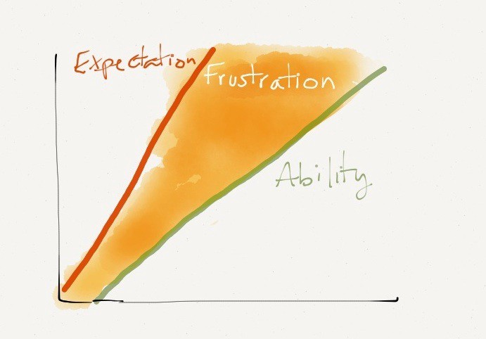
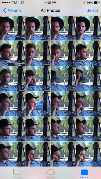
Anyone passionate about photography is familiar with the feeling: You go on a trip, you take heaps of photos every day, then at some point you go through them, either piecemeal or all at once, and you try to identify which you want to edit and what you want them to look like, then you get to work.
What I quickly realized when I was going through that routine two years ago, was how repetitive the process was. I knew I wanted to use VSCO’s M5 filter. It was by far my favorite because of what it did to yellows/greens/blues, but it had some quirks I didn’t care for. It was too warm, and it crushed my highlights.
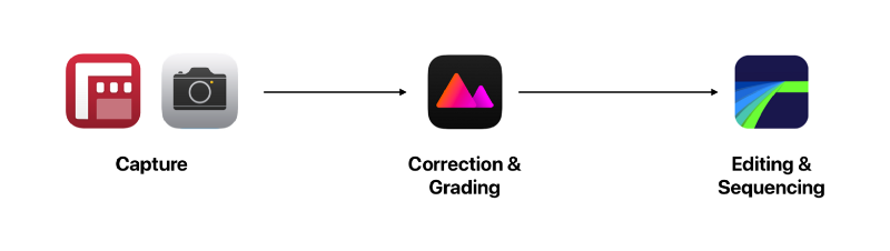
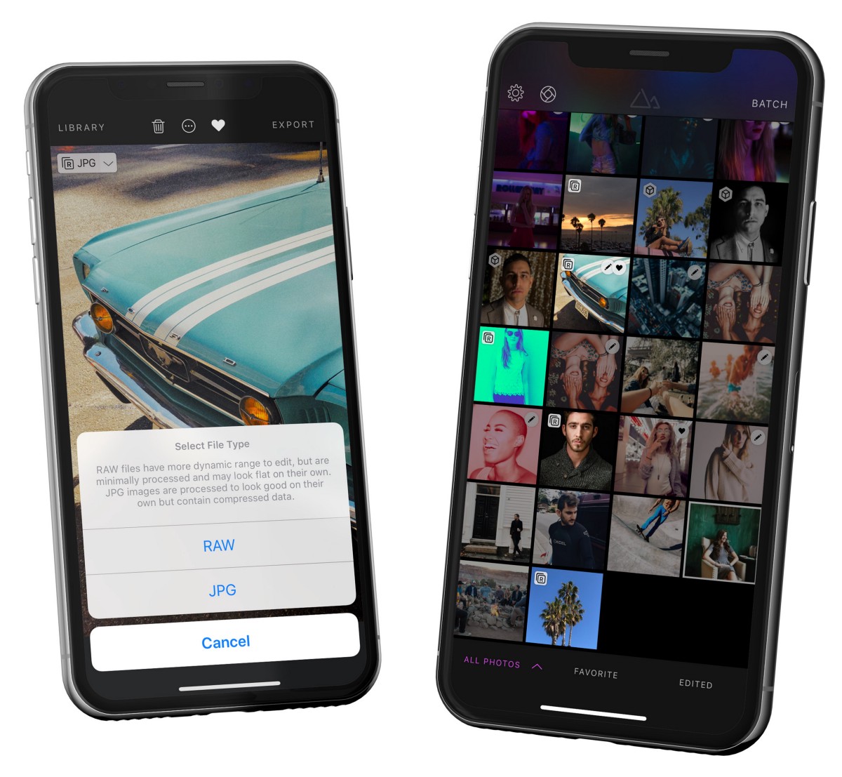
Putting aside the amount of work involved in identifying which of the photos I wanted to edit in the first place and how much work it took to import them, anyone familiar with VSCO understands the pain of how much work it is to edit multiple photos. I knew there was no technical reason why such a constraint and ineffeciency was necessary. Further, I knew that VSCO’s filters (And all the other filter apps, for that matter), simply operated on the premise of LUTs (Look-Up Tables). Before we continue, I think an understanding of what a LUT is and how filters work will really help demystify them.
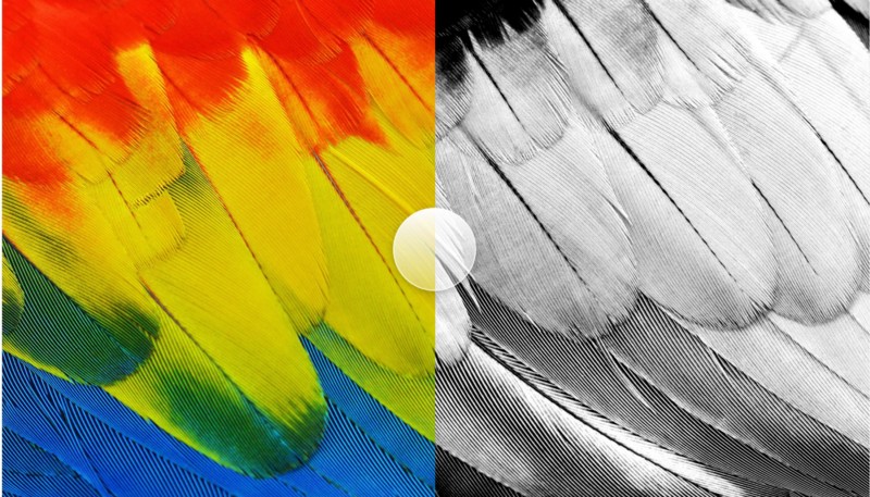
Without getting into too many details (Look up the terms for a deeper understanding, no pun intended), the basic premise behind how LUTs work is that a simple image is generated, covering every possible color in the RGB color space. For those unfamiliar with the RGB colorspace, a quick two sentence explanation goes something like this: Color Spaces can be represented as 3-dimensional shapes that contain all colors. RGB is represented as a cube, with each side ranging in value from 0 to 1.
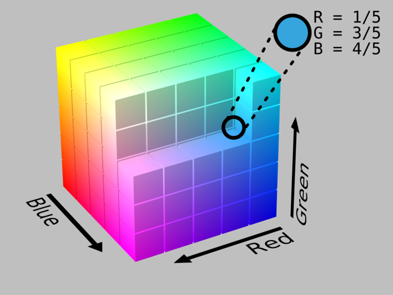
What a Look-Up Table does is it slices that RGB cube into thin slices, and arranges them into a flat image. The flat image is your table in which you “Look up” colors based on their location in the image (How a color relates to a location in the image depends on how you sliced the cube and how you arranged the slices).
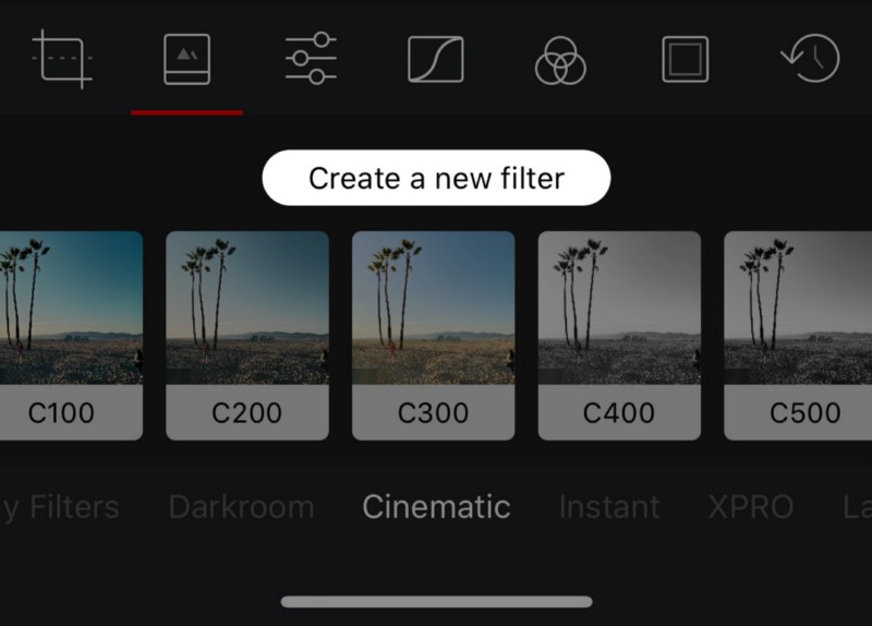
So, now that you know what a color space is, and you know what a look-up table looks like, we can get back to filters.
I’m not sure what they’re technically called, but for the sake of this article, let’s call them filter artists.
What a filter artist does traditionally, is that they open a sample photo, and then they manually edit it to accomplish a look they’re happy with. They might have a bank of images that contain multiple colors and multiple tones, so they tune the edits to each subject matter, but they’re using Photoshop tools to manipulate the image.
Once they’re happy with how their edits are affecting their bank of images, they save those edits, and they apply them to the unedited LUT, which looks a lot like the sample I showed you.
That edited LUT is suddenly valuable. It encodes all the edits of the filter artist, and it defines the filter. Remember how the RGB cube represents all the colors possible in RGB? Well, because the LUT is generated from the cube, the LUT also contains every color. Now, this is where it gets tricky.
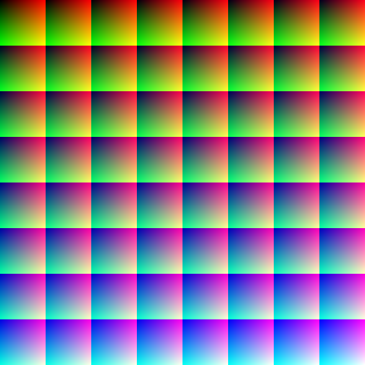
The brilliance of the LUT image above isn’t that it contains every single color. The brilliance of the LUT is that it contains two sets of information. This nugget of information is crucial to understand. The LUT image obviously contains the colors in the pixels of the image. The second set of information a LUT image contains is how the location of the pixels in the image relate to colors as well.
Here’s an example: The top-left pixel in the LUT I shared earlier is at location (0,0). That pixel, is black. Those are the two important pieces of information. We know for a fact, that whatever pixel is at location (0,0), it was black in the unmodified LUT. If that LUT is passed through Photoshop and the shadows of a photo were brightened, then that black pixel is no longer perfectly black, it’s a little gray. There’s your two pieces of information! The knowledge that location (0,0) should be black, means the actual color at that pixel can be different. That before/after is your mapping of the filter.
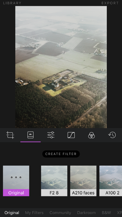
When an app like VSCO ships, it ships with a set of LUTs that have been passed through a series of editing steps that make up the individual filters. When you apply one of those filters onto one of your photos, the app goes through your photo pixel by pixel and look up the color of that pixel. If that color is black, it knows to look at the LUT at location (0,0) because that’s where the original black color in the LUT should be, and it reads what color is that location in the LUT. The app then replaces the original color of the image with the one in the LUT. Ta-da! You just applied the M5 filter to your photo.
Congratulations, you now know how to build a photo editing application. The simplicity of this approach is why there are so many photo editing applications on iOS, and why some of them have so many filters. Each app can be slightly different from the others by adding a feature here or there, or by hiring really good filter artists, but they’re all fundamentally the same:
Import > Open > Apply Filter > Save
From an app developer’s perspective, this is great: Modify a LUT, send the image down to people’s devices, and they have a new filter! Charge them a few dollars for it, pop some champagne. From a photographer’s perspective however, this is less than ideal. What happens if, like my example with M5 in the intro, the filter does not match my expectations or style? You’re out of luck. You and twenty million other people are all sharing the same LUTs, and all your photos look the same. If you want to use their auxiliary tools to fix the shortcomings of the filter, then you just introduced tons of repetitive work to your editing process.
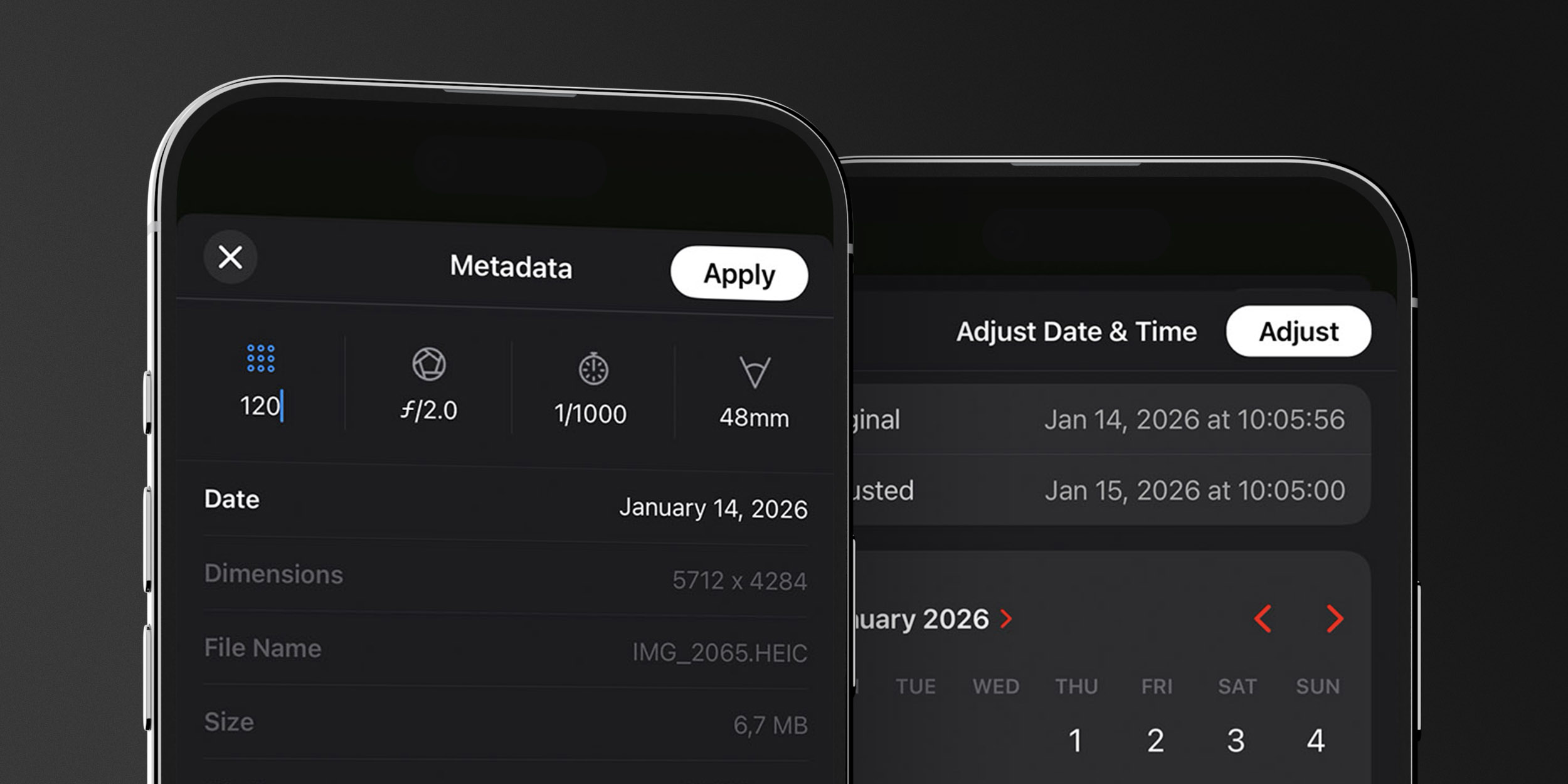
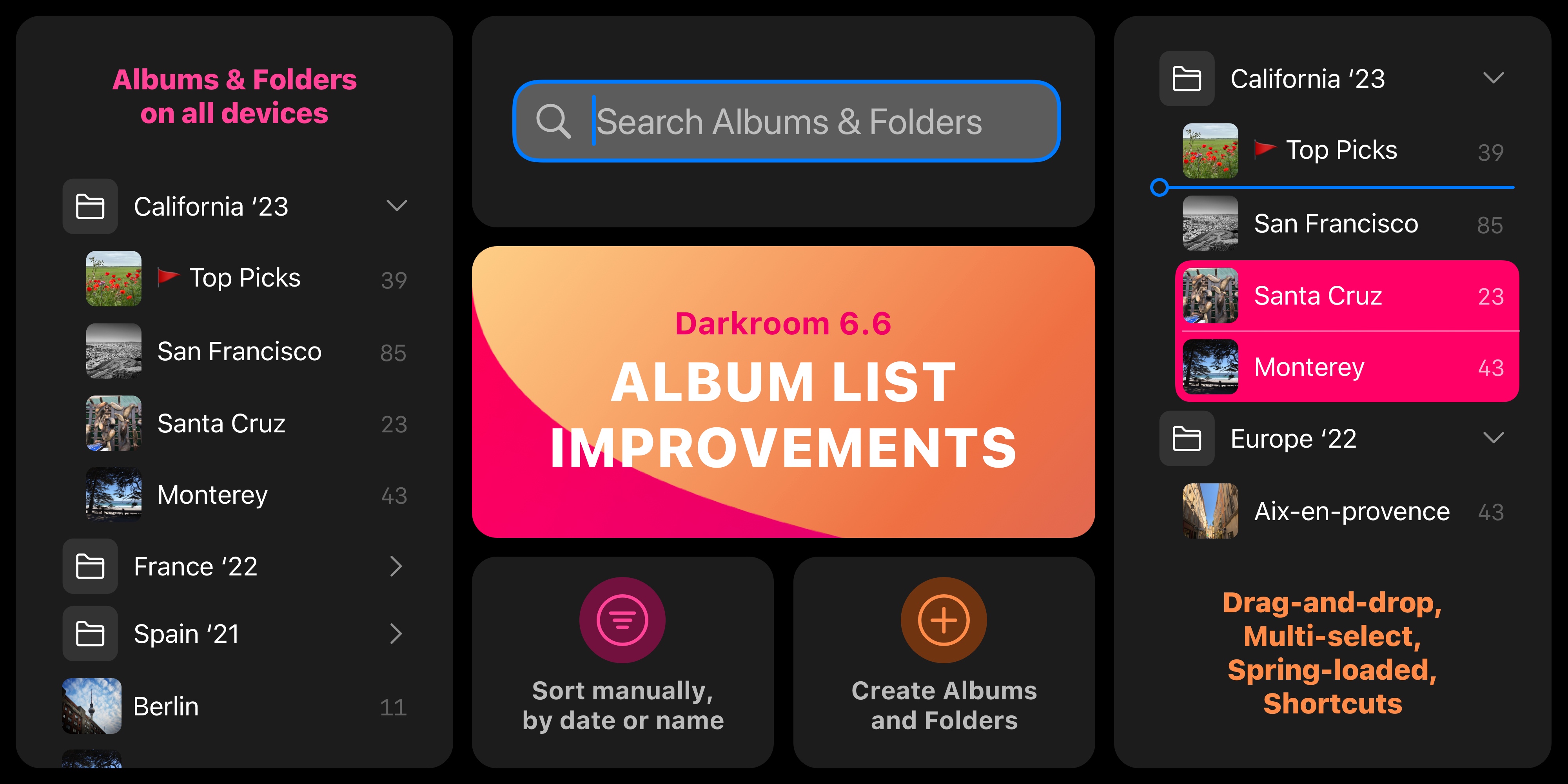
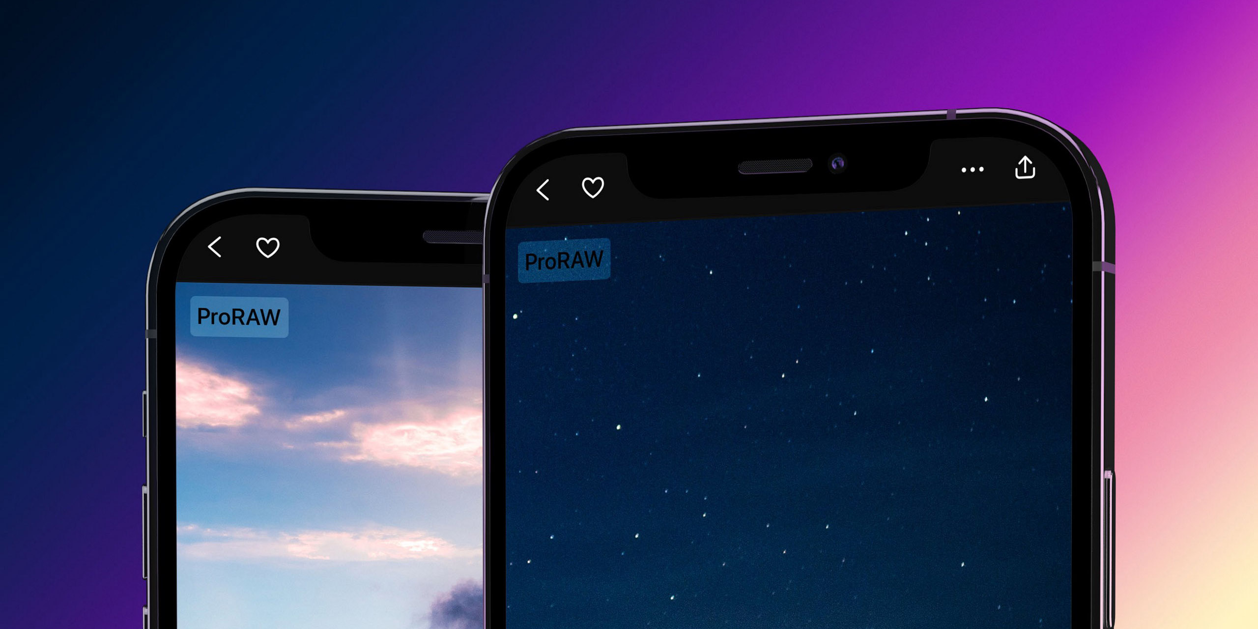
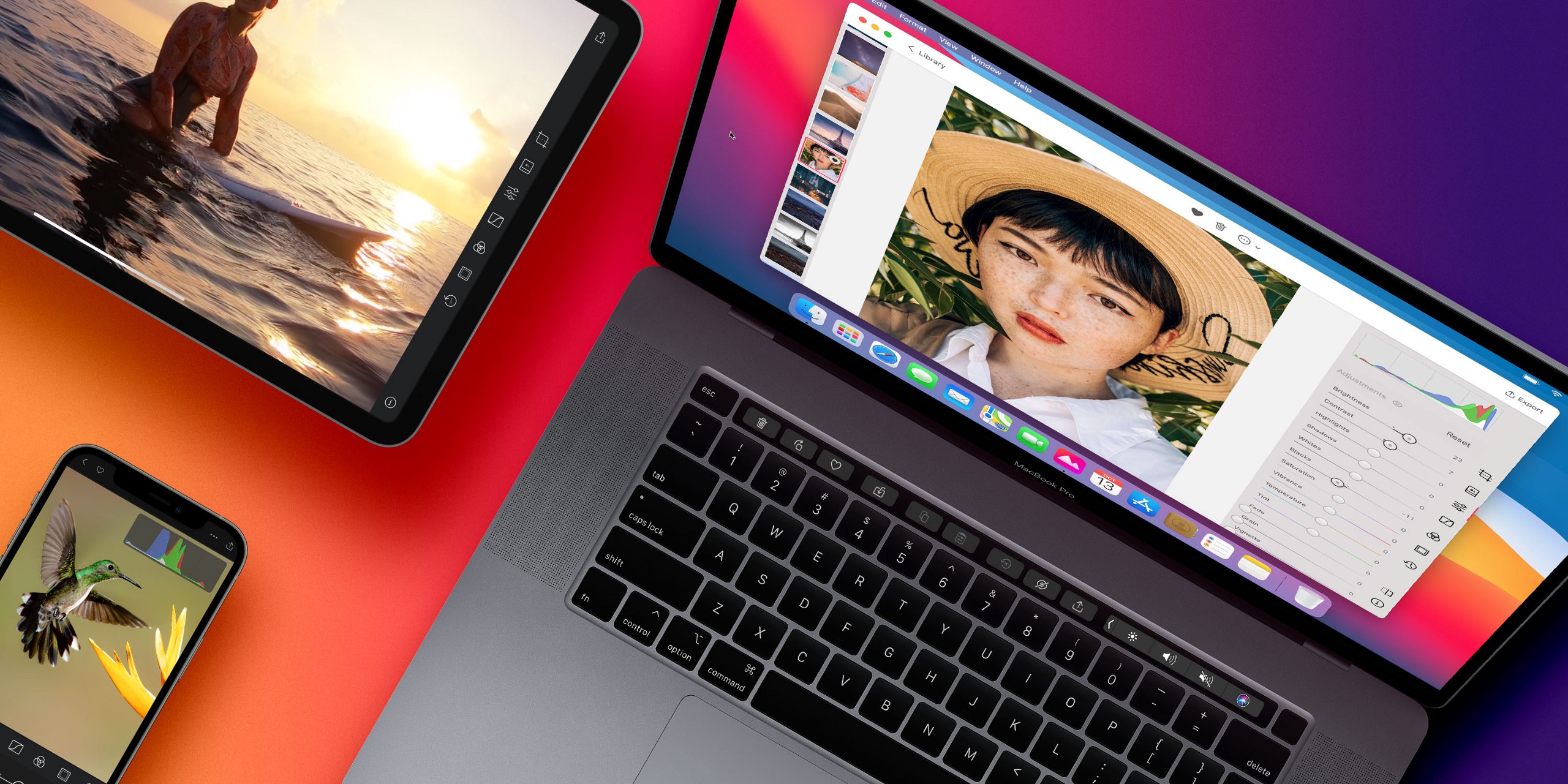
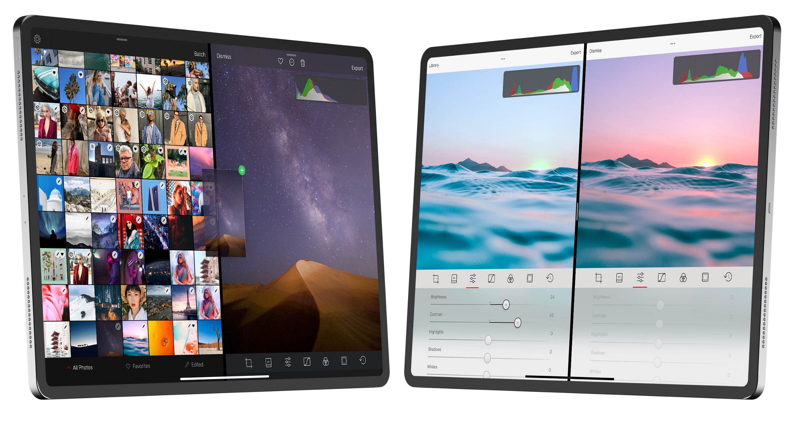
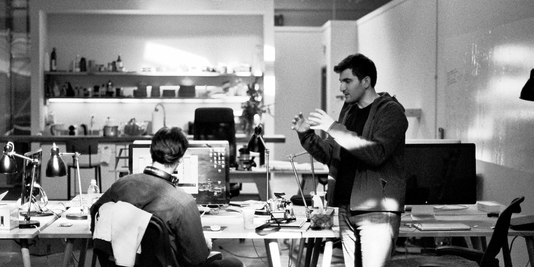
Obviously, I’m the creator of Darkroom, a photo editing app. This is where I zoom out from the technical details of how filters work, and explain to you why Darkroom is different.
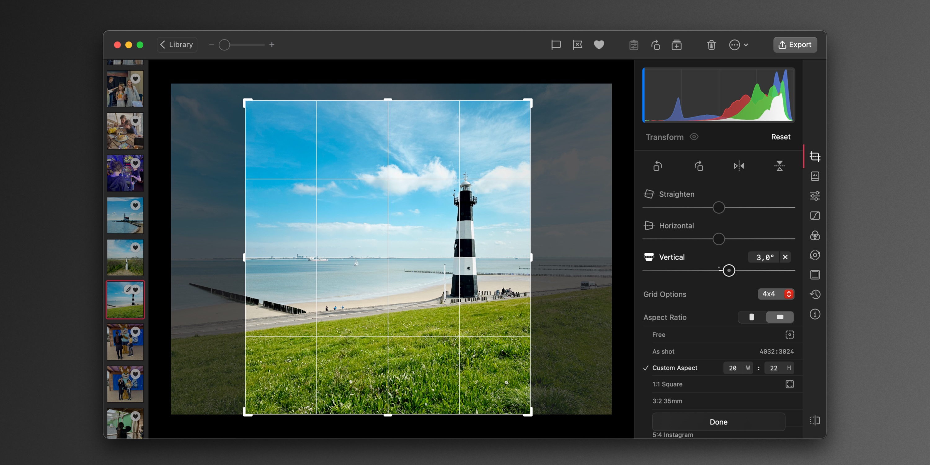
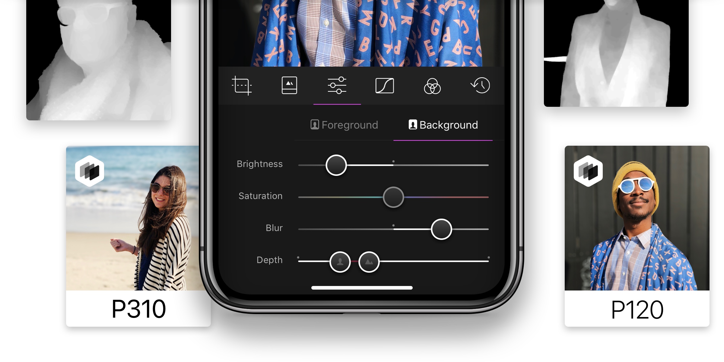
The big innovation with Darkroom was to take the same tools that the filter artists use to generate the LUTs, and to port them to your phone. In Darkroom, filters are instructions for generating the color mapping on the fly.
Here’s where this comes into play: Suppose I apply Darkroom’s A100
filter on my photo, but the rich green tones in the shadows aren’t working for me. In Darkroom, I can apply the filter, then use the Curves tool to alter the filter itself. If I see myself doing the same thing repeatedly, I can save those new instructions as my very own filter. Because Darkroom skips the import flow of all the other apps, my editing flow is thus reduced to:
Open > Apply Filter > Save
Except, the Filter I’m applying is my own, containing all my custom edits.
Now that the fundamental concepts of how LUTs, colorspaces, traditional filters, and Darkroom filters all work is out of the way, let’s get back to the original point.
Technically speaking, you can pass a blank LUT through any filter on any app and end up with the same LUT the app uses internally. That doesn’t really mean anything, and it isn’t really very useful. To recreate a VSCO filter in Darkroom, we’re going to need to approximate the instructions used to generate the LUT in the first place. Put another way, we have a meal, and we’re trying to guess the recipe.
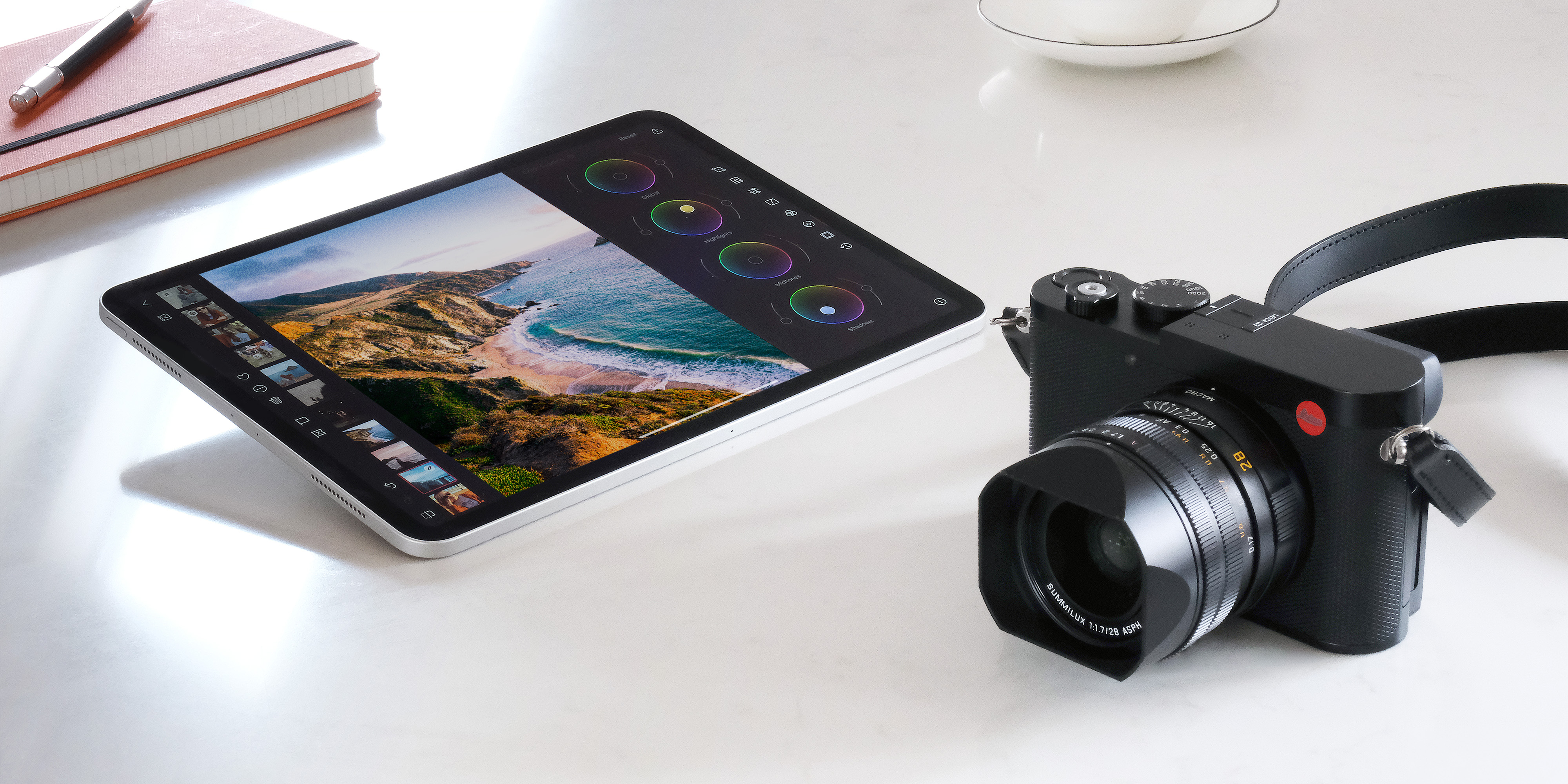
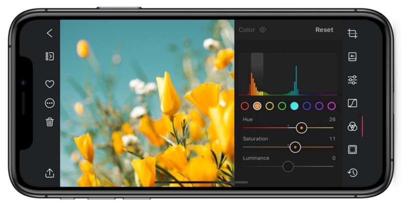
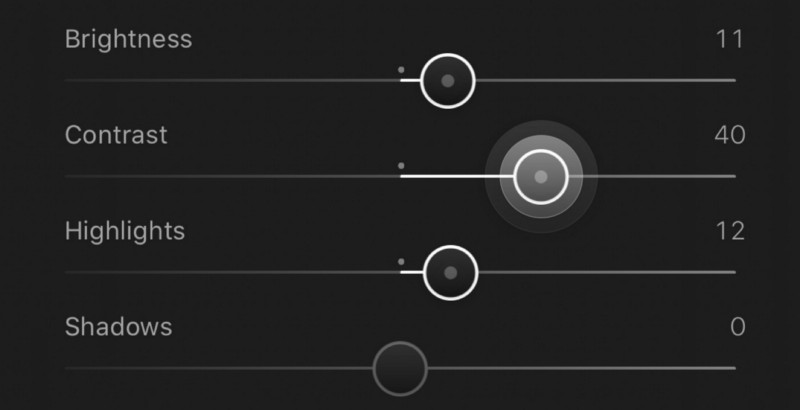
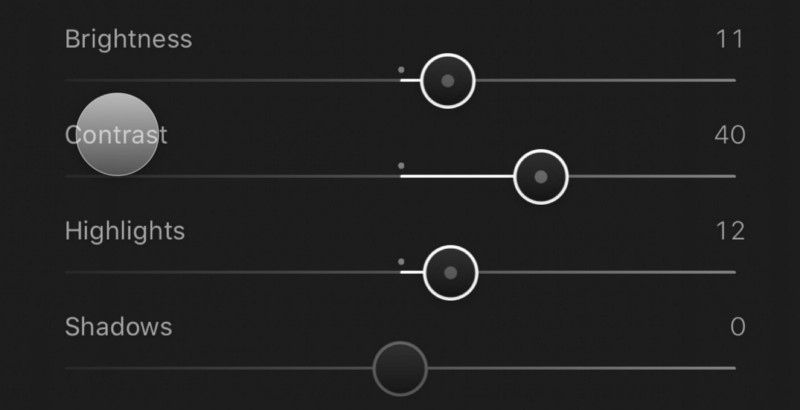
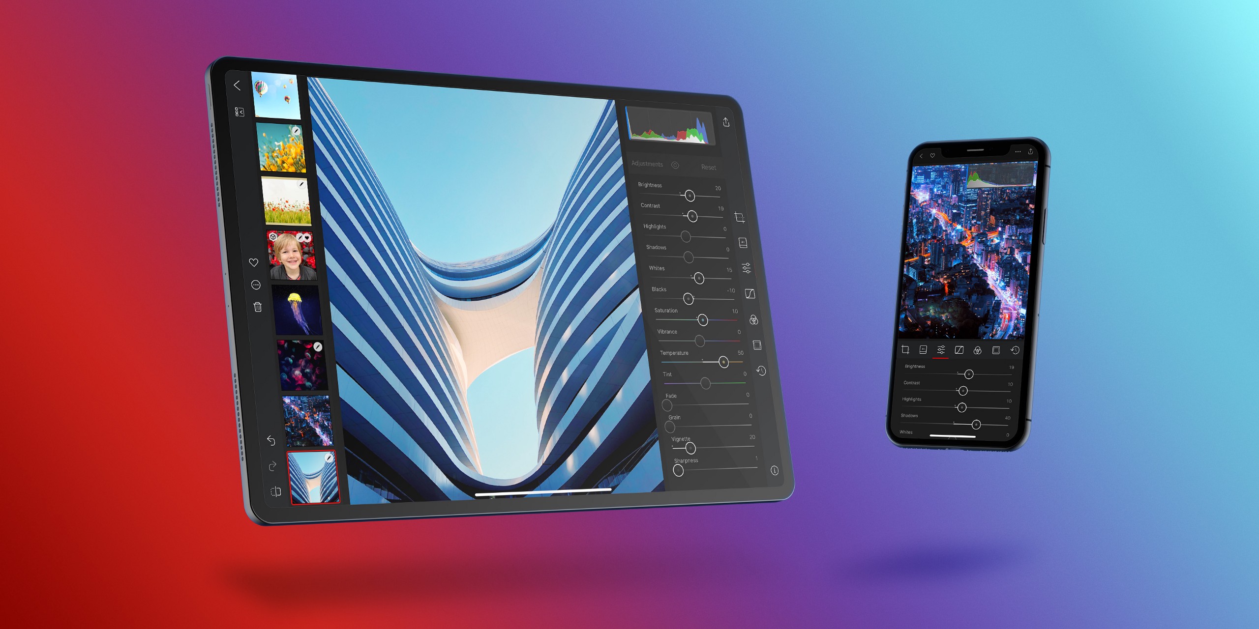
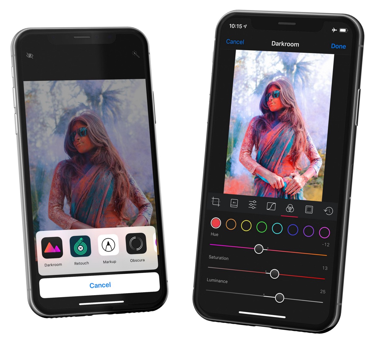
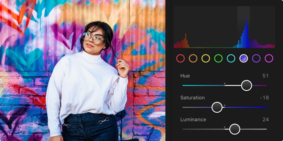
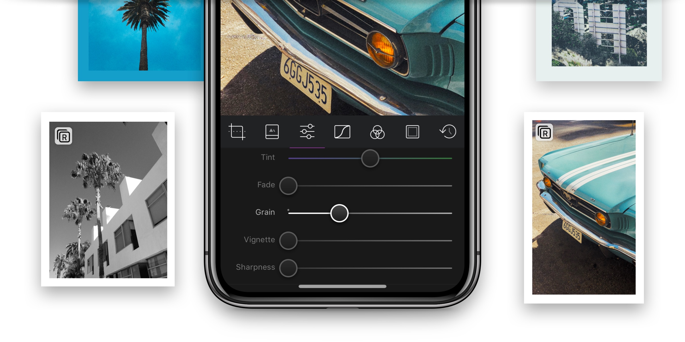
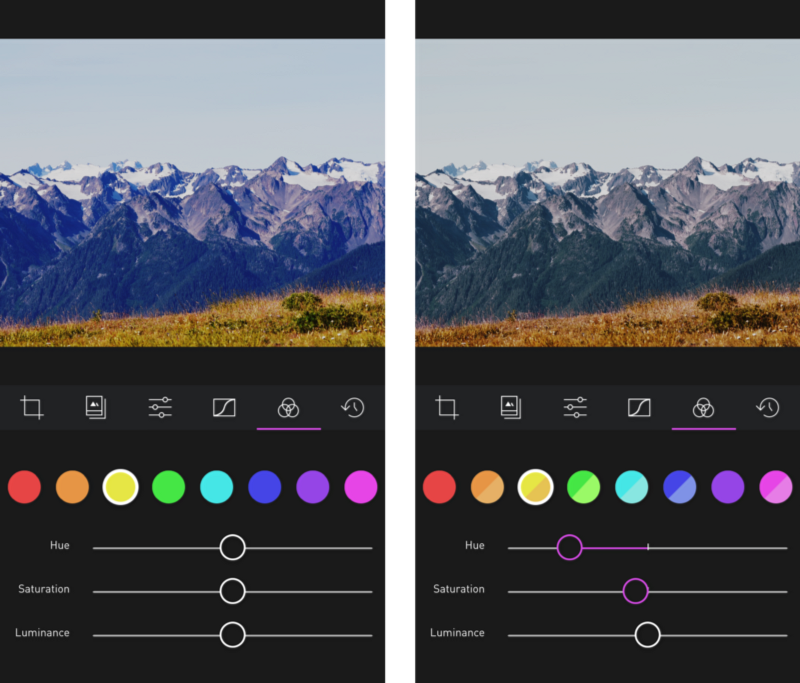
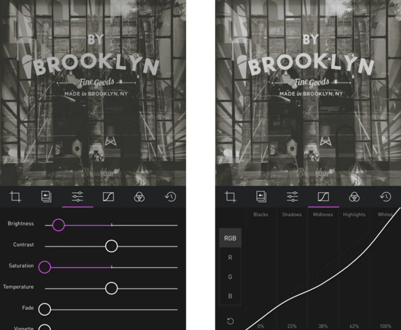
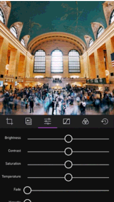
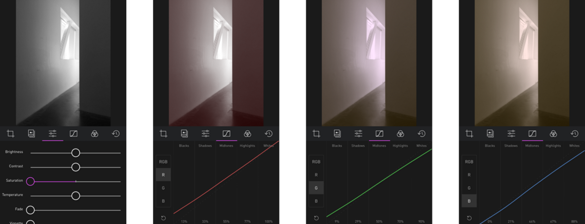
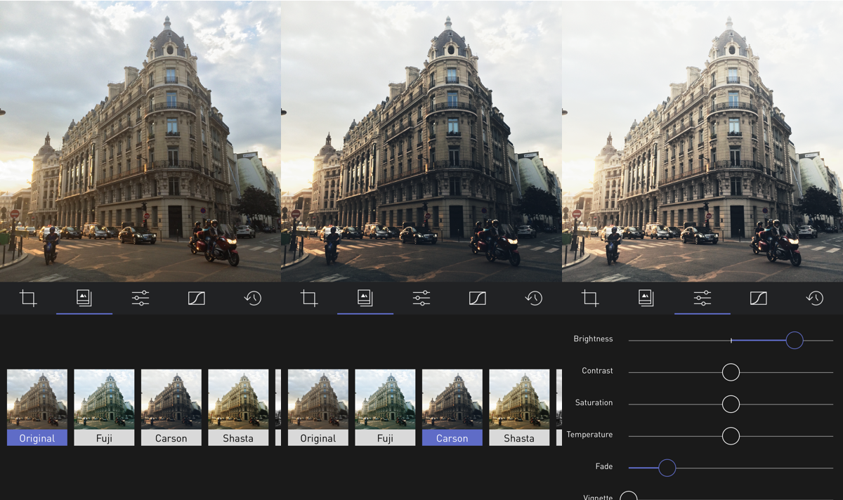
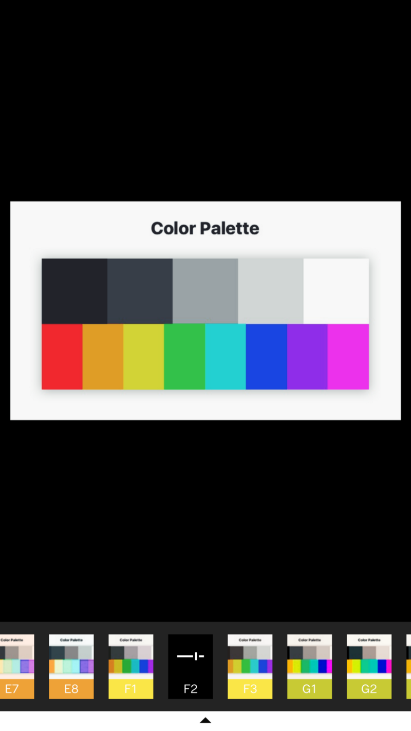
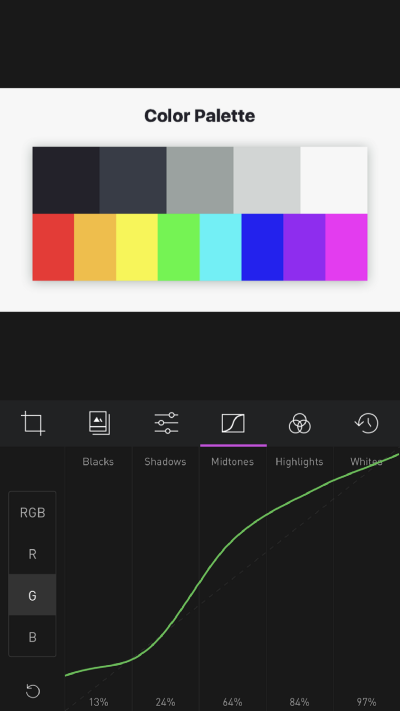
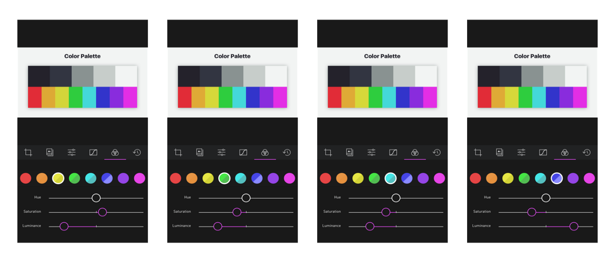
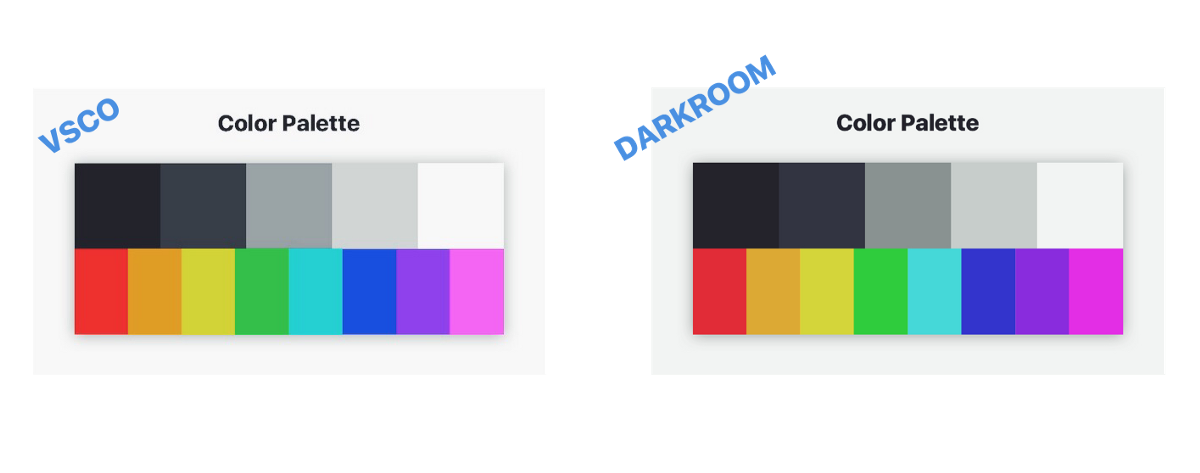
To do this, we’re going to need to be familiar with the Curves tool, and the Color tool in Darkroom. The former modifies the tones, the latter modifies the colors. Since these are the primary tools used for creating filters in Photoshop and Lightroom, we will generate a specific color palette which we will use to isolate changes to those two tools.
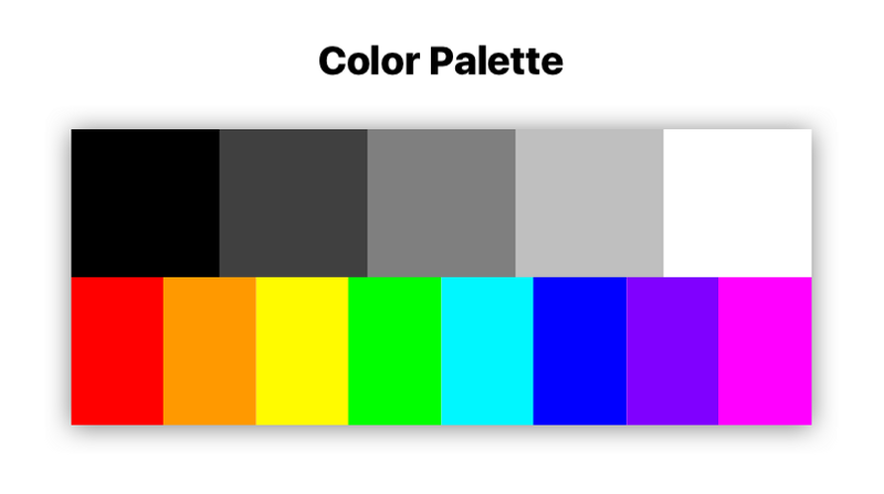
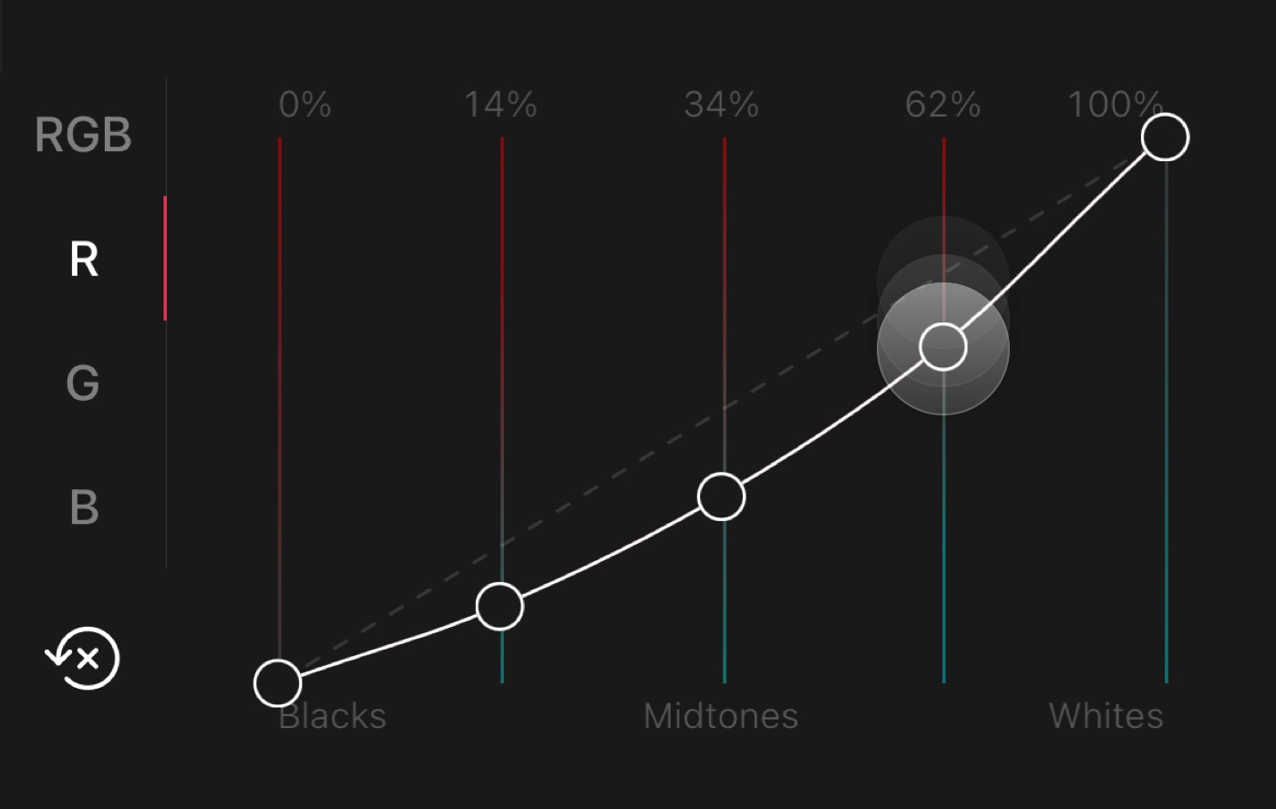
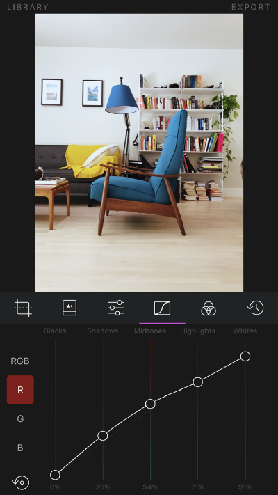
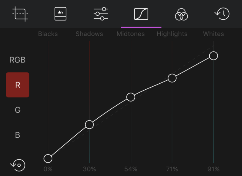
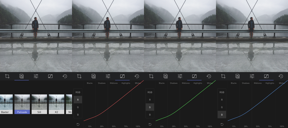
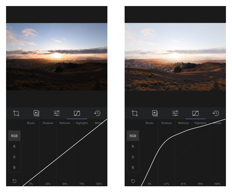
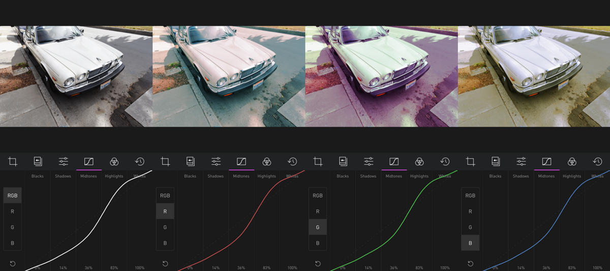
In Darkroom, the Curves tool is divided into five regions (Blacks, Shadows, Midtones, Highlights, and Whites). That’s why the first row in the palette is divided as it is. They’re desaturated, because we want to isolate the impact of tonal adjustments from color adjustments.
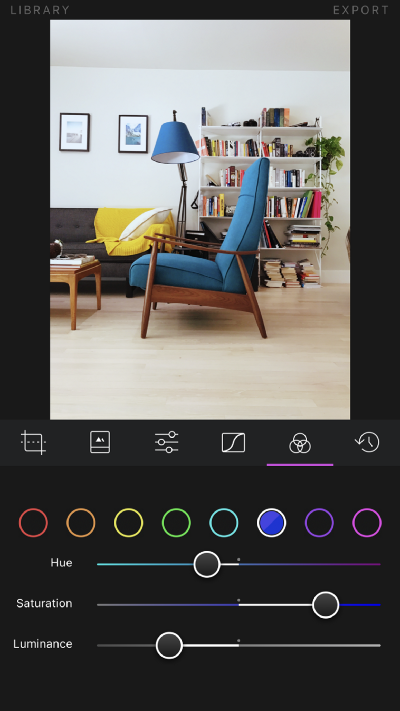
The Color tool however is divided into eight color channels, represented here in the second row.
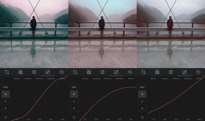
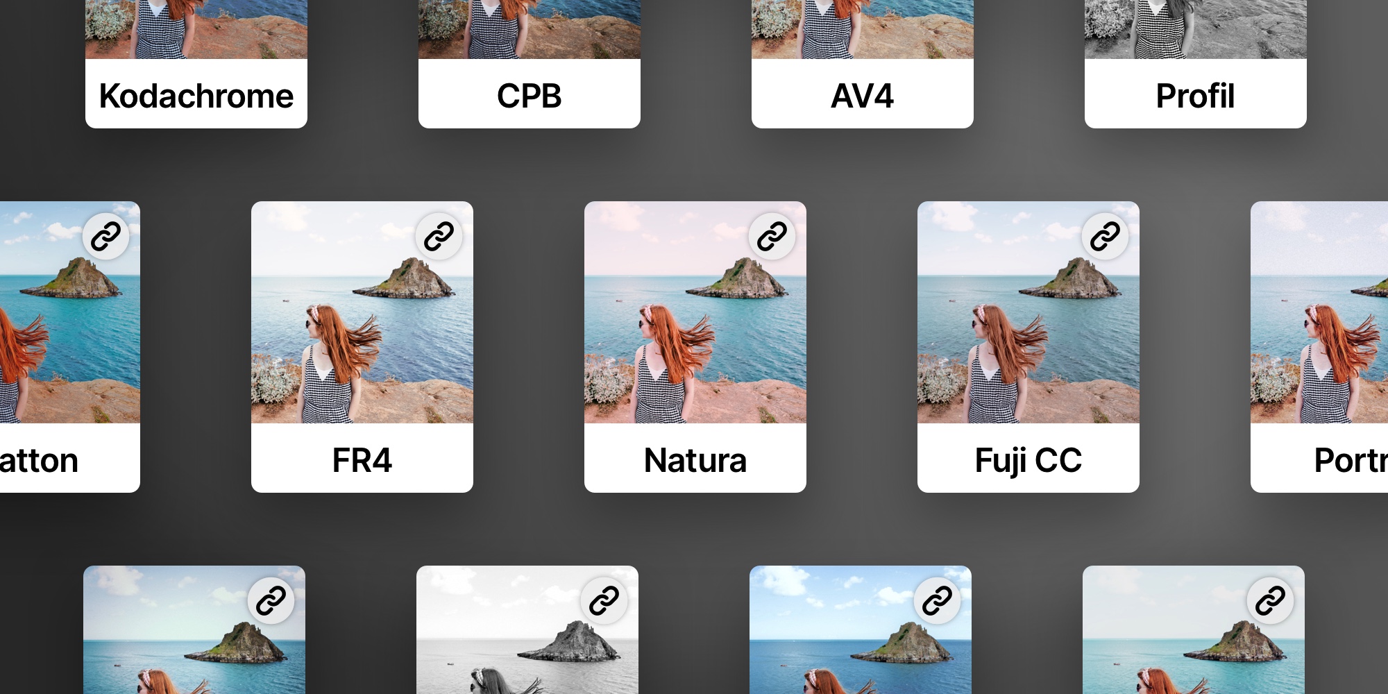
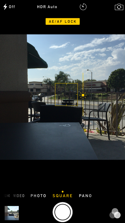
Simply download that palette to your phone, import it to VSCO, and pass it through your favorite filter. In this case, we’ll be recreating F2.
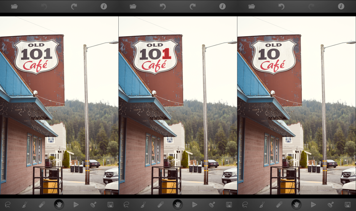
Next, move the edited image back to your computer using AirDrop. We’re going to need to read the values of those pixels. There are lots of tools available for doing just that, my favorite is xScope.
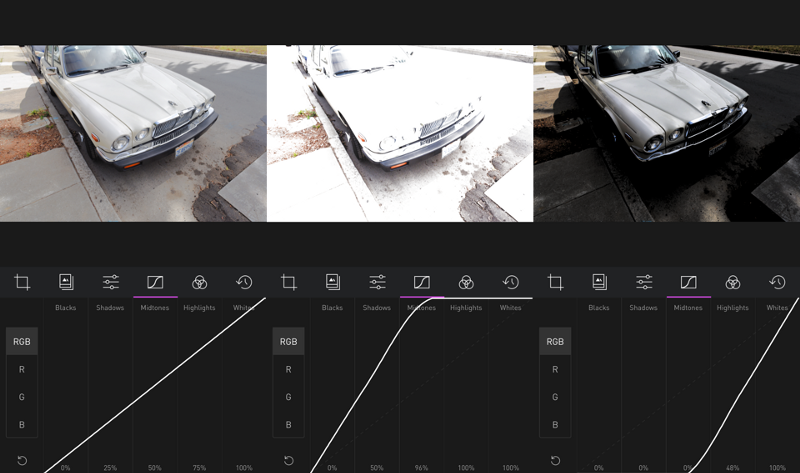
Open the edited image, and read the values of the gray boxes in order. Here’s what it looks like to use xScope on the Black square, and how the value appear:
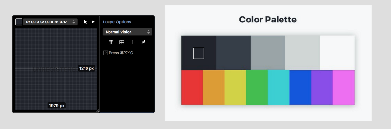
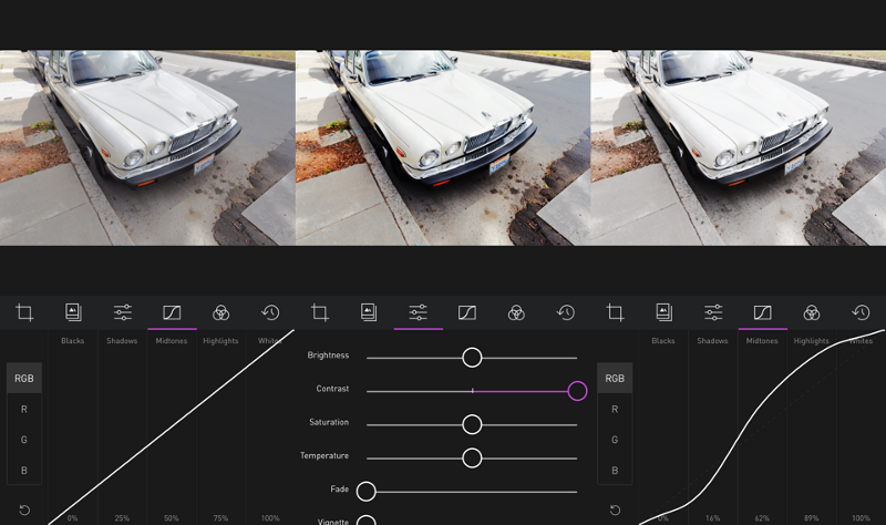
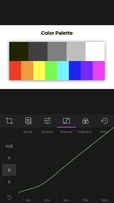
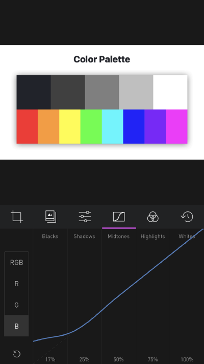
You can see on the left, the values of R:0.13 G:0.14 B:0.17
Those numbers reflect the impact of the filter on black colors, absent any color-specific adjustments. Switch to Darkroom and go to the Curves tool, apply those numbers to the Red, Green, and Blue curves respectively:
You can see how by the time I added the Blue curve adjustment, the black square already matched the VSCO-edited palette.
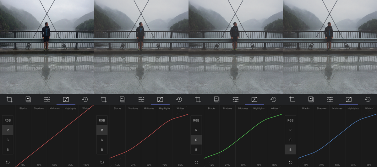
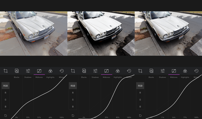
Now, repeat the process for the four other tone regions:
Et Voila! We’ve already gotten pretty far!
This is the end of the robotic part of the process. Now we’re on to the subjective and more intuitive part of the process.
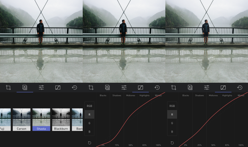
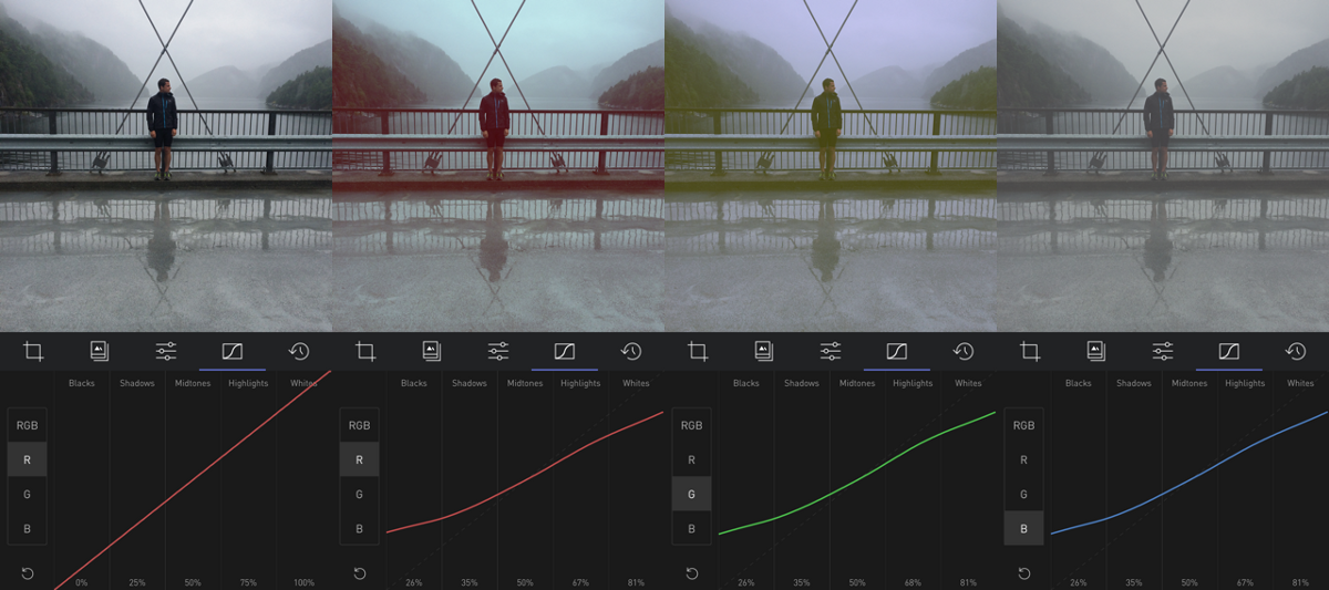
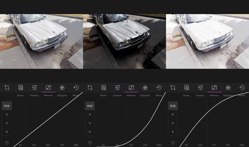
After matching the Red, Green, and Blue curves in Darkroom, export the palette onto your computer. Name the two images (VSCO F2 and Darkroom F2) so you can differentiate them. Open both in a photo viewing app (I’m using Sketch.app, and compare:
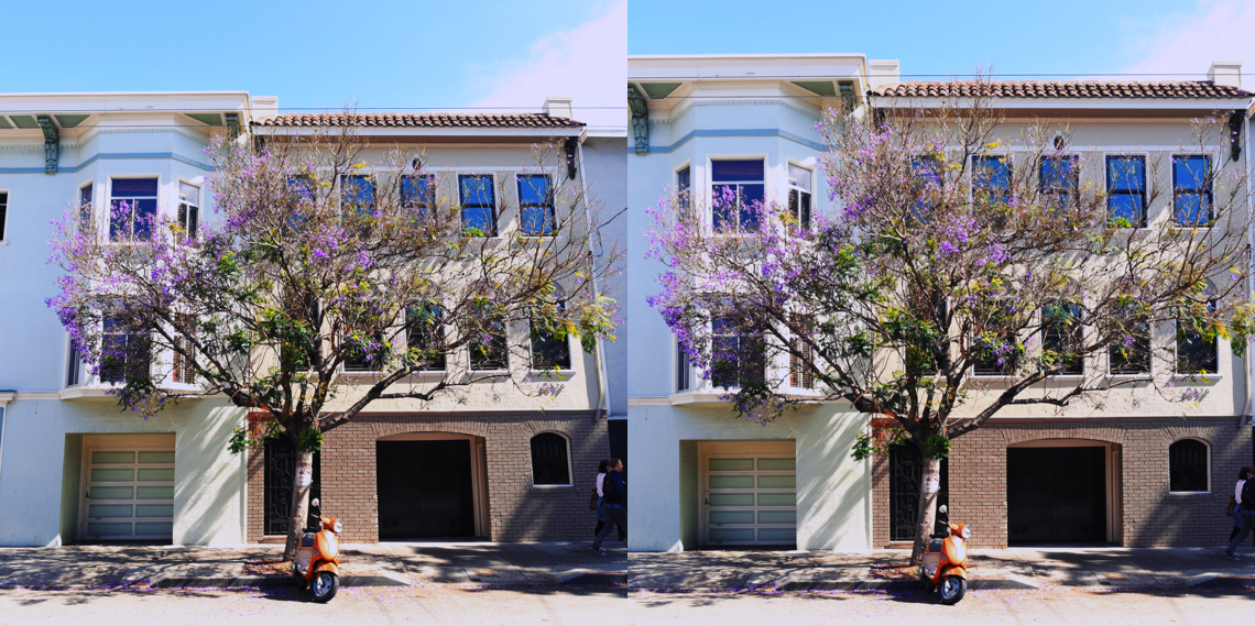
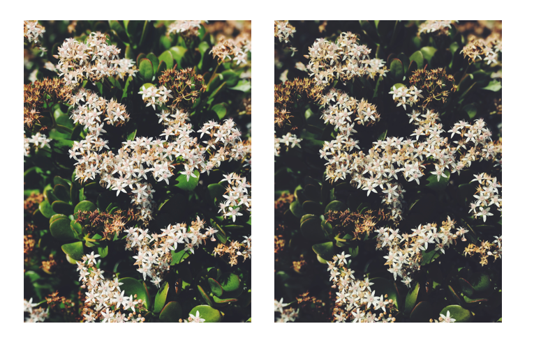
You can see the top bar matches closely, but the colors at the bottom are off. The colors in the VSCO filter appear less saturated across the board, and they appear darker across the board as well. This is where we start experimenting. Since we have no way of knowing what the recipe is, we have to keep guessing until we get close enough.
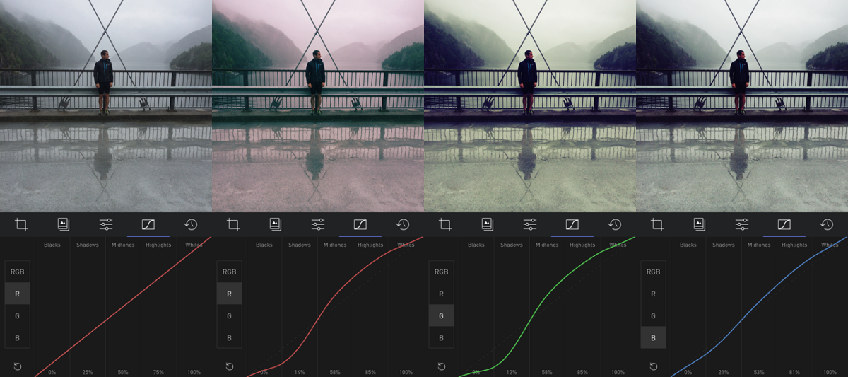
It’s important to remember when you’re doing this activity that your goal isn’t to recreate the VSCO filter exactly. You want to emulate the VSCO filter’s character. It doesn’t have to match. Looking at the palette, the difference is huge, and that’s good, because we’re using it as a tool, yet even without adjusting for the colors, the curves get us most of the way through to the final character of the F2 filter:
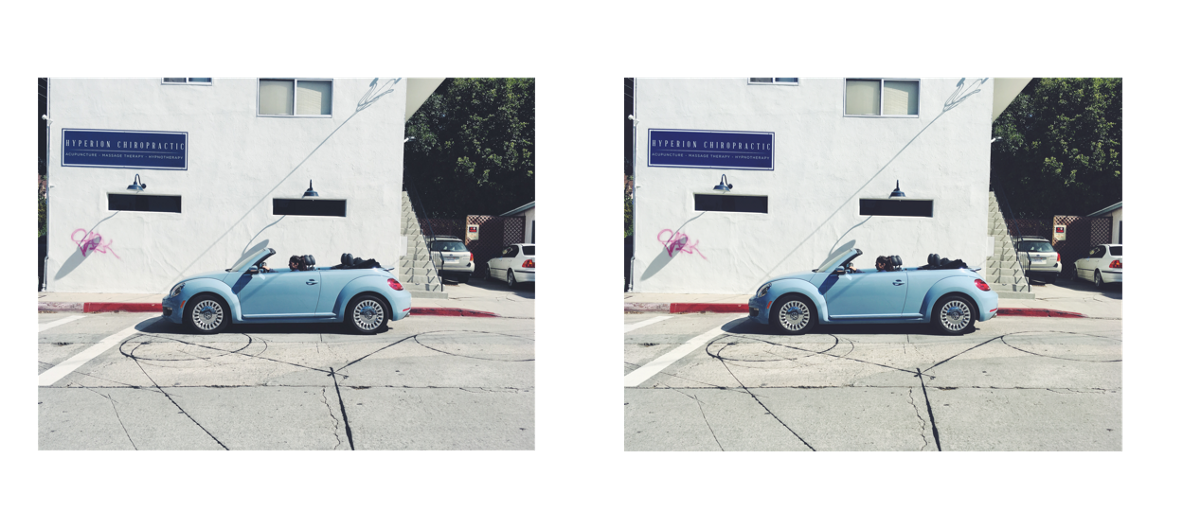
There are some differences, notably the saturation of the shadow that the side mirror is casting on the door, but it’s the same in character.
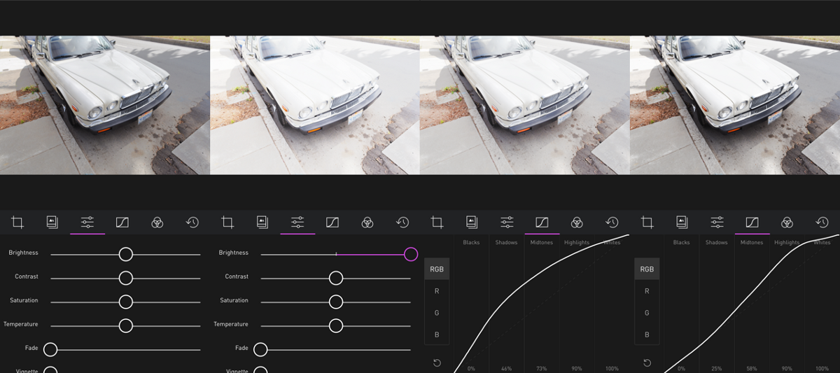
With a little bit more work, we can get much closer though. Since saturation appears to be low across the board, let’s knock it down in Darkroom’s Basic Adjustments tool (The default one with all the sliders). We don’t know how much to adjust it, so it could take a couple of back-and-forths of AirDrop’ing the updated palette and comparing again.
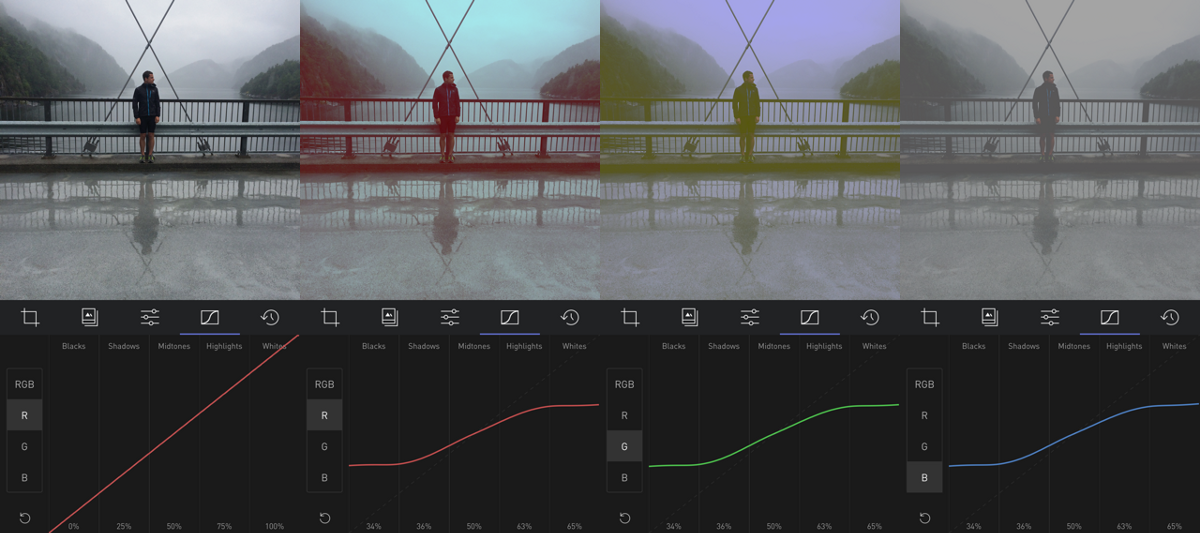
Now, we can see that the Red, Purple, and Pink colors are fairly close, but the Yellow and Green colors are noticeably darker in VSCO, and the blue appears even more desaturated.
To fix the color-specific channels, go to the Color tool, and adjust the Saturation and Luminance of the ones with differences. Again, it might take a few iterations to get it right, but take your time, you’ll see progress quickly!
Here are the changes I ended up making to match:
And here’s how they stand next to the original VSCO Palette:
Quite close! Not bad for a few minutes of work. But, there’s one crucial step left!
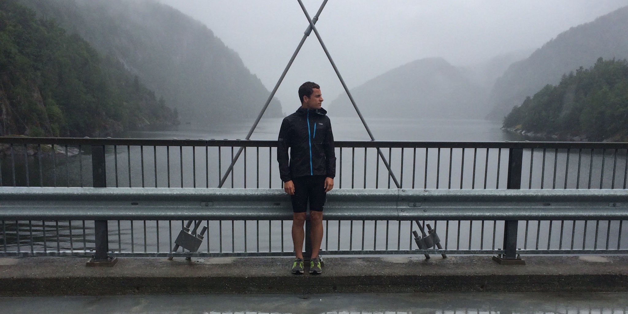
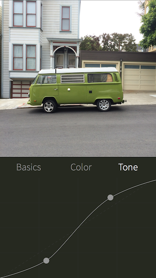
When I was making the edits, I was uncomfortable by how hard I had to push the luminance on the yellow and green channels to match the VSCO palette. I wanted my first test to be with a green-heavy photo:
Just as I had suspected, the greens and yellows are far too dark.
The thing to remember, is that Darkroom is a tool. Toolmakers, by their very nature, have to make decisions along the process of building tools that impact the behavior of the tools. For some things, standard mathematical definitions exist to define a tool. Those tools behave identically everywhere. Most of the time however, the tools behave subjectively. For example, a developer building a Saturation tool needs to define how colors get desaturation. We have an intuitive understanding of how it works, but at the end of the day, what does a desaturated yellow look like, and how does it look different from a desaturation red?
That’s where the conversation of character of a filter comes back. We want to match the filter by feel, not by technicality.
I upped the luminance of the green and yellow, et voila!
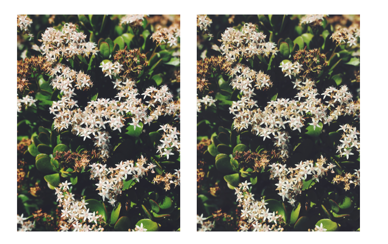
It’s still not exact, to be clear, but it doesn’t have to be, not should it be. This is a base, a foundation, on which you build, iterate, make your own. You have learned how to fish, now go catch a big one and feed your whole photography family!
I’ve uploaded the filter created in this tutorial to our server so you can download it and play with it. I named the filter “Charlie” after the Twitter user who turned me onto this rant in the first place. If you have the Darkroom app installed on your phone, tap the link below and it’ll open the app and install the filter.
darkroom:///install_filter?id=547
p.s. One last tip when doing something like this: I suggest creating filters every time you export a photo with changes from Darkroom, and matching the file name to the name of the filter. I number my attempts like commits in a git code repository. It took 9 attempts to match this filter. Enjoy the process!
The Darkroom Team
]]>Following through on our promise last month to pick up the pace of updates, we’re excited to share with you the biggest update since Darkroom 2 was launched. Darkroom 2.7 is here, and with it a bunch of new UI updates, and a brand new, marquee feature: Filter Backup & Restore.
People repeatedly tell us in feedback how attached they become to their custom filters in Darkroom. Those filters, used time and again, have become an essential part of our customers’ online brands, and expression of their personality, and a core part of their photograhy life. That’s why we’re so excited to finally address one of the most requested features by our users with the launch of Filter Backup & Restore.
Like everything else in Darkroom, the beauty is in the simplicity of the feature. All you need to use the feature is an active iCloud account, and you’re all set up to use it! Simple go to Settings, then tap Backup Filters. Ta da! That’s all you need to do!
In the background, Darkroom uploads your user filters to Apple’s secure iCloud servers where only you have access to your private files.
Here’s the magic trick: Because you can log in to the same iCloud account on multiple devices, it means you can restore your backups on all your devices! Think of it as a manual syncing of your user-filters!
We’ve completely redesigned the Share experience, and we’ve renamed it to “Export”. Along the way, we’ve dropped sharing to explicit third party apps, and we’ve dropped the “Save as Square Photo” feature.
When we launched Darkroom 2, Instagram still had a square limitation. That meant anyone who wanted to own their composition was forced to use any number of apps and intermediate steps to add a white border to make a square photo contain a non-square photo with a white border. In our effort to streamline the mobile photographer’s workflow, we integrated that feature right into Darkroom, and we made it as easy as a single button.
Since then however, a couple of things have changed. Obviously, Instagram now allows you to share non-square photos, but also, sharing directly to third party apps has stopped being supported as well, meaning the custom metadata we were able to share was no longer allowed. Finally, our data indicated that the vast majority of users simply never used those features. So, as per our iterative product philosophy, we’re taking time to trim features and improve the performance of the app, rather than throw the kitchen sink at the problem.
We’re really proud of the community we’ve built around Darkroom and we love hearing from you about how you use Darkroom and what you’d love to see in it. Please don’t hestitate to share your thoughts with us at feedback@bergen.co
The Darkroom Team
]]>Let’s get to the fun stuff first: To celebrate Darkroom’s 2 year anniversary, we’re announcing a 30% sale across the board for 1 week only. Open up the app, go buy all those filter packs and tools you’ve been putting off at a discount. Hurry!
We’re also sharing a new house-keeping update: Darkroom 2.6. It won’t impact your Darkroom experience much, but it addresses a bunch of issues some of our users have been dealing with and reporting. Here’s the low-down:
On this day two years ago, Matt Brown and I got into work early and launched Darkroom after 8 months of hard work. We watched as country after country around the world lit up with little red dots marking the app being featured by Apple in the iTunes Store internationally, and validating our decision to localize the app in 11 languages.
The premise behind the app was two fold:
Editing workflows are inefficient, and creative tools are limiting
Two year ago, Snapseed, VSCO, and Afterlight were the dominant players. In large part, they defined the space, and set its standards. But as iOS and the camera evolved, the needs and the scale of mobile photography exploded, and the tools remained stagnant. Darkroom was born out of our frustration with the status quo, and our vision for what mobile photography is capable of. Darkroom’s success has validated that our premise was true back then, and it continues to be true today.
That premise upon which we built Darkroom manifested itself in two ways: No-import editing, and Custom Filters. Apple recognized our innovation a month after our launch, when they named Darkroom the Best App of February.
Press coverage was unanimously positive:
Darkroom For iOS is The Photo App You Always Wanted
_Darkroom, a new photo app for iOS which was released today, hopes to bring some pro-level tools to the iPhone and…_thenextweb.com
Darkroom: A New iOS Photo Editor with DIY Filters, Curves, and Infinite History
_Darkroom is a new photo editor for iPhones that just launched today. The app offers a number of powerful features for…_petapixel.com
Best New Apps: Darkroom
_A number of us here at The Verge are big fans of VSCO cam, myself included. But I'm never completely satisfied with the…_www.theverge.com
Six months after our initial launch, after the dust settled, we got back to work on Darkroom 2. Truth be told, Darkroom 2 is what we wanted to launch originally, but we made the decision to space it out, validate our core propositions and assumptions before investing more deeply into the long-tail of features.
That’s why only six months after the release of the first Darkroom, we announced Darkroom 2, featuring a whopping 14 new features. With its launch, we finally hit our initial goal: To give mobile photographers the same tools that filter editors use to create filters. They can become masters of their own style.
In December, when they named Darkroom a Best New App of 2015 and featured it in their global Make Something New ad campaign.
In a final show of support, Darkroom was installed on all iPhone across the world in Apple stores as a demo app.
Whereas Darkroom’s first year was defined by activity, releases, tutorials, and awards, Darkroom’s second year has been defined by inaction and silence.
Darkroom at various points was either a two-man operation, or a one-man operation with advisors after Matt left the company. So, while Darkroom was going through all this activity, across the Atlantic, the migrant crisis was unfolding.
As a Syrian-American, I took it upon myself to document the ciris that was affecting my family and many of the people I grew up with. I enlisted the skills of my friend Sara Kerens and we both spent 10 weeks to document the crisis in a photo book.
During that time, I took a break from Darkroom. Truth be told, I anticipated the project taking no more than 3 months when I set out on it. Now however, 14 months later, I could not have been more wrong. In those 14 months, work on Darkroom all but ceased. I was consumed with the book and ensuring that we do justice to the project and the subject matter.
Yet despite this lack of activity, Darkroom has been extremely resilient. More than just that in fact, it has thrived. Writers continue writing about it. Photographers continue using it, and new photographers continue to discover how powerful and efficient mobile photo editing is with Darkroom.
The best photo editing app for the iPhone - The Sweet Setup
_For the past month, we've been experimenting with two dozen of the best-rated photo manipulation apps for iOS. It's a…_thesweetsetup.com
The trust that our early adopters have demonstrated in the product and the excitement that our new adopters share with us has kept our spirits high and our commitment strong.
There will be a longer-form article in the future to describe in more detail what the future of Darkroom will look like, but I wanted to use this opportunity to share a high level vision.
We’ve watched time and again mobile photo editing apps launch, find early success, and then ultimately go down one of two paths: The Kitchen-Sink, or The Social Network. The reason is quite simple: Economics. The economics of mobile applications are brutal. Depending on whether or not the developer decided to take on external venture funding, they either have to continuously release new in-app purchases, often resorting to novelty, or pursue hockey-stick user growth at all costs.
It is in our estimation that this ecosystem starves the market of useful, thoughtful, professional-grade tools that address structural problems in the life of professional creatives.
Bergen, the parent company of Darkroom which I started 2.5 years ago, has always operated under the following banner:
Creative Tools for Creative Professionals
So often in today’s climate, creative professionals are left behind as the pursuit of growth gradually opens up the target audience and tries to make something everybody wants. In the end, we have tools that do many things nobody needs.
We do not divide the world into consumers and professionals. We divide the world into professionals and aspiring professionals. We want to enable professionals to do their job well, efficiently, and consistently. Similarly, we want to enable aspiring professionals to elevate themselves by lowering the expectation gap.
This philosophy will continue to manifest itself in Darkroom moving forward, and I can’t wait to share more about this vision with you in time. Meanwhile, expect more regular updates as we pick up the pace again.
Until the next time, happy editing! The Darkroom Team
]]>Friends, It’s been a while since we last talked. Darkroom 2.4 was released in mid-October of last year. A full explanation for the delay will come later, I’ll keep this post as concise as the update itself. Suffice it to say we’re busy working on the next big update, and early indications are that it’s going to be a very big and awesome update. Can’t wait to share more details with you!
Changes in 2.5:
The Darkroom Team
]]>The tone is going to be a bit different for this one. If you’ve checked your App Store updates recently, you may or may not have seen me basically have a meltdown in the release notes. I owe you an update, an apology, and an explanation.
Let’s start on a high note:
I’m thrilled to have released Darkroom 2.1 a week ago. Here’s what was new:
TIFF Support
We’ve listened to your feedback, and we’ve added the ability to edit (but not export…yet) TIFF files! In earlier versions of Darkroom, this was accidentally, half-way supported. In Darkroom 2 we removed this functionality, and were surprised by how many people edit TIFFs in Darkroom, so we re-enabled it.
Sort by Date Added
This has been personally frustrating me for a long time. When Matt and I were first developing Darkroom, we wanted to mimick the behavior of the Photos app. When iOS 8 came out, it turns out there are two feeds of your photos: Moments, and All Photos. One was sorted by the capture date, and one was sorted by the modified date. If you were editing an old photo and you saved a copy, its capture date was still old, so it was hidden in your library. Worse, if you added a photo to your iPhone that was captured earlier (Like, through Dropbox), those photos were also hidden in the list of photos.
Now, in the Album Selector, you have the option of sorting by Date Added, or Date Created (Still the default). The choice is sticky, meaning when you change it, that change will hold, even if you restart the app.
Conserve Battery
A lot of users reported that Darkroom was consuming large amounts of battery. That’s because for heavy users, the sliders were re-rendering the image hundreds of times over the course of a single adjustment. For fast phones, this isn’t a problem at all — The phone might get a bit hot, but it’s no biggie. On slower devices however, the devices were having trouble keeping up with the increased demands of Darkroom 2. So we added a new “Conserve Battery” setting that is on by default on iPhone 5, 5C, and 4S. When turned on, this setting disables the live preview of the sliders.
We encourage you to play with it. Over the course of this feature’s development, we were surprised how big of an impact it made on our editing process. By disabling the live preview, you’re able to see the before and after of each individual adjustment more clearly, since the change is not incremental.
Happy times, right?
Well, we released Darkroom 2.1 then this happened:
That, friends, is a graph of our crash rate. Guess when Darkroom 2.1 came out.
Anywho, turns out the code we were using to detect which device model you were using had a race condition that could cause slower devices to crash. Suffice it to say, your valiant knight got on the case, and promptly fixed the issue.
Now I can relax and celebrate, right?
The day after, I start getting reports of features being broken on iOS 9. Turns out, due to me being on vacation in New York City and then busy with another project I’ve been working on, I didn’t test iOS 9 as thoroughly as I should have. In fact, I didn’t do much testing, assuming that the lack of complaints from existing beta testers was an indication that there wasn’t a problem. That is a completely amateur mistake on my part, and I apologize for the inconvenience it has caused you in using Darkroom.
Anyway, Darkroom 2.3 fixes the blocking issues. There are still a couple of issues but they’re low-priority and I’m fixing them as I write this. Well, not at the same time, but you know what I mean.
I’ll send out an update in the next few days on the new project I’m working on, and it’ll explain why things have been a bit hectic. Thank you so much for using Darkroom. I love you.
The Darkroom Team
]]>A whole new app
It’s finally here! Darkroom 2 is a milestone release with more than 14 new features covering every area of the product, an updated design reflecting the focus and simplicity of Darkroom, and an updated brand.
Building on the foundation and promise we laid out with our initial release and based on your invaluable feedback, Darkroom 2 is a mature, full-featured photo editor that truly brings the power of professional photo editing within the grasp of the casual mobile photographer.
There’s a lot to be said, and a lot to be shown, so let’s jump in and touch on all the new goodness. Here are the major new features of Darkroom 2.
Curves, our innovative and radically easy-t0-use curve editor is joined by two new professional-grade editing tools: Color and Tone, all packaged together into a single In-App Purchase along with Filter Sharing (more on that below).
Unleashing the full expressive range of desktop-grade color grading, the Color tool provides the ability to adjust the hue, saturation, and luminance of individual colors. The sky is too blue? Desaturate the blue. The grass is too yellow? Pull up the green hue.
When combined with the Curves tool, filters in Darkroom take on a whole new dimension. An entire range of cross processed filters become possible, and the depth of emotion and tonality you can achieve is stunning.
As a courtesy to our early supporters, photographers who purchased Curves will get the Pro Kit as an automatic and free upgrade.
Included as part of the Pro Kit In-App Purchase, you can now share your custom filters publicly using our unique one-step install mechanism. Using an on-image code, you can share your filters to your friends and followers on Instagram, and they can install them right from within their feed by taking a screenshot. That’s it! As your filters spread, photographers will have a link back to your Instagram profile, helping you build an audience and a following.
Every week, we will feature the best shared filter, shining a spotlight on a variety of styles and techniques, building a community around a shared love of photography.
Darkroom has always shipped with 12 premium filters right off the bat. These filters are all updated given the new capabilities of the Pro Kit, and they’re joined by four new premium filter packs available for purchase within the Darkroom Store.
We spent weeks iterating on these filter packs making sure that they cover a wide range of looks and and styles, and making sure they reflect modern tastes and styles. These filter packs are named after their intended styles or use-cases.
Darkroom’s core premise is that the best photo editor is one that combines workflow innovation as much as editing tools. To that end, we’ve supercharged Darkroom’s workflow capabilities with version 2. Here are the highlights
Now you can favorite and delete any photo while viewing it, helping you cut down on the clutter in your camera roll, and manage it as it grows over time. These changes are integrated to the system-wide iOS library.
Alongside favoriting and deleting, we’ve introduced two new sections to the main library view: Favorites, and Edited, to help you manage and curate your photo library. Within each photo, you can now favorite and delete, and your actions are integrated into Apple’s core iOS photo library.
In addition, you can now Copy & Paste the edits of one photo onto another, and when sharing, you can Save the image without having a duplicate in the library.
To further reduce clutter in your camera roll, Darkroom 2 adds “Save” as a new share option, overwriting the original photo in your system library, which allows you to continue editing in other applications without duplicates.
Also, Save as Square Photo, our radically simple one-button solution to share non-square photos to Instagram now gains the ability to inset the photo to provide borders.
Phew! Quite the list, and that’s just the major changes! Here’s a list of all the new features in Darkroom 2:
We hope you enjoy using Darkroom 2. If you have any questions, please feel free to reach out to us at feedback@bergen.co
The Darkroom Team
]]>We’re back! After a short hiatus to get Darkroom 2 releases, Sunday School is back! We’ll continue exploring mobile photography through the lens of Darkroom.
Have you all gotten a chance to upgrade to Darkroom 2 yet? If you haven’t you’ll need it to follow along. While you’re at it, make sure you buy the Pro Kit. We’re running a special offer which unlocks all the premium filter packs as well, all for 50% off the full price.
Phew. Ok. Let’s dig in.
Generally speaking, photo editing tools slice up the photo in different ways, and allows you target your edits to those slices. For example: Curves allows you to adjust the color of different tonal regions of the photo, vignette the brightness of the corners, and Color allows you adjust the tone of individual colors in the photo. The more granular the slice, the more control you have.
In the gif, you can see that we are adjusting the Hue and the Saturation of the yellow colors in the photos. New York City cabs being mostly yellow, they take on a very stronger orange hue in the process.
The ability to adjust the Hue, Saturation, and Luminance of individual colors is fundamental and central to the ability to create unique and interesting filters. Saturation and Luminance are indredibly powerful when you want to guide the viewer’s eye towards your focal point: If you shot a portrait and the trees in the background are drawing too much attention, adjusting their saturation and luminance can add contrast and focus attention on your subject.
Hue on the other hand, serves two purposes: Corrective, and artistic. Depending on the lighting conditions and white balance when you took the photo, you may need to fix a color cast in one part of the image. On the other hand, subtly shifting the hue of a color can dramatically alter the soul and the emotion of photograph.
The editing process in Darkroom typically starts by selecting a filter. With the 20 premium filters that launched alongside Darkroom 2, you now have over 30 filters to pick a starting look from. We categorized them based on intended use-case (A landscape filter is not going to look great on a Potrait) to make the selection process more seamless. Next, light is typically adjusted using Brightness and Contrast and Curves, and finally, Color comes in at the end to adjust the feel and tone of the photo. The process isn’t always linear, and a good deal of back and forth may be necessary, but generally speaking, the tools are laid out in the order they’re typically used.
Because the Color tool divides the photo into its various color channels, those typically correspond to the various elements in the photo. In a landscape: Look at the sky, how blue is it? How blue do you want it to be? Desaturating the sky puts more focus on the ground and gives the photo a slightly darker mood. Increasing the Luminance of the sky usually adds contrast to a photo where the sky and the ground are in the same tonal range and may be hard to separate using Curves.
The color selector is split into two halves: Original color, and Modified color. As you adjust the hue, saturation, and luminance of any, the bottom half of the circle reflects the new color. Play around with it, you have an infinite history that catches any mistakes you make :)
Pro Tip: Play around with the neighboring colors. Sometimes the color of an object is made up of multiple colors and you can separate them out using the Color tool. For example, try desaturating Aqua (between Blue and Green and see what it does to the photo!) and see what it does to the blue of the sky!
Back in the days of film photography, when you were developing the strip of film from your camera into negatives you can then print, you had to follow a specific chemical formula and process that was specific to the type of film you were using. If you used a chemical process for a different type of film, you typically ended up with often-unpredictable shifts in color and hue that spawned a whole generation of artistic expression.
The Color Tool is essential for shifting the colors in your image across the hue spectrum and creating unique film-like filters. If Curves is the backbone of filters, Color is the soul, and body. We play around with this in the XPro premium filter pack.
You can read more on Lomography’s “What the hell is Cross Processing?”
Happy Editing!
]]>This is the eighth installment in our weekly series exploring mobile photography through the lens of Darkroom. You can view all the articles here.
I’ve been excited about this one for a couple of months, ever since we finalized work on the Color Tool which recently launched with Darkroom 2. With Tone and Color, Black and White editing is now supercharged in Darkroom.
Black and White photos are a category of photos all on their own and can evoke very powerful emotional responses and elevate a photograph when done well. Mastering it puts yet another tool in your photography tool belt.
Black and White photography is particularly powerful for a couple of reasons. From a technical perspective, by reducing one of the variables in the photo (color), you eliminate an entire category of potential pitfalls and mistakes, and can focus on the value (used here in the artistic sense of “Amount of lightness and darkness”) and learn how to see and judge the value of a scene before you even take a photo. This “photographer’s eye” — An ability to imagine what the photograph will look like — is a fundamental skill.
From a more artistic sense, when you remove color from a photo, you divorce it from reality, and allow the user to project into the photo. When the photograph loses color, it becomes a representation of what the photographer was seeing, and not a documentation of the scene. This is one of the reasons why B&W movies from the pre-Technicolor days look so romantic to us.
There are two large topics that can be discussed when it comes to Black and White Photography: The technicalities of working in Black and White, and the artistic choices to make and how they influence the photo. The latter is a much broader topic that hinges on personal style and tastes. We may get into it in a future post, or multiple posts, by profiling individual photographers and their personal styles. This article will focus on the technicalities of working with Black and White photos in Darkroom.
Ok, let’s get into it: Drag that Saturation slider all the way to the left and make that photo black and white.
In our two-part Using Curves posts, we discussed how the RGB curve can be used to selectively add and remove contrast the various tonal ranges of the photo. The image being Black and White, you don’t have to worry about impact on saturation when editing the curve. Feel free to experiment here, you have more lattitude to make adjustments.
In the aforementioned two part series on Using Curves, we discussed the difference between using the Contrast slider and the RGB Curve. Much of that applies here. Namely: The Contrast slider is a global predefined adjustment, whereas the RGB Curve allows you to selectively apply contrast to different parts of the image by forming your own S-curve with its own steepness and it’s own steepest-point. The same applies to Brightness. Here’s an example of how the Brightness tool crushes the shadows, while the selective RGB Curve adjustment maintained the information.
This section carries on the chat about contrast, but it’s pretty fun to play around with and it’s new in Darkroom 2, so it felt like it needed its own section.
The Color tool includes one of my favorite hidden power-user features in Darkroom 2: The ability to edit the luminance of color channels in Black and White Photos.
This takes a bit of explanation. The order in which a photo editor applies the edits is very important in really taking advantage of the tool. For example, if the Color tool was applied after Saturation, then the Color tool won’t be able to differentiate between the various colors. However, the Color Tool in Darkroom 2 is applied before the Saturation tool, which means you can use it to adjust the Luminance of individual color in a black and white photo. Here’s a gif of it working:
When I recently asked on Twitter about what you guys wanted to know about Black and White editing, color and tone were the two standout requests. It may sound weird to talk about color in a “Black and White Editing” post, but it’s actually very powerful to add color after fully desaturating the photo. By desaturating the photo, all the colors get flattened to a gray color, which means adding color back up adds the color evenly across the entire tone range. There are multiple ways of adding color to your photo. The easiest way is to use the Temperature slider to add a blue/yellow hue to the photo.
Being constrained to global blue/yellow hue adjustments, while efficient, is very constraining. This is where the Tone Tool comes in.
Also new in Darkroom 2 is the new Tone tool (Part of the Pro Kit In-App Purchase). Now, you’re no longer constrained to just Blue/Yellow hues with the temperature slider. you can pick any color on the entire color spectrum, and a different color for the highlights and for the shadows. This is also known as Split Toning (splitting the tone between highlights and shadows). You don’t need to desaturate the image to make use of it, but the two work really well together. A very traditional split tone is using yellows for the highlights, and blue for the shadows.
You can also use the same orange tone for both highlights and shadows for a sepia look, or you can add a pink hue to your shadows for a sunburnt look.
To get the ultimate control over the color of your photos however, switch over to the Curves Tool.
For the ultimate control over the exact tone in your photo in various tones, Curves is your faithful servant. Again, almost all of the details described in the two-part series on Using Curves applies here. The only real difference is that because the colors have been removed, and because the RGB curve can be used to quickly adjust the brightness and contrast, the adjustments in the various color curves become much more subtle since they’re affecting the tone in a very obvious way.
You can recreate the same split tone style using Curves, but doing so requires a lot more work. If you want to play around with it, try making the curve of each color channel shallower or steeper (but still a straight line), and play around with the angles to get the tone you want.
We spent a lot of time thinking about whether Curves should come before or after Saturation. If Curves was applied before saturation, then by desaturating the photo, you end up with a grayscale photo regardless of what Curves was doing to the photo. On the other hand, you get the ability to really control how the Color-to-Grayscale conversion happens. If Curves comes after Saturation (As it does in Darkroom), then making adjustments to the Red, Green, and Blue curves will introduce tone to the photo. We ultimately decided that the ability to take advantage of Curves-Before-Saturation was too advanced to appeal to a wide segment of the Darkroom population, and that adding tone to a Black and White photo is common enough to win-out.
]]>The sixth installment in our weekly series exploring mobile photography through the lens of Darkroom
We’ve covered basic photography techniques, and started talking about how to use Darkroom’s Curves editor to fine-tune your photos. There’s a lot more to be said on each of those topics, and we’ll get to them, but first, I thought it would be helpful to stay high-level and cover our bases. This week, we’ll go over how to adopt a mobile photo editing workflow. Most of you probably already have a workflow, and hopefully this article will give you some insight into how you can optimize it.
It used to be that a single roll of 35mm film got you 36 photos, you got them processed, then shared the ones you liked. If you used 120mm Medium-Format film, you had 12 photos. You really needed to think about what you were photographing and whether it was worth the cost and the space on the roll. That thought process did a lot of the filtering and pre-selection, and you ended up with photos on your roll that you felt compelled by.
With digital cameras, and particularly smartphone cameras, our camera rolls are packed with near-duplicate photos. You want to photograph your coffee? It may take 3–4 photographs to get the perspective right, then you might try 2 or 3 different compositions, and your camera roll now has 30 photos of a single, now cold, latte. Going on a hike? a birthday party? Shoot, now you have 200 photos to go through. Having to go through them all, find the ones you like, and start editing them could take the fun out of the process altogether. When you consider how much time and work is involved with editing each one… fuggedaboutit!
Central to Darkroom are two principles: Workflow efficiency and Creative Control. There are some apps that excel at creative control, and other that excel at workflow management. It was our principle that without full editing control, a workflow would not be efficient, and vice versa. Darkroom’s innovating “No-Import Editing” and lightweight no-commitment editing makes photo editing as fast as photo browsing.
So, with that said, let’s start talking about why a workflow is important and how to start adopting one.
There isn’t a single “correct” workflow, and different workflows optimize for different variables, with experimentation, find the one that works for you!
The approach we’ll be covering today mimics a funnel. The goal in the first part of the process is to go through all your photos, find the ones that you want to edit, then dig deep onto those photos.
If you’re particular about the photos you take when you’re in the camera, this workflow may not be ideal for you, but you’d also be a person of intense constraint. How do you not keep snapping?
Darkroom doesn’t have every photo editing feature. This was done on purpose, to focus the product and to ensure everything is done tastefully (Also, only 1 person working on a photo editor means time constraints :P). This workflow involves multiple apps.
So you found a beautiful wall, your friend posed for you, and you took 12 photos waiting to get the right pose and lighting. The first step is to look through the photos you’ve taken, and figure out which is the one you want to share. Most people’s workflow starts with the Photos app for this reason. The Photos app is by far the fastest and most efficient for this specific task, but how do you get that photo into your workflow? The Photos app has some basic editing controls, but they’re designed for the lay-man who wants to do some basic quick adjustments, not a mobile photographer who’s trying to establish a personal style.
When we were doing some research in the early days of Darkroom, we heard a lot of horror stories from photographers who each had their own solutions to the problem. In one particularly extreme example, the photographer would go through their photos in the Photos app, find the one they want to edit, then rotate it, so when they open VSCOcam to edit, they can identify it and un-rotate it there. Another photographer would copy the photo in the Photos app then start their editing process in Snapseed where they can paste it.
The inefficiency here is pretty evident, and one of the core reasons why we started Darkroom. In Darkroom, all your photos are always there, no-import needed. Further more, getting in an out of a photo is as easy as a tap, and a swipe down. While you’re editing, you can swipe back and forth through your library.
What makes Darkroom different than the Photos app however, is how much power it puts immediately under your finger. Part of the process of determining which photo to edit from a set of near-duplicate photos is some basic editing. Maybe cropping and rotating helps you determine if that one photo is salvagable. Maybe some brightness and contrast does the trick. Darkroom blurs the line between photo browsing and professional-grade photo editing in a way that helps you do this faster than you’ve ever been able to before.
That’s why Darkroom makes sense as the first app in your workflow
Today, Darkroom specializes in a specific subset of photo editing: Light and Color. The first step when a photo is selected is to get the right rotation and crop. The order of the tools in Darkroom reflects this workflow. In Managing Composition, we talked about classic compositions in photography. If you’ve messed up, this is your chance to fix it. The various aspect ratios impact how the composition is perceived, and the pre-defined aspect ratios ensure you tell and accurate and consistent story.
Next, you try to land on a filter and get the look you want. There’s not much to say here, just tap on the filters until you find one you like or you’ve created. Once you land on a look, the color channel curves, temperature, and saturation are where you play next with color, getting the right tone and emotion. The filter is doing the heavy lifting here, but each photo is different, and your interpretation of the filter is unique to you. That’s what makes editable filters in Darkroom so powerful. The filter should fit your photo, not the other way around!
Finally, the Basic Adjustments Tool (The sliders) is where you play around with light. This involves a combination of Brightness, Contrast, and the RGB curve adjustments. The peculiarities and details involved probably deserve their own Darkroom Sunday School post. On a basic level, you can correct for exposure and contrast.
Ok now you’ve got the right light and color in your photo. Great. Hopefully you’ve enjoyed the process. At this point, you have a choice to make. If the photos looks great, you can just share it directly from Darkroom. If it still needs work, you can save it to the Camera Roll and pick up in another app. What else is there to do, you ask?
One of my favorite apps is touchRetouch. It’s a spot-removal app that, once you get used to, you’ll always want to keep close by. It’s a fairly straightforward process to use it, though predictably tap-heavy.
The variety of situations where you’d want to remove spots is surprisingly common: Birds in the sky, trash on the street, rocks in the sand, a protruding light pole in your composition, a parked car, even a whole building sometimes!
When you know what your focal point is, and what story you want to tell, these unwanted elements could get in the way, and increase the amount of visual noise in your photos. By removing them, you end up with a clean photo that tells a stronger story.
To remove a spot, tap “Open photo from gallery”, select the photo you just exported from Darkroom, then select the “Highest” setting (See what I mean by tap-heavy?), and you’re in. There are only really three buttons that you need to know about: The brush, the eraser, and the start button (The triangle). Zoom in on the section that contains the spot, use the brush to draw around it, then hit “Start”, and watch it do its magic. You may need to undo, use the eraser to fix issues, and try again, but you can experiment and see where its boundaries are. When you’re done, the Floppy Disk icon is where you go to share.
A proper perspective can make the difference between a good and a great photo. If you’re sharing to Instagram, at this point you can go straight to Instagram and edit perspective in the “Adjust” tool of the upload process, but I prefer the control that SKRWT (I pronounce it as “Skroot” but, “Screw it” works too, I hear).
Again, the app is unnecessarily tap-heavy, but it gets the job done. Importing a photo to SKRWT is pretty simple, and the two main tools of import are vertical and horizontal perspective. The goal here is, if you have a right angle, make sure it’s actually a right angle. This involves a combination of vertical and horizontal perspective correction. Play around, practice makes perfect!
Share to Instagram and start counting likes. Most people won’t know how much work went into the photo, but they’ll appreciate and ogle, and you’ll know. Oh, you’ll know, because the likes are flooding your inbox.
Ok so, it’s a lot of work. I know. Yes, those other apps aren’t great. Having three duplicates isn’t great. The suggested solutions to these problems seem like temporary hacks, which they are. Right now, today, this is what we have though. I am confident the future will be brighter though ;)
]]>This is the fifth installment in our weekly series exploring mobile photography and Darkroom. Explore the rest here.
This is the second of two parts on Using Curves in Darkroom. Last week, we talked about how Curves works, what it is capable of, and how you can use it as the workhorse and foundation of your post-processing. This week, we’ll focus more on the Red, Green, and Blue channels and talk about how you can use your knowledge to capture the perfect tone and that look you’ve been lusting after.
Just to review, a mental model to think about post processing is to imagine every pixel of your image as three buckets of red, green, and blue light. The unique combination of light in those buckets is what makes up the color of the pixel, and by filling and draining those buckets, you control what color the pixel is.
As we demonstrated in our previous post, Curves can be used to create brightness and contrast selectively in your photo. With access to the individual red, green, and blue channels, you also get the ability to adjust the color of the photo in its various tonal regions (A tonal region is all the pixels of the image that fall within a region of light). This transform is at the heart of post-processing.
It’s impossible to cover every possible effect that is possible using Curves in this post, so we’re going to focus on a specific type of edit: Natural light response.
In this type of editing, your curves always have a smooth shape to them, and the Red, Green, and Blue channels all look fairly similar, but vary in subtle ways in different parts. For example, a filter might be more sensitive to red light in the shadows, and less so in the highlights, which gives a subtle two-tone cast to the image. Subtlety is key when editing with Curves, and that’s why Darkroom’s Curve editor is designed the way it is.
Editing in Darkroom typically starts with a filter, either one of the built-in filters, or one you’ve created yourself. It takes a lot of time to create curves from scratch whenever you want to edit a photo, and filters are how you streamline your process and make it much more efficient.
Once you find a filter you like, explore the different curves of the filter and look at how it influences your photo. Is one of the tones too strong? Try pulling it down. Shadows too dark? Pull them up.
It’s important to remember when you’re playing around with curves that the three color curves normally aren’t adjusted in isolation. In order to increase the contrast of the photo and give it a cast, all three color curves need to be adjusted to an “S-curve”, and the tone comes from the variation of the curve. For example, in our aforementioned example, if your shadows are too dark, you may need to pull the shadows up on all three colored curves, and how you adjust the values between them is the tone of that part of the image.
It takes some practice to understand how changes in the curves adjust your tone, and it takes some practice to develop an eye for tone and how to establish a style that you like. Practice makes perfect here!
Faded looks became very popular with Instagram and later VSCO. Fade can add a lot of softness to your photo. Technically speaking, Fade is achieved by brightening up the blacks towards gray, and darkening the whites towards gray. In the process, crushing similar values together can simplify the amount of detail in your photo, and help focus the eye of the viewer towards a focal point in the photo.
When adding a fade to your photo, you have two main variables you can control: The amount of the fade, and the strength of the fade. The amount determines how bright the blacks become, and how dark the whites become. The Strength determines how much of the neighboring shadows and highlights the fade picks up with it.
Here’s an example of a standard fade, applied step-by-step.
Here’s an example of a very intense fade. Notice how the blacks are so much brighter, and the whites so much darker, and how it affects the rest of the photo.
Here’s an example of a very strong fade. Notice how the gray that’s added to the photo includes a lot of shadows and highlights.
As always, changing one colored curve more than another gives you the ability to add color to your fade. Here’s an example of a hard fade that adds different tones to the highlights and the shadows. Notice the different values for the curves.
Sometimes, when you’ve been editing the curves of a photo for a few minutes, you may find yourself with a weird effect on the photo, and you’re not sure which curve is introducing that effect. By long-pressing on the curve selector, you can individually turn off that curve, and keep every other effect in place, allowing you to narrow down the tools.
Also, as we mentioned repeatedly in this and the previous article, moving the curves together and relative to each other is very powerful. The percents at the bottom of the curve allow you to mimic one curve to another, and when editing, tapping above and below the curve moves the curve in small, 1% adjustments, allowing you to get very accurate results.
Curves doesn’t work in isolation in Darkroom. There’s a pipeline of tools that get applied in order, and understanding the order is an important part of combining the tools for an interesting effect.
Generally speaking, the tools are in the order they are visually presented in. Top down within a tool, and left-to-right across tools. For example, if you’re adding a fade, you can combine it with some vignette and that darkens the outer parts of the images down into the tonal regions that are affected by the fade. Play around with the different tools together, see what you come up with!
For a century, photographers have used various brands of Film to give their photos a look, relying on the chemical mixture of the film and the development process to affect the colors and give photos certain looks. There was a lot of creativity afforded within the process that photographers built reputations, styles, and brands on top of.
When digital cameras replaced analog film cameras, all that creativity was lost, and digital post-processing mostly involved correcting for mistakes and basic adjustments. Photoshop was the tool to use, but because of its powerful and scope, it was very hard to use and learn. Lightroom came on to the scene, and distilled Photoshop down for photographers, and VSCO launched their very popular Lightroom presets for Lightroom which brought post-processing within the grasp of many more amateur photographers. Along the way, film-emulation became the aspiration of digital photographers trying to capture the nostalgia of classic photography and its looks.
Digital post-processing does not necessarily have to mimic old film stock, but it’s a great source of inspiration and practice.
What makes one brand of Film different from another is how the chemicals in the film strip react to different amounts and colors of light. Curves is how you capture that effect. For example, certain film stock is much more sensitive to green light in low light than red and blue, which gives the photo a green cast in its shadows. Similarly, by pulling up the greens in the shadows, you can recreate the effect.
This is the second installment of the weekly series exploring mobile photography and post processing. In last week’s post, we explored exposure, and how to properly control it. This week, we’ll talk about composition.
No amount of post-processing can turn a bad photo to a good photo. Editing a photo after taking it can bring out certain subjects, hide others, and give the photo a mood and an emotional dimensionality to it. Every beautifully edited photo you’ve seen started out as a beautiful photo, with care taken to identify a focal point, leading lines, and symmetry. These are the elements from which a photo forms its 1,000 words. A basic grasp of these elements and how they influence your photo can dramatically improve the quality and expressiveness of your photography.
A photograph derives its power from its ability to tell a story visually. The story may be as simple as “look at this beautiful house” or complex enough to start a revolution. When you’re starting out, picking a singular focal point allows you to reduce the complexity of your photos.
In this context, “Focal point” refers not to the optical focus from your lens, but to an element in your photograph that stands out as the central, most important one. You have quite a few tools in your tool belt to identify and separate you focal point from the rest of your photograph: Color, size, pattern, and leading lines. We’ll talk about leading lines in the next section, but the others are simple enough to explain.
When it comes to using Color and Size to establish a focal point in your photo, what you’re going after is contrast. If you’re taking a photo in an urban environment on a drab day, a person’s yellow jacket really pops against the grayness that surrounds it. Same thing for size. If you’re taking an overhead photo of a crowd in a festival, a single person taller than everybody else becomes the focal point you can build your story around.
Establishing patterns — and more importantly — breaking them, is another very powerful method of establishing a focal point. When the brain sees a pattern, it treats it as a single object, and the individual items making the pattern recede to the background. When you break that pattern, it pops out and stands on its own. Apartment complex facades, meadows with one tree turning color before the others, etc are all examples of using pattern to establish a focal point.
I want to stress that not every photo needs a focal point. For example, you can use perspective to establish a vanishing point, and your photo might use color and proportion to tell a story. But for photos that have them, focal points become the center of attention, upon which a story is built.
One of the most impactful ways of reinforcing a focal point is using leading lines. Leading lines get their name because they lead the viewer’s eye towards a point or region in the photo and create flow in a photograph.
The classic example of a leading line is a tree log along a trail, the yellow dividing line on a road, or the tops of buildings on a city street. In a compositionally complex photo, leading lines can reduce the complexity, create a pattern, and give structure to your photo.
When you combine a focal point with a leading line, you can dramatically empower that focal point and push the viewer’s eyes towards it, creating a much more dramatic effect.
Any discussion of leading lines naturally leads to talk about perspective and vanishing points. When you use the curb of a city sidewalk as a leading line, you inevitably end up with the curb of the opposite side of the street, as well as the roofs of the buildings and all the floors and balconies. If you are taking a photo along the street, you’ll notice that they all lead towards a single point: The vanishing point. If you stand diagonally across a building, you’ll be looking down two streets, and end up with two vanishing points.
Vanishing points are the terminals, the periods at the end of the sentence. Without them, your eyes are led down an incomplete path. What you put at the end of that road if up to you. Your central subject, perhaps?
Given that background and terminology, we can move forward to assembling these pieces together into a photograph. Let’s say you have your focal point, leading lines, or vanishing point. Where do you put them in your photo? Speaking very technically and prescriptively, there are two places to put these areas of focus, and choosing which depends on the story you want to tell.
The first is smack-dab in the middle. Center it, and create symmetry around it. You can center either vertically or horizontally or both. Centering along only one axis gives you the ability to use the other as a part of telling the story. For example. If you’re in New York City, walking to the center of the street and taking a photo down an avenue creates a beautiful vanishing point that you can horizontally center. However, the intersection itself is not interesting, and sliding your vanishing point down can really elongate all the buildings and get much more of them in, which improves the sense of space and proportion in the photo.
Centering is a powerful tool for establishing focus, empowering your focal point, and giving it power.
The second rule of composition is known as the Rule of Thirds, and this one you likely have heard of. The basic idea is that by dividing your frame into three equal columns and three equal rows, you establish points that your focal point can sit on. If you’re taking a landscape, you horizon could be on the bottom third line. If you’re taking a photo of a person looking to the right, they should stand on the left third line. This, like most other rules in photography, is a sure-fire way of establishing a result. Straying off the advice is encouraged, but an understanding of what the elements at play are is helpful in avoiding frustration.
To really understand when to center, when to use the rule of thirds, and when to stray from these rules, a discussion of context is important.
One of the most common mistakes we see photographers make is not providing enough context in their photos. Context allows the viewer to understand the focal point in its environment, how it interacts with it, and how it lives within it. For example. A photo of a beautiful car parked with a view is much less powerful when the view is cropped out of the frame or the car takes up too much space in the frame. A beautiful building or house without its lawn or porch and some sky and surrounding buildings feels too close. Often, taking a few steps back, letting more of the surroundings into the frame while keeping the focal point centered can really let the point sit in its natural space, instead of feeling detached and aggressively cropped.
For photo of people, a form of providing context is by allowing what they are looking at to be included in the frame. For example, if your model is looking left, putting them on the right side of the photo allows more of the environment to their left into the frame, allowing the viewer to see what the model is looking at. Try this: Make your friend stand and look left. Now take two photos, one with them on the left side and one with them on the right side. Which is more expressive? Unless you’re intentionally trying to create a sense of mystery or tension, you’ll find that positioning the model on the right when they’re looking left will create a much more compelling story.
When it comes to landscapes, how much sky you choose to include in your frame is a major factor in determining the mood of your photo. The more sky, the more airy and open the landscape. Also, in landscape photography, having a foreground and a background is essential for creating depth. Without a foreground, a landscape in the distance can appear washed out, flat and distant. With a foreground to provide contrast and distance, your landscape can really pop.
One last parting note on perspective. When lining up your photos, and particularly when centering your focal point, taking the time to properly line up your vertical and horizontal lines can make a world of difference. If you’re taking a photo of a door or the facade of a building, making sure that the right angles of the door remain right angles in your photo is extremely important. A little bit of careless perspective looks sloppy and lazy. You don’t have to worry too much about getting it absolutely right — There are a lot of photo editing applications that support perspective correction — but you should try to get it close.
As always, the first step is to remember to wipe your lens and make sure it’s not full of dust and skin-oils!
]]>This is the third installment of the weekly series exploring photography and post processing. In the previous lessons, we discussed Exposure and Composition.
By now, you should understand how to compose your photos, and how to properly expose them so that you don’t end up with clipped highlights or shadows. By learning how to see, read, and incorporate light into your photos, you’ll have all the technical fundamentals of photography covered.
Understanding where it comes from, how it affects your photo, and how to manipulate it to your advantage is what differentiates a casual photo from an intentional, beautiful photo. As always, we’ll begin with a slightly technical introduction to establish context and frame the topic, then we’ll delve into how to use it.
Your camera’s sensor is a grid of tiny buckets of light. Light travels as a wave, and its wavelength determines its color. Thankfully, throngs of engineers have — and continue to — optimize sensors to extract the more correct color, more nuanced gradations of light, and to do it with better optics and performance so you don’t have to worry about it. Yet understanding what the variables that impact Light are and how they affect light is how you learn to control it to your benefit.
The details of how camera sensors differentiate color and light off of photos is a fascinating topic, and may eventually be one we tackle, but understanding that photography at the end of the day is taming the wild beast of Light will suffice.
Light gets emitted from a source, either the Sun, or a flashlight. For simplicity, let’s talk about a flashlight. The bulb emits light that is very concentrated, and diffuses (spreads apart) very quickly. As it hits a surfaces, it further diffuses as it travels in other directions. Light that is bounced off a surface is called Bounced Light.
The relationship that matters to you as a photographer is that dense light is very bright and harsh, and diffused, bounced light is spread out and soft. Neither is better than the other, but they have an extremely dramatic impact on the photo, how it looks, what story it tells, and what it draws attention to.
In common english, Contrast is defined as:
contrast
noun |ˈkänˌtrast|
the state of being strikingly different from something else, typically something in juxtaposition or close association
In photography, it can be restated as the range of brightness between the light and dark areas of the photo. This isn’t a canonical description of contrast in photography, but it serves our purposes here.
If you take a photo on a foggy day, the fog adds an even, gray cast that pulls up the shadows and brings down the highlights, and you end up with a low-contrast photo. At noon on a clear and sunny day, the bright areas of your scene bounce a massive amount of light from the sun, and the shadows are completely hidden, bouncing almost no light, and you end up with a very high-contrast photo.
As I’ve always said, there isn’t a “Correct” contrast that you should aim for always since it’s so dependent on the story you want to tell and the style you’re going after. However, unless you intentionally want to avoid it, ensuring that the darkest points of your photo are near-black, and the brightest parts of your photo are near-white will give your photo the widest tonal range possible, without clipping.
Increasing the tonal range means everything in between the brightest point and the darkest point gets as much gradation as possible. This is important because when subtle differences in tone are squished in a small range, they become indistinguishable (like clouds in the sky). The bigger the range, the more differentiation is possible.
Apart from controlling when you shoot and in what conditions, one way you can ensure you’re capturing as much detail as possible is by using the trick we described at the end of our first post: Proper Exposure Control. Keep knocking exposure down until you make sure your whites are not being clipped (another concept described in that post), and you’ll ensure you’re capturing the range.
Portraits can be one of the most fulfilling subjects to photograph. People generally love having their photograph taken, and to provide people with a beautiful representation of themselves is itself a thrill for the photographer.
The human eye is incredible sensitive to subtleties of the face. It’s what allows us to tell each other apart from slight changes in the facial shape and structure. In portrait photography, light is how you sculpt the face. Light is what distinguishes the nose from the cheeks, the forehead’s wrinkles from the eyebrows.
A portrait at noon on a hike is not a very please portrait. For one, the light source is directly above, which casts the shadows of the eyebrows down on the eyes. The nose also casts its shadow down on the mouth, elongating it, and the skin oils on the face shine in the sun’s light.
In a traditional portrait, the light typically shines at 45˚ from the side, primarily lighting one side of the face, and the reflected light illuminating the other. Shooting outside, this typically means you’ll have to get your shots within an hour of sunset, or an hour within sunrise. Indoor, you have more options. Let’s dig into both.
You might’ve heard this term thrown around between your photographer friends. The Golden Hour is actually two hours: The hour after sunrise, and the hour after sunset. During those times, due to the angle of the sun to the photographer’s location on Earth, less light makes it through which softens it, and the light spends much more time in the atmosphere, which absorbs more blue light than normal and yellow/golden light is left.
Use Google to find out when the Sunrise and the Sunset are in your area, and seek it out. Look for a high place with a long view. The longer the view, the more extreme the effect. Ideally, clouds in the sky will capture the light before the Sun actually rises, and the intensity of the color is at its highest.
Portraits and landscapes at these hours are incredible displays of light. Mountains cast shadows, people cast long shadows, and portraits are especially beautiful. Play around with the light, try pointing the camera directly towards the sun.
Light, as we said, bounces off reflective surfaces. The more it bounces, the more it’s diffused, and the softer it is. For example, in an urban environment, two people in a coffeeshop with a window to their left will have the sun reflected off the buildings and the environment around, and through the window, casting a soft light to the environment. The softness of the light allows you to bring up the shadows without clipping the whites, increasing the range of what the sensor can capture.
Look for large windows in open indoor spaces, wait for the sun’s light to get bounced in, rather than shine directly in, and try taking portraits sideways to the window. You’ll be amazed how good soft, bounced light can make a portrait.
On a closing note, I wanted to talk about harsh light. This is in contrast (hah!) to what I’ve been talking about for a few sections, but I thought it was important to reiterate there isn’t “one true way” or “correct” way to photograph and use light.
Harsh light is distinguished from soft light in two aspects: Its intensity, and how diffused it is. Like we said earlier, light diffuses quickly. If you bring your subject closer to the source of the light, more of it is closer together, and you have harsh light. You can simulate this by passing light through a small opening: A crack in the ceiling, a small window, a flashlight. You can use harsh light to add drama to your scene, and you when you combine it with underexposure, you can really focus the viewers attention to a single subject. Browse around Instagram on the #chasingharshlight for some inspiration.
As always, have fun with it!
]]>The first in a series of tutorials on mobile photography.
Working on a photo editor for a year means we spend a lot of time staring at pixels and manipulating them. One common pitfall we see photographers falling into repeatedly is proper exposure. The question of proper exposure is well-documented, but hasn’t been adapted to mobile photography before.
We’ll attempt to describe what’s happening on a technical level first, then we’ll dive into how you control it on your iPhone, then dive into some recommendations to make sure you capture the best photo possible, always.
Before we start, a little bit of terminology is helpful to establish context. Exposure refers to the amount of light that hits the sensor of your camera. Proper Exposure means the bright and the dark areas of the photo both got enough light to distinguish detail. Overexposure means the bright areas in the photo got too much light, and underexposure means the dark areas got too little.
The problem with over and under exposing is that you risk “clipping” your whites or blacks. When they’re clipped, you lose detail; Your sky no longer contains clouds, but is bleached white. To understand what Clipping means and why it happens, you need to have a basic understanding of how your camera sees the world.
This is a simplified analogy of how the sensor works, helpful to establish a mental model. On a modern digital camera sensor, each pixel is represented by three colors: Red, Green, and Blue. Each can be thought of as a bucket. Once your camera is finished filling the buckets, it reads the amount of light in each, and that’s your pixel. Clearly, each bucket has a maximum amount of light it can hold, and once it’s full, it can’t fill up any more. If all three red, green, and blue buckets fill up while the shutter is open, you end up with indistinguishable white, and all the detail in that part of the photo is lost forever. Similarly, if not enough light gets into the buckets, you end up with near-black.
Your camera is really smart and takes care of all of this for you, so you never have to think about it. However, in most photos, you have to make a trade-off between capturing detail in your shadows, and capturing detail in your highlights. It’s a tough decision to make, because you ideally want to capture the full scene, but during most of the day, the brights are very bright, and the shadows can be very dark. If you’ve heard the term “Golden Hour” before or wondered why a lot of photographers post photos of the sunrise and sunset, one of the reasons is because during those times, the sun gets much softer, making the difference between highlights and shadows less stark.
Ok, so with that background, let’s start talking iPhone. The first step to taking a good photo on an iPhone is to wipe your lens. Make sure you don’t have a blanket of dust on it from your pocket, and make sure you don’t have a lot of skin-oil on it causing streaks of light. Wipe it quickly on your shirt or pants, and make sure it’s sparkling clean. This’ll make sure lights in the evening aren’t streaky and your photos don’t look like they’re shot through foggy eyeglasses.
Once you’re in the camera app, iOS takes over exposure for you. It analyzes the stream from the sensor, and if it finds really bright areas (the sky, a white house, or a laptop screen), it automatically adjusts the exposure down, and alternatively, will up the exposure if it finds a lot of really dark areas.
When composing a photograph, you need to have some point of focus: An area in the photo that you want to guide the viewer’s eye towards. That’s the most important part of the photo, and you want to make sure that point is properly exposed and focused. When you tap to focus on that point, you’re also indicating to iOS that you want that area exposed.
What happens if that point is dark? iOS will up the exposure, and your sky might get blown out (become indistinguishably white) in the process. You’ll notice, when you tapped to focus, that a little sun icon showed up next to the focus square. If At this point, you swipe up and down, you’ll control exposure. Up will increase the exposure, and down will decrease it.
You can play around with this slider, sliding it up to get a better sense of what white clipping is, and sliding down for the opposite. When you move your phone however, or when iOS thinks the object you focused on is outdated, it’ll take over again and try to fix the exposure for you. If you don’t want that to happen, long-press on the point you want to focus, until a yellow pill shows up at the top letting you know that AE/AF Lock is on. AF means Auto-Focus, and AE means Auto-Exposure. You’ve essentially taken over and told iOS that you know what you’re doing.
At this point, you get to make your artistic decision. Are you taking a silhouette of a person against the sky? You’ll want to underexpose aggressively to completely black out the person. Are you taking an indoor shot? You’ll want to properly expose the wood and the walls, and the windows can be blown out, it doesn’t matter. How you make your decision here takes us to our final point –
The answer, frustrating as it may be, is that it depends. Unless intentionally used for effect, once a region of the photo is clipped, it’s lost forever. iOS doesn’t know whether you want to post-process your photo or not, so it tries to get you a photo you can use as-is. However, if you use a tool like Darkroom, you can get the best of both worlds with some work.
When you tap on an area and lock AE/AF, you can underexpose slightly to make sure the highlights are not clipped, then you can use Curves in Darkroom to counteract the underexposure by pulling up the shadows and midtones. That way, your highlights are maintained, and your point of focus remains properly exposed. You’ll be surprised how much you can boost the exposure of a region of your photo in Darkroom without ruining it.
My personal rule of thumb is: Unless used for effect or style, never clip whites, and worry about it later in Darkroom. It’s easy to clip whites in Darkroom, it’s impossible to unclip them. In my testing, clipping shadows, while easy and prevalent, is much harder than clipping highlights. Getting absolutely no light into your red green and blue buckets is actually really hard, so you always have at least some color that you can bring out. That’s why I err on not overexposing, rather than worry too much about underexposure.
As always, you need to experiment, see what works for you, and adapt as your style and subjects change. I hope this post has given you another tool in your tool belt so the next time you go to take a photo, you can take the perfect photo. It’s quite incredible what these tiny cameras are capable of today.
]]>This is the fourth installment in our weekly series exploring mobile photography and Darkroom. The first three lessons covers basic photography techniques.
So far, all our lessons have focused on the fundamentals of photography. That was an intentional choice to reinforce the idea that post-processing does not make a bad photo good; It merely helps it tell its story better.
Now that we understand how light affects our photos, how to properly compose them to tell the right story, and how to expose them so they have a wide expressive range, it’s time to switch gears and start talking editing.
This part of the series involves Darkroom, and we’re starting it with an in-depth look at Curves (In-App Purchase). To celebrate, we’re having a 30% off sale to wet your feet with it and start playing around if you haven’t already.
The story of Curves goes back to the earliest days of Darkroom. I grew to love what certain filters on VSCO where doing to my photo, but they weren’t perfect, and my process involved multiple apps and compromises to get the look I wanted. I decided to build an app to automate that process. After a few failed attempts at figuring out what was giving the filter its unique qualities, I stumbled on tone curves, began experimenting with them in Lightroom, and was awe-struck at the power and expressiveness of those lines.
After building a traditional point-based curve editor as a prototype, I realized how hard it was to use on a small device, and spent a good long time designing various interactions until we landed on the curve editor we shipped with Darkroom.
Curves is such a powerful and central tool, that you can actually recreate many of the popular filters on iOS just using that tool. You can fix exposure issues, capture unique styles, create fades of any tone, and establish mood.
With so much power and flexibility, it goes without saying that an understanding of what Curves is as a tool, how it works, and how to use it goes a long way towards being able to use it effectively. There’s a lot to cover, so we split it into two parts. This is part one.
As we mentioned back in Proper Exposure Control, a model for thinking about how your camera’s sensor sees light is buckets. Each pixel of your photo is comprised of three buckets: One for red, one for green, and one for blue. As long as your shutter is open and light is hitting your sensors, the buckets are filling up accordingly.
Photo Editing is the process of manipulating the amount of light in those buckets. You can artificially top off the blue bucket to give your photo a blue cast, or artificially drain the blue buckets in your photo to give the photo a yellow case (reducing blue means you end up with more red and green, which combine to produce yellow). Understanding this relationship provides you with a model to think about photo editing.
Simply adding and removing light across your entire photo doesn’t get you very far though. You’re constrained to giving your photo a hue-cast. Different tools give you different cuts and different ways of manipulating the buckets to create filters, fix white balance, and create emotion. Curves is one such tool.
Curves takes the photo, and divides it into different tonal regions. Tone in this context refers to the amount of light. So, “Blacks” have no light, “Shadows” have a little, and so on until “Whites” have so much light it becomes indistinguishable from white. Within each tonal range, you can add more light to each of the red, green and blue buckets, or drain the buckets. In Darkroom, by swiping up within a given tone range, you are telling Darkroom to find all the pixels in the photo that fall within that tone range, and pump more red into the red bucket of that pixel. If your swipe down, Darkroom drains red from the red bucket. There’s a channel selector (RGB/Red/Green/Blue are called color channels) that lets you decide which bucket you want to add/drain color from.
The RGB channel is a special one, because it affects all three buckets simultaneously. Part 1 of the two part series will focus on the RGB curve, and explain how it can be used to edit brightness and contrast.
Apart from how much easier to use, refined, and accurate Darkroom’s curve editor is, the RGB curve is where Darkroom’s Curve editor really shines and stands apart from the other curve editors available on iOS.
As we mentioned, the red, green, and blue curves allow you to add and remove those respective colors from their buckets. With RGB, however, the interpretation of how to combine the influence on the three buckets is part of the secret sauce.
You’ll notice, in Darkroom, that by pulling the region up to 100%, it goes to white, and if you pull it down to 0%, it goes to black. This gives you the ability to “crush” your shadows and “wash out” you highlights, which can be particularly useful for silhouettes and putting the focus on other aspects of the image.
Given that understanding, the RGB curve can be described as the curve that determines the amount of light in your photo.
Brightness is also defined as the amount of light in your photo.
“Wait. Are you telling me I just paid $2.99 for a slower, more complicated way of doing brightness, which is available for free???”
My first response, which I would likely keep to myself, is the $3 is about the cost of a bad latte at Starbucks.
My second, more constructive response, however, is that by allowing you to control the amount of light per tone region, Curves allows you to selectively brighten parts of your photo, while keeping others as they are.
Let’s say you took a photo of a landscape or a bright car that included a dark ground. If you increase the brightness, your clouds could easily be lose all the details from the highlights ¡No Bueno!
By pulling up only the shadows and mid-tones, you can brighten up your shadows, while keeping your highlights as they are. In Lightroom, you might recognize this as the “Shadows” slider. That’s right, the RGB curve in Darkroom is in many ways equivalent to the Blacks, Shadows, Highlights, and Whites sliders in Lightroom.
Brightness visually looks like a bow. Either a bow up, or a bow down. A bow up will increase the brightness of the photo, and a bow down will decrease the brightness. How much you bow the curve up or down is up to you, but remember that clipping occurs when you overexpose and underexpose, and the curve lets you know but flatting at the top and bottom. Unless you explicitly are trying to, make sure a dark region is not more bright than a bright region (which creates and inverted look), and make sure you’re not clipped!
Contrast, much like brightness, adjusts the amount of light in a photo. However, unlike brightness which is the amount of light across the photo, contrast can be defined as “the distance from grey”. Visually, this means contrast looks like an “S-Curve”. High contrast means the highlights are brighter, and the shadows are darker, and low contrast means the highlights are darker and the shadows and brighter.
Another way I like to describe and think about contrast, is in terms of “stretch” in the curve. In this context, stretch is vertical stretch. If you brighten the highlights and darken the shadows, you’re “stretching” the curve, and when you do the opposite, you’re “compressing” the curve. If you want to selectively apply contrast to your photo, you can stretch certain parts of the curve or compress them.
Some restraint is called for however. Curves is a tool of subtlety. Stretching too much can introduce artifacts to your photos, and compressing too much can make parts of your photo indistinguishable. Use judiciously!
]]>The relentless march of progress continues! Matt and I are stoked to share 1.2 with you guys. We’ve updated most of our filters and completely rebuilt McKinley, Carson, and Shasta. A lot of time was spent making sure Darkroom maintains its edge as the fastest photo editor on iOS, and we’ve added a new tool and a whole bunch of refinements along the way. Let’s dig into the new hotness…
Every filter has been updated taking into consideration your feedback and lessons we’ve learned since we launched Darkroom almost two months ago.
McKinley works really well for indoor portraits. It slightly increases the contrasts and casts a green hue, particularly in the shadows and adds a lot of warmth to skin tones.
Carson is a new, moody filter that works really well for urban and landscape photos. Constrasty, with a blue tint in the shadows, Carson adds a lot of emotion to and strength.
Shasta is our nod to Velvia. Bright, contrasty, and colorful, Shasta will do beautiful thing to greens and yellows. Try it on landscape photos and photos with a lot of color.
We’ve added a new slider to the Basic Adjustments tool: Fade. It works great for photos with a lot of harsh blacks and whites. We’ve also moved vignette up the stack. The two work well together to add a lot of mood.
Darkroom will now download photos from iCloud allowing you to edit your entire photo library, whether it’s on the device or in The Cloud™
Added a new gesture to pinch & rotate to dismiss back to the grid. Happy swiping!
The Darkroom Team
]]>We just released our first upgrade to Darkroom, and it’s packed with lots of improvements, performance tweaks and bug fixes — most of them based on your helpful feedback (thank you!).
Here’s a rundown of what’s new:
Our #1 most requested feature! Now you can double tap or pinch an image to quickly zoom in and out.
When you’re cropping an image, tap “Free” to custom crop it any way you like. We’ve also added support for 16:9 ratio presets.
A how-to guide to Curves Our Curves tool gives you all the power of Darkroom, and if you haven’t picked it up yet, you should (it’s just $1.99 this week). Check out this super short video to see how it works.
Finally, we’ve added a bunch of refinements to make Darkroom smoother and faster:
Thanks so much to all of you who have downloaded and given us feedback about Darkroom! Your support means a lot to us, and we’ll be sure to update you as we make changes to our product.
The Darkroom Team
]]>Today we’re excited to launch Darkroom: A powerful, efficient photo editor for mobile photographers. It’s available for free on the iOS App Store.
Last summer, Matt (@brownthings) and I (@m) met over coffee to talk about a prototype I had been building and our experiences as mobile photographers. We were both frustrated by our lack of control over the editing process, and the amount of work involved. We knew we could do better.
For starters, filters didn’t always fit our images. They might capture the right tone in the shadows but not the highlights; adjustments were either hard or impossible. As a result, we ended up picking from a limited set of looks that lead us to filter fatigue. We wanted a way to define the precise tone and effect on our images.
Our insight was that mobile filters were developed using desktop tools. What if the same tools existed on a mobile app?
Darkroom is our answer. By putting the tools used to make filters in an app, we’ve turned static filters to jumping off points for editing. For the first time, you can capture the perfect tone, and you can create your own filters. The editing tools we offer are carefully chosen and powerful. Everything about Darkroom is designed to be fast and get out of your way.
In distilling photo editing to its essentials, we’ve built the fastest, most powerful photo editing app on iOS. Along the way, we’ve eliminated the import flow, added infinite history, and built a foundation for the future.
One of Darkroom’s best features is something you don’t see — speed. We scrapped the slow, multi-tap import process, so all your photos are ready to edit right away.
Edit existing filters and make them fit your style. Capture that beautiful edit in a custom filter and quickly apply it in the future.
Darkroom is built around powerful editing tools like Curves that gives you raw access to RGB channels.
With infinite history, every edit is always saved. Recall back to any time in your edits, or reset all the way to the beginning.
Last but not least, have fun with it!
To try out Darkroom, head over to the App Store. It’s is free to download, and Curves costs just $2.99. You can also learn more at usedarkroom.com.
Follow us on @usedarkroom on Twitter and @usedarkroom on Instagram. Hashtag is #darkroomapp.
We can’t wait to hear what you think of the app. We’ll be writing more about how we built Darkroom and what we’ve got planned in the next few weeks, so stay tuned!
The Darkroom Team
]]>