# Darkroom Help Center — Full Documentation
> The complete Darkroom help documentation in a single file, generated from https://darkroom.co/help. Darkroom is a professional photo & video editor for iPhone, iPad, Mac, and Vision Pro.
# Welcome to Darkroom
> Get started with Darkroom — the powerful photo and video editor for iPhone, iPad, and Mac.
Source: https://darkroom.co/help/start/welcome
Section: Getting Started
Updated: 2026-03-06
Darkroom is a powerful photo and video editor for iPhone, iPad, and Mac. It's designed to be easy to use and navigate, with a focus on simplicity and efficiency.
- [FAQ](https://darkroom.co/help/start/faq): Answers to the most common questions
- [Membership](https://darkroom.co/help/membership/darkroom+): Learn about Darkroom+ features and plans
- [Your First Edit](https://darkroom.co/help/start/your-first-edit): Step-by-step guide to editing your first photo
- [Interface Overview](https://darkroom.co/help/start/interface-overview): Learn the layout of Darkroom and how to navigate the app
- [Export](https://darkroom.co/help/export/export-view): Export your edits and share them with the world
- [Presets](https://darkroom.co/help/edit/presets): Discover and apply presets made by the community
- [Organize](https://darkroom.co/help/manage/library-view): Browse, organize, and manage your photo library
- [Edit](https://darkroom.co/help/edit/edit-view): Explore all adjustment sliders and editing tools
- [Settings](https://darkroom.co/help/app/settings): Customize Darkroom to fit your workflow
---
# Frequently Asked Questions
> Common questions about Darkroom membership, editing, export, libraries, and getting support.
Source: https://darkroom.co/help/start/faq
Section: Getting Started
Updated: 2026-04-08
Here you’ll find quick answers to the most common questions about using Darkroom, your membership, and how to get the most out of the app.
## Membership
### Can I use my Darkroom+ membership across my Apple devices?
Yes! Once you paid to access Darkroom+ on one device, you can use it on any number of your other iPhone, iPad or Mac. You don't have to purchase or subscribe to Darkroom+ multiple times. You do have to make sure to login on all devices using the same App Store account you used to make the purchase.
If you have iCloud Keychain turned on, your devices will share access to your unlocked premium features automatically.
Alternatively, in the app go to Settings at the left top of the photo grid. Once in Settings tap the 'Already made a purchase?' option and all your previous purchases should be fully restored.
### What does a Darkroom+ membership cost?
Prices vary per country, but the prices for the United States are $39.99 for our yearly membership, $9.99 for our monthly membership, or $99.99 for our one-time lifetime membership. We recommend going to our [app store page](https://apps.apple.com/app/apple-store/id953286746?pt=117198944&mt=8) to see the exact pricing in your country.
All Darkroom+ membership options, including the one time purchase option, unlock all features now and moving forward.
*Note: Occasionally we do pricing tests to have an up-to-date understanding of what people think Darkroom is worth. If we ever make a structural pricing change that affects existing customers, we will clearly communicate that.*
### Can I try Darkroom+ without a subscription trial?
Yes, you can. Darkroom is a free app, and a lot of the features we provide are fully free and unrestricted to use. You can even use all our Darkroom+ features without any trial or purchase, you just won't be able to export when you do use our premium Darkroom+ membership features. To export with Darkroom+ features, we do provide a trial.
### How do I restore a Darkroom+ membership, on a new device?
If you have iCloud Keychain turned on, your devices will share access to your unlocked premium membership features automatically.
If that doesn't work in Darkroom, go to Settings, you can find the option at the left top of the photo grid. Once in Settings tap the 'Already made a purchase?' option and all your previous purchases will be fully restored.
If that doesn't work you might want to make sure you are using the same App Store account as you made the original purchase with. You can also try and logout of the Apple App Store, and then log back in. You can also check to see the status of the App Store, and other services on Apple's System Status page.
### Can I use App Store Family Sharing with Darkroom+?
Yes. We have enabled family sharing for all our membership options. You can read more about [ App Store Family Sharing at Apple Support](https://www.apple.com/family-sharing/). Specifically, make sure to turn on Purchase Sharing in the Family Sharing settings.
Important: Apple restricts the number of devices that can share in-app purchases such as our Darkroom+ Forever or [legacy](/help/membership/legacy) membership. The limit is approximately 10 devices, which may be important for families considering the average number of devices in a household.
Make sure to check how many devices are using a Family Sharing account, each family member needs to review their devices individually in the Apple ID settings. There isn't a centralized feature to view all devices using shared in-app purchases.
When you using our subscription membership options you will not have such limitations.
### I don't like subscriptions, can I just buy Darkroom+?
Yes, you can. We know some people prefer outright buying access to their software, instead of using a subscription. As such, our Darkroom+ membership is also available as a one time (forever) purchase, and not only available as a subscription but. The only difference is the cost, which is higher upfront. You can find it in the app anytime it says 'try Darkroom+', you will have to make sure to tap 'show all purchase options' to see the forever purchase option.
### The discount I was offered in the app didn't work!
We are sorry for the inconvenience. We do occasionally run seasonal promotions, which we announce both in the app and across our social media channels. If ran into any issues please [contact us](mailto:feedback@darkroom.co) and we will make sure to help you out.
### Do you have any discount promo code?
We generally don't provide discount, promo, or offer codes for educational, institutional, or other purposes. We do occasionally run seasonal promotions, which we announce both in the app and across our social media channels.
### Can I upgrade from a Darkroom+ subscription to the forever purchase?
Yes, you can upgrade or switch from a Darkroom+ subscription to the forever purchase. Unfortunately, it's not a simple click to switch. First, you will have to [cancel](#trial) your currently running subscription. For which the instructions can be found below. Then, let it lapse. Once the subscription period has lapsed, you can go to settings in the app and make a new purchase.
### How do I cancel my Darkroom+ trial?
You can cancel your Darkroom+ trial at any time. You can do so [yourself on your App Store account](https://apple.co/2Th4vqI). There you will find the option to cancel your Darkroom+ trial subscription. You can also find the instructions at [Apple's User Guide](https://support.apple.com/en-au/guide/iphone/iph4e3e7324f/ios).
### Can I cancel a Darkroom+ subscription, or get a refund?
You can stop or cancel your subscription [yourself on your App Store account](https://apple.co/2Th4vqI).
For a Forever purchase, Apple handles all sales and therefore also all refunds. Follow their [instructions at Apple Support](https://support.apple.com/en-us/HT204084).
### What is a legacy purchase?
The legacy purchase provided access to limited features for a one-time fee until February 2020. Since then, Darkroom has moved to the [Darkroom+ membership](/darkroom+), with more features. Legacy customers have access to limited Darkroom+ features introduced prior to 2022. Learn more by heading to our dedicated [Legacy Purchase page](/help/membership/legacy).
## Features
### Has Darkroom support for OS 26, and Liquid Metal?
Although Darkroom supports iOS & iPadOS 26, macOS Tahoe, it is not specifically optimized for it yet, and is not updated to use the new Liquid Metal interface. We plan to release an update for it later this year.
### Where is, or are you considering feature X?
If you can't find it in the app it's probably not there. And most likely, we are considering adding it in the future. We have a publicly available community [feature suggestion board](https://darkroom.nolt.io) where you can see what we are planning to add, where you can suggest additional features, and even vote on our, your, and others features to help us understand what you think is important.
### Can I resize my photo or video?
Unfortunately, no. Darkroom currently does not have the ability to resize photos or videos, by making them smaller or upscaling them. We are considering adding this in the future. You can crop, and you can inset a photo on a frame.
### How do I import photos or videos from my camera?
- You can import photos and videos directly into Darkroom from a digital camera, an SD memory card, or another iPhone, iPad, or iPod touch that has a camera. Depending on your model, use the Lightning to USB Camera Adapter, the USB-C to SD Card Camera Reader, or the Lightning to SDCard Camera Reader.
- Once you have your digital camera or SD card connected to your device (iPhone, iPad, Mac), open Darkroom at tap the *Import* button, found in the album selector.
- Select the photos and videos you want to import and import them.
### Can I browse and edit photos on an external hard drive?
Unfortunately, no. Darkroom currently does not have the ability to browse and edit photos on an external hard drive without first importing them first. We are considering adding this in the future.
### How do I save/export/share my edited photo?
You can save an edited photo by tapping *Export* in the top right when you are viewing or editing a photo. Or even if you tap and hold a photo in the Library Grid. From the Export sheet you will be able to save and share to many third party services.
**Note** that by default Darkroom edits all your photos non destructively, meaning we never automatically save any of the edits to your original photo without your explicit consent. If for any reason you ever did save an edit to a photo and you want to undo or revert back to the original you can easily do so:
- Go to the *History* tool, or use the *...* menu when viewing the photo.
- And tap *Revert Photo* option.
### How do I create a custom preset (filter)?
Anytime you either edit your photo yourself, or after you have selected a premium preset and made additional edits the *Create Preset* button is enabled, right above the preset strip in the *Preset* tool. Just tap or click it, give your preset a name, and et voila you now have a custom preset. Ready for you to speed up your workflow or share.
If you want to learn how to create and develop your own unique preset and share it with the community, we put together [a detailed step-by-step guide](/blog/2023-03-23-create-presets) that walks you through the entire process—from developing a strong look to publishing it with confidence.
### How do I share a preset (filter)?
Once you have create a custom preset, and have it selected or applied to a photo, tap the preset again by tapping on the big three dots, and the preset action menu will appear. Now tap the *Share* option and a link will be created for you enabling you to share the preset with anybody and anywhere.
### How do I update a shared preset (filter)?
You can update a shared preset by going to the *Presets* tool, and then tap the *My Filters* tab.
- First select the preset in question and then tap the *...* action button.
- Tap the *Unshare* action.
- Now make any edits you wish.
- Then come back to the presets tool, select the preset in question and then again tap the *...* action button.
- Now tap the *Update* action.
- Finally, the last step is to *Share* your preset again. This will keep the same link, but will update the preset for anybody who installs it next.
### How do I delete a shared preset (filter)?
You can delete a shared preset by going to the *Presets* tool, and then tap the *My Filters* tab. Now tap the *...* button on the preset you want to delete and select *Delete*. This will remove the preset from your device, and will unshare you preset as well. It will no longer be available for anybody else.
### Do you have an Android or Windows app?
Currently, Darkroom is only available on Apple platforms (iPhone, iPad, and Mac). While we're focused on delivering the best possible experience on these platforms, we understand there's interest in Darkroom for [Android](/android) and [Windows](/windows). If you'd like to be notified if that ever changes, you can [sign up for Android updates](/android) or [sign up for Windows updates](/windows).
Please note: Occasionally copycat apps have appeared on the Google Play Store using our name. We are not affiliated with any of those apps, and we strongly recommend avoiding them.
### Do you have a Beta program to help test and try new features?
Yes, welcome thrill seekers. You are welcome to live on the cutting edge trying out the great new features in our Beta program, in which you can participate by going to [our Beta page](https://darkroom.co/beta). Please make sure to read the instructions carefully, to understand the risk. And please provide us feedback when you participate!
### Is Darkroom available in my language?
We provide support for 16 languages; English, Arabic, Dutch, French, German, Hindi, Italian, Japanese, Korean, Malay, Portuguese, Russian, Simplified Chinese, Spanish, Traditional Chinese, Turkish. If your language isn't in the above list, just [send us an email](mailto:feedback@darkroom.co?&subject=Language%20Request) to request it!
Please note that we follow the language iOS is set in. As of iOS 13 you can now set the language per App. Go to *System Settings* → *Darkroom* → *Language*.
### Are some features missing or removed on Mac?
Yes, we had to make some trade offs which resulted in changes to our feature set on the Mac. That said, our intention is to bring feature parity to every device when we can.
- **Custom App Icon** — On Mac you can only do this [yourself manually](/help/app/mac-app-icon). We created a [special 'Alternate Mac App Icons' instructions page](/help/app/mac-app-icon) that lists out all the steps required for you. Unfortunately it is not possible for Mac apps to change the appearance of the App Icon from within the app itself.
- **Hashtags** — On iPhone, and less so on iPad, there are social apps that allow for quick and easy integration for quickly sharing your photos and videos together with Hashtags. On Mac those apps simply aren't there, and in some cases there aren't even web versions either.
### Why can't I use the Darkroom extension in the Apple Photos app?
The [Darkroom Photos Editing Extension](/blog/2019-03-everywhere#extension) was unfortunately discontinued. This decision was necessitated by Apple's resource-intensive restrictions on extensions, which impeded the full utilization of Darkroom's editing tools within Apple Photos. To seamlessly transition, you are encouraged to utilize the faster Share Extension for direct photo opening in Darkroom from the Photos app. More details can be [found here](/blog/2022-11-03-highlights-shadows#extension).
### What happened to the ProRAW Tone Map slider?
Darkroom used to have a [tone map slider for ProRAW photos](/blog/2020-12-proraw). Unfortunately we had to remove it due to major memory and performance issues in combination with other features. Fortunately, the improved ability of the Highlights & Shadows tools to recover details in ProRAW photos, and the use of the blacks and whites sliders, enables similar results to the tone map slider.
### What happened to the Portrait Depth Blur slider?
The [portrait depth background blur slider](/blog/2018-03-depth-editing) has been removed due to considerable performance constraints and instability when using the Apple provided portrait blur functionality. If you wish to change the blur, you can now do so in the [Apple Photos app itself](https://support.apple.com/en-is/guide/iphone/iph310a9a220/ios). We do intend to bring back a mask blur option at a later point.
## General
### Why does Darkroom need access to my photos?
Darkroom needs access to your photos to be able to view and edit them. It is up to you to either give us full access, in which we can display and access all your photos, or you can choose to only give us access to selected photos. We will never access your photos without your permission. We never upload or remotely store your photos. We never share your photos with anybody, they never leave your device unless you explicitly share them yourself. For more detail read our [Privacy Policy](/legal/privacy-policy).
### What is your policy on Privacy & Copyright?
Giving us permission to access your photos is a privilege and act of trust. We believe it's paramount to understand what we do with that privilege. That's why we've written our [Privacy Policy](/legal/privacy-policy) using simple, clear language.
### How do I report an issue, bug, or crash?
If you just have feedback or an idea, please use our publicly available community feature suggestion board where you can see what we are planning to add, where you can suggest additional features, and even vote on our, your, and others features to help us understand what you think is important.
If you are experiencing an issue, bug, or crash, first of all we are sorry for the inconvenience and kindly request that you please follow these steps:
- Make sure you are using the latest version of Darkroom and iOS.
- You will help us most by finding precise and detailed steps to reproduce the issue. This is honestly the most important thing for us.
- Use the 'Ask a Question' option in the app's settings to report the issue. This is helpful as this method sends us a little bit of context along with your message.
- Send us a screenshot, or even a screen recording video would help us tremendously as we'd be able to watch along.
- If you have multiple issues, make sure to clearly report them separately.
Please always try and use the 'Ask a Question' option found in the app, if for what ever reason you can't, you can also [send us an email](mailto:feedback@darkroom.co).
### Why do photos seem to be downloaded so often?
The key bit of context to have is that Darkroom is built on top of Apple iCloud Photos. By default Apple chooses to optimize local on device Photos storage, to ensure there is enough space for newly capture photos. Which you can change if you'd like. [Apple has documentation on this available.](https://support.apple.com/en-us/HT205703) What this means is that Apple Photos fairly quickly unloads large images like RAW from your device silently in the background, and only keeps a JPG preview around. So if you then want to view or edit it, we have request iCloud to download it the original large RAW image.
### Importing photos crashes the app.
We are aware of an issue in which importing photos can cause Darkroom to crash. We are working on a fix, but in the meantime we recommend importing photos in smaller batches.
### Importing on Mac doesn't work.
Darkroom may not have access to all folders and drives. It does not by default. To enable this, you will have to follow these instructions:
- Go to *System Settings*, and open the *Security & Privacy* section.
- Open the *Privacy* tab.
- Scroll down to *Full Disk Access*.
- Either drag the Darkroom app into the list, or click the + button.
### Performance and stability with large photos and specific editing tools.
We are aware of a class of issues are caused by memory constraints in our current rendering engine, especially evident when handling large (RAW) images, during extended editing sessions, and using specific tools such as clarity, highlights and shadows, and grain. Our team is committed and actively working on resolving these problems. We appreciate your patience and are committed to enhancing the app's performance and stability. If you encounter any further issues or wish to provide feedback, please contact us through the app's feedback section or our support email. Your input is crucial in helping us improve the app for all users.
## File Formats
### What are RAW Photos?
[RAW photos](https://en.wikipedia.org/wiki/Raw_image_format) are special and different from other file types. A RAW file is a pure capture, an equivalent to a digital negative - an unprocessed image. RAW files always remain raw, any edits always need to be saved to another file. They allow for a lot of editing flexibility because of the much broader exposure range, and that comes at the cost of significantly larger file sizes. They are mostly very useful when capturing evening or night photos, or situations where you have very bright and dark areas.
Also note that our RAW editing tools are not as extensive as some other tools. We know, and we wish they where, but some other companies have a historical advantage over us. One step at a time we will get there too.
### What is ProRAW?
ProRAW is a new image file format, introduced in iOS 14.3 and iPhone 12 Pro, that gives you the convenience of processed JPEGs with the editing range of a RAW photo, without either of their flaws. The only negative is the file size. This is made possible by iOS taking a RAW photo which it then runs through a magic box of HDR, Night Mode, Deep Fusion, AI…the works. When it's done, you get a beautifully processed image.
Yes, Darkroom is ProRAW-aware. When we notice a ProRAW photo, we'll indicate it with a new badge. Darkroom [used to have a tone map slider](/blog/2020-12-proraw), Unfortunately we had to remove it due to some major memory and performance issues.
To capture ProRAW using Apple's Camera app, follow [these instruction](https://support.apple.com/en-us/HT211965) for enabling through System Settings. You can also us an app like [Halide](https://halide.cam) to do so.
### Why does my RAW Photo look darker?
You just ran into one of the realities of shooting RAW. For those of you shooting in RAW+JPG on an iPhone it's very easy to come to the conclusion that the RAW photos look wrong and to dark as compared to the JPG. The thing is that the JPG is a heavily automagically processed image generated by Apple. Where as the [RAW](#raw) image is literally the raw set of pixels as they where captured by your the camera sensor. With RAW photos the editing is fully up to you. Honestly, these days shooting in RAW is rarely going to have a better outcome than using the automagically processed JPG, especially in high contrast situations.
### Does Darkroom support the RAW file format used by my camera?
Most likely yes. Darkroom uses Apple provided system-level support to handle [RAW photos](#raw). As such they do the heavy lifting for us. They have conveniently created lists of supported cameras for all of us:
- [iOS & iPadOS 26, macOS Tahoe](https://support.apple.com/en-us/122870)
- [iOS & iPadOS 18, macOS Sequoia](https://support.apple.com/en-us/120534)
- [iOS & iPadOS 17, macOS Sonoma](https://support.apple.com/en-us/HT213775)
It is possible, when you buy a completely new camera, that support isn't available yet. Fortunately Apple updates the supported camera list regularly through software updates.
### How I still edit an unsupported RAW photo?
You can do so by converting the RAW image to DNG. DNG is an open standard digital negative format that we do support. There are a couple of apps that enable you to convert RAW to DNG for you. We recommend [Adobe Digital Negative Converter](https://helpx.adobe.com/camera-raw/using/adobe-dng-converter.html) for Mac. It's free and works great.
**Important:** Make sure you have the latest version of the app. We have seen a couple of instances in which the conversion failed, but updating the app fixed the issue.
### I'm getting an error when opening a RAW photo
A couple of things could be happening.
- **Compressed RAW:** A couple of the recent cameras (Fuji, Sony, Nikon) shoot in Compressed RAW format by default, but Apple and us do not have support for that. So you will have to switch to Uncompressed RAW format on your camera.
- **File Transfer:** We have seen a couple of instances in which the file transfer by cable or app caused a corruption in the file. Often times trying to transfer again can help solve the issue.
- **RAW Badge not showing:** Unfortunately not all devices have the hardware capability to load or process RAW files.
### Can I playback Live Photos?
Sorry, you currently can't playback Live Photos in Darkroom. We are considering adding this back in the future.
### Can I process ProRes Video?
It's currently not possible to process and export [Apple ProRes video](https://support.apple.com/nl-nl/109041) in Darkroom. Currently exporting will show an error message. We do intend to make this possible in the future.
### Can Darkroom display, edit and export HDR photos & videos?
Darkroom currently can't display, edit or export HDR photos or videos. We are considering adding this in the future.
HDR (high dynamic range) in Camera helps you get great shots in high-contrast situations. iPhone captures several images in rapid succession at different exposures and blends them together to bring more highlight and shadow detail to your images. For more information [head to Apple's documentation](https://support.apple.com/guide/iphone/adjust-hdr-camera-settings-iph2cafe2ebc/ios).
### Can Darkroom view, edit and export slow motion videos?
Darkroom currently can't display, edit, export, or change playback speed of slow motion videos. We are considering adding this in the future.
---
# Your First Edit
> Go from opening a photo to a finished edit — pick a shot, apply a preset, adjust, crop, and share without importing.
Source: https://darkroom.co/help/start/your-first-edit
Section: Getting Started
Updated: 2026-03-06
Editing a photo doesn't have to be complicated. Darkroom is designed to let you go from opening a photo to sharing a finished edit in just a few steps, no imports required. Everything happens right inside your Apple [iCloud Photos](/help/manage/icloud-library) library.
This guide walks you through a complete first edit: choosing a photo, applying a preset, making manual adjustments, cropping, and sharing or saving. By the end, you'll understand the basic editing workflow and feel confident exploring further on your own.
## Step-by-Step Workflow
### 1. Choose a Photo
Darkroom works directly with your iCloud Photos library. There's no import step required (although you can) — your entire photo library is already there when you open the app.
When your open the app your recent photos are displayed in the grid. You can scroll through your recent images or use albums to find something specific. When you see a photo you'd like to edit, tap or click it to open it in the editor.
A few good first choices:
- **A landscape or outdoor shot** — these respond well to contrast and color adjustments, so you'll see dramatic results quickly.
- **A portrait in natural light** — exposure and temperature tweaks can make a big difference in how skin tones look.
- **A photo you like but feel is a little flat** — most smartphone photos benefit from even basic adjustments.
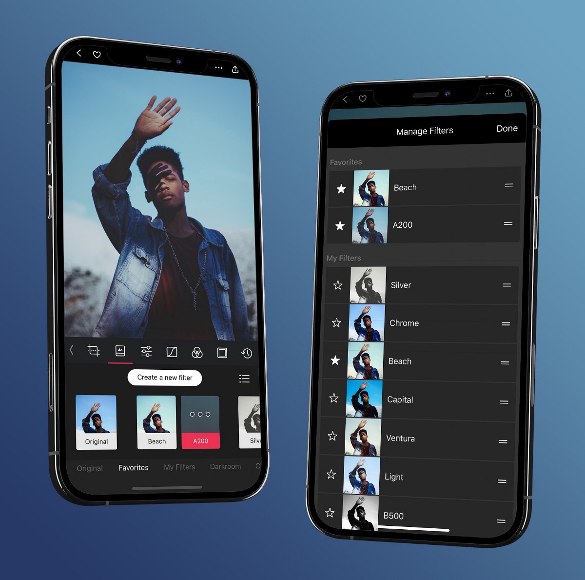
*Your iCloud Photos library is already there when you open Darkroom — pick a shot and tap to start editing.*
### 2. Apply a Preset
The fastest way to transform a photo is with a preset. Presets are saved combinations of adjustments — like a recipe for a particular look — that you can apply in a single tap.
Open the **Presets** tool and browse the available styles. Darkroom comes with a set of free and premium built-in presets, and you can explore thousands more in [Community Presets](/presets). Swipe through the options, and when you see a look you like, tap install to use it.
A few things worth knowing:
- **Presets are non-destructive** — applying a preset doesn't permanently change your photo. You can switch to a different preset, adjust the settings it applied, or remove it entirely at any time.
- **Presets are a starting point** — think of them as a foundation. Apply one to set the mood, then refine the individual adjustments to match your taste and the specific photo.
- **Every preset is transparent** — you can see exactly which adjustments a preset made and tweak any of them. This makes presets a great way to learn how different looks are built.
If you'd rather start from scratch, skip this step and move straight to manual adjustments.
### 3. Adjust the Image
Whether you started from a preset or from scratch, the **Adjustment Sliders** are where you fine-tune the look of your photo. Open the sliders and start with the basics:
- **[Brightness](/help/edit/adjustment-sliders#brightness)** — controls the overall brightness of the image. Push it up if the photo is too dark, pull it down if it's too bright.
- **[Contrast](/help/edit/adjustment-sliders#contrast)** — increases the difference between light and dark areas. A moderate boost makes most photos look more vivid and defined.
- **[Saturation](/help/edit/adjustment-sliders#saturation)** — controls color intensity. A subtle increase makes colors richer; pulling it down mutes them toward monochrome.
- **[Temperature](/help/edit/adjustment-sliders#temperature)** — shifts the overall color between warm (yellow/orange) and cool (blue). Use it to correct white balance or to set a mood.
Once you're comfortable with those, explore the tonal controls:
- **[Highlights & Shadows](/help/edit/adjustment-sliders#highlights-shadows)** — these adjust the brightness of the bright and dark areas independently. Pulling highlights down recovers detail in bright skies and windows. Lifting shadows reveals detail in dark areas without affecting the rest of the image.
- **[Blacks & Whites](/help/edit/adjustment-sliders#blacks-whites)** — these control the absolute endpoints of the tonal range. Crushing the blacks (pulling them down) creates deep, rich shadows. Pushing whites up adds clean, bright highlights.
**Use the [Histogram](/help/edit/histogram)** at the top of the editor to guide your adjustments. The histogram shows the distribution of tones in your image from dark (left) to bright (right). If the graph is bunched up on one side, it means the image is underexposed or overexposed. As you adjust sliders, watch the histogram spread out — a well-distributed histogram generally means a well-exposed image.
Don't worry about getting everything perfect. The goal of a first edit is to make the photo feel closer to what you saw when you took it — or to push it somewhere more interesting. A good habit is restraint: if an adjustment looks obviously "edited," pull it back and let the photo breathe. Tap and hold the image to compare against the original as you go, and try to judge your edit on a consistent screen brightness rather than in direct sunlight, where the display auto-brightens and throws off your sense of exposure and color.
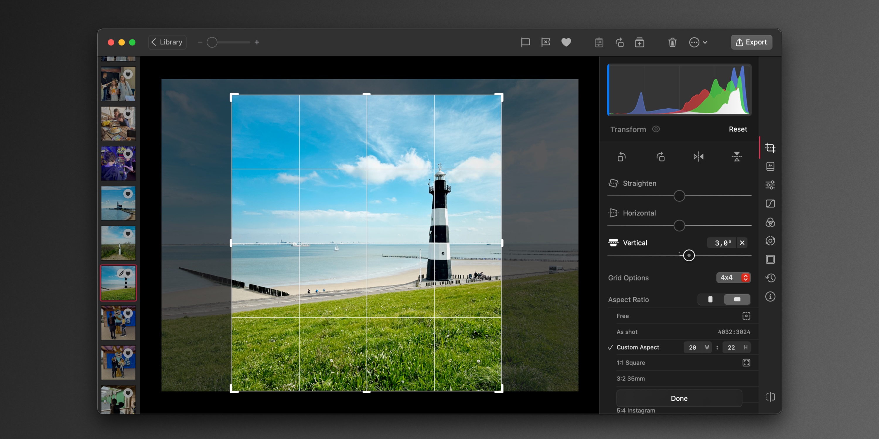
*Start with the basics — brightness, contrast, saturation, and temperature — then refine the tonal controls.*
### 4. Crop and Straighten
A good crop can completely change the impact of a photo. Open the **[Transform](/help/edit/crop-rotate-transform)** tool to reframe your image.
- **Aspect ratio** — choose a preset aspect ratio (like 4:3, 16:9, or 1:1 for square) or crop freely. A square crop works well for social media; wider ratios suit landscapes and cinematic compositions.
- **Straighten** — if the horizon is tilted or a building leans, use the straighten control to rotate the image until the lines are level. Even a small correction — one or two degrees — can make a photo feel much more polished.
- **Reframe the subject** — use the rule of thirds grid to position your subject along the intersecting lines. Placing the subject slightly off-center usually creates a more dynamic composition than centering it.
Cropping is also a great way to remove distractions at the edges of the frame — a stray object, a busy background, or empty space that doesn't add to the image.
### 5. Share or Save
When you're happy with your edit, you have a few options:
- **Save** — Darkroom's edits are fully non-destructive. Your original photo is never modified. When you save, Darkroom writes the edited version back to your Photos library. On iOS, this creates a new version of the photo that you can revert at any time.
- **Share** — tap the share button to send your edited photo directly to other apps — Messages, Instagram, email, or anywhere else. Darkroom renders the final image at full resolution when you share.
You can always come back to a photo later and change or undo any edit. Nothing is permanent.
---
## What to Try Next
Now that you've completed your first edit, here are some directions to explore:
- **[Community Presets](/presets)** — browse thousands of presets created by photographers around the world. Find a style you love and make it your own.
- **[Masks](/help/edit/masks-local-adjustments)** — apply adjustments to specific parts of a photo rather than the whole image. Brighten a face without blowing out the sky, or darken the edges to draw the eye inward.
- **[Color Grading](/help/guide/color-grading-mood)** — learn how to use Curves and HSL to shape the mood and atmosphere of your photos with precise color control.
- **[Batch Actions](/help/manage/batch-actions)** — apply the same edits to multiple photos at once. Great for keeping a consistent look across a series.
---
### Related Topics
- [Make Photos Look Like Film](https://darkroom.co/help/guide/vintage-film)
- [Editing RAW Photos](https://darkroom.co/help/guide/raw-editing)
---
# Interface Overview
> Find your way around Library, Viewer, and Export — the three main areas of Darkroom on iPhone, iPad, Mac, and Vision Pro.
Source: https://darkroom.co/help/start/interface-overview
Section: Getting Started
Updated: 2026-03-06
Darkroom is designed to be familiar to use and easy to navigate across your iPhone, Mac, iPad or Vision Pro. In this guide we’ll help you understand how to get around and where everything can be found.
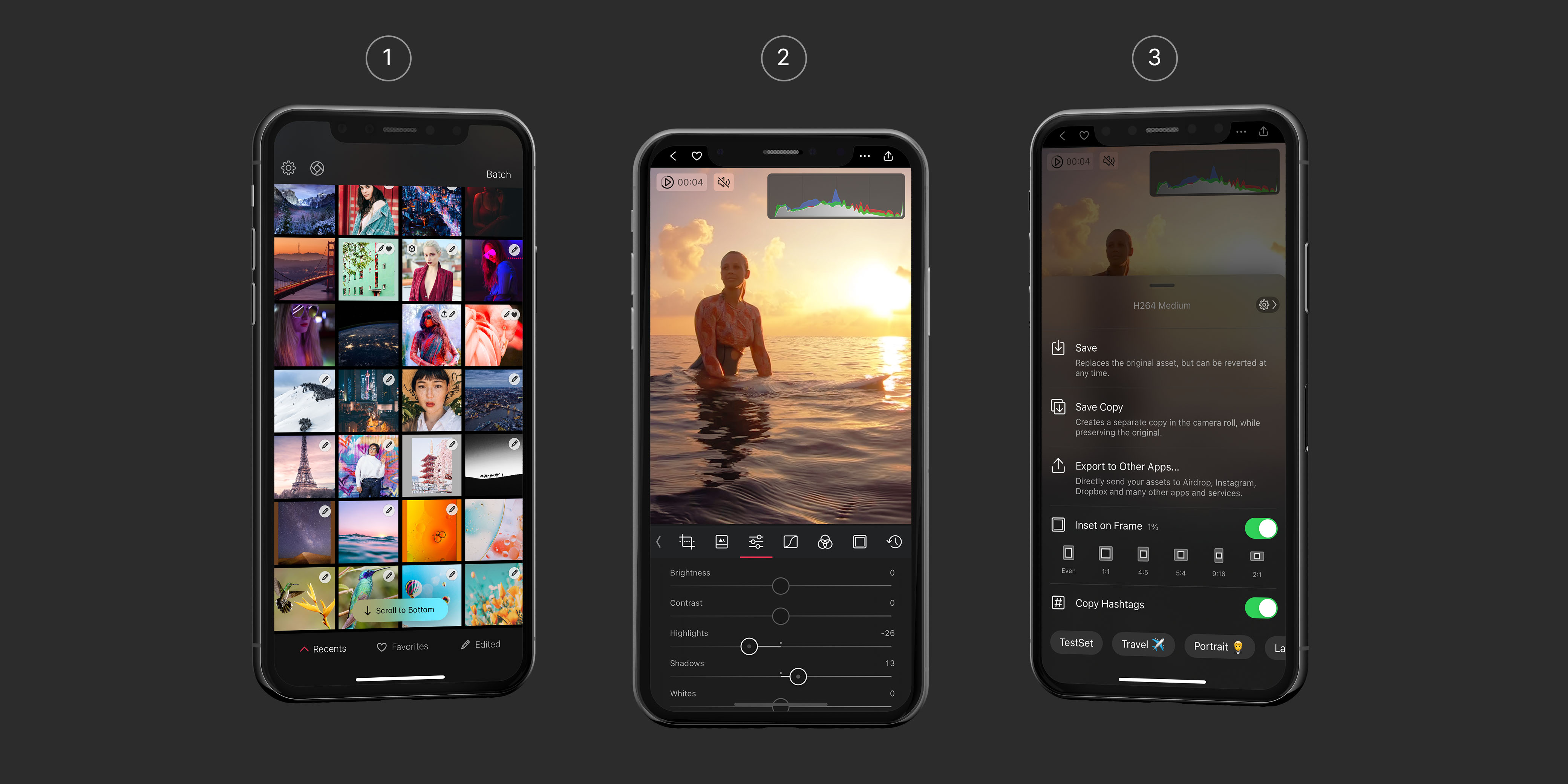
Darkroom has three main areas:
1. **Library**, where you browse and manage your photos and videos.
2. **Viewer**, where you view, edit, and choose between your photos and videos.
3. **Export**, where you save or share your photo and videos.
---
## The Library View
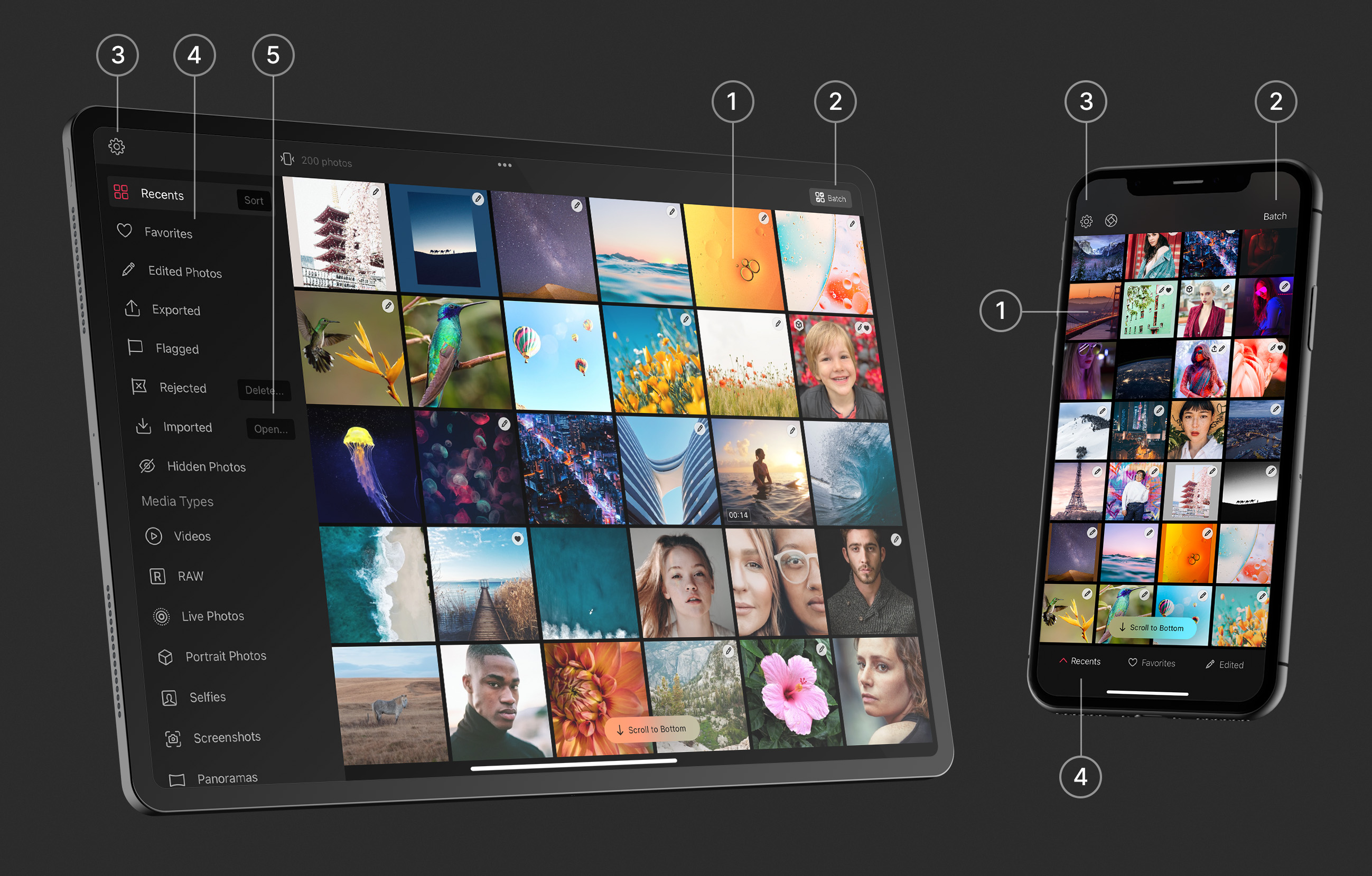
### Photo Grid
If you have chosen to give Darkroom access to all of your photos, you should see them all here, no importing needed. Note that you don't have to do this, you can also give it access to one photo at a time. Please note, we don’t do anything with your photos without your explicit consent. We also don’t upload them to our servers, we don’t analyze them. We just show you your photos from the Apple iCloud Photo Library.
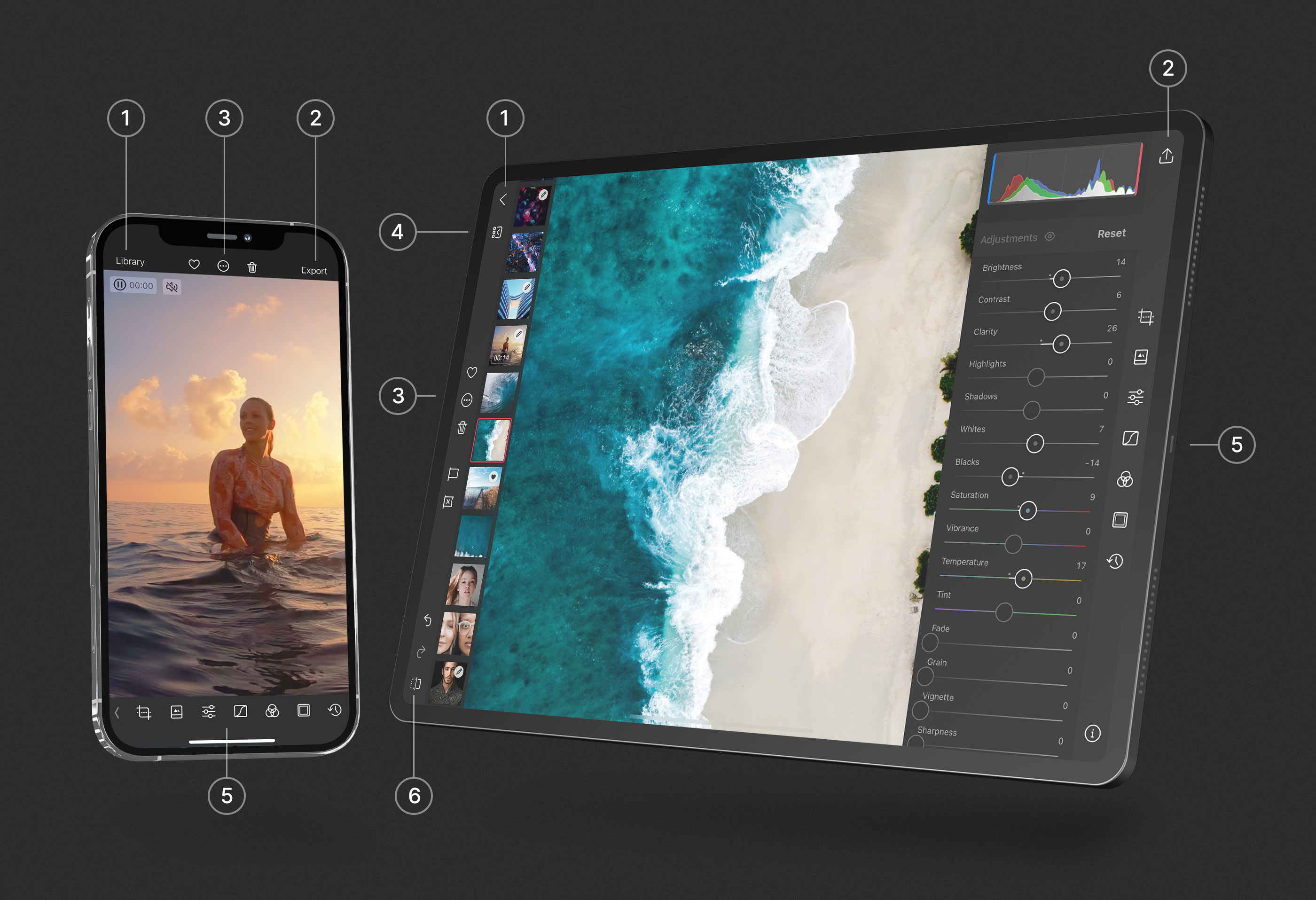
**1 — View & Edit**. On iPhone, iPad and VisionPro opening a photo to view or edit is as simple as tapping it. On Mac we use the native behavior, which is to double click!
**2 — Batch**. On iPhone, iPad and Vision Pro, at the top right you will see the Batch button which will allow you to select multiple photos. Once photos are selected, the Batch actions bar will appear at the bottom. On iPhone and iPad you can quickly start Batch selection by simply swiping left or right on the photos you wish to select! On Mac, you can multi select by default, use the "command ⌘" and "shift ⇧" keys while selecting to extend your selection, and the batch actions show at all times at the top right in the toolbar.
**3 — Settings**. On iPhone, iPad and Vision Pro, at the top left you will find the gear icon, tap to open our Settings. On Mac you can head to the "Darkroom" menu and click the "Settings..." menu item. This is a good place to look around, you’ll find plenty of useful options.
### Album List
**4 — Folders & Albums**. On iPhone you will find a bar at the bottom of your Preview Grid that has 3 smart albums (Recents, Favorites, Edited) ready for you. But you can also pick and search for any other album on your iPhone by tapping on the left most option with the ^ triangle. Which in turn will show you all our Smart Albums and all of your personal Folders and Albums in your Apple iCloud Photos Library. On iPad, Mac and Vision Pro, our album list is always located on the left-hand sidebar.
**5 — Import**. At times you might want to import some photos or videos from a different source than your Apple iCloud Photos Library. The Import option is the way to do that. It works through Apple’s Files app, so anything connected to it, including your DLSR memory card or connected USB drive will be accessible.
> **Drag and Drop** — On Mac you will be able to drag and drop photos to the library from your desktop. And on iPad you can also drag and drop photos from your library to any of the albums shown in the album list on the left.
---
## The Photo View
### Navigation
Darkroom is designed to be easy to navigate, and familiar to use across all your iPhone, Mac, iPad or Vision Pro. Some of the more unique and most efficient ways to move around in Darkroom make use of gestures, allowing for extremely easy one handed or even just thumb based navigation on iPhone, as well use of keyboard shortcuts on iPad and Mac. We have made sure though that you can get around without knowing any of them. But knowing them is like having a super power!
* **Close**. On iPhone and iPad you can swipe down to close the photo. On Mac you can drag the image downwards.
* **Previous/Next**. On iPhone and iPad you can also swipe left or right to navigate between your previous and next photos. This even works when you have your tools open. Allowing you to edit rapidly through photos, even by using copy and pasting, or do quick comparisons. On your iPad and Mac you can also use the arrow keys to quickly navigate through your album.
* **Before and after comparison**. On iPhone and iPad you can tap and hold your finger on the photo to see the original. On Mac you can use just tap-and-hold your mouse on the photo or video. And on iPad and Mac you can also use the dedicated button for it.
* **Zoom.** You can do a quick double tap to zoom into your photo, and double tap again to zoom out. Or use a pinch gesture to zoom into any area of the photo you want. And the swipe around with one finger to pan around the photo.
* **Hide the interface**. When viewing or editing a photo you can simply tap on the photo briefly once to hide all the interface to just see your photo. Just tap once more to show it all again.
### Actions
In our main toolbars shown at the top of Darkroom, actions on the left typically take you back, and actions at the right move you forward.
**1 — Back**. There is a clearly marked Library or < back button to go back to the library. On iPhone and iPad you can also Swipe down to close the photo, and even on Mac you can drag the image downwards.
**2 — Export**. After editing your most likely next step is for you to save to use elsewhere, or share. We explain more on this view further down.
**3 — Actions**. On iPhone we “hide” quite a few secondary options for you here. Ranging from show/hiding the Histogram or Metadata viewer, to many of the photo management options such as “Add to..”. On Mac and iPad we expose quite a few more depending on how much space we have.
**4 — Photostrip**. On both iPad and the Mac we have the Photostrip, which shows you all your photos in a thin strip on the left side of your screen. Allowing you to quickly navigate through your photos. And it even has all the management context menu options you can find in the library.
### Tools
**5 — Swipe up to reveal tools.** When you are viewing a photo or video you can either tap any of our tools to open them, or you can quickly swipe up to reveal the adjustments (sliders) tool on iPhone and iPad. On Mac you just click the tool you wish to open. There are many tools accessible through our main toolbar, and some through or our photo actions menu. We’d like to invite you to please take some time to explore them.
On iPhone we also have the Flag & Reject features accessible by swiping the toolbar right, or tapping on the small < arrow at the left of the toolbar. On iPad and Mac the Flag and Reject options are always available and conveniently sit in the toolbar.
**6 — Before and after comparison**. In order to make edits it’s actually pretty useful to be able to check what the original looked like. On iPad and Mac we have a dedicated button for it. You can also tap the eye 👁 icon next to the tool title to see the original. As mentioned before, on iPhone you can tap and hold your finger on the photo to see the original.
---
## The Export View
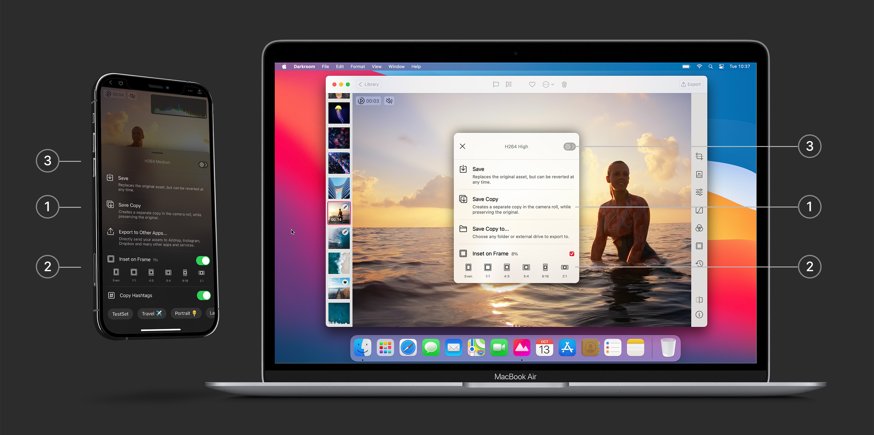
**1 — Save or Share**. All edits made in Darkroom are non destructively. That means that any edit you make isn’t directly applied to the original photo. Instead we render the edits live on top of the original, which enables you to undo and change your edits at any time in the future. That also means you have to export, using “Save” or “Save Copy”, for any of the edits you have made to show up in other apps outside of Darkroom.
**2 — Export tools.** We offer quick access to adding a frame when you export. This is great for things like Stories and Reels, where you want to keep the same aspect ratio. You also have the ability to easily copy some of your hashtag sets for sharing to social networks.
**3 — Settings.** There is quick access to settings where we offer several options that relate to exporting. Which ranges from setting the file format (for both photo and video), to applying a watermark, location embedding, managing your metadata, or managing your hashtags.
---
## iPhone, Mac, iPad and Vision Pro
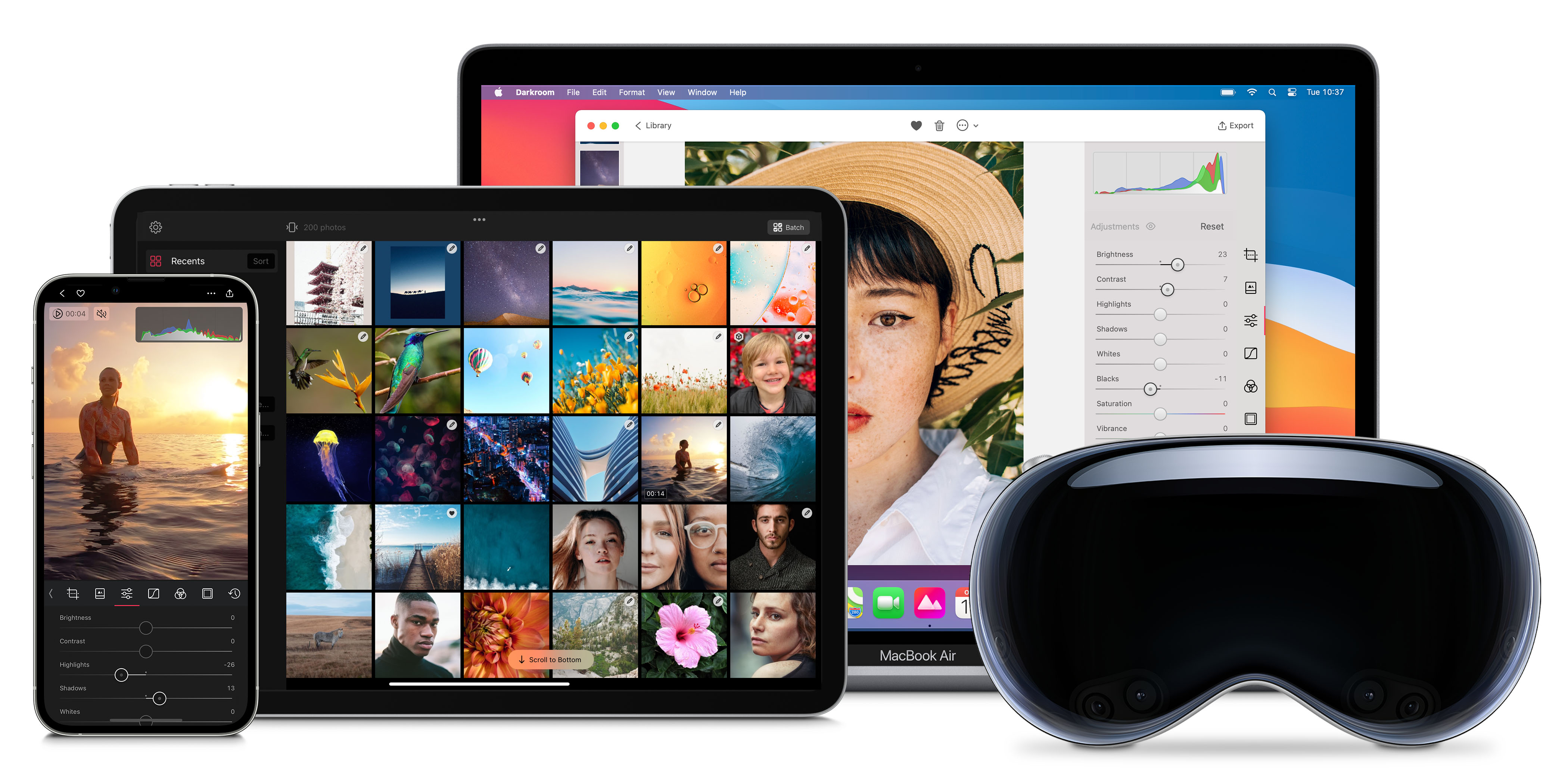
Darkroom has apps for all of your major devices. We have made sure that the visual language and navigation between our apps is true to each platform, but similar enough that there shouldn’t be much of a learning curve to get around.
>**Pro-tip, Keyboard Shortcuts** — On Mac and iPad we have made sure to have solid [keyboard shortcuts](/help/app/keyboard-shortcuts) support. Making it possible to more efficiently move around and work by just using your keyboard. To discover all the shortcuts, on iPad tap and hold the command key, and on Mac you can click through the top main menu or head on over to our dedicate help page listing all the available [keyboard shortcuts](/help/app/keyboard-shortcuts).
---
# Darkroom+ Membership
> What's included in Darkroom+, how App Store billing and trials work, and how to restore or share your membership.
Source: https://darkroom.co/help/membership/darkroom+
Section: Membership
Updated: 2026-04-08
Darkroom+ is Darkroom's premium membership. It unlocks the full set of advanced tools across iPhone, iPad, Mac, and Vision Pro, and because it's an App Store purchase, all billing — pricing, trials, renewals, and refunds — is handled by Apple through your account. This page walks through the questions people most often bring to support: what's included, what it costs, how trials and cancelation work, and how to restore or share a purchase.
## What Darkroom+ unlocks
Darkroom is free to download and includes many free features. Darkroom+ adds unrestricted export access along with the full premium toolset:
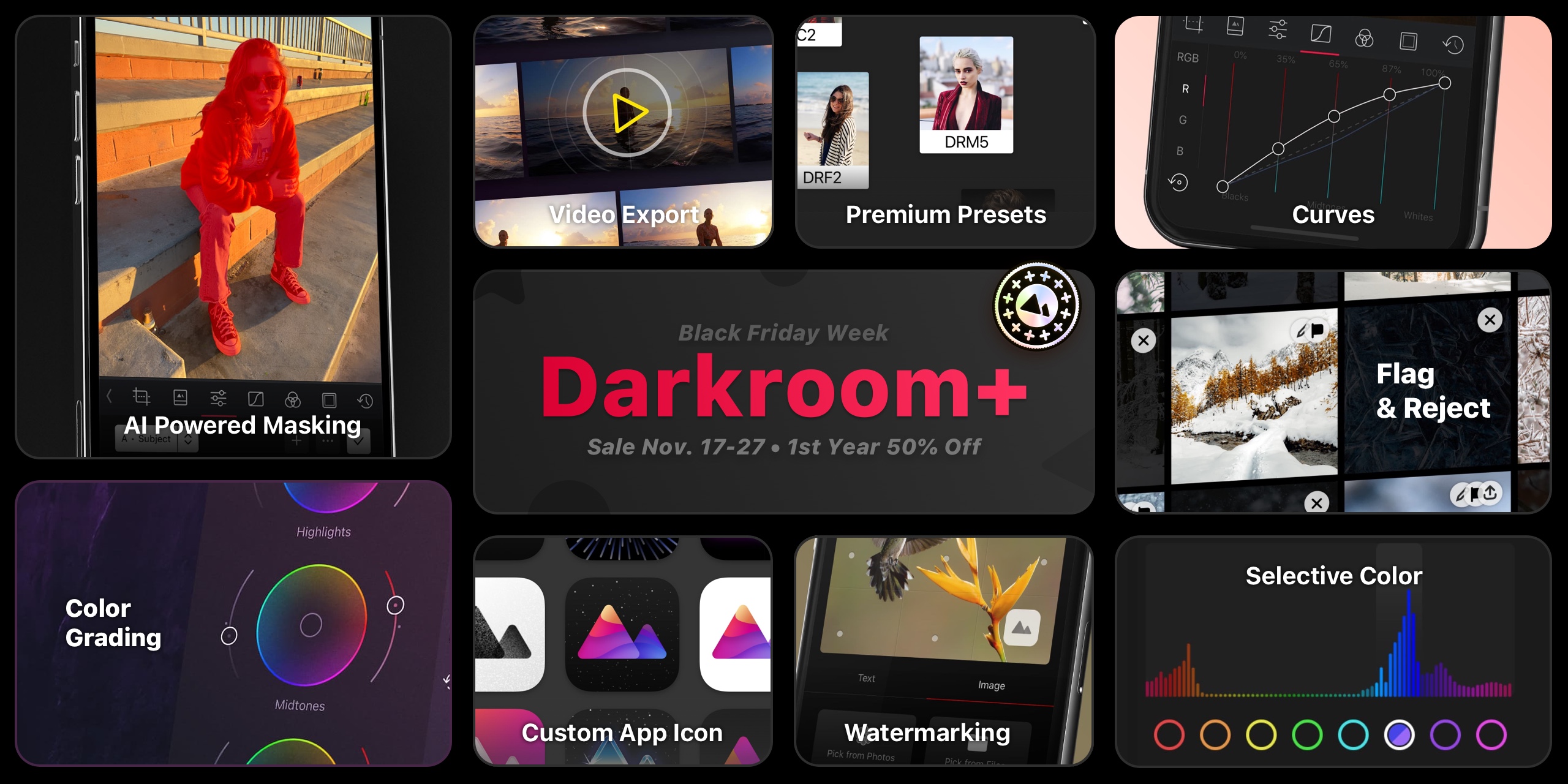
*A membership unlocks the full premium toolset across iPhone, iPad, Mac, and Vision Pro.*
A useful quirk of Darkroom's model: you can open and fully *experiment* with every premium tool without a membership — a membership is only required for **export**. So you can build a complete edit with Color Grading, Masks, and Curves and see exactly what you'd get; Darkroom+ is what lets you save or share the result. It's a real try-before-you-buy, not a locked door.
- [Metadata Editor](/blog/2026-04-08-metadata-editor) - 2026 - Edit image metadata like date, location, camera, and more.
- [Bloom and Halation](/blog/2025-12-08-bloom-halation) - 2025 - Add analog warmth and cinematic glow.
- [Color Grading](/blog/2022-12-12-color-grading) - 2022 - Adjust the color of your photos to match your style.
- [Local Adjustments with AI backed Masks](/blog/2022-04-masks) - 2022 - Enhance the lighting in an area of your photo.
- [Flag & Reject](/blog/2021-03-flag-reject) - 2021 - Efficiently cull your ever-growing photo library.
- [Video Export](/blog/2020-04-video) - 2020 - Grade and export your videos.
- Watermark - 2020 - Explicit online protection and clear attribution.
- Customize App Icon - 2020 - Have a little fun and customize your home screen.
- Curves - 2015 - Achieve any look with just a few targeted swipes.
- Color - 2015 - Adjust the tone of individual colors.
- Premium Presets - 2015 - A collection of premium presets to help you get started.
## Plans and pricing
Darkroom+ is usually offered three ways: a **monthly** subscription, a **yearly** subscription, and a **Forever** one-time purchase. Prices vary by country and currency, and we occasionally run localized pricing tests and seasonal campaigns, so the most accurate price for your account is always the one shown in-app or on our [App Store page](https://apps.apple.com/app/apple-store/id953286746?pt=117198944&mt=8).
Those seasonal campaigns — Black Friday, for example — are announced in-app and on our blog and social channels. You almost never need a promo code: if your account is eligible, the offer appears automatically, though some campaigns apply only to specific plans (yearly but not Forever, say). If an offer doesn't apply correctly, email [feedback@darkroom.co](mailto:feedback@darkroom.co) with a screenshot of the offer screen.
Occasionally we run pricing tests to understand what people feel Darkroom is worth, so the number you see may differ from a friend's. If we ever make a structural pricing change that affects existing customers, we'll communicate it clearly — your current plan won't quietly change out from under you.
You can start a membership from any premium tool's paywall in-app, from Settings in Darkroom, or from the [Darkroom+ overview page](/darkroom+). If you'd rather buy once than subscribe, look for the **Forever** option and tap **show all purchase options** if it isn't visible.
## Trials, billing, and cancelation
Some plans and regions include a free trial; availability varies with App Store rules. You can cancel during a trial from your App Store subscription settings, but Apple may still charge if you cancel too close to renewal — so if you don't want it to renew, cancel at least **24 hours before the trial ends**. Apple controls all plan changes and cancelations through [Manage subscriptions](https://apple.co/2Th4vqI); their [cancel-a-subscription guide](https://support.apple.com/en-au/guide/iphone/iph4e3e7324f/ios) walks through it step by step.
There's no one-tap way to convert a subscription into the Forever purchase. To switch, cancel your active subscription, let it fully lapse, then buy the Forever option in Darkroom.
## What happens if you cancel or lapse
Canceling doesn't put your work at risk. Darkroom edits non-destructively, so **your original photos are never altered**, and that doesn't change with your membership status. The edits you've made and the [presets](/help/edit/presets) you've created stay exactly where they are — nothing is deleted when a membership ends.
What changes is going forward: once Darkroom+ lapses, the premium tools return to try-before-you-buy mode, and you'll need an active membership again to **export** photos or videos that use premium edits. Your existing exported files are yours to keep regardless. Resubscribe at any time and everything picks up right where you left off — same edits, same presets, full export access restored.
## Using Darkroom+ across your devices
Your purchase works on every Apple device signed in with the **same Apple ID** that bought it, and in most cases access syncs automatically via iCloud Keychain. If it doesn't appear, open Darkroom Settings, tap **Already made a purchase?**, and wait for the restore to finish. If a restore still fails, confirm you're on the right Apple ID, sign out and back into the App Store, make sure Darkroom is up to date, and check [Apple System Status](https://www.apple.com/support/systemstatus/) for any ongoing outage.
A few specific situations trip people up:
- **"I paid but don't have access."** Almost always this means you're signed into a *different* Apple ID than the one that made the purchase. Membership is tied to the Apple ID, not to a Darkroom account (there isn't one), so check **Settings → [your name] → Media & Purchases** on the device and confirm it matches the account you bought with.
- **"You're currently subscribed to this."** This message means the purchase went through on your Apple ID but Darkroom hasn't picked it up yet. Tap **Already made a purchase?** in Darkroom Settings to restore it onto the device.
- **The restore spins and never finishes.** Force-quit and reopen Darkroom, confirm you have a working connection, and try once more; if it still hangs, an Apple-side outage on [System Status](https://www.apple.com/support/systemstatus/) is the usual culprit.
If none of that resolves it, email [feedback@darkroom.co](mailto:feedback@darkroom.co) and we'll help track it down.
Darkroom+ also supports [App Store Family Sharing](https://www.apple.com/family-sharing/). Make sure Purchase Sharing is enabled and each family member is signed into the expected Apple account. Note that Apple may limit sharing of some one-time purchase types (like Forever or legacy) by device count, while subscription-based sharing generally has fewer restrictions.
## Refunds
Apple is the payment processor and merchant of record for all iOS in-app purchases, which means we can help with guidance and troubleshooting, but refund approvals and payment reversals are decided by Apple. Start a request through Apple's [refund flow](https://support.apple.com/en-us/HT204084). If you were billed unexpectedly, it's worth first checking your trial end date and renewal timing in your Apple subscription settings to see whether cancelation landed within Apple's 24-hour window.
## Frequently Asked Questions
### Can I use my Darkroom+ membership across my Apple devices?
Yes. Your Darkroom+ access works on your iPhone, iPad, Mac, and Vision Pro when you use the same App Store account that made the purchase.
If access does not appear automatically, open Settings in Darkroom and tap *Already made a purchase?* to restore.
### What does a Darkroom+ membership cost?
Pricing varies by country, currency, and occasional campaigns. In the United States, plans are typically monthly, yearly, and forever one-time purchase. For exact current pricing, check the in-app paywall or our [App Store page](https://apps.apple.com/app/apple-store/id953286746?pt=117198944&mt=8).
### Can I try Darkroom+ before paying?
Trial availability depends on region and plan. Darkroom also lets you test premium editing workflows with export restrictions, even without an active membership.
### How do I cancel a Darkroom+ subscription or trial?
Manage or cancel directly in your App Store account: [Manage subscriptions](https://apple.co/2Th4vqI). You can also use Apple's guide: [Cancel a subscription on iPhone](https://support.apple.com/en-au/guide/iphone/iph4e3e7324f/ios).
### Do I keep my edits and presets if I cancel?
Yes. Your original photos are never altered, and your edits and saved presets stay exactly where they are when a membership ends. You'll just need an active membership again to *export* photos or videos that use premium edits. Resubscribe any time and everything picks up where you left off.
### Can I get a refund?
Apple handles all billing and refunds for App Store purchases. Use Apple's refund flow: [Request a refund](https://support.apple.com/en-us/HT204084).
### Does Family Sharing work with Darkroom+?
Yes, Family Sharing is enabled. Make sure Purchase Sharing is turned on in Family Sharing settings. Note that Apple may apply device-sharing limits for some one-time in-app purchases.
### Can I switch from subscription to Forever?
Yes, but not instantly. Cancel your current subscription first, let it lapse, then purchase the Forever plan in Darkroom.
### What is a legacy purchase?
Legacy purchases were one-time purchases sold before February 2020. They are no longer available. See [Legacy Membership](/help/membership/legacy) for details.
---
# Legacy Purchases
> What pre-2020 one-time purchases unlock today, which Darkroom+ features they don't include, and how to check your access.
Source: https://darkroom.co/help/membership/legacy
Section: Membership
Updated: 2026-04-08
Legacy purchases relate exclusively to purchases made before February 2020, and are no longer available. Legacy customers paid a one-time fee, not a subscription or membership fee, to access one or more of our features. The maximum fee was $9.99, which unlocked all available premium tools, the Curves and Color tools, along with all premium filters. The minimum charge was $1.99 for an early day single premium filter pack.
## Legacy Feature Access
Legacy customers have access to the following premium Darkroom+ features:
- [Flag & Reject](/blog/2021-03-flag-reject) - Introduced 2021
- [Video Export](/blog/2020-04-video) - Introduced 2020
- [Watermarking](/blog/2020-02-watermark-subscription) - Introduced 2020
- [39 Custom app icons](/blog/2023-01-11-app-icons) - Introduced 2020
- Curves & Color Tool - Introduced 2015
- 39 Premium Presets - Introduced 2015
In addition to the Darkroom+ features listed above, legacy customers receive all free features and regular updates that Darkroom releases.
Legacy customers **do not** have access to the following Darkroom+ features:
- [Metadata Editor](/blog/2026-04-08-metadata-editor) - Introduced 2026
- [Bloom and Halation](/blog/2025-12-08-bloom-halation) - Introduced 2025
- [Color grading](/blog/2022-12-12-color-grading) - Introduced 2022
- [Masked local adjustments](/blog/2022-04-masks) - Introduced 2022
---
## Context
In [February 2020](/blog/2020-02-watermark-subscription), the [Darkroom+ membership](/darkroom+) replaced one-time purchases. When Darkroom+ launched, we granted all paying customers full access to Darkroom+ until 2022 at no additional charge regardless of their initial purchase, as a thank you for their early day support.
[Starting in 2022](/blog/2022-04-masks), legacy customers no longer receive access to the latest additions to Darkroom+ features. They maintain indefinite access to all Darkroom+ features introduced before 2022.
---
## Questions? Answers.
### Can I upgrade to Darkroom+ from legacy?
Yes, you can. We provide an option in the settings to unlock Darkroom+. Also, whenever you attempt to use a tool that you currently do not have access to, an option to upgrade will appear.
### Can I try Darkroom+, is there a trial?
Yes, there is. We offer a 7-day trial that you can cancel at any time. During this period, you'll have access to all Darkroom+ features, including the ones not available to legacy customers.
You can try all Darkroom+ for as long as you want with export restrictions.
### Does my legacy purchase work access my devices?
Yes. If you have legacy feature access on one device, you can use it on any of your other devices like an iPhone, iPad or Mac. You don't have to purchase or subscribe to Darkroom+. You do have to make sure to login on all devices using the same App Store account you used to make the purchase.
If you have iCloud Keychain turned on, your devices will share access to your unlocked premium features automatically.
Alternatively, in the app go to Settings, on your iPhone at the left top of the photo grid. Once in Settings tap the 'Already made a purchase?' option and all your previous purchases should be fully restored.
### How do I restore my legacy purchase on a new device?
If you have iCloud Keychain turned on, your devices will share access to your unlocked premium features automatically.
If that doesn't work in Darkroom, go to Settings, you can find the option at the left top of the photo grid on iPhone. Once in Settings tap the 'Already made a purchase?' option and all your previous purchases will be fully restored.
If that doesn't work you might want to make sure you are using the same App Store account as you made the original purchase with. You can also try and logout of the Apple App Store, and then log back in. You can also check to see the status of the App Store, and other services on Apple's System Status page.
### Do I have to upgrade to Darkroom+?
No, you are not required to upgrade to Darkroom+. As a legacy customer, you will continue to have access to all the features you initially paid for, plus all the Darkroom+ features launched before 2022. However, keep in mind that any new features introduced from 2022 onwards will only be accessible with a Darkroom+ membership.
### Do you have a discount to upgrade?
We don't offer a specific discount for upgrading from legacy to Darkroom+. However, we do offer seasonal discounts throughout the year, which could be used for this upgrade. We suggest following us on our social channels or checking the app regularly. We strive to ensure everyone is aware of our discount campaigns when they occur.
### What happens to my legacy access if I try the Darkroom+ trial?
If you take advantage of the Darkroom+ trial, your legacy access will remain unaffected. After the trial ends, you will still have access to all the features you initially paid for, plus any Darkroom+ features introduced before 2022.
### Can I go back to legacy if cancel Darkroom+ after upgrading?
Yes, if you decide to cancel Darkroom+ after upgrading, you will automatically revert back to your legacy access. All the features you initially paid for, plus any Darkroom+ features introduced before 2022, will still be accessible to you.
### Can I make a legacy purchase?
No, you can no longer make a legacy purchase. Although legacy purchases are visible in the App Store as in app purchase, they exist only to ensure that legacy customers maintain access to legacy features.
### Why was the switch to Darkroom+ made?
Since launching Darkroom in 2015, we've been dedicated to creating a photo-editing and management tool that matches any market leader in features, user experience, and design. We're also committed to the long-term development of Darkroom. That's why we've never sought outside funding and chosen a slow and steady growth approach.
The scope of our work will increase as our team and platform expand.
We consistently reinvest in our future, enabling us to develop long-awaited features, improve app stability, and significantly enhance its power and efficiency. To accomplish this, we need a sustainable business model that supports Darkroom's ongoing development and necessary investments.
Subscriptions have boosted our revenues, allowing us to hire additional staff, invest more in our infrastructure, and broaden our ambitions. With [nine years of history demonstrating our commitment](/updates/), we hope you'll trust us with your support.
---
# Create a Vintage Film Look
> Build an analog film look in Darkroom — soft contrast, muted color, grain, and warm tonal shifts without a film camera.
Source: https://darkroom.co/help/guide/vintage-film
Section: Guides
Updated: 2026-03-06
There's a reason film photography never went away. The soft contrast, muted colors, visible grain, and warm tonal shifts of analog film have a quality that digital images don't naturally produce. Film feels human in a way that pixel-perfect digital sharpness sometimes doesn't.
The good news: you don't need a film camera to get there. With the right adjustments in Darkroom, you can transform any digital photo into something that captures the character of analog film — from the faded shadows of Kodak Portra to the moody tones of Fuji Pro 400H.
This guide walks you through each step, from flattening contrast to adding grain, so you understand how the look is built.
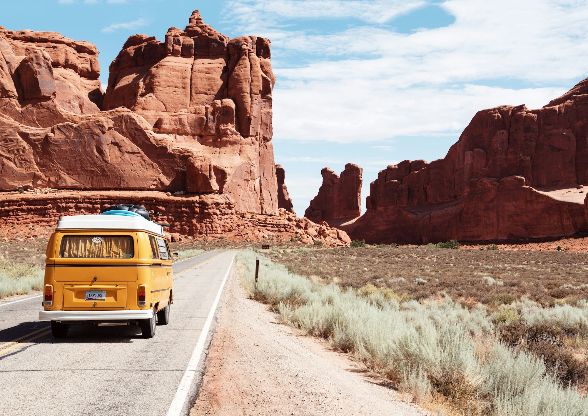
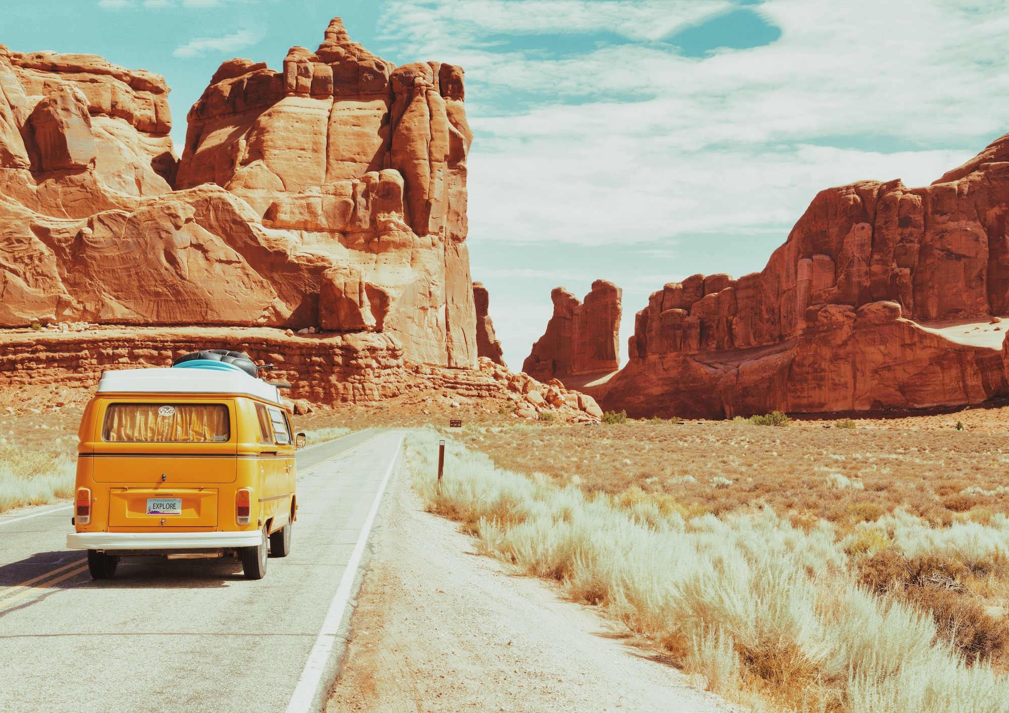
## When to Use This Technique
The film look works across many genres, but it shines especially when:
- **You're shooting portraits** — film's softer contrast and warm tones are naturally flattering for skin.
- **The scene has warm or golden light** — sunset, golden hour, and indoor lamp light pair beautifully with film-style color shifts.
- **You want a nostalgic or editorial feel** — the film aesthetic instantly evokes memory, intimacy, and a timeless quality.
- **Your photo is too "clean"** — sometimes a technically perfect digital image benefits from a bit of imperfection. Film grain, faded blacks, and subtle color casts add life.
- **You're creating a cohesive series** — the film look provides a consistent visual thread that ties a set of images together.
---
## Step-by-Step Workflow
### 1. Start from a Film Preset (Optional)
Darkroom's community preset library includes dozens of film-inspired presets — from faithful emulations of classic film stocks to original styles with an analog character. Collections like [Kodak](/presets/collections/kodak), [Fuji](/presets/collections/fuji), [Ilford](/presets/collections/ilford), and [Vintage](/presets/collections/vintage) are great places to start.
Applying a preset gives you a strong foundation to work from. Since every community preset is fully transparent, you can see exactly which adjustments were made and fine-tune any of them. Think of a preset as a starting point, not a final destination.
If you prefer to build the look from scratch, skip ahead — the following steps walk through each adjustment individually.
### 2. Lower the Contrast
Digital cameras produce images with crisp, punchy contrast. Film doesn't work that way. Most film stocks have a gentler contrast curve — shadows aren't as deep, highlights aren't as bright, and the transition between tones is smoother.
The quick way is the open the **Adjustments Tool** and lower the **Contrast** slider. For full control, open the **Curves (RGB)** tool and flatten the default curve slightly. Instead of a steep S-shape, aim for something more gradual:
- Pull the shadow region up slightly — this prevents the darkest areas from going pure black.
- Pull the highlight region down slightly — this keeps bright areas from clipping to pure white.
The result is a softer, more compressed tonal range that immediately reads as more film-like.
### 3. Lift the Shadows
This is the single most recognizable trait of the film look: faded, milky shadows instead of deep black.
The quick way is to open the **Adjustments Tool** and lower the **Shadows** slider. For full control, open the **Curves (RGB)** tool, grab the bottom-left anchor point (the blacks point) and raise it upward. This maps what would be pure black to a dark gray instead, creating that characteristic matte, washed-out shadow tone.
How far to lift depends on the mood you're after. A subtle lift creates a gentle fade. A dramatic lift gives you a very hazy, dreamy look. Start around 10–15% off the bottom and adjust from there.
### 4. Add Warmth with Color Grading
Film stocks don't render color neutrally — they have inherent color biases that give each stock its personality. Portra leans warm. Fuji Superia leans green. Cinestill goes heavy on halation red. You can recreate these color shifts using the **Color Grading** wheels.
The Color Grading tool lets you push color independently into the shadows, midtones, and highlights:
- **Shadows** — push toward warm amber or orange. This replaces the cold, blue-gray shadows that digital cameras produce with something warmer and more inviting.
- **Highlights** — push toward warm yellow or light peach for a golden, sun-kissed feel.
- **Midtones** — a very subtle shift toward green or yellow can mimic certain film stocks. Keep this gentle.
### 5. Reduce Saturation
Film generally renders colors with less intensity than a digital sensor. Pulling back the saturation helps sell the analog feel.
In the **Adjustments Tool**, lower the **Saturation** slider by 15–30 points. You're not going for black and white — just taking the edge off the digital vividness. Colors should feel muted and harmonious rather than bold and saturated.
**Vibrance** can also be lowered slightly. Since Vibrance does not target skin tones, reducing it tames any overly intense hues while leaving subtler colors mostly intact.
### 6. Add Grain
No film look is complete without grain. It's the texture of the medium itself — the physical silver halide crystals that make up a film image.
In the **Adjustments Tool** increase the **Grain** slider. Darkroom's grain is designed to look natural and organic, not like digital noise. And it even works on video!
A light touch works for most images. If you're going for a high-ISO film stock look (like Kodak Tri-X 400 or Ilford HP5), push it further. The grain should be visible but not distracting — something you notice when you look closely, not something that overwhelms the image, unless intended.
### 7. Add Bloom or Halation (Optional)
**Bloom** creates a soft glow around bright areas of the image — the kind of light bleed you see in photos shot on older or uncoated lenses. It softens highlights and creates a dreamy atmosphere.
**Halation** simulates the warm color bleed that occurs at high-contrast edges in film photography, where light bounces off the film base and re-exposes the emulsion. It adds a subtle warm fringe around bright objects against dark backgrounds.
Both are found in the **Adjustments Tool**. Use them subtly — a little bloom or halation adds authenticity, but too much looks heavy-handed.
### 8. Add a Vignette (Optional)
A subtle vignette — darkening at the edges of the frame — is a natural characteristic of many film-era lenses. It draws the viewer's eye toward the center of the image and adds a sense of intimacy.
In the **Adjustments Tool** under **Effects**, lower the **Vignette** slider to add darkening at the corners. Keep it subtle. The vignette should feel like a natural property of the lens, not an obvious overlay.
### 9. Add a Frame (Optional)
For a finishing touch, the **Frames** tool can add a border around your image — mimicking the look of a film scan with its characteristic border. Choose white for a clean lab-scan feel, black for a slide-mount look, or use a smart color that picks up tones from the image itself.
Adjust the **Inset** to control the border width. A thin border adds just a hint of the film-scan aesthetic.
---
### Related Topics
- [Create a Custom Preset](https://darkroom.co/help/guide/create-preset)
- [Make Photos Look Like Black and White](https://darkroom.co/help/guide/black-and-white)
---
# How to Edit RAW Photos
> A practical RAW workflow in Darkroom — recover detail, fix color, and add a look without ending up muddy, noisy, or overworked.
Source: https://darkroom.co/help/guide/raw-editing
Section: Guides
Updated: 2026-06-10
A RAW file is a digital negative. Straight off the camera it looks flat, a little dark, and unfinished — and that's the point. It hasn't thrown away the highlight and shadow detail that a JPEG bakes off, which means you have far more room to recover, balance, and shape the image before it starts to fall apart. The trick to RAW is treating that extra latitude as a resource to spend carefully, not a license to push every slider.
Darkroom is a natural fit for this. It's a non-destructive editor, so your original RAW stays untouched while you experiment, compare versions, and refine over days rather than minutes. And it leans on Apple's RAW engine for the decode, so the heavy lifting of turning sensor data into a clean, sharp image happens before you ever touch a control — your job is the creative part, not damage control. This is especially worth the effort on high-contrast scenes (a bright sky over a dark foreground), on anything where color accuracy matters like skin tones or product shots, and whenever you want to push a stylized look while keeping detail and tonal smoothness intact.
## Build the tones before anything else
Resist the urge to chase "punch" in the first minute. Start by getting the file into an honest, neutral state — confirm you're editing the RAW variant rather than its JPEG companion, clear any heavy preset so you can judge the image fairly, and glance at the clipping warnings on the brightest skies and deepest shadows.
Then build your tonal structure in roughly this order: set overall brightness with **Exposure**, pull **Highlights** down to rescue bright detail, lift **Shadows** only as far as you actually need, and use **Whites** and **Blacks** to set clean contrast anchors at each end. RAW files hold dramatically more recoverable information here than JPEGs do, which is why this stage comes before any color work. Darkroom's modern recovery pipeline — [rebuilt from the ground up in 2022](/blog/2022-11-03-highlights-shadows) — is what makes these moves hold together instead of turning grey and flat.
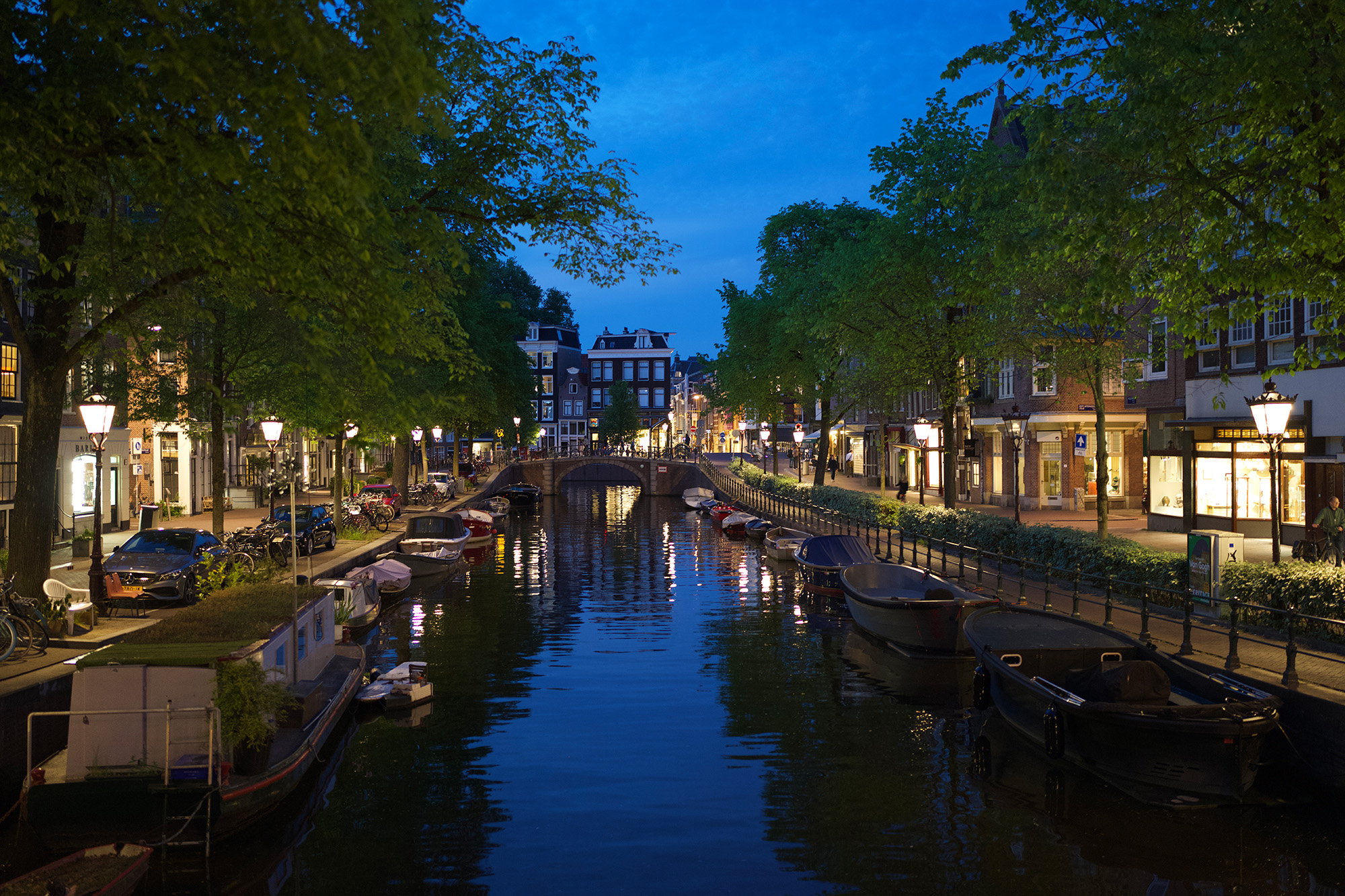
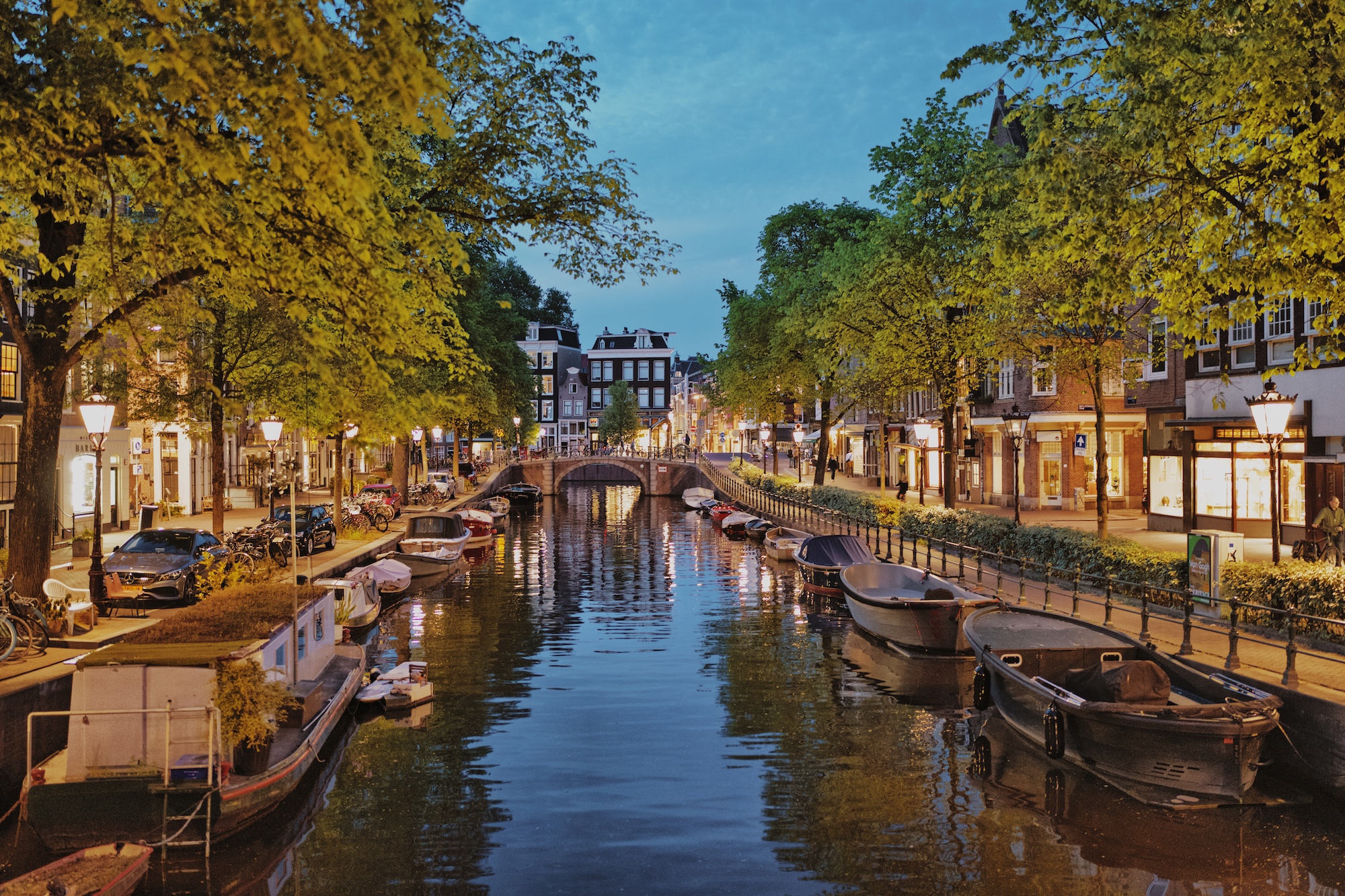
If the photo looks lifeless after recovery, don't immediately crank global contrast to compensate — that's the fastest route to a harsh result. Rebuild it locally with whites and blacks first, then fine-tune with Curves. Because Darkroom's recovery is spatially aware, a soft sky and a textured field in the same frame are treated differently, so you can be aggressive where it helps and gentle where it would hurt.
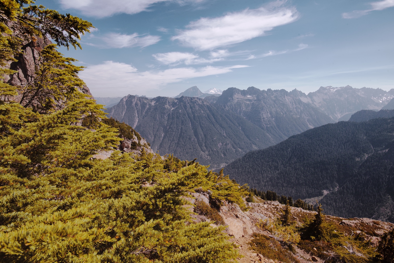
## Fix color before you stylize
With tones stable, correct color while it's still neutral. Set white balance and tint so whites and greys actually look neutral, then reach for [Color (HSL)](/help/edit/color-hsl) for targeted fixes — greens that read too neon, skin that's drifted magenta — keeping skin and neutral surfaces believable. Doing this housekeeping first makes the creative grade that follows far easier to control, because you're styling a clean image rather than fighting a color cast.
Only then shape the look. [Color Grading](/help/edit/color-grading) handles the broad mood — warm highlights against cool shadows for cinematic separation — while [Curves](/help/edit/curves-rgb) does the precision work, a subtle S-curve for depth and the individual RGB channels for color contrast within specific tonal ranges. Think of grading as the macro direction and curves as the micro-corrections.
## Handle detail with restraint
Lifting shadows makes noise more visible — that's normal, not a mistake. Check your work at more than one zoom level, because a setting that looks clean at 100% can look overprocessed across the full frame. The goal isn't to erase all texture; it's to balance detail against cleanup. If a file feels too clinical afterward, a touch of [grain](/blog/2021-07-improved-grain) can put some organic life back into it.
Before you export, compare against the original and check three zones specifically — highlights, shadows, and the skin or neutral midtones — and if it's bound for social, preview it small too, since over-sharpening and noise artifacts show up there first. Save the result as a [preset](/help/guide/create-preset) only once you've tested it on a few photos in different light; a look that's perfect on one frame can collapse on the next.
If you shoot **ProRAW**, everything above still applies — you simply have even more tonal latitude to work with, since ProRAW keeps the RAW data *and* Apple's computational processing in one file. The [ProRAW deep-dive](/blog/2020-12-proraw) explains why that combination is so forgiving to edit. (And for a sense of how far Darkroom's RAW handling has come, the [original RAW update](/blog/2018-10-raw) is a fun bit of history.)
The mistakes that sink RAW edits are predictable: starting with a heavy preset before fixing exposure, over-lifting shadows until everything reads grey and noisy, confusing saturation with genuine color quality, smearing detail in pursuit of zero noise, and judging the whole thing at a single zoom level. Work in passes — tonal, then color correction, then creative, then cleanup — and when a move feels dramatic, pull it back twenty or thirty percent and look again.
## Related
- [Use Color Grading for Mood](/help/guide/color-grading-mood) — shaping a look after the tones are right
- [Curves (RGB)](/help/edit/curves-rgb) — precise contrast and color by tonal region
- [Adjustment Sliders](/help/edit/adjustment-sliders) — the exposure and recovery controls in depth
- [Create a Custom Preset](/help/guide/create-preset) — save a finished RAW look to reuse
---
# Create a Custom Preset
> Save your edits as a reusable preset, refine it for consistency, and share it with the Darkroom community.
Source: https://darkroom.co/help/guide/create-preset
Section: Guides
Updated: 2026-03-06
In this guide, we'll dive into the key considerations for crafting your own presets. We'll walk you through a step-by-step process for developing your unique style, experimenting and refining your preset, and then sharing it with the Darkroom community.
A preset is essentially a collection of editing commands that allow you to quickly attain a specific look or style in your photographs, applied in one go instead having to apply each edit individually. They're an incredibly handy tool, offering a solid starting point and streamlining the photo editing workflow, while ensuring your photos maintain a consistent visual look.
---
## How to create a preset
If you are simply wondering what steps to take to practically create a presets:
1. Make sure you have opened a photo and have made edits.
2. Go to the preset tool and tap the “Create a New Preset” button.
3. Finally, giving it a name in the dialog that appears.
4. Your newly created preset will now show in the “My Presets” section.
That’s it, you are done creating a preset.
Now, we made the below quick and easy to follow tutorial video to help you get started with creating a preset. It’s a great way to get a feel for the process and see how it’s done. However, if you are looking for a more in-depth guide, keep reading as there are more considerations when creating your preset. The key of these considerations is to strike a balance between personal style and universal versatility when developing a preset.
[Make Your Own Custom Presets on iPhone](https://www.youtube.com/watch?v=MEYE0MeQx58)
---
## Develop your own custom preset
Creating a preset solely by experimenting with sliders while looking at a photo can be challenging. It is creatively more effective to begin with a clear goal in mind, so that you can determine when you have achieved your desired result.
When determining your style, it is important to try and analyze your preferred aesthetic and mood. Consider the overall look and feel that you want to convey in your photos. Are you attracted to vibrant and vivid colors, or do you prefer a more subtle and muted palette, or perhaps even black and white? What emotion do you want to impart on your photos, bright and fun, or dark and moody? Do you lean towards a clean and minimalist style, or do you prefer a bold and dramatic approach? Perhaps you want to replicate a specific look that you have seen before? At this stage, there is no right or wrong answer; it is subjective, so focus on what you personally like.
It is very helpful to gather example photos that you admire to create a mood board. This can serve as a reference point as you develop your preset. Platforms like Pinterest and Instagram are great sources of inspiration to start with.
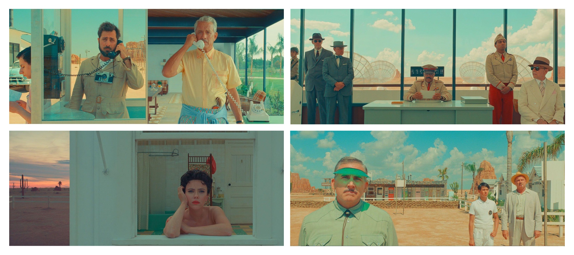
*Wes Anderson’s Asteroid City Moodboard, photos by Focus Features*
### Inspect, play and learn
Collecting photos of looks you like, and trying to recreate the look is a well established and great way to learn and create presets. Playing around with the different tools to recreate or match a look is a great way to learn how to create a preset. What you might not have realized, is that when you apply any of the bundled or [community presets](/presets) in Darkroom, you can inspect all the tools to see and learn exactly what tools and specific edits where used to achieve that look! Dissecting or recreating presets offer a fantastic learning opportunity. By understanding the adjustments and choices made in a look, you can gain deeper insights into advanced color grading techniques.
### Create an opinionated first preset
Start by making bold and significant changes. Don't be afraid to push the limits of each tool. Sometimes the most unique and personal presets come from unexpected tweaks and adjustments. Often, we tend to make subtle changes that are not distinctive enough. Once you have an opinionated starting point, it becomes easier to gradually tone it down where necessary.
While it is possible to create a single preset that works on any photo, it can limit your ability to enhance the colors in the photo. That's why we recommend starting with a specific look that you like, and then consider creating variants of that preset that work well for bright/dark or flat/contrasty photos. Having a naming system, which we will discuss later in this guide, allows you to easily identify which preset works best for different photos.
### Tools to use in Darkroom
When creating your own presets in Darkroom, it is recommended to primarily use the curves, color grading, selective color, and masks tools for making adjustments. These tools offer a wide range of flexibility and control over the editing process. Use the Selective Color tool to make the blues in a summer sky more vibrant, or employ Masks to subtly darken the background in a busy street scene. By excluding basic adjustments like brightness, contrast, blacks, and whites from your preset, you enable yourself and others to freely apply the preset and separately make photo specific lighting adjustments.
If you don’t do this, your presets adjustments either won’t be applied, as the adjustments already made to the photo are prioritized and will be kept. Or, if you first apply the preset and then make adjustments the additional changes will have less available range.
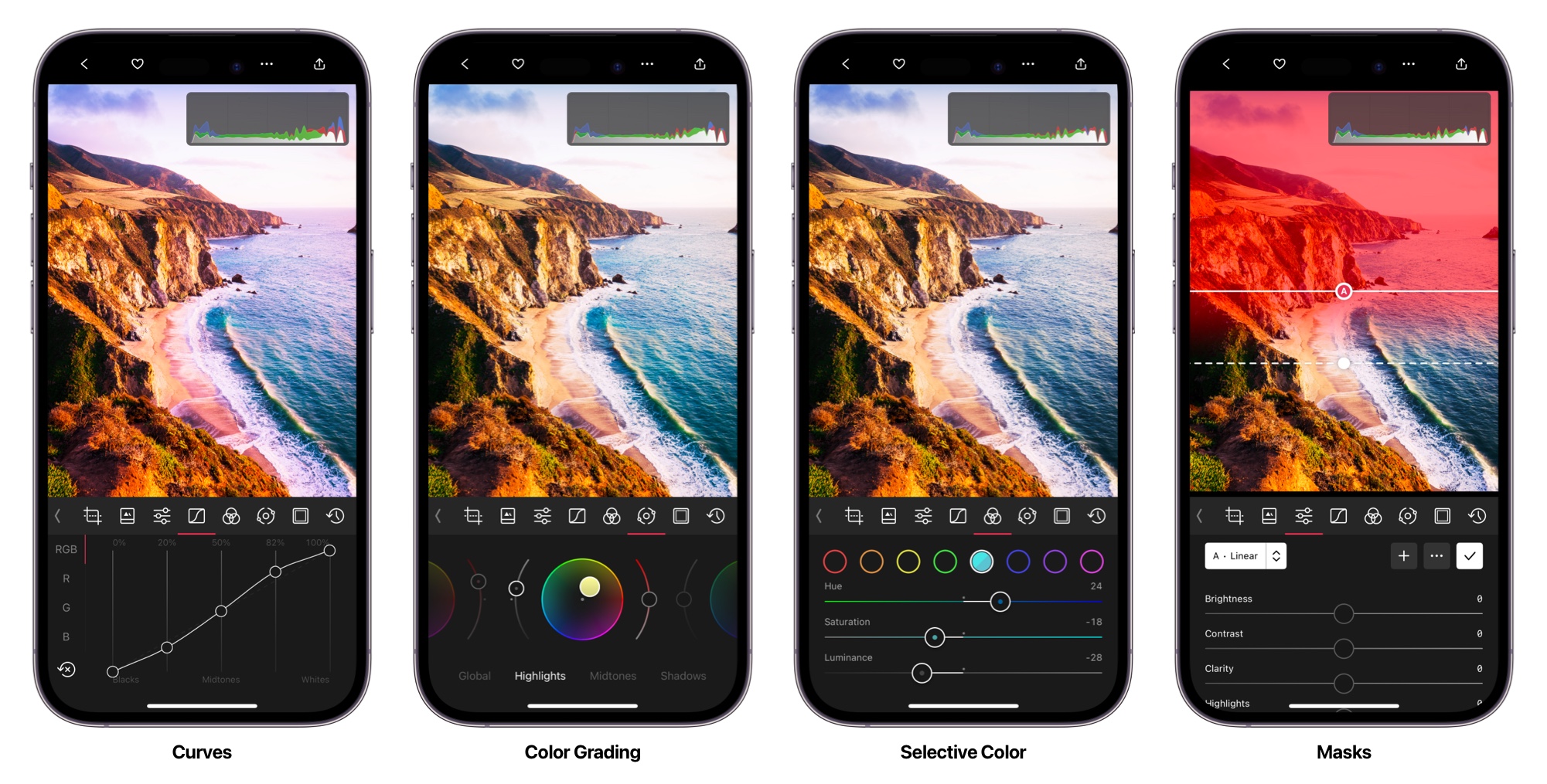
1. **[Curves](/blog/2015-06-curves-part-1-of-2)** We recommend by starting with this tool first, as it allow you to adjust the basic lighting, by brightening or darkling the whole image. As well as adjust contrast by manipulating the light and dark areas of an image separately. You can create deeper blacks, brighter whites, and everything in-between, giving you more control over the overall tone and mood of the photo. And with curves support for individual colors curves can also be used to tweak colors and color casts. By adjusting the curves for individual color channels (like red, green, and blue), you can correct color imbalances and enhance tones in a way that's often more precise than using the selective color tool.
2. **[Color Grading](/blog/2022-12-12-color-grading)** wheels make it easy to visually adjust the balance of colors overall, or in your shadows, mid-tones, and highlights specifically. By simply dragging a point around the wheel, you can add or reduce specific colors in these tonal ranges. This is super handy for creating a balanced or stylized look, with the ability to make the whole photo, or just the shadows, look warmer or cooler.
3. **[Selective Color](/blog/2015-08-color-tool)** enable quick control over individual color regions, giving you the ability to adjust their brightness, saturation and shift their hue. Want to make those blues pop in the sky, or shift them to teal, or make the grass seem more green and saturated. Be careful when using the red and orange tones as they tend to significantly impact skin colors.
4. **[Masks](/blog/2022-04-masks)** are a pretty advanced and powerful way for you to layer different color adjustments on top of each other. This means you can have one set of color adjustments for the background and a different set for the subject, all within the same preset. It's like having multiple presets in one. By adjusting colors in specific areas, you can guide the viewer's eye and create a sense of depth. For instance, you might want to desaturate the background while keeping the subject in full color, drawing attention to them.
### Add subtle effects for visual interest
Vignettes, [grain](/blog/2021-07-improved-grain), masks, and even [clarity](/blog/2021-05-clarity) can add subtle yet impactful effects to your photos, enhancing visual interest and directing the viewer's attention. Experiment with vignettes and masks to darken the edges of the frame slightly, drawing the eye towards the central subject. Or consider applying grain to compliment your overall editing style to gain a more vintage look. These elements can add a unique touch to your photos and contribute to the cohesive look you're aiming for.
Remember, the process of identifying your editing style and making creative choices is subjective and personal. It's about expressing your unique vision and creating a visual language that reflects your aesthetic preferences and mood. Enjoy the exploration and experimentation as you develop your editing style in Darkroom.
---
## Testing and iterating on your preset
Continuously experimenting, evaluating, and refining your preset is the only way to truly make it your own, versatile, and over time, gain enough confidence to share it with others.
### Update your preset
Once you have your first pass on a set of edits that you like, and you have created a preset of those edits, you will likely want to update your preset whenever you make follow up edits. We have tried to make this as easy as possible. So when you have created and applied a preset, and make any subsequent changes we will indicate that your preset can be updated by showing dot • in front of the name. To actually update it, tap the ••• preset action icon, and use the available Update button to update your preset.
### Preview and Compare
To create a high-quality and somewhat broadly effective preset in Darkroom, it is crucial to preview and compare your edits throughout the preset development process on a wide range of photos. By doing so, you can iteratively refine the preset and evaluate its impact on your photos.
***Tip:*** You can tap-and-hold on your photo to quickly see the original unedited image. Enabling you to quickly visually compare what your edits are doing compared to the original photo.


By continuously previewing and comparing your preset, you can ensure that it delivers the desired visual style and maintains a cohesive look across a range of photos. This iterative process allows you to fine-tune the preset settings, ensuring that it achieves the intended effect while preserving the original qualities of the photos.
***Tip:*** To help in this process it can be useful to create a specific album with photos to test on. And to now end then export a few photos with the preset applied into a separate album. This way you can look through both originals, and previous version to compare changes made over time.
### Ensure compatibility with different subjects and skin tones
When applying your preset to different photos, it's important to ensure compatibility with various subjects and specifically skin tones. Each photo may have unique characteristics that require adjustments to achieve optimal results. Pay attention to how your preset affects different types of photos, such as landscapes (sky, water, vegetation), portraits (skin tones), or still life shots. Skin tones are specifically very important, so make adjustments if necessary to maintain a natural and pleasing appearance. Be careful not to brighten or darken skin tones (near orange) specifically as that can easily cause unintended results.
---
## Naming, sharing and gathering feedback
It can take a bit of time to develop a preset. It’s actually very good practice to just leave it be for a while to then come back to it with a fresh set of eyes. Either way, have fun with the process, don’t feel the need to rush it.
### Name your preset
By now we are pretty sure you have already given your preset a name as you have been developing it. You might have noticed that giving it a short name has helped as there aren’t a lot of characters available.
For the presets bundled with Darkroom we developed a naming convention. Perhaps you will find it useful. This can be especially useful if you want to develop a set of presets. But if you want to develop presets that stand on their own you can also just give them fun short names.
So, what are these Darkroom preset names; C100, I250, etc? The letter (C) represents the set name (Cinematic). The first number represents the main variant (C100), the second number a subtler or stronger sub-variant (C110).
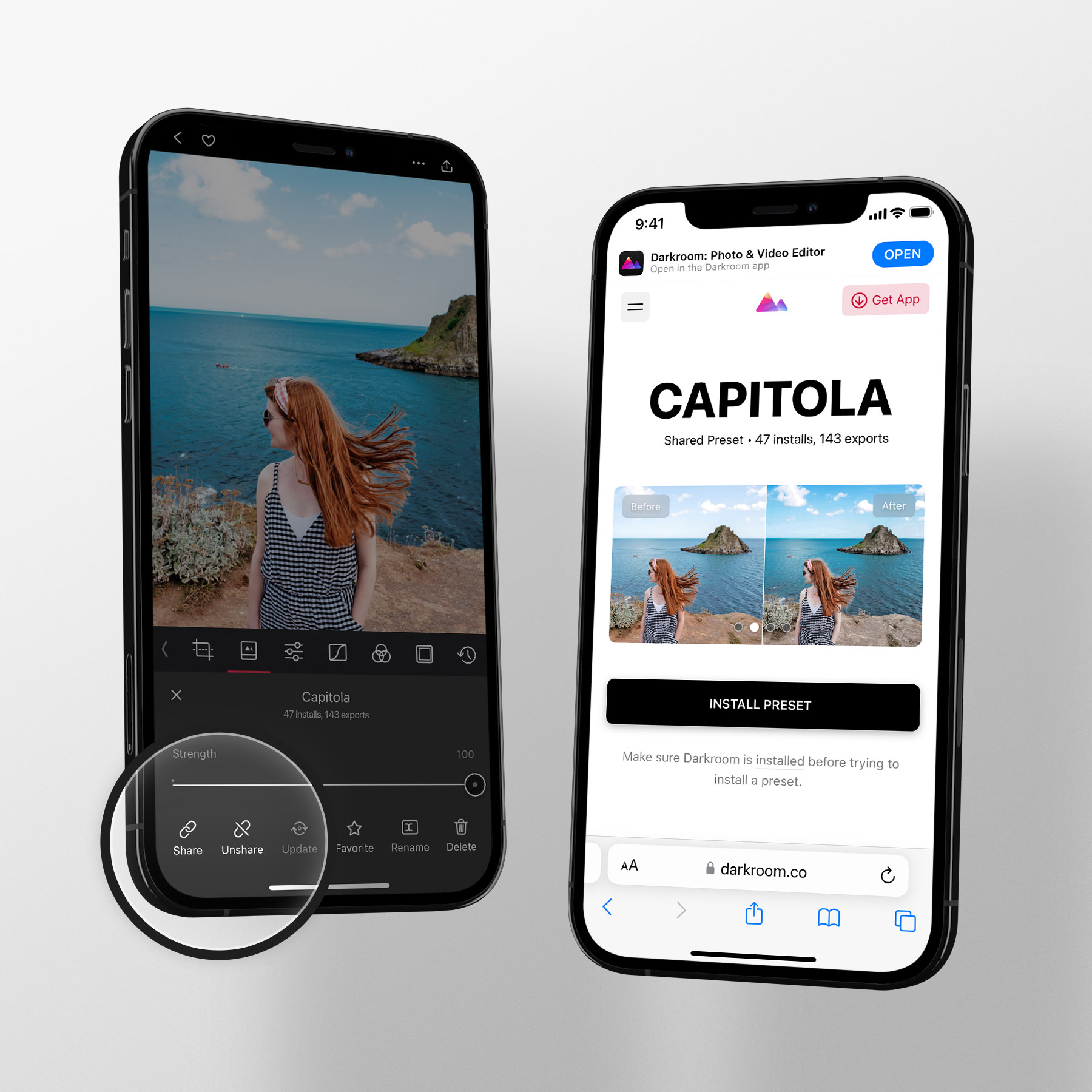
*Share your custom presets with anyone quickly and easily using a simple link*
### Share to gather constructive feedback
To Share your preset, tap the ••• preset action menu, and use the Share option you will find in the Preset actions options. When you do that we will upload your preset and create a unique URL, which you can then share with anybody.
To further refine and improve your preset, it can be valuable to seek feedback from others. Sharing your preset with the Darkroom community or trusted peers can provide valuable insights and constructive criticism. By gathering feedback, you can identify areas for improvement, address potential issues, and enhance the overall quality and usability of your preset. Embrace the opportunity to collaborate and learn from others to create a preset that resonates with a wider audience and contributes to the Darkroom community.
***Tip:*** Once a preset is shared, you have the flexibility to un-share it, make updates, and share it again, ensuring that all users have access to your latest changes.
---
In conclusion, creating your own presets in Darkroom allows you to establish a unique and consistent editing style for your photos. By inspecting and learning from existing presets, using the recommended edit tools, and identifying your preferred aesthetic and mood, you can craft presets that reflect your personal vision. So go ahead, unleash your creativity, and develop presets that bring your photos to life in a distinctive and captivating way.
---
# Use Color Grading for Mood
> Shift shadows, midtones, and highlights with color grading wheels to set mood — warm intimacy, cool distance, or cinematic contrast.
Source: https://darkroom.co/help/guide/color-grading-mood
Section: Guides
Updated: 2026-03-06
Color grading is the art of shifting colors in an image to create a specific mood or atmosphere. It's the difference between a photo that looks like a snapshot and one that feels like it belongs in a film or editorial.
Unlike basic color correction — where the goal is accuracy — color grading is about emotion. Warm tones can make an image feel intimate and nostalgic. Cool tones create distance, tension, or calm. And the interplay between warm and cool across different tonal ranges is what gives professional work its cinematic depth.
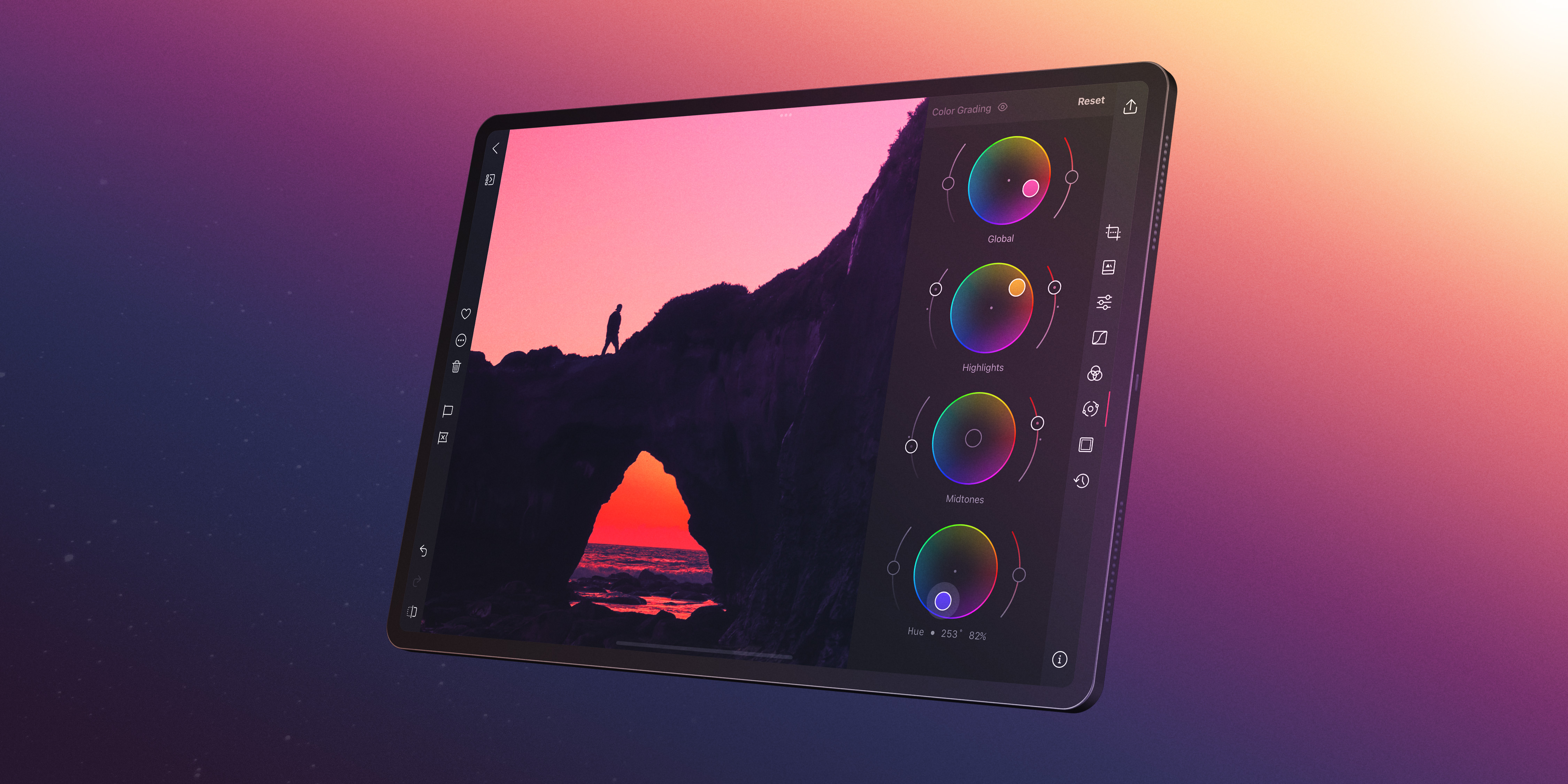
Darkroom's **Color Grading** tool gives you independent control over the color cast in your shadows, midtones, and highlights. This guide shows you how to use it to create four distinct moods, and how to fine-tune your grade with Curves and Saturation.
---
## How Color Grading Works
The Color Grading tool provides four color wheels:
- **Global** — shifts the overall color cast of the entire image.
- **Shadows** — affects only the dark tones.
- **Midtones** — affects the middle tonal range where most of the image lives.
- **Highlights** — affects only the bright tones.
Each wheel lets you choose a **hue** (the color direction) and **saturation** (how strong the shift is). The **Balance** slider controls where the boundary between shadow tones and highlight tones falls, letting you expand or contract each range.
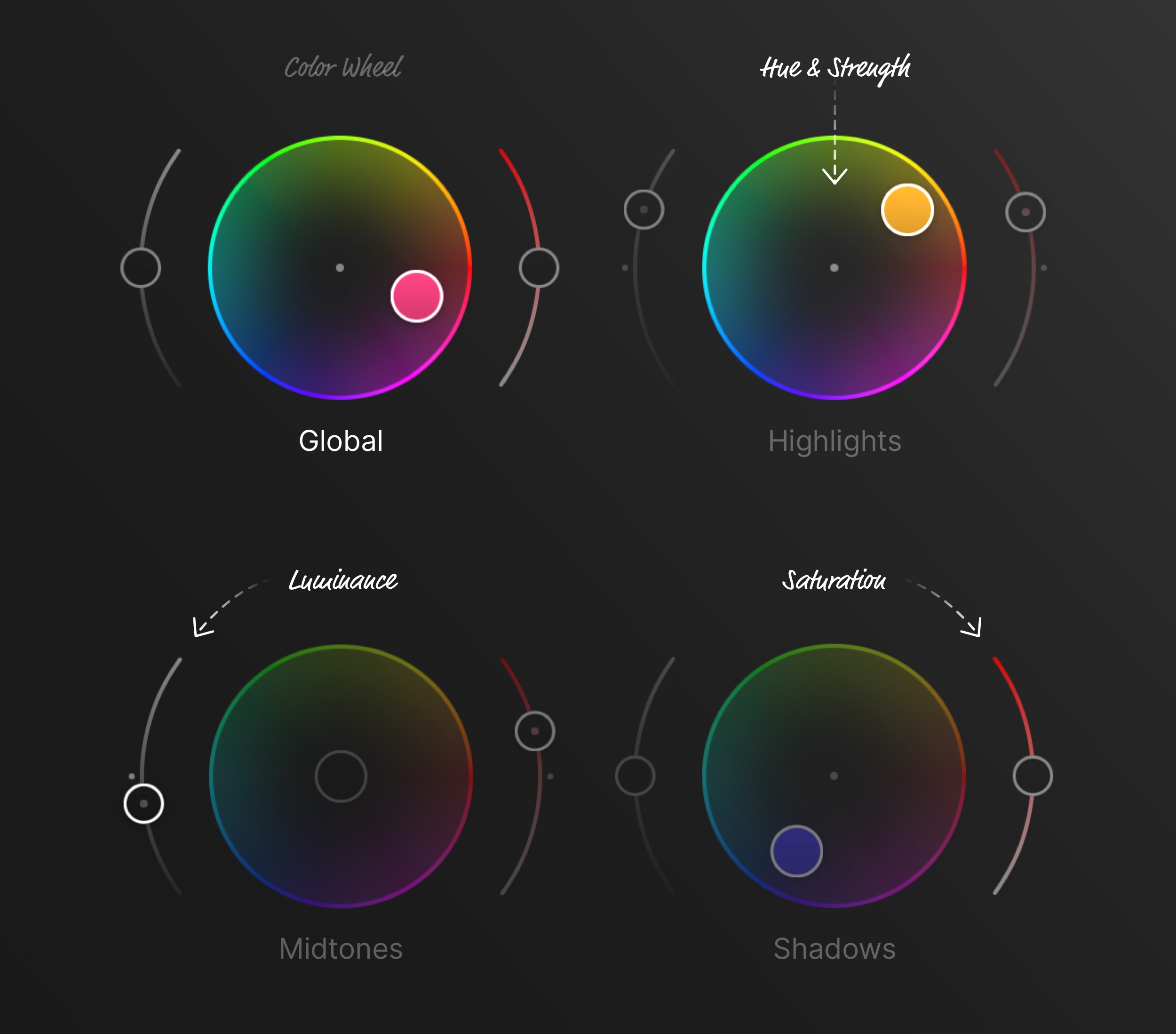
The power of color grading lies in using different colors for different tonal ranges. Warm shadows and cool highlights, or cool shadows and warm highlights — these complementary splits create visual tension and depth that a single global tint can't achieve.
---
## Step-by-Step: Warm Golden Hour Look
This grade enhances the warmth of golden-hour light, making everything feel sun-drenched and inviting.
### 1. Set the Shadow Tone
Open the **Color Grading** tool and select the **Shadows** wheel. Push the color toward **warm amber or orange**. Keep the saturation moderate — you want warmth, not a heavy orange tint. This replaces cold blue-gray shadows with something that feels like late-afternoon light.
### 2. Set the Highlight Tone
Switch to the **Highlights** wheel and push toward **warm yellow or light gold**. This makes bright areas glow with the warmth of direct sunlight. Again, keep the saturation gentle.
### 3. Adjust the Midtones (Optional)
The midtones wheel can add a subtle overall warmth. A very slight push toward yellow or peach unifies the look. Be careful here — midtones affect the largest portion of the image, so even small shifts are noticeable.
### 4. Fine-Tune the Balance
Use the **Balance** slider to shift the boundary between shadow and highlight tones. Moving it toward the shadows will extend the warm highlight tone further into the image, amplifying the sun-drenched feel.
### 5. Boost or Temper the Grade
If the warmth feels too strong, lower the **Saturation** slider in the Adjustment Sliders by 5–15 points to take the edge off. If it feels too subtle, increase **Vibrance** slightly to bring out the warm tones without oversaturating everything.
---
## Step-by-Step: Cool Moody Look
This grade pushes the image toward cold, desaturated tones — think overcast days, nighttime cityscapes, or brooding portraits.
### 1. Set the Shadow Tone
In the **Shadows** wheel, push toward **blue or teal**. This is the foundation of the moody look — cool shadows create a sense of coldness or emotional distance.
### 2. Set the Highlight Tone
Keep highlights neutral or push them very slightly toward **pale blue or lavender**. You want the cool feeling to be consistent, without any warm relief.
### 3. Lower Exposure and Lift Blacks
In the **Adjustment Sliders**, lower **Exposure** slightly (-0.3 to -0.5) to darken the overall image. Moody images tend to be underexposed. Optionally, lift the **Blacks** slider slightly to keep the shadows from going completely dark — this adds a slightly hazy, atmospheric quality.
### 4. Desaturate
Lower the **Saturation** slider by 20–35 points. Moody images work best with muted, restrained colors. The blue/teal grade should tint the image without making it look like a color filter was applied.
### 5. Adjust Contrast
A moderate increase in **Contrast** (+15 to +25) helps the remaining tonal range feel intentional. You can also use a gentle S-curve in the **Curves (RGB)** tool for more control.
---
## Step-by-Step: Cinematic Teal and Orange
The teal-and-orange look is everywhere in cinema. It works because teal and orange are complementary colors — they create maximum visual contrast when placed side by side. In practice, skin tones fall in the warm/orange range, and shadows and backgrounds are pushed toward teal.
### 1. Push Shadows Toward Teal
In the **Shadows** wheel, push toward **teal** (between cyan and green). This is the cooler half of the look — it will color your shadows, dark backgrounds, and any non-skin areas in the darker tonal range.
### 2. Push Highlights Toward Warm Orange
In the **Highlights** wheel, push toward **warm orange or amber**. This warms up bright areas and skin tones, creating the characteristic warm-cool split.
### 3. Balance the Split
Use the **Balance** slider to control how much of the image falls into the teal versus the orange. For portraits, shift balance toward shadows so the warm skin tones extend further into the midrange. For landscapes or urban scenes, keep it more centered.
### 4. Refine with Curves
Open the **Curves (RGB)** tool and switch to individual color channels for precision:
- In the **Blue** channel, lift the shadow region slightly (adds blue/teal to shadows) and lower the highlight region (removes blue from highlights, adding warmth).
- In the **Red** channel, a very subtle lift in the highlights can enhance the orange warmth in skin tones.
Curves and Color Grading complement each other — use Color Grading for the broad strokes and Curves for the fine details.
### 5. Control Intensity
Use the **Saturation** and **Vibrance** sliders to dial in the final intensity. If the teal-orange split feels too aggressive, lower Saturation. If you want to push it further, increase Vibrance — this amplifies the less-saturated colors (like the teal tones) without oversaturating already-vivid hues.
## Fine-Tuning with Curves RGB Channels
The **Curves (RGB)** tool isn't just for contrast — its individual Red, Green, and Blue channels let you shift color balance at any point along the tonal range. This makes it a powerful companion to the Color Grading wheels.
Some useful techniques:
- **Lift Blue shadows** — adds a blue cast to the darkest tones, great for a cool base.
- **Lower Blue highlights** — removes blue from bright areas, adding warmth. Combined with the above, you get a classic warm-highlight/cool-shadow split.
- **Lift Red midtones** — adds subtle warmth to skin tones and midrange areas.
- **Lower Green shadows** — adds a magenta tint to the shadows, which works well for moody or fashion-oriented edits.
The key difference between Curves and Color Grading: Curves applies color shifts based on the pixel's brightness, while Color Grading uses its own tonal mapping. For most grading work, start with Color Grading for the broad mood, then use Curves channels to refine specific tonal regions.
---
### Related Topics
- [Create a Custom Preset](https://darkroom.co/help/guide/create-preset)
- [Make Photos Look Like Black and White](https://darkroom.co/help/guide/black-and-white)
---
# Edit Portraits with Masks
> Brighten a face, soften skin, and lift a subject off its background — a mask-driven portrait workflow that keeps every adjustment where it belongs.
Source: https://darkroom.co/help/guide/portrait-editing
Section: Guides
Updated: 2026-06-10
A great portrait draws attention to one thing — the subject's expression, their eyes, the quality of light on their face. Everything else in the frame should support that, not compete with it. The trouble is that global adjustments treat the whole image equally: brighten the face and you blow out the background, soften skin and you lose the crispness of hair and clothing. [Masks](/help/edit/masks-local-adjustments) solve this by letting you edit each part of a portrait on its own terms, so the light, color, and texture all point the viewer toward the person.
This is the workflow to reach for whenever the face is underexposed by backlighting or harsh sun, when a busy background pulls focus, or when skin tones simply need a little care. Get the overall exposure roughly right first — masks are refinements, not your primary exposure fix — then open **Masks** in the Edit view toolbar and build the portrait up area by area.
## Brighten the face
Start by making the face the brightest, most inviting part of the frame; that's what naturally draws the eye. Add a **Subject** mask and Darkroom's on-device AI selects the person for you. If that selection is broader than you want — catching the full body when you only care about the face — a **Radial** mask centered on the face gives you tighter control.
Inside the mask, lift **Exposure** until the face reads clearly, open the darker pockets under the chin, eye sockets, and jawline with **Shadows**, and ease **Highlights** down a touch if the forehead or cheekbones are catching too much light. You're recreating what a fill light or reflector would do in a studio: soft, even illumination across the face. Keep the neck and ears inside the adjustment too — a bright face above a dark neck reads as unnatural immediately.
## Soften skin without erasing it
Most portraits benefit from a subtle skin softening that reduces the look of pores and small blemishes without turning skin to plastic. The quickest route is to lower **Clarity** inside your Subject or Radial mask. Clarity controls midtone contrast, so pulling it back smooths fine texture while preserving the overall structure of the face. On Portrait and ProRAW photos you can go further with the **Skin** smart mask, which isolates skin and leaves eyes, eyebrows, lips, and hair sharp — exactly the separation you want.
The restraint matters more than the technique. The edit should be invisible: the viewer should simply think the subject has great skin, not notice a beauty filter. Real skin has texture, and the goal is to quiet distractions, not wipe out detail.
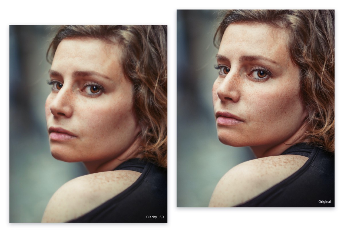
*Reducing Clarity smooths skin while keeping hair, eyes, and other features sharp — the foundation of a natural portrait retouch.*
## Separate the subject from the background
With the subject looking its best, push the background back to create separation. The fastest way is **Duplicate and Invert** on your Subject mask — that hands you an exact inverse covering everything that isn't the subject. (If Darkroom detects a **Background** mask directly, that works just as well.)
Inside the background mask, lower **Exposure** to darken it, drop **Saturation** so its colors stop competing, and, if you like, ease **Sharpness** down to suggest the shallow depth of field of a wide-aperture lens. A brighter subject against a darker, muted background is the dimensional separation you see in professional portraiture. Go gently at the edges, though — pushed too far, AI masks with imperfect boundaries can leave a faint halo around the subject.
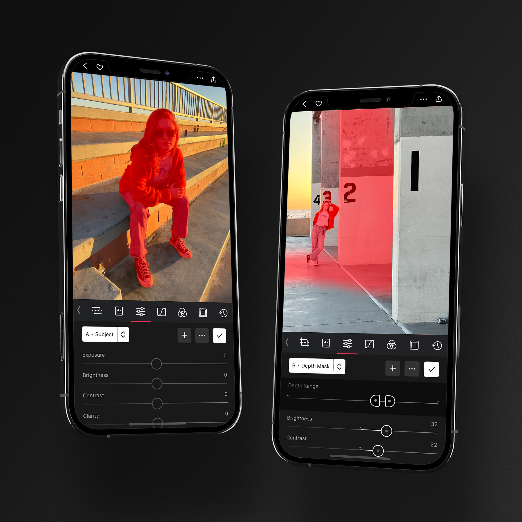
*Subject, Foreground, and Background masks split the scene front-to-back, so the person and their surroundings can be lit and graded independently.*
## Grade warm subject, cool background
Color grading becomes far more powerful when applied selectively. The classic portrait move is warm subject, cool environment — a complementary split that adds depth and pulls the subject toward the viewer. Inside the Subject mask, nudge **Temperature** warmer (or add subtle warmth with [Color Grading](/help/edit/color-grading)) to bring life to skin tones; inside the background mask, shift **Temperature** cooler. The contrast does the work.
You can also grade globally with the [Color Grading](/help/edit/color-grading) wheels: push **Highlights** toward warm orange to catch the bright areas of skin and **Shadows** toward cool blue or teal to settle the darker background, using the Balance slider to decide where the split falls. Selective grading rides on top of your overall white balance, so if the white balance is off, correct it globally before layering warm-cool adjustments on top.
## Finish on the eyes
The eyes anchor every portrait, and even small enhancements make them more expressive. Place a small **Radial** mask over the eyes — just large enough to cover both and the bridge of the nose — and apply the lightest touch: a hair of **Exposure** to brighten the irises and add a catchlight, a little **Contrast** to define the iris pattern, a gentle **Sharpness** boost for crispness, and only a whisper of **Saturation**, since over-colored eyes look artificial fast.
These adjustments should be felt, not seen. If you can point to the mask boundary, you've gone too far. The whole portrait works the same way: a well-placed Subject mask and its inverted copy usually carry most of the result, three or four masks is plenty, and toggling your edits on and off often is the surest way to keep an over-edited portrait honest.
## Related
- [Masks & Local Adjustments](/help/edit/masks-local-adjustments) — the full mask toolset behind this workflow
- [Make Local Adjustments with Masks](/blog/2022-04-masks) — the original feature tour
- [Clarity in Darkroom](/blog/2021-05-clarity) — how Clarity smooths skin while keeping detail
- [Color Grading Wheels](/help/edit/color-grading) — for the warm-cool split
---
# Edit Landscapes with Masks
> Recover the dynamic range your camera missed, deepen natural color, and lead the eye through a scene using masks, HSL, and curves.
Source: https://darkroom.co/help/guide/landscape-editing
Section: Guides
Updated: 2026-06-10
Landscape photography captures the scale and beauty of the natural world, but a straight-out-of-camera frame rarely matches what your eyes saw. Your eyes adapt across a scene's range, holding detail in both a bright sky and a dark foreground at once; a sensor can't. Good landscape editing bridges that gap — it recovers the detail the camera missed, brings back the colors that caught your attention, and directs the viewer through the scene. With Darkroom's masks, HSL controls, and curves you can do all of it non-destructively.
The techniques here apply across outdoor work: wide scenic views, high-dynamic-range sunrises and sunsets, forests and foliage rich with color, and travel shots you want to feel as vivid as the place itself. They reward [RAW files](/help/guide/raw-editing) especially, since the extra latitude gives you far more room to recover highlights and lift shadows cleanly. The workflow below moves from sky to foreground.
## Enhance the sky
The sky is usually the first thing a viewer notices and the area most likely to wash out. A **Linear** mask lets you treat it independently: position it over the sky, then lower **Highlights** to recover detail in bright clouds, add a little **Contrast** to give cloud formations definition, and deepen a blue sky with a small drop in **Exposure** or a gentle **Saturation** lift. A slightly cooler **Temperature** makes the sky read deeper, and a touch of **Clarity** inside the mask brings out dramatic cloud texture without touching the land below. On portrait-orientation shots, the **Sky** smart mask follows the horizon automatically, even around trees and buildings.
The one caution worth keeping in mind: the sky and foreground have to feel like they belong in the same photograph. A heavily darkened, oversaturated sky can look striking on its own and completely unnatural next to the rest of the frame.
## Boost greens and foliage
Foliage almost always looks duller in a photo than it did in person. The [Color (HSL)](/help/edit/color-hsl) tool lets you target specific colors without disturbing the rest of the image. On the **Saturation** tab, boost the green channel to revive grass and trees and nudge yellow up too, since many natural greens carry a yellow component. On the **Luminance** tab, darkening greens slightly makes foliage read dense and lush rather than pale, while lightening yellows adds glow to sunlit grass. The **Hue** tab lets you steer the season: shift green toward yellow for warmer, golden foliage or toward cyan for cooler, deeper tones. The fastest way to land on the right channel is the Color Picker — tap a color in the photo and Darkroom selects the matching HSL band for you.
## Control dynamic range with masks
Most landscapes hold a wide brightness range, and applying global exposure compromises one end to fix the other. Editing the bright and dark regions separately is the single technique that does more for a landscape than any other. **Luminance Range** masks make this precise: build one targeting the dark tones and raise **Exposure** and **Shadows** to open foreground detail without touching the sky, then build a second targeting the bright tones and lower **Highlights** to pull back any remaining blown areas. It's the control HDR software promises, but you decide exactly how much and where. For simpler compositions, a **Linear** mask across the foreground works as an alternative.


## Shape light with curves
Once the dynamic range is balanced, the [Curves (RGB)](/help/edit/curves-rgb) tool shapes the overall tonal character. A gentle S-curve — shadows pulled down a little, highlights lifted — adds contrast that feels natural rather than aggressive. The individual color channels are the often-overlooked part: in the **Blue** channel, lift the shadow region to cool deep forest shadows and lake reflections and lower the highlights to warm the sunlit areas, creating the warm-cool split that mirrors how outdoor light actually behaves. A slight lift in the **Red** midtones adds golden warmth that suits a sunset or golden-hour scene.
## Final polish
A few finishing moves bring everything together. A moderate **Clarity** boost sharpens midtone detail in rock, bark, sand, and clouds — though it's additive and a little goes a long way, so stop before you see grungy halos around edges. A small **Sharpness** lift brings out fine texture, best checked at 100% zoom where over-sharpening and noise actually show. A subtle **Vignette** under **Effects** darkens the edges to draw the eye inward; wide-angle shots benefit most, but it should feel like a property of the lens, not an obvious overlay. Finally, revisit **Temperature** and **Tint** for overall mood — sunrise and sunset frames often look best pushed a touch warmer.
For atmospheric and film-leaning landscapes, a measured amount of **Grain** adds tactile texture and a sense of mood that clean digital files can lack. Darkroom integrates grain along a luminosity curve, so it stays subtle in bright skies and more present in darker regions — the way real film behaves — which keeps it convincing rather than noisy.
*Grain follows a luminosity curve — quiet in the bright sky, more pronounced in the shadows — for a natural, film-like texture.*
## Related
- [RAW Editing](/help/guide/raw-editing) — why landscapes benefit most from RAW latitude
- [Masks & Local Adjustments](/help/edit/masks-local-adjustments) — Linear and Luminance Range masks in depth
- [Color (HSL)](/help/edit/color-hsl) and [Curves (RGB)](/help/edit/curves-rgb) — targeted color and tone
- [Highlight & Shadow Recovery](/blog/2022-11-03-highlights-shadows) — the engine behind dynamic-range edits
---
# Edit Color into Black and White
> Turn color shots black and white using Darkroom.
Source: https://darkroom.co/help/guide/black-and-white
Section: Guides
Updated: 2026-03-06
Black and white photography strips away the distraction of color to focus on light, shadow, texture, and composition. A well-crafted black and white conversion can turn an ordinary photo into something timeless.
But removing color is only the first step. What separates a flat desaturated image from a truly striking black and white photo is how you control tones, contrast, and texture. In this guide, you'll learn how to use Darkroom's editing tools to create black and white images with depth and character.

## When to Use Black and White
Not every photo benefits from removing color. Black and white tends to work best when:
- **The scene has strong contrast** — dramatic light and shadow, harsh sunlight, or deep silhouettes give a black and white image its visual punch.
- **Textures tell the story** — weathered surfaces, fabric, skin, architecture, and natural patterns all gain emphasis without color competing for attention.
- **Color is distracting** — mixed or unflattering lighting, clashing colors, or busy backgrounds often look better in monochrome.
- **You want a mood** — black and white naturally evokes a sense of timelessness, nostalgia, or gravity that color can't always achieve.
- **The composition is strong** — leading lines, geometric shapes, and bold framing stand out more when color is removed.
---
## Step-by-Step Workflow
### 1. Start from a Black and White Preset (Optional)
If you want to jumpstart your black and white editing, the [Black & White preset collection](/presets/collections/black-and-white) in Darkroom features dozens of presets created by the community. Styles range from classic film emulations like Ilford HP5 and Kodak Tri-X to more modern, high-contrast looks.
Every community preset is fully transparent — you can see exactly which adjustments were made and tweak any setting to make it your own. This makes presets a great learning tool: apply one you like, then look at the Curves, Color, and Contrast settings to understand how the look was built.
### 2. Remove Color with the Saturation Slider
To make a photo black and white in Darkroom is to drag the **Saturation** slider all the way to the left (-100) in the Adjustment Sliders. This removes all color information, giving you a neutral grayscale starting point.
At this stage, the result will look flat — that's expected. Think of it as a blank canvas. The real work happens in the steps that follow, where you'll shape the tones, add contrast, and bring the image to life.
**Tip:** Leave the **Vibrance** slider alone for now. Vibrance affects color intensity selectively, specifically not touching skin colors, but since we're removing all color, Saturation is the right tool here.
### 3. Control How Colors Become Grays with Color Brightness
Here's where things get interesting. Even though your photo looks black and white, the original colors are still there underneath — and you can use them to control which areas appear lighter or darker.
Open the **[Color](/help/edit/color-hsl)** tool and pick the color you wish to adjust. Each color channel lets you brighten or darken the tones that were originally that color:
- **Push the Blue channel down** to darken skies and water, creating drama.
- **Push the Orange channel up** to brighten skin tones in portraits.
- **Push the Green channel down** to darken foliage and make it richer.
- **Push the Yellow channel up** to lift golden-hour highlights.
This is the digital equivalent of using colored lens filters in traditional black and white film photography. A red filter darkens blue skies; a yellow filter brightens skin. The Color tool in Darkroom gives you that same control, but for every color at once, and with far more precision.
Experiment freely here — small changes can dramatically reshape the feel of a black and white image.
### 4. Add Punch with Contrast and Clarity
Black and white images thrive on tonal separation. Without color to distinguish elements, you need contrast to do that work.
In the **Adjustment Sliders**, try:
- **[Contrast](/help/edit/adjustment-sliders)** — increase to widen the gap between lights and darks. Start subtle (around +20 to +40) and adjust to taste.
- **[Clarity](/help/edit/adjustment-sliders)** — boosts midtone contrast, which reveals texture and detail. Works especially well on architecture, landscapes, and anything with fine surface detail.
- **[Highlights & Shadows](/help/edit/adjustment-sliders)** — pull highlights down and lift shadows slightly to recover detail in both ends of the tonal range, or push them apart for a more dramatic look.
- **[Blacks & Whites](/help/edit/adjustment-sliders)** — set the endpoints of your tonal range. Crushing the blacks (pulling them down) creates deep, inky shadows. Pushing whites up adds bright, clean highlights.
There's no single right answer here. A high-contrast look with deep blacks feels bold and graphic. A softer approach with lifted shadows feels more gentle and film-like. Let the subject guide you.
### 5. Shape the Tonal Curve
The **[Curves](/help/edit/curves-rgb)** tool gives you the most precise control over the tonal range of your black and white image. It works on the combined brightness channel (RGB), letting you place control points anywhere along the range from blacks to whites.
A few starting points:
- **S-curve for contrast** — pull the shadows down slightly and the highlights up to add contrast. This is the classic curves move and works beautifully in black and white.
- **Lifted blacks for a film look** — raise the bottom-left point of the curve so the darkest shadows become dark gray instead of pure black. This creates the faded, matte look characteristic of many film stocks.
- **Highlight compression** — pull down the top-right point slightly to prevent highlights from becoming pure white, giving a softer, more analog feel.
The Curves tool also has individual tracks for Blacks, Shadows, Midtones, Highlights, and Whites — letting you make targeted adjustments without affecting the rest of the tonal range.
### 6. Add Film Grain
Grain is a hallmark of analog black and white photography. Adding it digitally can give your image a tactile, photographic quality that smooth digital files often lack.
In the **[Adjustment Sliders](/help/edit/adjustment-sliders)** the **Grain** slider adds a natural-looking film grain pattern to your image. Start with a subtle amount — a little goes a long way. The goal is to add texture without making the image look noisy.
Grain works especially well alongside the lifted-blacks technique from the previous step, together creating a convincing analog film aesthetic.
### 7. Get Creative with Toning and Duotones
A pure black and white image doesn't have to stay purely neutral. Many classic analog darkroom techniques involve toning — adding a subtle color cast to the grayscale image. You can achieve this in Darkroom using the individual color channels in the **[Curves](/help/edit/curves-rgb)** tool.
**Sepia / Warm Tone:**
Switch to the **Blue** channel in Curves and pull the midtones down slightly. This removes blue from the image, giving it a warm, brownish tone. For a richer sepia, also push the **Red** channel midtones up slightly.
**Cool Tone:**
Push the **Blue** channel midtones up for a cold, steely look that works well for urban and architectural photography.
**Split Tone:**
The most sophisticated approach — add warmth to the highlights and cool tones to the shadows (or vice versa). In the Blue channel, raise the shadow region while lowering the highlight region. This creates a beautiful tonal separation where warm and cool coexist in the same image.
**Duotone:**
Push a single color channel more aggressively to create a bold two-color effect. For example, lifting the Red channel across the entire range creates a striking red-and-black duotone.
These techniques layer on top of your desaturated image, so you're in full control of both the tonal structure and the color overlay.
---
# Library View
> Browse, sort, and organize your photos straight from your Apple Photos library — albums, folders, and smart collections, all in sync across your devices.
Source: https://darkroom.co/help/manage/library-view
Section: Organize
Updated: 2026-06-10
The library view is where you browse, organize, and manage your photos and videos. Darkroom reads directly from your Apple Photos library, so everything you see here reflects what's already in your library — albums, favorites, shared albums, and all. There's nothing to import and nothing copied onto our servers; we simply show you your own photos from iCloud, and we never analyze them or do anything with them without your explicit consent.

*The library view on iPad and iPhone — a familiar grid backed directly by your Apple Photos library.*
## The photo grid
If you've given Darkroom access to all your photos, they all appear in the grid with no importing needed — though you're free to grant access one photo at a time instead. The grid is the main way to browse: pinch on iPhone and iPad, or use the zoom slider on Mac, to change how many thumbnails fit per row, from large previews to a dense overview. Thumbnails are cropped to a square by default, so a composition may look slightly different from the full frame. On iPad and Mac, a filmstrip view is also available below the main photo view.
Opening a photo is as simple as tapping it on iPhone, iPad, and Vision Pro, or double-clicking on Mac (its native behavior). Once a photo is open, swipe left or right on iPhone, or use the arrow keys on iPad and Mac, to move between shots, and tap the back button or press Escape to return to the grid. You can sort the grid by **date created** — when the photo was taken — or **date added**, when it entered your library.
Quick actions live in the context menu: tap and hold a photo, or right-click on Mac, to **Share** it to other apps or people, **Favorite** or unfavorite it, **Hide** it from the library, or **Delete** it. To work on many photos at once, use **Batch**. On iPhone, iPad, and Vision Pro the Batch button sits at the top right, and you can start a selection quickly by swiping across the photos you want; once photos are selected, the batch actions bar appears at the bottom. On Mac you can multi-select by default, extending a selection with the **⌘** and **⇧** keys, with batch actions always present in the top-right toolbar.
You'll find **Settings** behind the gear icon at the top left on iPhone, iPad, and Vision Pro, or under the **Darkroom** menu on Mac — it's worth a look around for the many options tucked there.
## Album list
Your albums and folders live alongside the grid. On iPhone, a bar at the bottom of the grid gives you three smart albums — **Recents**, **Favorites**, and **Edited** — ready to go, and tapping the leftmost option with the **^** triangle opens the full picker with every smart album, folder, and album from your iCloud Photos library. On iPad, Mac, and Vision Pro, that album list is always present in the left-hand sidebar.
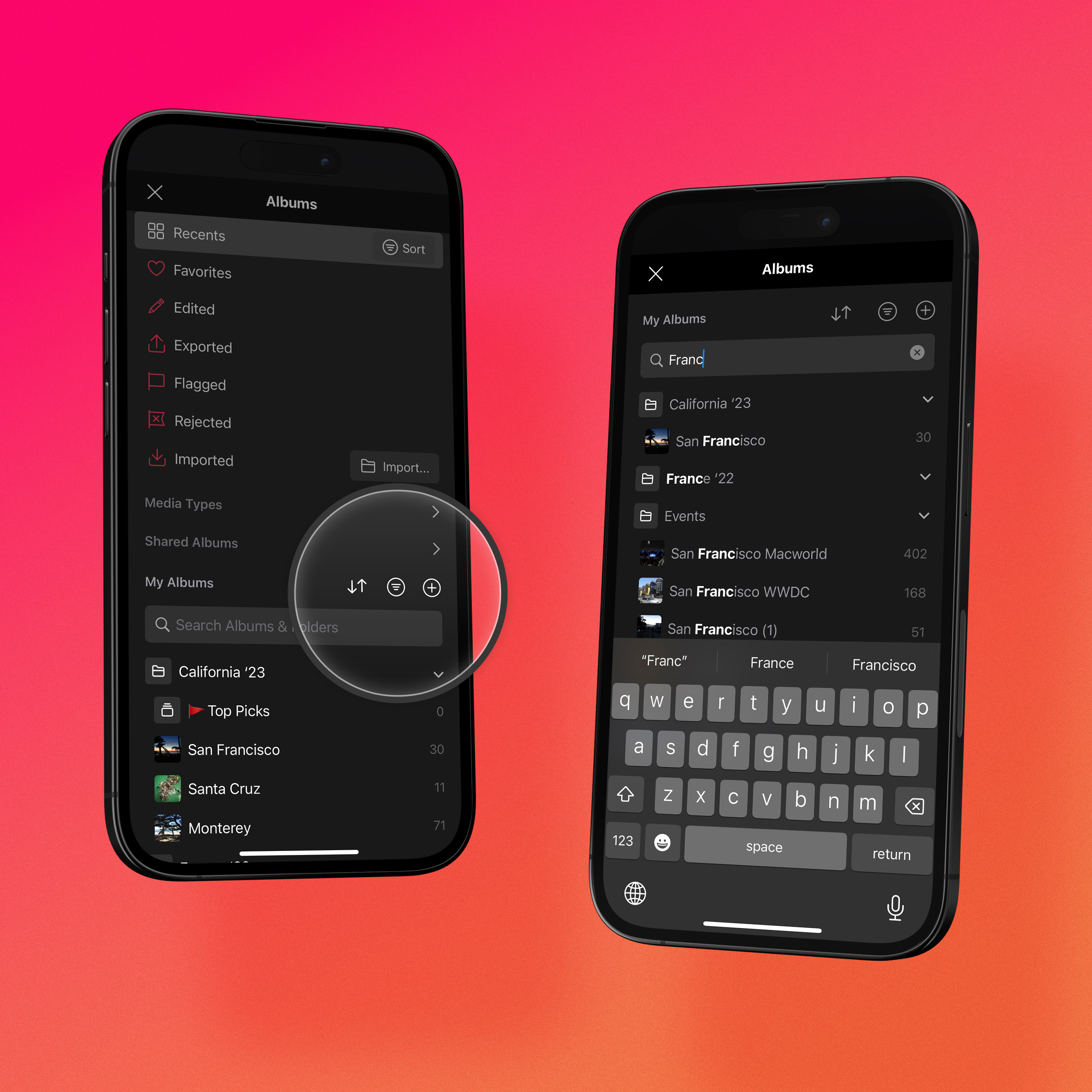
*Sort the album list manually, by name, or chronologically — and search across your albums and folders no matter how deep the hierarchy.*
Darkroom mirrors the smart albums Apple Photos offers: **Recents** for your most recently added media, **Favorites** for anything you've hearted, and **Edited** for photos you've worked on in Darkroom, plus media-type collections like **RAW**, **Videos**, and **Live Photos**. Shared albums from iCloud sit in the list beside your own, fully browsable and editable, and your personal albums appear below the smart ones, where you can reorder them, sort them, or find one by name with the search field at the top.
Folders let you group related albums, nest folders inside folders, and drag albums between them — and that structure syncs across all your devices through iCloud. You can create, rename, and delete albums right in Darkroom: to fill an album, select photos in the grid and choose **Add to Album**; to clear one out, open it, select the photos, and choose **Remove from Album**, which takes them out of the album without deleting them from your library.
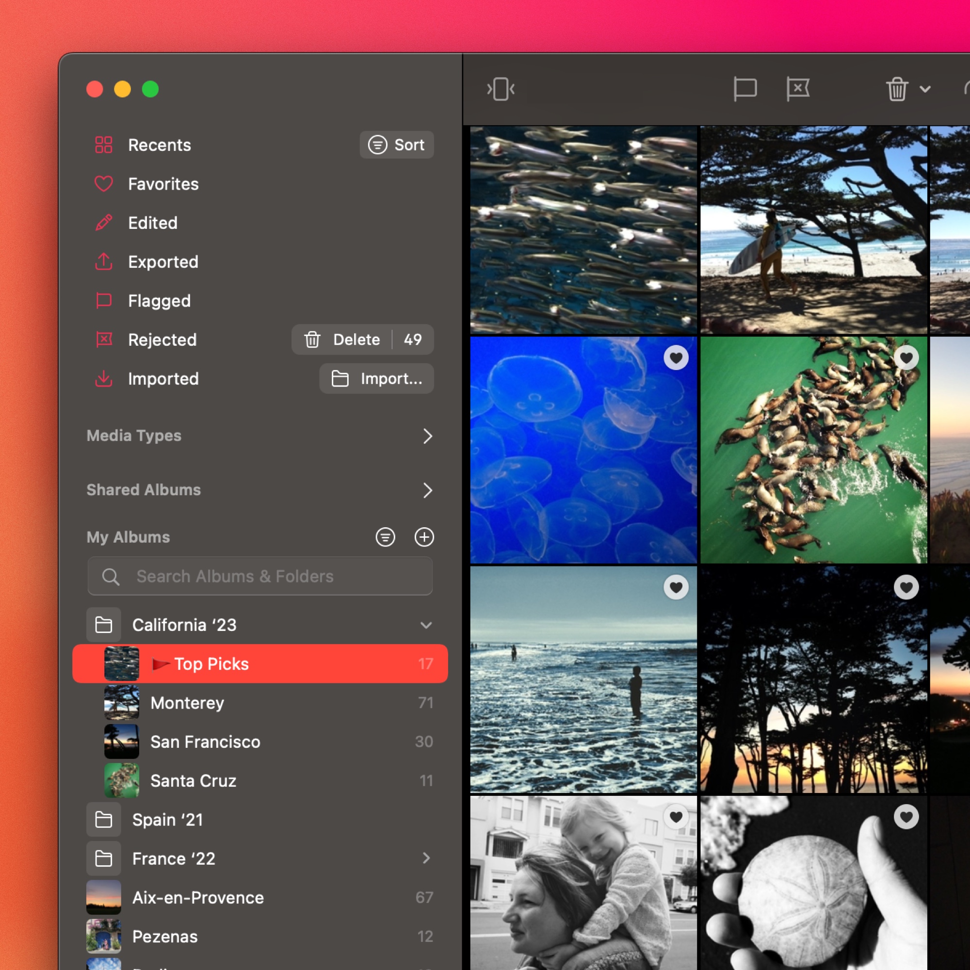
*On Mac the album list carries the same powerful sorting, search, and folder tools as on iPhone and iPad.*
When you need photos from somewhere other than your iCloud library, the **Import** option brings them in through Apple's Files app, so anything connected there — a DSLR memory card, a USB drive — is reachable. On Mac you can also drag and drop photos into the library from your desktop, and on iPad you can drag photos from your library onto any album in the sidebar.
## Platform differences
The library view adapts to each platform. On iPhone, navigation runs through the bottom tab bar, with the album list and photo grid as separate screens. On iPad and Mac, the album list appears as a sidebar beside the grid, so you can switch between albums without ever leaving the grid view.
---
# iCloud Library
> No catalog, no proprietary format, no importing — Darkroom reads straight from Apple Photos, so understanding how that works explains what syncs and what doesn't.
Source: https://darkroom.co/help/manage/icloud-library
Section: Organize
Updated: 2026-06-10
Darkroom works directly with your Apple Photos library. There's no catalog to manage, no proprietary library format, and no importing step — just open Darkroom and your photos are there.
## Why Darkroom Uses iCloud Photos
Darkroom started as an iPhone app, and the majority of people shoot photos with their iPhone. Building directly on Apple Photos means there's zero friction — you take a photo, open Darkroom, and it's right there. No importing, no syncing, no catalog to manage. For most people, this is the fastest possible workflow.
Unlike traditional photo editors that require you to import photos into a separate catalog or library, Darkroom reads directly from your Apple Photos library. Your photos stay exactly where they are, managed entirely by Apple Photos and iCloud.
This means:
- **Instant access.** Any photo or video in your library is immediately available in Darkroom — including albums, favorites, and shared albums.
- **No duplicate files.** Darkroom never copies your photos into its own storage.
- **No lock-in.** If you stop using Darkroom, your photos remain in Apple Photos, untouched.
When you first open Darkroom, it will ask for access to your photo library. You can grant access to all photos, or choose to give access to individual photos one at a time.
> Note that Darkroom does not currently support local catalogs or folder-based libraries like some desktop editors (e.g. Lightroom Classic). If your workflow revolves around importing photos from a DSLR or mirrorless camera into a local catalog, you'll need to import those photos to first for Darkroom to access them.
## How Edits Are Stored
All edits you make in Darkroom are **non-destructive**. Your original photo or video is never modified. Instead, Darkroom stores your adjustments in its own database on your device.
This is different from editors that write sidecar files (like `.xmp` files) or embed edit metadata into the image. Darkroom keeps its edit data separate, which means:
- Your originals are always preserved, exactly as Apple Photos manages them.
- When you do export using Save, Modify Original, behind the scenes Apple stores it as a new version, which can always be "Reverted" to the original.
- You can reset any edit, or revert to the original, at any time to return to the original.
- Edit data is lightweight and stored locally on your device.
## What Syncs & What Doesn't
Because Darkroom builds on Apple Photos, it's important to understand what iCloud handles and what it doesn't.
### Photos & videos sync via iCloud
Your photos and videos sync across all your Apple devices through iCloud Photos. Any photo you take on your iPhone will appear in Darkroom on your iPad or Mac, and vice versa. This is handled entirely by Apple — Darkroom simply reads from your library.
### Darkroom edits do not sync automatically
Darkroom's edit data is stored locally on each device. If you edit a photo on your iPhone, that edit won't automatically appear when you open Darkroom on your iPad or Mac.
To transfer your edits across devices, use the **Save, Modify Original** option. This writes the edited version back into Apple Photos as the modified original, which then syncs via iCloud. The other device will see the saved result, though it will appear as a new starting point rather than an editable Darkroom adjustment stack.
## Offline Editing
You can edit photos in Darkroom even when you're offline — as long as the photo is available locally on your device.
Apple Photos manages a local cache of your photos. When your device has enough storage, it keeps full-resolution versions of recent and frequently accessed photos. Older or less-used photos may be stored only in iCloud, with a lower-resolution thumbnail kept on your device.
Darkroom has no control over this cache. If a photo hasn't been downloaded to your device, you'll need an internet connection for Apple Photos to fetch it before you can edit at full resolution. You can manually download photos in Apple Photos to ensure they're available offline.
---
# Import
> Most of the time there's nothing to import — but when photos live on a camera, SD card, or in Files, here's how to bring them into Darkroom.
Source: https://darkroom.co/help/manage/import
Section: Organize
Updated: 2026-06-10
Darkroom works directly with your Apple Photos library, so most of the time there's nothing to import at all — your photos are already there the moment you open the app. The cases below are for the times they aren't yet: bringing in shots from a camera, an SD card, or the file system.
## From iCloud Photos, there's nothing to do
If you use iCloud Photos, every photo and video in your library is automatically available in Darkroom — no import step, just open and browse. A photo you take on your iPhone shows up in Darkroom on your iPad and Mac, and vice versa. For the full picture of how this works, see [iCloud Library](/help/manage/icloud-library).
## From a DSLR or mirrorless camera
When you connect a camera or SD card to your iPad or Mac, you import through Apple's built-in flow rather than a separate step inside Darkroom. On iPad that's the Photos app or the Files app; on Mac you can use Image Capture, the Photos app, or simply drag the files out of the card in Finder. Either way the photos land in your Apple Photos library, and Darkroom picks them up automatically — they appear in the **Recents** album as soon as they're in.
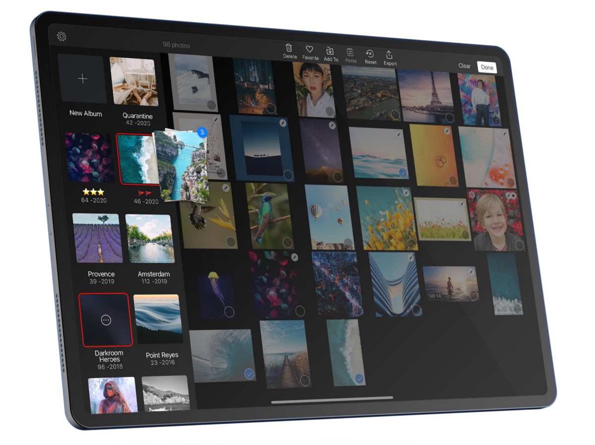
*However photos arrive — camera, SD card, or Files — they flow into your Apple Photos library and show up in Darkroom across every device.*
## From Files
You can also pull photos in from the file system. On iPhone and iPad, use the file picker to browse and select from Files, or open a photo in another app and save it to your photo library. On Mac and iPad, drag and drop photos straight into Darkroom or the Photos app — they're added to your library and appear in Darkroom immediately.
However they arrive, imported photos join your Apple Photos library and show up in **Recents** right away, syncing to your other devices if iCloud Photos is enabled.
## Supported formats
Darkroom supports the same image and video formats Apple Photos does — JPEG, HEIF, PNG, TIFF, ProRAW, and most RAW formats including DNG, CR2, ARW, NEF, ORF, and RAF for photos, plus H.264 and HEVC (H.265) for video. RAW support depends on your device and operating system version, since newer devices and OS releases recognize more camera models. The [FAQ](/help/start/faq) links out to Apple's documentation on supported RAW formats per device.
---
# Flag & Reject
> Cull a shoot fast by flagging keepers and rejecting rejects — then filter, batch-edit, or clean up from those marks.
Source: https://darkroom.co/help/manage/flag-reject
Section: Organize
Updated: 2026-03-06
Flag & Reject is a culling workflow that helps you quickly sort through a set of photos, marking the ones you want to keep and the ones you want to discard. It's especially useful after a shoot or trip when you have dozens or hundreds of similar shots to sort through.
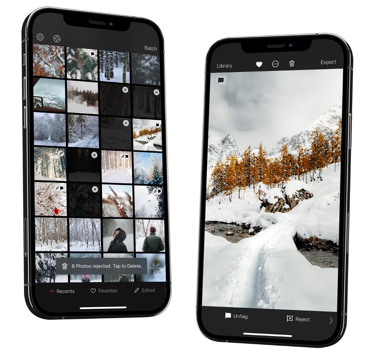
---
## How It Works
Every photo in your library starts in a neutral state — neither flagged nor rejected. As you review your photos, you mark each one:
- **Flag** — marks a photo as a keeper. Use this for the shots you like and want to keep or edit further.
- **Reject** — marks a photo for removal. Use this for duplicates, blurry shots, or anything you don't want to keep.
You can always change your mind — flagging or rejecting a photo is non-destructive and doesn't move or delete anything until you choose to act on it.
## The Culling Workflow
A typical culling workflow looks like this:
1. **Review** — open an album or your recent photos and start swiping through them one by one.
2. **Flag keepers** — as you go, flag the photos you want to keep.
3. **Reject the rest** — mark the photos you don't want with reject.
4. **Delete rejects** — once you've reviewed everything, filter to see only rejected photos and delete them in one go.
This lets you make quick, low-pressure decisions on each photo without having to immediately commit to deleting anything.
## Where to Find Flagged & Rejected Photos
Flagged and rejected photos appear in dedicated smart albums in your album list. You can tap into the **Flagged** or **Rejected** smart album to see only photos with that status, making it easy to review your selections or bulk-delete your rejects.
---
## Using Flag & Reject
### iPhone
When viewing a photo, the flag and reject buttons appear in the toolbar. Tap the flag icon to flag a photo, or the reject icon to reject it. Tap again to remove the status.
### iPad & Mac
The flag and reject buttons are available in the toolbar, just like on iPhone. You can also use keyboard shortcuts for faster culling:
- **P** — flag the current photo.
- **X** — reject the current photo.
- **U** — remove the flag or reject status.
This makes it possible to cull through a large set of photos very quickly using just the arrow keys and P/X.
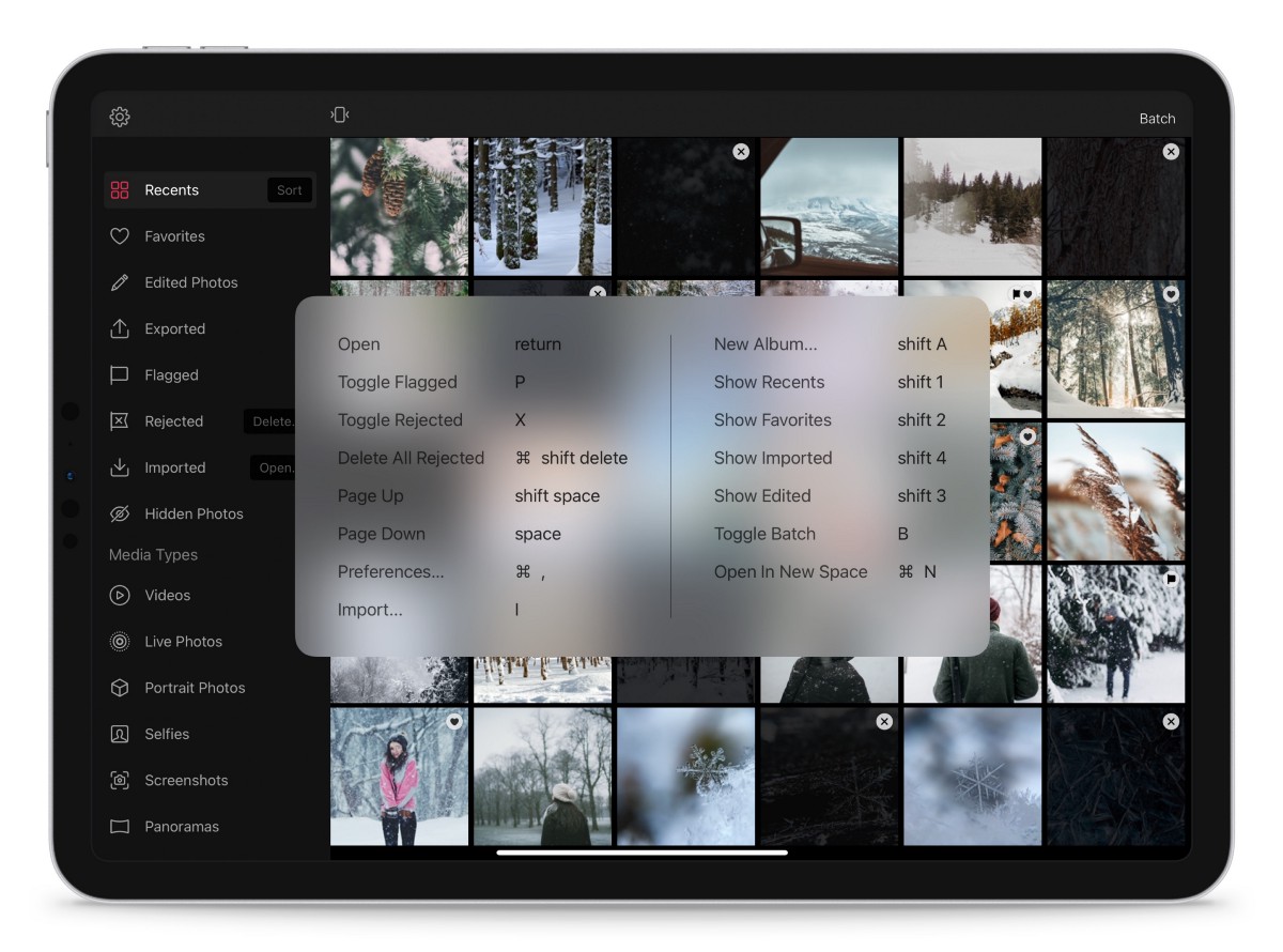
*On iPad and Mac, Flag and Reject sit alongside Favorite and Delete, with keyboard shortcuts to categorize a photo and advance to the next.*
---
## Batch Actions
You can flag or reject multiple photos at once. Select the photos you want in the library grid, then apply flag or reject to the entire selection. This is useful when you've already identified a group of photos you want to keep or discard.
To delete all rejected photos, open the **Rejected** smart album, select all, and delete. See [Batch Actions](/help/manage/batch-actions) for more on working with multiple photos.
---
# Batch Actions
> Select many photos at once and edit, organize, export, or clean them up in a single pass — the fastest way to keep a whole set consistent.
Source: https://darkroom.co/help/manage/batch-actions
Section: Organize
Updated: 2026-06-10
Most of Darkroom is built around one photo at a time, but real libraries don't work that way — you come home with forty shots from the same afternoon, all needing the same crop, the same look, the same album. Batch actions are how you handle a set as a set: select once, then apply an edit, an organizational change, or an export to everything you picked in a single move.
It starts with selection, and the gesture depends on your device. On **iPhone**, tap **Select** at the top-right of the library grid and tap the thumbnails you want — or swipe across several to grab a range quickly. On **iPad and Mac** you can hold **Command** and click to pick individual photos, **Shift** and click to grab a span, or use the same **Select** flow as on iPhone. When you want the whole album, **Select All** is the shortcut — handy for exporting an entire shoot or applying one edit across all of it. Once anything is selected, the batch actions bar appears (at the bottom on iPhone and iPad, in the toolbar on Mac).
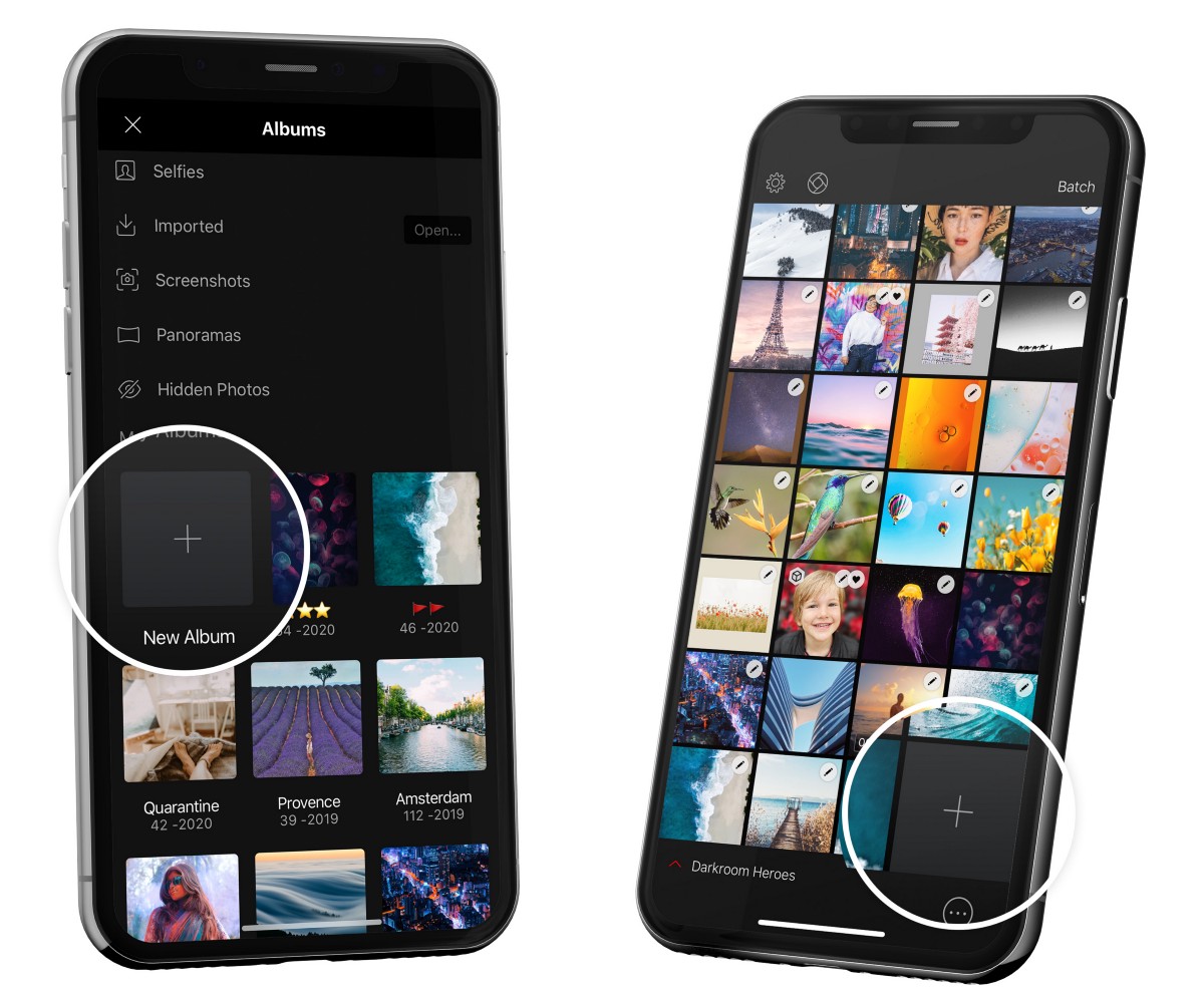
*With photos selected, a row of batch actions appears — including Add To for moving a whole selection into an album.*
## Editing a whole set at once
The most powerful batch action is **Copy & Paste Adjustments**. Edit one photo until it's right, copy its adjustments, then paste them onto the rest of your selection — and when you paste, you choose *which* adjustments carry over, so you can push just the color grading across a set while leaving each photo's individual crop alone. It's the single best way to give a trip, a wedding, or a feed a consistent look without redoing the work. When a set needs to go the other direction, **Reset Edits** returns every selected photo to its original state, and **Rotate** turns the whole selection ninety degrees at a time.
## Culling and organizing in bulk
Batch actions are just as useful for the unglamorous work of sorting a library. You can **Flag** or **Reject** an entire selection at once to drive a culling pass (see [Flag & Reject](/help/manage/flag-reject) for the full workflow), **Favorite** or **Hide** groups of photos, and **Add to Album** to file a selection into an existing album or a brand-new one on the spot — the heart of fast [album management](/blog/2020-06-manage-albums). **Duplicate** makes copies of everything selected when you need working variants. All of it syncs straight back to iCloud Photos, so the structure you build here shows up everywhere.
## Exporting and deleting
When a set is finished, **Export** sends every selected photo out at once using your current [export settings](/help/export/export-settings) — the natural endpoint for a batch that's been edited together. And **Delete** removes the whole selection from your library; rather than vanishing, those photos move to Apple Photos' Recently Deleted album, where they linger for 30 days before they're gone for good, so an accidental bulk delete is recoverable.
## Automate the repetitive runs
When a batch routine becomes something you do constantly — same crop, same frame, same watermark, same destination — it's worth handing off to [Shortcuts automation](/help/app/shortcuts-automation). Using Siri or the Shortcuts app, Darkroom can take or edit photos and videos, apply a look and adjust its intensity, crop, frame, watermark, and then save or upload the result to any platform, all without manual tapping.
## Related
- [Flag & Reject](/help/manage/flag-reject) — the culling workflow batch selection feeds
- [Library View](/help/manage/library-view) — browsing and organizing your photos
- [Export, Save or Share](/help/export/export-view) — what a batch export produces
- [Shortcuts Automation](/help/app/shortcuts-automation) — automate repetitive batch routines
---
# Edit View
> Your workspace in Darkroom — where you inspect, compare, and apply every tool non-destructively. A map of the editor and where each tool fits in your workflow.
Source: https://darkroom.co/help/edit/edit-view
Section: Edit
Updated: 2026-06-10
The Edit view is your darkroom: the workspace where you inspect detail, compare before and after, and reach for every tool. Open any photo or video from your library grid to enter it. The toolbar sits along the bottom on a phone and to the side on larger screens, and the **•••** action menu holds share, export, and copy/paste. Everything you do here is **non-destructive** — edits render live on top of the original, so you can change or undo any of them at any time, and your file isn't actually altered until you export.
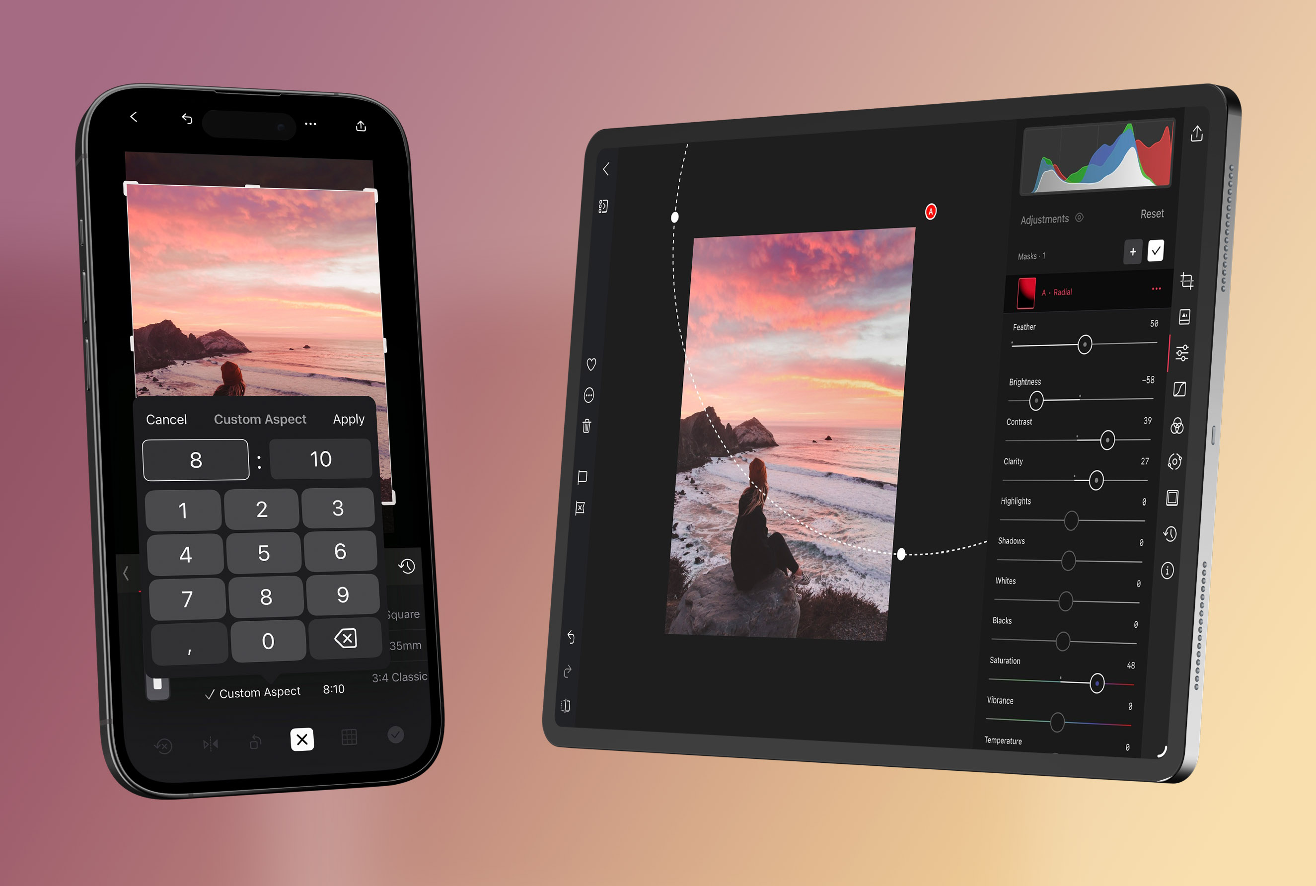
*The Edit view across devices — the same tools and gestures whether you're on iPhone, iPad, or Mac.*
A couple of habits make everything that follows easier: pinch or double-tap to zoom in for detail and back out to judge overall balance, and **tap and hold** the image to flash the original so you can see whether each change is actually helping. Turn on the [Histogram](/help/edit/histogram) for an objective read on exposure, and judge on a neutral screen brightness.
## A map of the tools
**Start with the frame.** Composition comes first — set your crop, straighten, and geometry in [Crop, Rotate, and Transform](/help/edit/crop-rotate-transform) before any color work, since later edits depend on it.
**Get a head start.** A [Preset](/help/edit/presets) applies a complete look in one tap that you can then refine, and it's the fastest route to a strong, consistent result.
**Shape light and color.** The [Adjustment Sliders](/help/edit/adjustment-sliders) handle exposure, color, and texture and are where most edits live. From there, [Curves](/help/edit/curves-rgb) give precise control over brightness, contrast, and tone; [Color (HSL)](/help/edit/color-hsl) targets individual color families; and [Color Grading](/help/edit/color-grading) tints shadows, midtones, and highlights for mood.
**Work locally.** When a change should affect only part of the frame, [Masks](/help/edit/masks-local-adjustments) let you brighten a subject or hold back a sky without touching the rest.
**Add character.** [Bloom & Halation](/help/edit/bloom-halation) bring analog-style glow and warmth, and [Frames](/help/edit/frames) wrap the finished image for its destination.
**Check your work.** The [Histogram](/help/edit/histogram) keeps exposure and color honest, and [Metadata](/help/edit/metadata) tells you how the shot was captured.
**Stay efficient.** [History](/help/edit/history) handles undo/redo, reset, and copy/paste across a set, and the whole toolset applies to motion in [Video](/help/edit/video) too.
## Related
- [Interface Overview](/help/start/interface-overview) — how the library, editor, and export fit together
- [Keyboard Shortcuts](/help/app/keyboard-shortcuts) for faster navigation and editing
- [Export View](/help/export/export-view) — saving and sharing your finished edit
---
# Crop, Rotate, and Transform
> Set your composition first — crop, straighten, rotate, and correct perspective — so every tone and color decision after it lands right.
Source: https://darkroom.co/help/edit/crop-rotate-transform
Section: Edit
Updated: 2026-06-10
Composition comes first. Get the framing and geometry wrong and no amount of grading will rescue the photo — a tilted horizon or a crooked crop nags at the viewer no matter how good the color is. That's why Transform is the natural first stop in an edit, and it's the most-used tool in Darkroom for exactly that reason. Open a photo and select **Transform** toolbar.

*Crop, straighten, rotate, flip, and perspective correction — all in one tool, applied before tone and color work.*
## Framing and aspect ratio
Decide where the photo is going before you crop — a square for the feed, a tall frame for a story, a specific ratio for print — so you're not rebuilding the composition later. Alongside a free crop, Darkroom offers aspect-ratio presets for social, analog, print, and cinema. On Mac you can set a **custom ratio** by typing or nudging the width and height with the arrow keys (hold Option for fine 0.1 steps, Shift for jumps of 10), and tap any portrait preset a second time to flip it to landscape. As you drag, the area being cropped away is shaded so your composition stays the focus.
## Straighten, rotate, and flip
The **straighten** control levels a tilted horizon or a leaning building, and even a one- or two-degree correction makes a photo feel noticeably more polished (on Mac the angle value is editable directly). Use **rotate** for 90-degree turns or free rotation, and **flip horizontally** when a composition simply reads better mirrored — no need to rotate-and-flip to fake it.
## Perspective correction
Vertical and horizontal **perspective correction** straightens converging lines — the keystoning you get shooting tall buildings or interiors. It's powerful but easy to overdo: push it too far and edges stretch unnaturally, so apply the minimum that makes the lines feel right, then reassess your crop, since correction changes what's in frame.
## A grid to compose against
Two overlay options help you judge the frame: **4×4** for composition guidance, and **None** for a clean, distraction-free view when you just want to see the image. A reliable order is to straighten first, crop to taste, apply any perspective correction, then finish with rotate or flip. Keep in mind that [Frames](/help/edit/frames) are applied *after* the crop in the render pipeline, so crop with the final framing in mind.
## Related
- [Mac Transform Improvements](/blog/2024-06-07-mac-transform) — custom ratios, grids, and editable values
- [Image Zoom and Free Crop](/blog/2015-03-darkroom-11) — where free crop began
- [Histogram](/help/edit/histogram) to check exposure once your framing is set
- [Frames](/help/edit/frames) for borders applied after the crop
---
# Presets
> Apply a complete look in one tap, save your own signature edits, and share or discover presets from the Darkroom community.
Source: https://darkroom.co/help/edit/presets
Section: Edit
Updated: 2026-06-10
A preset is a saved recipe of edits — a whole look you can apply to any photo in a single tap, then fine-tune for the shot in front of you. They're the fastest way to get a strong result, and the backbone of a consistent style across a trip, a client shoot, or an entire feed. Crucially, presets in Darkroom stay *transparent*: after you apply one, every adjustment it made is still visible and fully editable, so a preset is a starting point you can build on, never a locked filter.
You'll find **Presets** in the Edit view toolbar, with your built-in presets, **My Presets**, and installed **Community** presets all in one place. Apply one, then adjust — and because the edits are open, you can tap into any tool to see exactly how a look was built. That transparency makes presets one of the best ways to *learn*: dissect a preset you admire and you'll see precisely which Curves, Color Grading, Selective Color, and Mask moves create it.
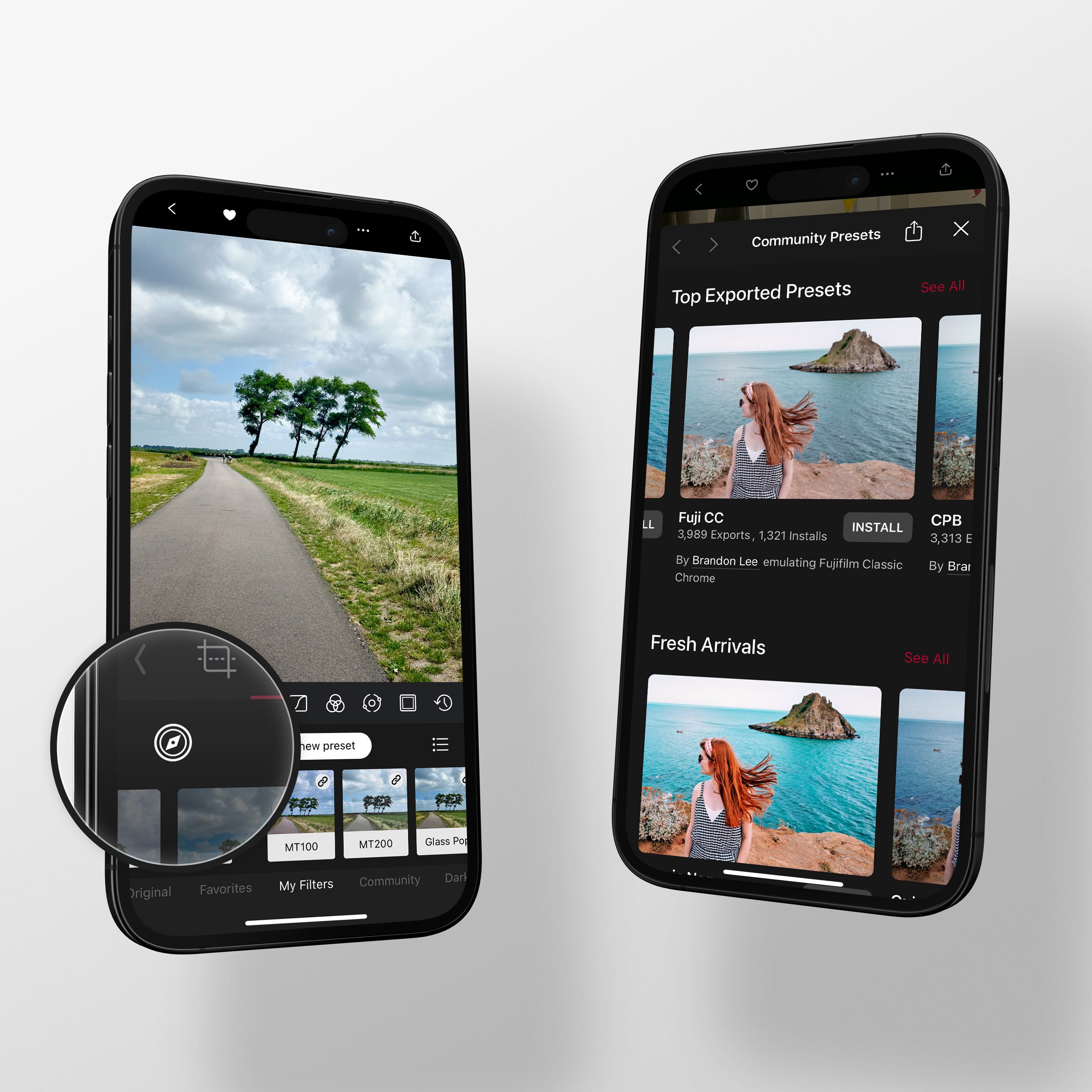
*Tap the compass icon to open Community Preset Discovery and browse curated and dynamic collections.*
## Creating your own
The mechanics are quick: make your edits, open the Presets tool, tap **Create a New Preset**, and name it. Keep editing afterward and a **•** appears next to the name to show the preset can be updated — tap the **•••** actions and choose **Update**.
The one habit that makes presets portable: build them from the *stylistic* tools — Curves, Color Grading, Selective Color, Masks — and leave per-photo technical corrections like exposure and white balance out. That way the preset lays its look over any image without fighting the lighting each photo needs. From there, a base style plus a few variants (brighter, darker, higher-contrast) covers far more situations than one preset trying to do everything. For the full walkthrough, see the [Create a Preset guide](/help/guide/create-preset).
## Managing your list
As your library grows with your own creations and community installs, curation keeps it usable. From the Presets tool you can **favorite** the ones you reach for, **reorder** them for quick access, **hide** the sets you don't use, and **rename** anything. A light naming convention helps once you have variants — Darkroom's bundled presets use a letter for the set and numbers for variants (C100, C110), but short, memorable names work just as well for standalone looks.
## Sharing
Any preset can become a link. Select it, tap **•••**, and choose **Share** — Darkroom generates preview images across a range of scenes and gives you a web link anyone can open, whether or not they have the app. They preview and install with a single tap; there are no files to host, download, or import, and you'll see how many times your preset has been installed and exported. To change a shared preset, unshare it, update, and share again — the original link is kept.

*Share any preset as a link — recipients preview and install it in one tap, no files to manage.*
## Discovering community presets
Tap the **compass** icon to open Community Preset Discovery on iPhone, iPad, and Mac — or browse it on the web at [darkroom.co/presets](/presets). Dynamic collections like **Top Exported**, **Fresh Arrivals**, and **Most Installed** surface what photographers worldwide are actually using, alongside hand-curated sets like **Analog Film Favorites** and **Independent Favorites**. Search by film stock or name to find a specific look fast. As with your own, every community preset is transparent — install one and study how it's made.
## Synced across your devices
Your presets — custom and community — sync automatically across iPhone, iPad, and Mac, including your favorites, arrangement, and hidden sets. It's built on iCloud, needs no account, and works out of the box, so the look you save on your phone is waiting on your Mac.
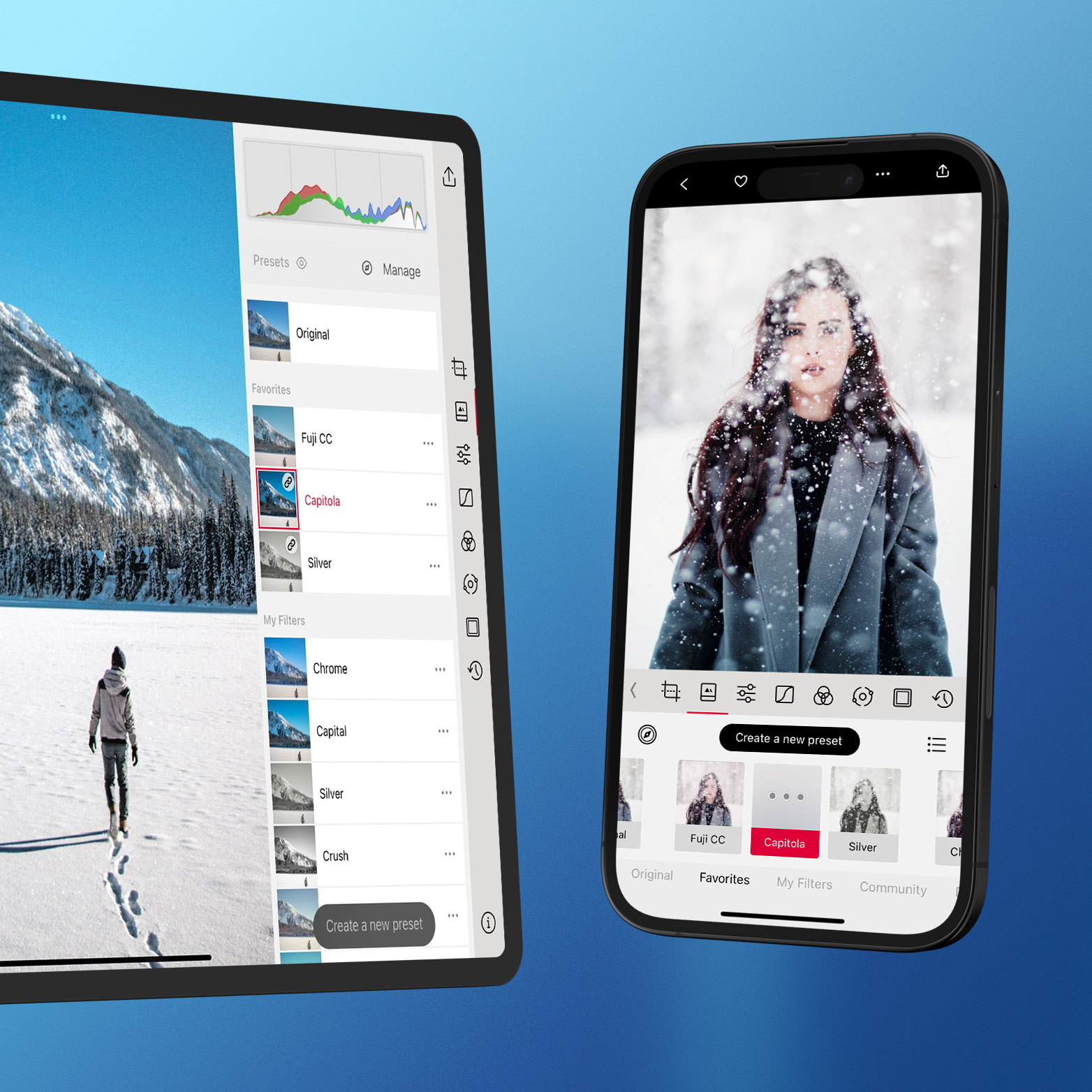
*Custom and community presets, favorites, and arrangement stay in sync across all your devices.*
## Related
- [Create Your Own Custom Preset](/help/guide/create-preset) — the full preset-building guide
- [Share Your Presets from Darkroom](/blog/2022-10-13-preset-sharing)
- [Discover Community Presets](/blog/2023-07-25-preset-discovery)
- [Preset Sync & Backup](/blog/2024-02-14-preset-sync)
---
# Adjustment Sliders
> The foundation of nearly every edit in Darkroom — exposure, color, texture, and effects, and the order to work through them for clean, predictable results.
Source: https://darkroom.co/help/edit/adjustment-sliders
Section: Edit
Updated: 2026-06-10
Almost every good edit starts here. Before you reach for [Curves](/help/edit/curves-rgb), [Color Grading](/help/edit/color-grading), or [Masks](/help/edit/masks-local-adjustments), the Adjustment Sliders do the heavy lifting: getting exposure right, balancing color, and adding the texture and finishing effects that give a photo its feel. You'll find them in the Adjustments tool.
The single most useful habit is to work in that order — tone, then color, then texture and effects — because your exposure and white-balance choices change how everything downstream behaves. Keep the [Histogram](/help/edit/histogram) open so brightness decisions are objective, set your composition in [Transform](/help/edit/crop-rotate-transform) first, and tap-and-hold often to compare against the original.
## Exposure: get the light right
This is where you fix and shape the light. **Brightness** shifts overall lightness; **Highlights** and **Shadows** recover detail at the bright and dark ends; **Whites** and **Blacks** set your tonal endpoints and overall punch; and **Contrast** controls the separation between dark and bright.
**Clarity** is the quiet standout. It adjusts contrast *within the details* of an image without touching the overall tone — so edges stay sharp and your whites and blacks don't move. Push it up to bring out texture in petals, rock, and weathered detail; pull it down to smooth skin while keeping eyes and hair crisp. It's logarithmic, so small moves near the center are subtle and the ends get dramatic.
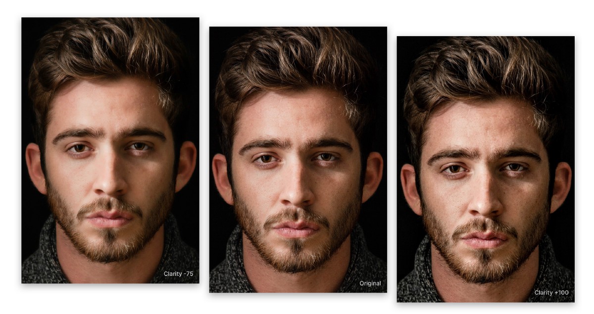
*Clarity at -75%, original, and +75%. Down smooths skin; up emphasizes texture and drama.*
## Color: balance and intensity
Two pairs do most of the work. **Temperature** and **Tint** are your white balance — warm/cool and green/magenta — and fixing them first keeps every later color decision honest. **Vibrance** and **Saturation** then set color intensity, and the difference matters: Saturation boosts every color equally and oversaturates skin and already-vivid areas quickly, while Vibrance protects those and lifts the muted tones. Reach for Vibrance first, and only add Saturation if you still need it.
## Texture: character and finish
Texture is where a photo gains mood. **Grain** adds filmic cohesion and hides digital smoothness — invaluable for stylized and black-and-white looks. **Fade** lifts the black floor for a soft, flatter, film-like base. **Sharpness** crispens edge detail, best used sparingly to avoid halos. And **Bloom** and **Halation** add analog-inspired glow and warmth — see [Bloom & Halation](/help/edit/bloom-halation) for the full story.
*Grain adds analog character and visual cohesion, especially in stylized and monochrome edits.*
## Effects: guiding attention
**Vignette** darkens (or brightens) the edges to pull the eye toward your subject, and **Tinting** lays a stylized color wash over the whole image. Both are finishing moves — apply them last, after tone, color, and texture are settled.
## A reliable order
If you're ever unsure where to start, this sequence keeps edits predictable:
1. **Exposure** — Brightness, then Highlights/Shadows, then Whites/Blacks.
2. **Color** — Temperature/Tint, then Vibrance before Saturation.
3. **Texture** — Contrast/Clarity, then Sharpness, Grain, and Fade.
4. **Effects** — Vignette and Tinting, with Bloom/Halation if the scene calls for it.
Make smaller moves than you think you need; sliders stack, and the most natural-looking edits come from many gentle adjustments rather than a few aggressive ones. When something looks crunchy, ease off Clarity and Sharpness first; when colors look fake, trade Saturation for Vibrance.
## Related
- [Clarity in Darkroom](/blog/2021-05-clarity) — how Clarity works and when to use it
- [Curves (RGB)](/help/edit/curves-rgb) for precise tonal and color shaping
- [Color (HSL)](/help/edit/color-hsl) for channel-specific color fixes
- [Histogram](/help/edit/histogram) to keep exposure objective
---
# Histogram
> Read your photo's exposure and color objectively — catch blown highlights, crushed shadows, and color casts your screen quietly hides.
Source: https://darkroom.co/help/edit/histogram
Section: Edit
Updated: 2026-06-10
Your eyes lie to you. Screen brightness, True Tone, and the light in the room all change how a photo looks, which makes it genuinely hard to know when you've hit pure black or pure white — or whether a neutral wall has picked up a color cast. The histogram doesn't lie. It's a diagram of how your pixels are distributed from black on the left to white on the right, plotted for the red, green, and blue channels, and it turns "this looks about right" into something you can actually verify.
To show it, tap the **•••** action menu while viewing a photo and choose **Show Histogram** (or enable it in Settings); swipe it off to the right to hide it. Keep it up whenever you're making exposure- or color-critical decisions.
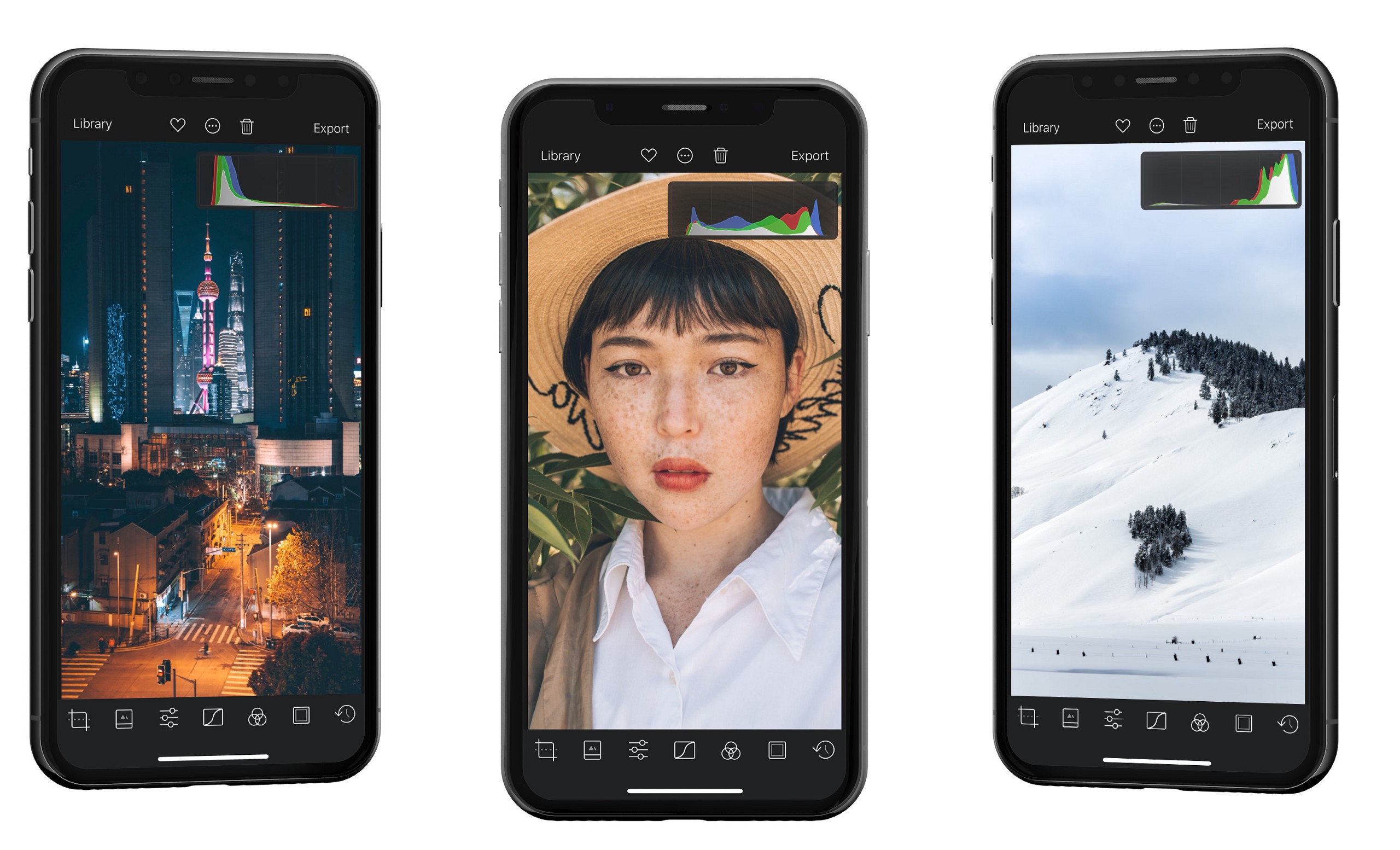
*A dark photo piles up on the left, a bright one on the right, and most photos sit center-weighted. There's no single correct shape.*
When it comes to histogram shapes: don't chase a "perfect" centered histogram. Plenty of beautiful images are deliberately low-key or high-key. The histogram is guidance, not a target.
## Use the full tonal range
Phones try to expose for the whole tonal range, but they struggle with glare, backlight, or shooting through glass — and the result often looks flat. The histogram makes the fix obvious: if the graph doesn't reach the right edge, you have no true whites; if it stops short on the left, no true blacks. Stretch your **Whites** and **Blacks** until the data fills the range and the image gains richness and depth. Many professionals do exactly this as their first move.
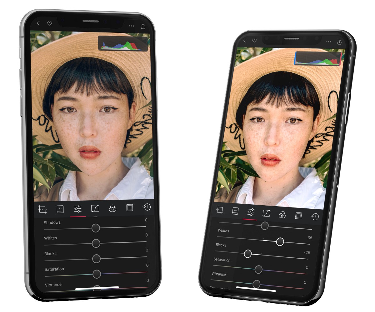
*The histogram on the left never reaches the edges; stretching whites and blacks uses the full range for a richer result.*
## Spot and fix color casts
The color channels reveal problems your eye glosses over. Here's the key idea: where red, green, and blue overlap, you get neutral gray. So if a region *should* be gray but the channels are pulling apart, you have a cast — and the histogram tells you which way to correct. Align the channels with **Tint** and **Temperature** (or [Curves](/help/edit/curves-rgb)) and the cast disappears.
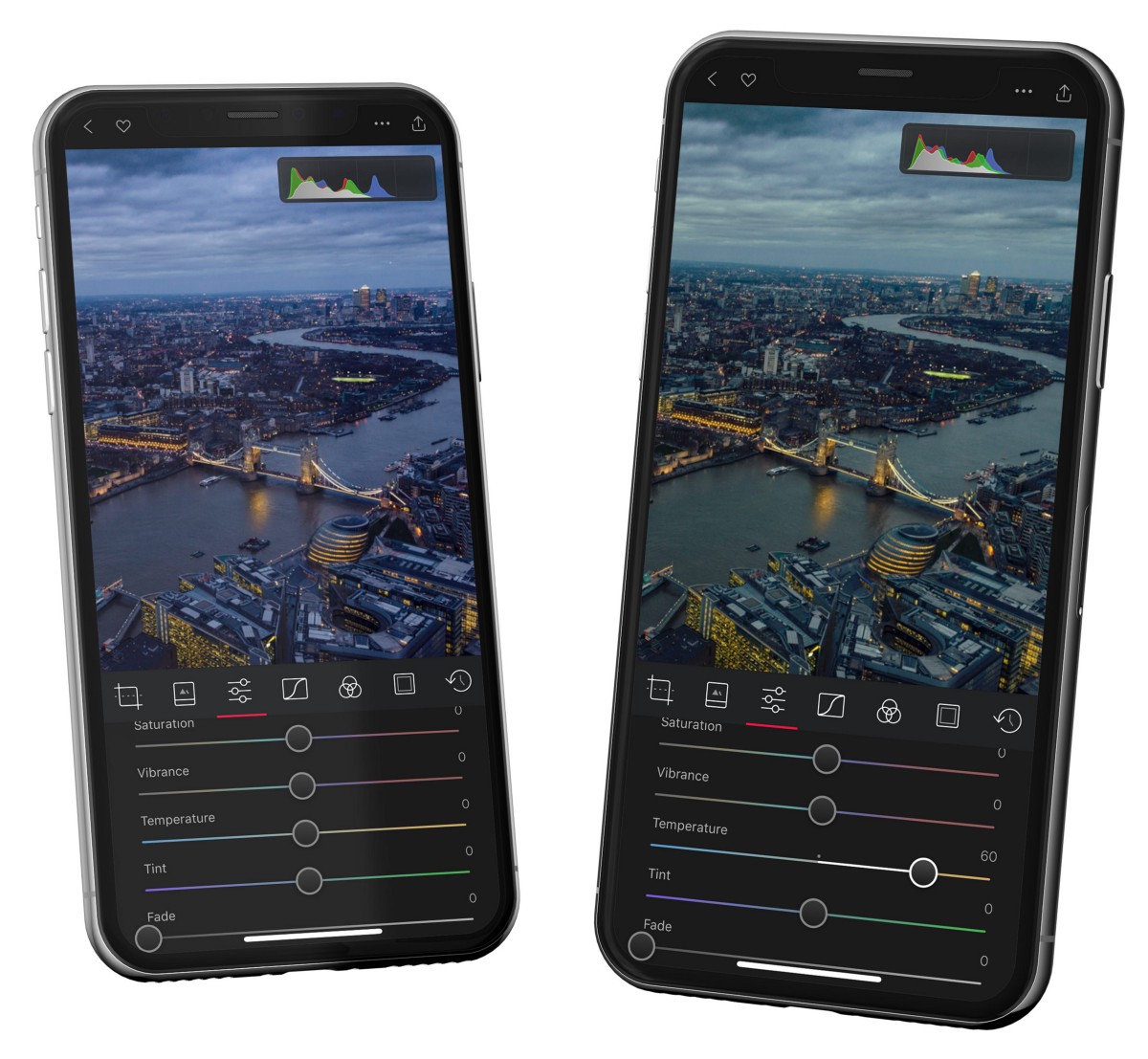
*Shot through tinted glass, this image skews green-blue in the highlights; aligning the channels neutralizes the cast.*
## Watch for clipping
Clipping is data pushed out of range — highlights blown to featureless white, or shadows crushed to pure black, with detail lost for good. Tools like Whites/Blacks, Curves, and Vignette make it easy to clip without noticing. When the histogram is visible, Darkroom calls it out with plain-language indicators and even marks the offending pixels right on your photo — clipped whites in red, clipped blacks in blue. Decide whether that clipping is an intentional style choice or a mistake, and re-check after any big tonal move or finishing effect.
One related gotcha: stretching the range too aggressively causes **posterization** — banding where you'd expect a smooth gradient, most visible in blue skies. You'll spot it as jagged steps in the histogram, and a little [Grain](/help/edit/adjustment-sliders) helps disguise it.
## Related
- [Introducing the Darkroom Histogram](/blog/2019-08-histogram) — the full feature, with examples
- [Adjustment Sliders](/help/edit/adjustment-sliders) for the Whites/Blacks and exposure controls
- [Curves (RGB)](/help/edit/curves-rgb) for precise tonal and channel correction
---
# Masks & Local Adjustments
> Edit one part of a photo without touching the rest — brighten a subject, recover a sky, or separate foreground from background to direct the viewer's eye.
Source: https://darkroom.co/help/edit/masks-local-adjustments
Section: Edit
Updated: 2026-06-10
Most edits change the whole frame at once. Masks let you change *part* of it — brighten just your subject, pull back just the sky, warm just the foreground. This is the step that separates a corrected photo from a deliberate one: by lighting some areas and quieting others, you guide the viewer's eye exactly where the story is.
Open a photo, tap **Masks** in the Edit view toolbar, and add a mask with the **+** button. Every mask carries its own full set of adjustments, so you can stack several — each doing one job — and see them as preview thumbnails in the mask list. Masks are a [Darkroom+](/darkroom+) feature; foreground and background editing on Portrait photos remains free.
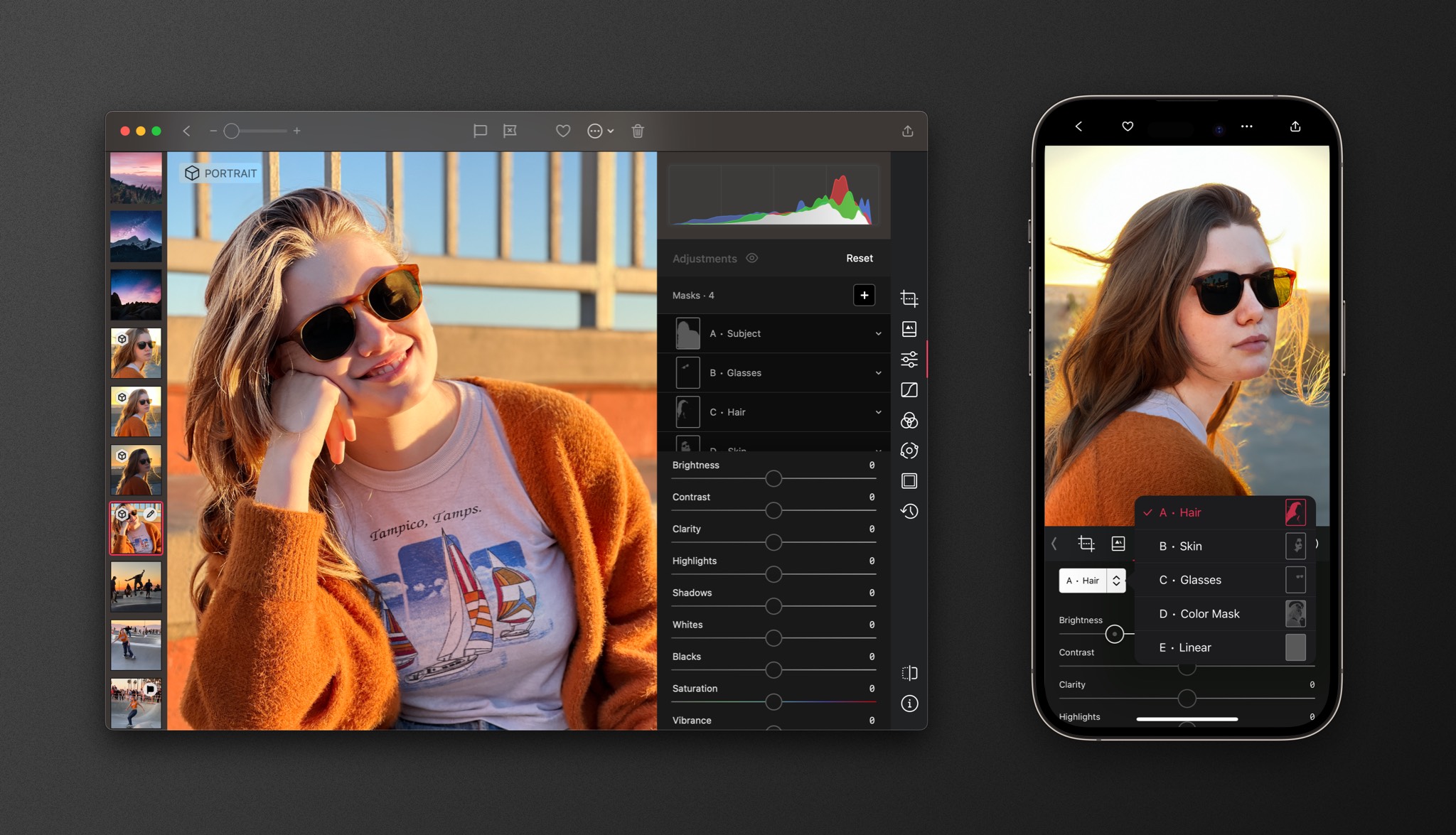
*Preview thumbnails make it easy to tell your masks apart when you're stacking several.*
## Masks that understand your photo
When you open a photo, using AI, Darkroom builds understanding of the scene right on your device — privately, and fast enough to fit your normal workflow. That powers a set of automatic masks that used to require painstaking manual selection:
- **Subject** isolates the main subject so you can make them pop. **Foreground** and **Background** split the scene front-to-back, ideal for separating a person from their surroundings.
- **Depth Range** targets a slice of distance in the scene, and can be inverted to edit everything *except* that slice.
- **Smart Masks** on Portrait and ProRAW photos go further still, isolating **Sky, Skin, Hair, Glasses,** and **Teeth** where the capture data supports it. Drop Clarity inside a Skin mask to smooth complexion while keeping eyes and hair crisp, or brighten Teeth a touch for a portrait at someone's best.

*AI masks bring subject and depth selection to every photo, not just Portrait shots.*
## Masks you draw and define
When you want to place a selection yourself, two families cover almost everything:
- **Gradient masks** — **Linear** for skies, horizons, and foreground falloff; **Radial** for subjects and vignette-style attention, with adjustable feathering and the option to invert so you edit everything outside the oval.
- **Range masks** — **Color Range** selects by hue (widen the range to pull in neighboring colors), and **Luminance Range** selects by brightness, so you can target only the bright or only the dark pixels.
The real power is combining them. A Linear mask plus a Luminance Range edits only the bright sky and leaves the horizon untouched; a Color mask plus a Luminance mask catches only the bright blue pixels; Subject plus a little Clarity and Exposure lifts a person cleanly off their background.
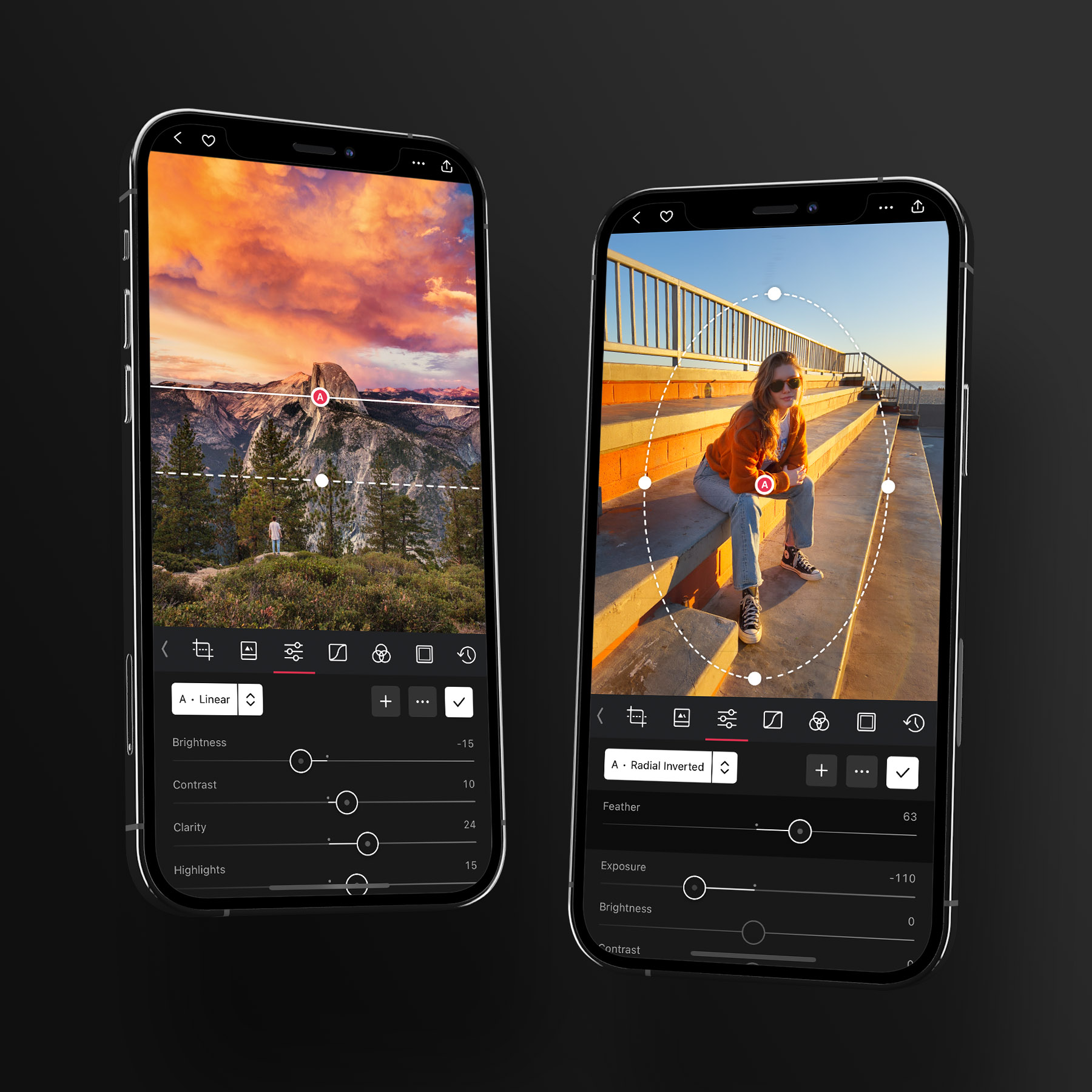
*Linear and radial masks are the manual foundation; combine them with range masks for pixel-precise selections.*
## Working with masks
Each mask's actions live behind the **•••** button: add, invert, duplicate-and-invert (great for grading foreground and background as a complementary pair), delete, or reset just that mask's edits. The workflow that holds up best is to correct the whole image globally first, then add your most impactful mask, then smaller supporting ones — keeping each adjustment subtle, since local edits stack into something artificial fast. If a masked look travels badly to another photo, use selective paste in [History](/help/edit/history) to copy your edits *without* the masks.
## Related
- [Make Local Adjustments with Masks](/blog/2022-04-masks) — the full feature tour
- [Mask Previews](/blog/2023-06-13-mask-previews) — telling stacked masks apart
- [Portrait editing](/help/guide/portrait-editing) — for a mask-driven portrait workflow
- [Adjustment Sliders](/help/edit/adjustment-sliders) — the edits you apply inside each mask
---
# Bloom & Halation
> Add the analog-inspired glow of vintage lenses and film to your digital photos — soft dreamy highlights with Bloom, warm vintage edges with Halation.
Source: https://darkroom.co/help/edit/bloom-halation
Section: Edit
Updated: 2026-06-10
Bloom and Halation recreate the way light used to behave in old lenses and on film — the soft glow around a streetlight, the warm halo bleeding around a backlit subject's hair. They're the difference between a photo that looks *captured* and one that looks *remembered*: dreamy, atmospheric, a little nostalgic.
Both effects come from how light diffuses through glass and film, and they complement each other. **Bloom** softens and spreads the brightest areas outward into a gentle glow. **Halation** is more subtle — a warm orange halo that forms only on the hard edges of high-contrast highlights, exactly like vintage film. You'll find both inside [Adjustment Sliders](/help/edit/adjustment-sliders) under **Texture**, so build your base tonal edit first, then add them as a finishing touch.
## Bloom: a soft, glowing light
Bloom makes the brightest parts of a photo bloom outward, wrapping light sources and bright edges in a gentle, radiant glow. Photographers used to chase this look physically — smearing a little vaseline on a filter, or stretching a stocking over the lens — to soften highlights while keeping the focal point sharp. Bloom gives you that ethereal quality with a single slider.
It's at its best wherever light is part of the story: golden-hour and backlit **portraits**, where it adds a flattering glow to skin; **night scenes**, where it softens harsh streetlights and neon into something cinematic; **weddings and events**, for romantic, emotional moments; and **sunrise/sunset landscapes**, where it tames the sun and smooths the transition between bright sky and darker land. Try pairing it with the Exposure and Highlights sliders to shape the glow, or a touch of [Color Grading](/help/edit/color-grading) to warm a golden-hour scene.
## Halation: warmth at the edges
Halation adds a subtle red-orange glow around high-contrast edges, the kind you'd get when light scattered through a film's layers and reflected back. On film it was an imperfection manufacturers tried to suppress; photographers loved it anyway, because it lends an unmistakable vintage warmth and character.
Because it works on contrast, Halation depends on the light in your scene. **Backlit portraits**, **high-contrast scenes**, and **urban night photography** light it up beautifully; an evenly lit, low-contrast frame may show almost nothing. That's expected — reach for Halation when there's drama in the light, and lean on more Contrast or the Shadows slider beforehand to give it edges to work with.
## Using them together
Bloom for atmosphere, Halation for edge warmth — used together and kept restrained, they build a cohesive, filmic look. Add a little grain or fade and you've got a convincing analog rendering. The usual caution applies: these effects stack quickly, so start low. If glow turns to haze and your image goes flat, pull Bloom back before touching contrast.
## Related
- [Bloom & Halation: an analog-inspired guide](/blog/2025-12-08-bloom-halation) — the origins and deeper technique
- [Adjustment Sliders](/help/edit/adjustment-sliders) — where Bloom and Halation live, under Texture
- [Color Grading](/help/edit/color-grading) for cinematic, golden-hour tones
- [Vintage Film look](/help/guide/vintage-film) for a full analog workflow
---
# Curves (RGB)
> The most expressive tool in Darkroom — shape brightness, contrast, fades, and film-like color tone by bending a single line per channel.
Source: https://darkroom.co/help/edit/curves-rgb
Section: Edit
Updated: 2026-06-10
Curves is the closest thing Darkroom has to a blank canvas. With it you can fix exposure, build contrast exactly where you want it, lift blacks into a soft fade, and tune color tone region by region. It's powerful enough that you can recreate most popular film and filter looks with this one tool — which is exactly why it became the foundation Darkroom was built around.
A simple mental model helps: every pixel is three buckets of light — red, green, and blue. Curves sorts your photo into tonal regions (blacks, shadows, midtones, highlights, whites) and lets you add or drain light from those buckets *within each region*. Pick a channel from the selector on the left — **RGB** moves all three buckets at once (brightness and contrast); **Red**, **Green**, and **Blue** move one at a time (color and tone). You'll find Curves in the Edit view toolbar.
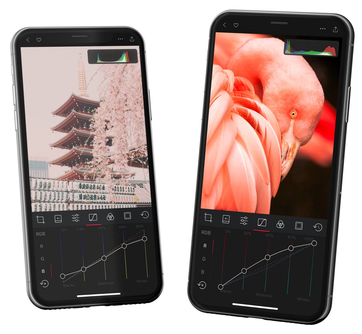
*Curves divides the image into tonal regions; each point you move remaps how those input tones come out.*
## The RGB curve: selective brightness and contrast
The RGB curve controls the amount of light in your photo — but unlike the Brightness slider, it lets you do it *selectively*, one tonal region at a time. That's the whole point. Brighten a dark landscape foreground by pulling up only the shadows and midtones, and your clouds keep all their detail instead of blowing out.
Two shapes do most of the work:
- **A bow** (up or down) raises or lowers brightness across the regions you bend. Bow the shadows up to open them; bow the highlights down to rein them in.
- **An S-curve** adds contrast: lift the highlights, drop the shadows, and the image gains punch while the midtones hold. Flatten it instead to soften a harsh photo.
Pull a region all the way up and it goes white; all the way down and it goes black — handy for crushing shadows into a silhouette or washing out highlights to focus attention. Keep an eye on the [Histogram](/help/edit/histogram) so you don't clip more than you mean to.
## Per-channel curves: color and film tone
The Red, Green, and Blue channels are where personal style lives. Adjusting them in different regions gives a photo a two-tone cast — say, slightly more red in the shadows and a touch less in the highlights — which is precisely how film stocks earned their signature looks. A film that was more sensitive to green in low light gave shadows a green cast; pull the green channel up in the shadows and you've recreated it.
The trick is restraint and coordination. Color curves usually move *together*: to build a contrasty, toned look, give all three an S-curve and let the small differences between them create the tone. Big moves on a single channel contaminate neutrals and skin, so make small adjustments — tapping just above or below the curve nudges it 1% at a time for fine control.
## Fades
A fade is just a curve move: lift the blacks toward gray and drop the whites toward gray. The result is the soft, airy look that defined the Instagram and VSCO era — and because it crushes nearby values together, it also simplifies detail and pulls the eye toward your focal point. Push it gently for a whisper of softness, or hard for a bold, washed-out style. Bias the channels differently and your fade picks up color: warmer highlights, cooler shadows.
## A useful habit
When an edit starts looking strange and you can't tell which channel is causing it, long-press the channel selector to toggle that single curve off while keeping everything else in place. It's the fastest way to isolate what a curve is actually doing.
Curves works best early, before finishing effects, and pairs naturally with [Color Grading](/help/edit/color-grading) for stylistic color — then save the whole thing as a [preset](/help/edit/presets) to reuse it.
## Related
- [Histogram](/help/edit/histogram) to watch clipping while you work
- [Color (HSL)](/help/edit/color-hsl) for targeted, per-color fixes
- [Using Curves, Part 1](/blog/2015-06-curves-part-1-of-2) — brightness and contrast in depth
- [Using Curves, Part 2](/blog/2015-07-curves-part-2-of-2) — color, tone, and film emulation
---
# Color (HSL)
> Adjust one color family at a time — its hue, saturation, and luminance — to make skies pop, calm distracting backgrounds, and keep skin tones natural.
Source: https://darkroom.co/help/edit/color-hsl
Section: Edit
Updated: 2026-06-10
Every editing tool slices a photo a different way and lets you target your edits to those slices. Curves works on tonal regions; the Color tool works on *individual colors* — and that's the most granular slice of all. If Curves is the backbone of a look, Color is its soul: it's how you make a blue sky bluer or shift it toward teal, calm a background that's stealing attention, fix a color cast from bad lighting, or build the film-like palettes that give a preset its character.
You'll find it as **Color** in the Edit view toolbar. Pick one of eight channels — red, orange, yellow, green, cyan, blue, purple, magenta — or tap the picker and touch a color directly in your photo to jump to its channel. Each channel gives you three sliders: **Hue** shifts that color toward its neighbors, **Saturation** sets its intensity, and **Luminance** makes it brighter or darker.
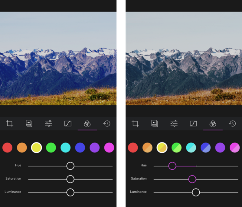
*Eight color channels, each with its own Hue, Saturation, and Luminance — here the sky's blues are pulled down to put more focus on the landscape.*
## Guiding the viewer's eye
Saturation and luminance are quietly powerful for directing attention. Shot a portrait where the green trees behind your subject pull the eye away? Drop their saturation and luminance and the background recedes, leaving your subject in focus. The same move works in reverse — lift the saturation and luminance of the color you *do* want to feature.
In landscapes, this is often easier than fighting with Curves. Ask how blue you want the sky: desaturating it darkens the mood and shifts weight to the ground, while raising its luminance separates a sky and foreground that sit in the same tonal range and would otherwise be hard to pull apart.
## Hue: corrective and creative
A hue shift does two jobs. **Correctively**, it fixes a color that went wrong under tricky lighting or white balance. **Creatively**, even a subtle nudge can change the entire emotion of a photo — shifting greens toward yellow for late-summer warmth, or blues toward teal for a cinematic feel. Big shifts cross over into neighboring colors and look unnatural, so make small moves and watch the edges where two colors meet.
A word on skin: skin tones live in the **orange and red** channels. They're the easiest thing to ruin and the first thing a viewer notices, so treat those channels gently — small saturation and luminance changes, minimal hue.
## Building film-like looks
Shifting colors across the spectrum is exactly how film stocks earned their signatures, and how the old cross-processing look — running film through the "wrong" chemistry — produced its unpredictable, beloved color shifts. The Color tool is your route to those palettes. A useful habit: play with the *neighboring* channel. An object's color is often a blend, so desaturating cyan (between blue and green) can change a sky in ways the blue channel alone won't. Once you land a palette you love, save it as a [preset](/help/edit/presets).
## Related
- [Meet the Color Tool](/blog/2015-08-color-tool) — the thinking behind selective color, and cross-processing
- [Curves (RGB)](/help/edit/curves-rgb) for tonal and per-channel color shaping
- [Color Grading](/help/edit/color-grading) for tinting by tonal range instead of by color
- [Masks](/help/edit/masks-local-adjustments) to confine a color change to one area
---
# Color Grading Wheels
> Shape the mood of a photo or video by tinting its shadows, midtones, and highlights independently — the cinematic technique behind most great presets.
Source: https://darkroom.co/help/edit/color-grading
Section: Edit
Updated: 2026-06-10
Color Grading is how you give a photo or video a *mood*. Instead of correcting what the camera captured, you decide what it should feel like — warm and nostalgic, cool and cinematic, faded and dreamy — by pushing color into the shadows, midtones, and highlights independently. It's the same technique colorists have used in film for decades, and it's the single most powerful tool in Darkroom for building a recognizable, repeatable style.
Think of the Global wheel like a pair of tinted sunglasses: drop in a warm tint and the whole scene reads like late-afternoon sun. The real magic comes from the other three wheels, which let you treat bright and dark areas differently — cool teal shadows under warm orange highlights is the look behind half the films you've ever seen.

*Four independent wheels — Global, Highlights, Midtones, and Shadows — each controlling hue, strength, luminance, and saturation in its tonal region.*
## The four wheels
You'll find **Color Grading** in the Edit view toolbar — open a photo or video and it reveals four wheels, each targeting a specific tonal region. Drag the handle in the center to choose a **hue** and how **strongly** to apply it; the sliders on either side adjust **luminance** and **saturation** in that same region.
- **Global** tints the entire image at once. Reach for it first to set an overall atmosphere — purple into a sunset, orange into autumn foliage, blue into a seascape.
- **Highlights** color the brightest areas. Warming highlights is the fastest way to fake golden-hour light.
- **Shadows** color the darkest areas. Cooling shadows toward teal or blue adds depth and that filmic separation from warm highlights.
- **Midtones** sit in between — and this is where skin lives, so treat it gently.
## Your edits stay clean
Behind the scenes, color grading adjusts each pixel based on its brightness, so the *structure* of your photo is preserved: white pixels stay white, black pixels stay black, and already-saturated colors are protected. You can push the wheels hard without the unnatural color casts you'd get from white-balance hacks.
> Because midtones are separated from highlights and shadows, you can make your shadows teal and your highlights orange without wrecking skin tones — those live in the midtones, untouched.
## Building a look
There's no single "right" grade — it depends on the feeling you're after. A few starting points:
- **Cinematic.** Cool the shadows toward teal, warm the highlights toward orange. Keep both subtle; the effect works because it's quiet.
- **Cohesive set.** Apply the same gentle Global tint across a batch of photos so they feel like they belong together — invaluable for a trip, a wedding, or an Instagram grid.
- **Make a color pop.** Push the Global hue toward the dominant color already in the scene to amplify it — bluer seas, greener forests.
- **Fix a cast.** Nudge the wheel *away* from an unwanted tint to neutralize it.
Small moves go a long way. Start near the center, build up gradually, and compare against the original often by tapping and holding the image. Each wheel has its own reset, so you can experiment freely and clear just one without disturbing the others.
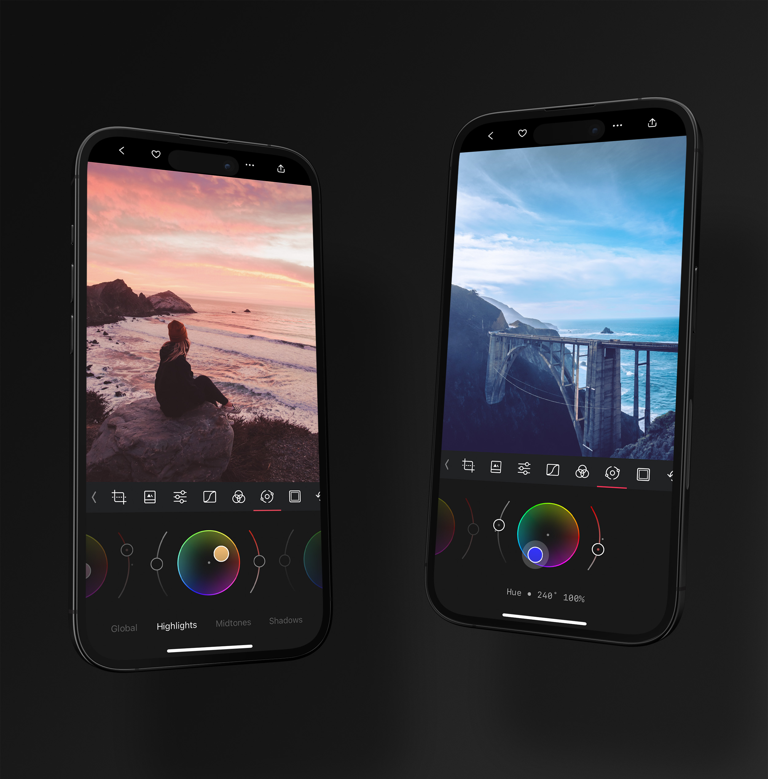
*As you move a wheel or slider, Darkroom shows the control's name and exact value so you can dial looks in precisely — and recreate them later.*
## Where it shines: presets
Color Grading is where most great [presets](/help/edit/presets) are born. Before it existed, shifting colors meant juggling white-balance sliders and individual curves — indirect, fiddly, and prone to clashing with a photo's own white-balance needs. Now brightness, saturation, and hue for every tonal range live in one place, so you can focus on the *look* rather than the mechanics of achieving it. Get a grade you love, save it as a preset, and apply it across your whole library in a tap.
Because grading is purely stylistic, do it **last**: crop and straighten first, correct exposure and white balance, then layer color grading on top as a finishing pass.
## Related
- [Color Grading comes to Darkroom](/blog/2022-12-12-color-grading) — the original announcement, with examples
- [Adjustment Sliders](/help/edit/adjustment-sliders) for exposure and white-balance groundwork
- [Curves](/help/edit/curves-rgb) and [Color (HSL)](/help/edit/color-hsl) for more precise color control
- [Presets](/help/edit/presets) to save and reuse a finished look
---
# Frames
> Wrap your photo in a border that fits its mood and your destination — content-aware colors, story and social-card ratios, and consistent insets across a set.
Source: https://darkroom.co/help/edit/frames
Section: Edit
Updated: 2026-06-10
Frames started as a way to post a non-square photo to Instagram without an awkward crop, and the humble white border never went away. Darkroom's Frame tool takes that instinct and turns it into real creative expression: a frame controls the *context* your photo is viewed in, letting you extend its natural edges, make its key colors pop, or simply fit it cleanly to whatever platform it's headed for. You'll find **Frames** in the Edit view toolbar; toggle it on and off to compare instantly.
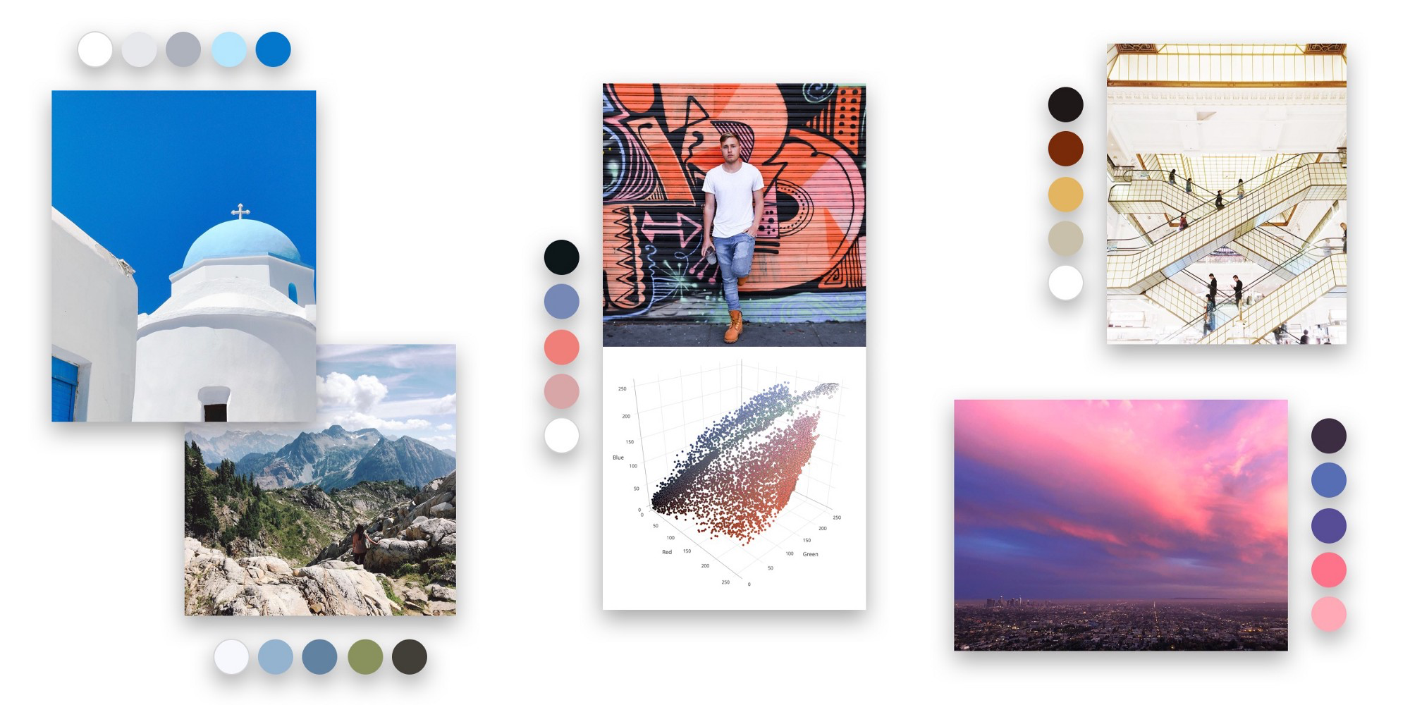
*Content-aware colors analyze your photo and offer a curated palette that matches its mood — alongside classic white and black.*
## Color sets the mood
The color of a frame has an outsized effect on how the eye reads the colors *inside* it. Beyond white and black, Darkroom analyzes your photo and suggests **content-aware colors** — a curated palette drawn from the image itself, one tap away. Pick a hue that extends the natural edges of the scene for a seamless look, or one that picks up a key color to make it sing. White borders brighten and add air; black borders tend to deepen perceived contrast.
## Inset and ratio for every destination
Just as important as color is size. The **inset** sets how much breathing room surrounds the image, and the ratio presets target where it's going: **9:16** for Snapchat and Instagram Stories, **4:5** for Instagram portrait, **2:1** for a social-post card, or square for the classic feed. Smaller insets feel modern and minimal; larger ones feel editorial and print-inspired.
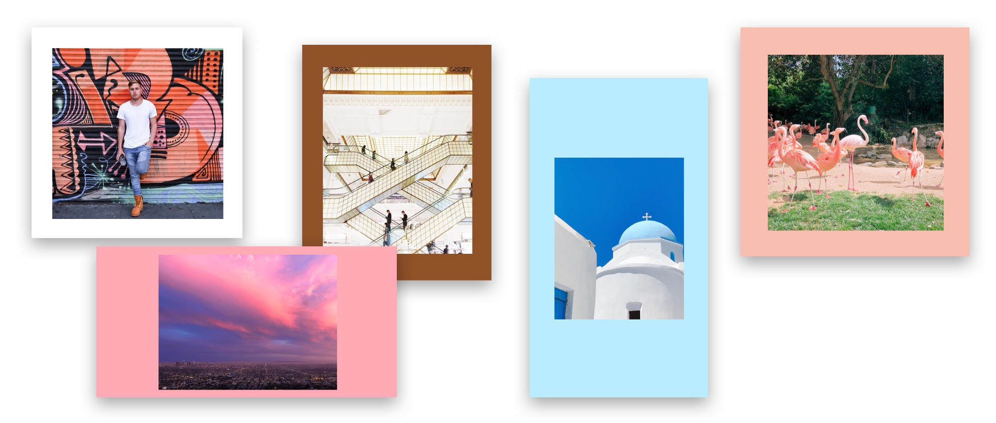
*Insetting into a 9:16 frame turns any photo into a polished story or social card.*
The inset slider remembers your last value, which is the secret to a cohesive set — apply the same border across a whole batch and your exports stay visually consistent. Frames are included on export, and the inset presets are available right from the export flow, even in batch.
## Where it sits in your workflow
Frames are applied *after* the crop in the render pipeline, so finalize your composition in [Transform](/help/edit/crop-rotate-transform) first, then add the frame as a finishing layer. If you want a repeatable presentation style, pair a frame and ratio with a [preset](/help/edit/presets) so every export in a series matches.
## Related
- [Content-Aware Frames](/blog/2018-06-frames) — the thinking and technology behind the tool
- [Crop, Rotate, and Transform](/help/edit/crop-rotate-transform) — finalize composition before framing
- [Export Settings](/help/export/export-settings) — frame and inset options at export time
---
# Video
> Edit video with the exact same tools and feel as photos — real-time grading, masks, and presets, with no import step and export up to 8K.
Source: https://darkroom.co/help/edit/video
Section: Edit
Updated: 2026-06-10
In Darkroom, video feels as light as a photo. Videos autoplay, loop, zoom, crop, and every edit renders in real time — no timeline wrangling, no separate library, no import step. Because Darkroom plugs straight into your iCloud Photo Library, the thirty clips sitting on your phone are ready to edit the moment you open one, and you grade them with your favorite [community presets](/presets). That's the real benefit: one visual language across your stills and your motion, so a set holds together.
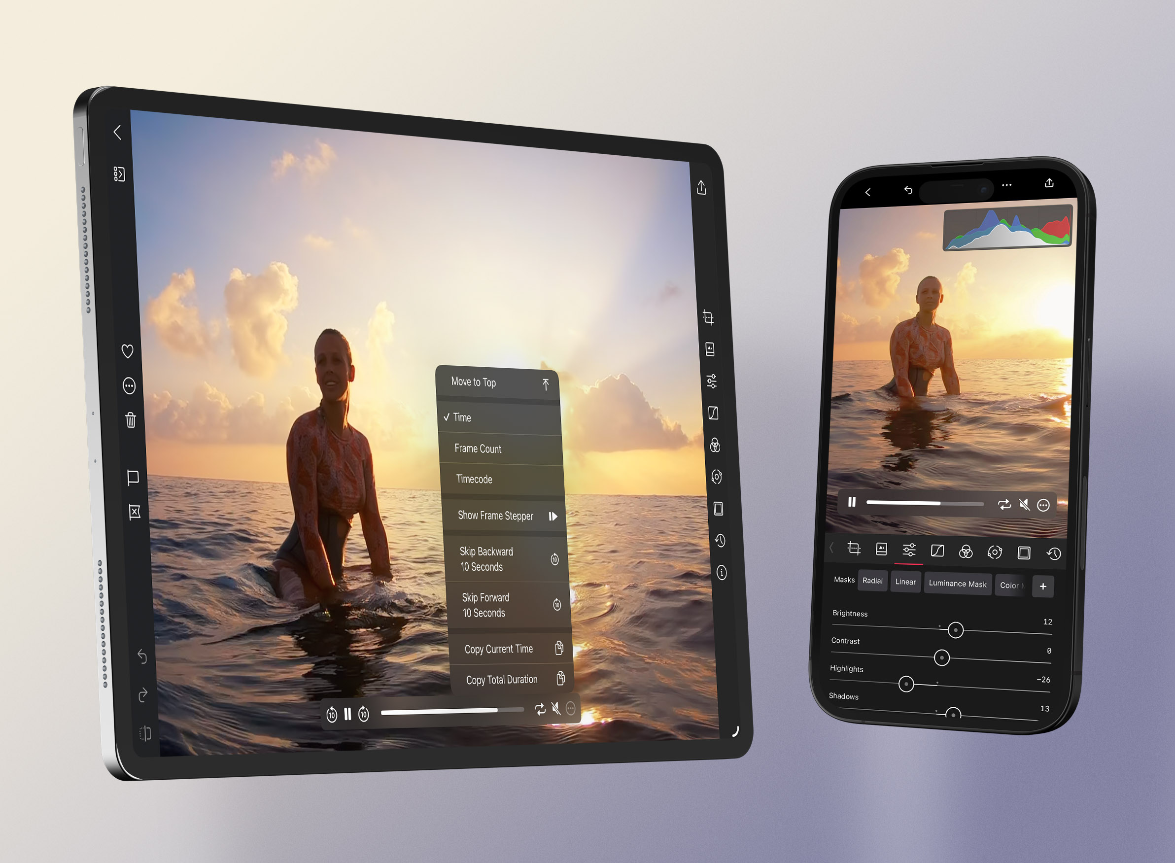
*The full edit toolbar plus playback controls and a live histogram that updates as the clip plays.*
## The same tools you already know
Open any video from your library and the tools look exactly like it does for photos. The whole stack carries over — [Adjustment Sliders](/help/edit/adjustment-sliders), [Curves](/help/edit/curves-rgb), [Color (HSL)](/help/edit/color-hsl), [Color Grading](/help/edit/color-grading), [Presets](/help/edit/presets), [Frames](/help/edit/frames), [Transform](/help/edit/crop-rotate-transform), and [Masks](/help/edit/masks-local-adjustments) where the media and device support them. Save a look as a preset and you can apply it consistently across every clip in a project.
## Judge it in motion
A grade that looks perfect on a paused frame can fall apart once things move, so edit against playback, not a freeze-frame. Play, pause, scrub, and step frame-by-frame for precision, and **loop** a key segment while you grade so you're reacting to the clip in motion. Keep the [Histogram](/help/edit/histogram) visible while it plays to catch highlights that only clip during the brightest moment.
## Two ways to work
For casual clips, capture in the Camera app (or a companion like Moment Pro), edit in Darkroom, and export with **Modify Original** to save your edits without spawning a duplicate — the Frame tool is great for a perfectly formatted border. For professional work, cull your selects, color-correct and grade them in Darkroom, **favorite** the keepers so they're easy to spot, then use batch paste and export to push a look across the set before sequencing elsewhere.
## Export
Darkroom exports video as H.264, HEVC, at resolutions up to 8K, in SDR. Bitrate is relative to the original — higher means better quality and larger files — and the usual export options apply, including watermarks, copyright, and stripping location metadata.
## Related
- [Video Processing Comes to Darkroom](/blog/2020-04-video) — how video editing works
- [Color Grading](/help/edit/color-grading) for cinematic looks across clips
- [History](/help/edit/history) for batch paste across a sequence
- [Export Settings](/help/export/export-settings) for formats, resolution, and bitrate
---
# Metadata
> Inspect the full technical story behind any photo or video — camera, lens, exposure, color profile, and GPS — edit capture and descriptive fields, and control what gets shared on export.
Source: https://darkroom.co/help/edit/metadata
Section: Edit
Updated: 2026-06-15
Every photo carries a record of how it came to be: the camera and lens, the exposure settings, when and where it was shot, and the color pipeline it travelled through. Darkroom's metadata viewer surfaces all of it. With the **Extended Metadata** rewrite it's faster, more reliable, and far more complete than before — if a detail exists in the file, you can now inspect it. Open any photo or video, then choose **Metadata** from the **•••** action menu; it lives in the same place across iPhone, iPad, and Mac.
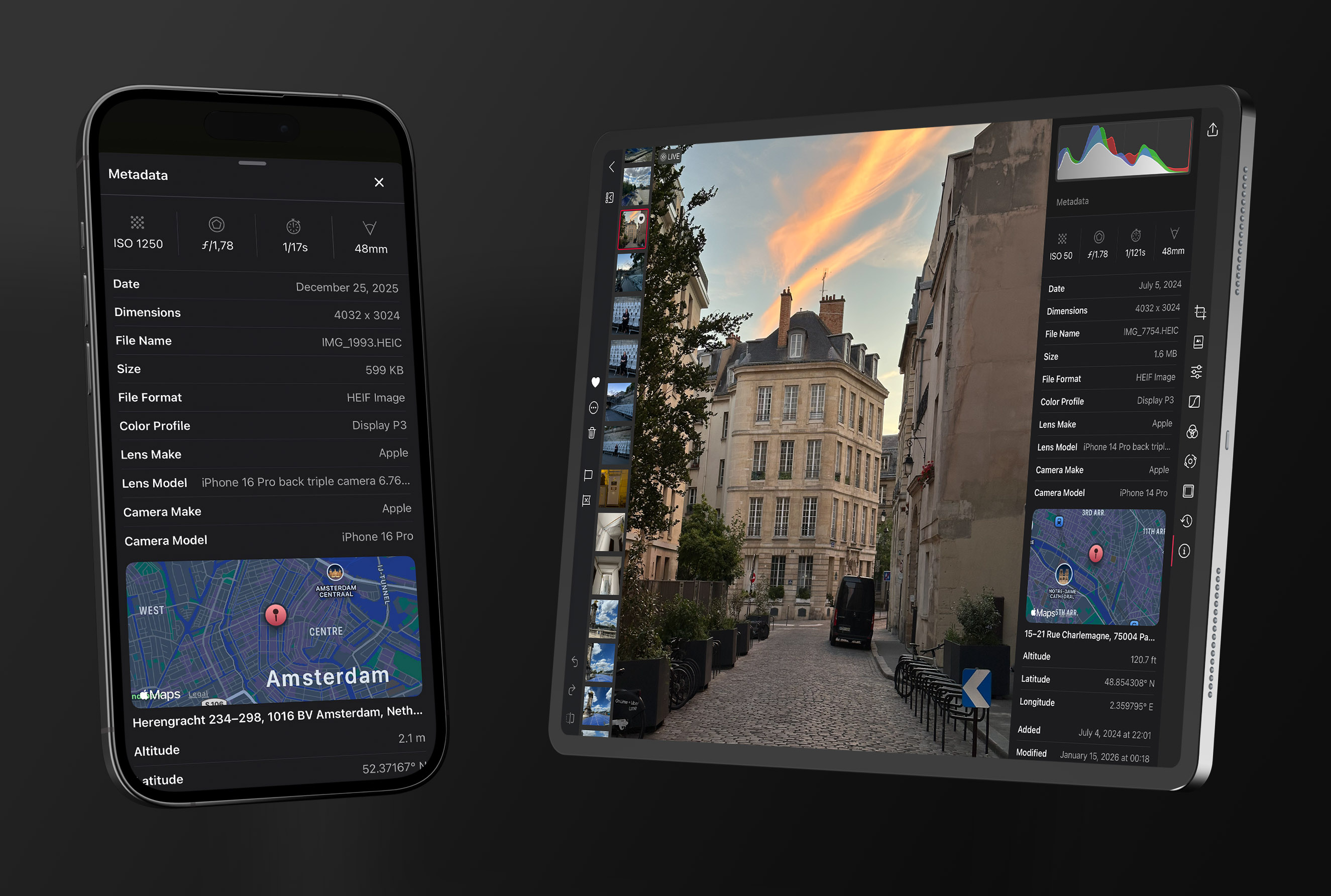
*A clean summary up top, with expandable sections that reveal the complete EXIF, lens, color, and location data underneath.*
## A clean summary, with the full picture underneath
The view opens with the details you reach for most — camera, lens, exposure, ISO, focal length, and resolution — so the important context is right there at a glance. Expandable sections below reveal everything else: detailed EXIF fields, extended lens data, color space and profile information, GPS coordinates when present, and any other technical metadata embedded in the asset.
It also loads in two stages so it never makes you wait. The moment you open it, you see whatever is already available locally or cached from iCloud Photos; if there's more to fetch, Darkroom pulls it in quietly in the background and merges it in. Responsiveness first, depth second — which matters most with large libraries or assets stored in iCloud.
## What it's good for
For newer photographers, metadata is a way to learn from your own shots — review your best and worst frames side by side and the exposure numbers start to explain why. For more demanding work it's a precision tool: compare lenses between shoots, validate export settings, troubleshoot an unexpected color shift by checking the profile, or simply confirm how an image was captured before building a preset for the set. Paired with the [Histogram](/help/edit/histogram), it turns guesswork into objective decisions.
## Editing metadata
With [Darkroom+](/darkroom+), you can edit metadata directly from the metadata view — no separate app required. Darkroom covers both kinds of metadata, so you can manage the details that matter most:
- **Capture metadata** — the technical record of how an image was made: camera model and brand, lens model and brand, ISO, aperture, and shutter speed.
- **Descriptive metadata** — the information that helps you organize and identify your work: title, description, keywords, copyright, location, and capture date.
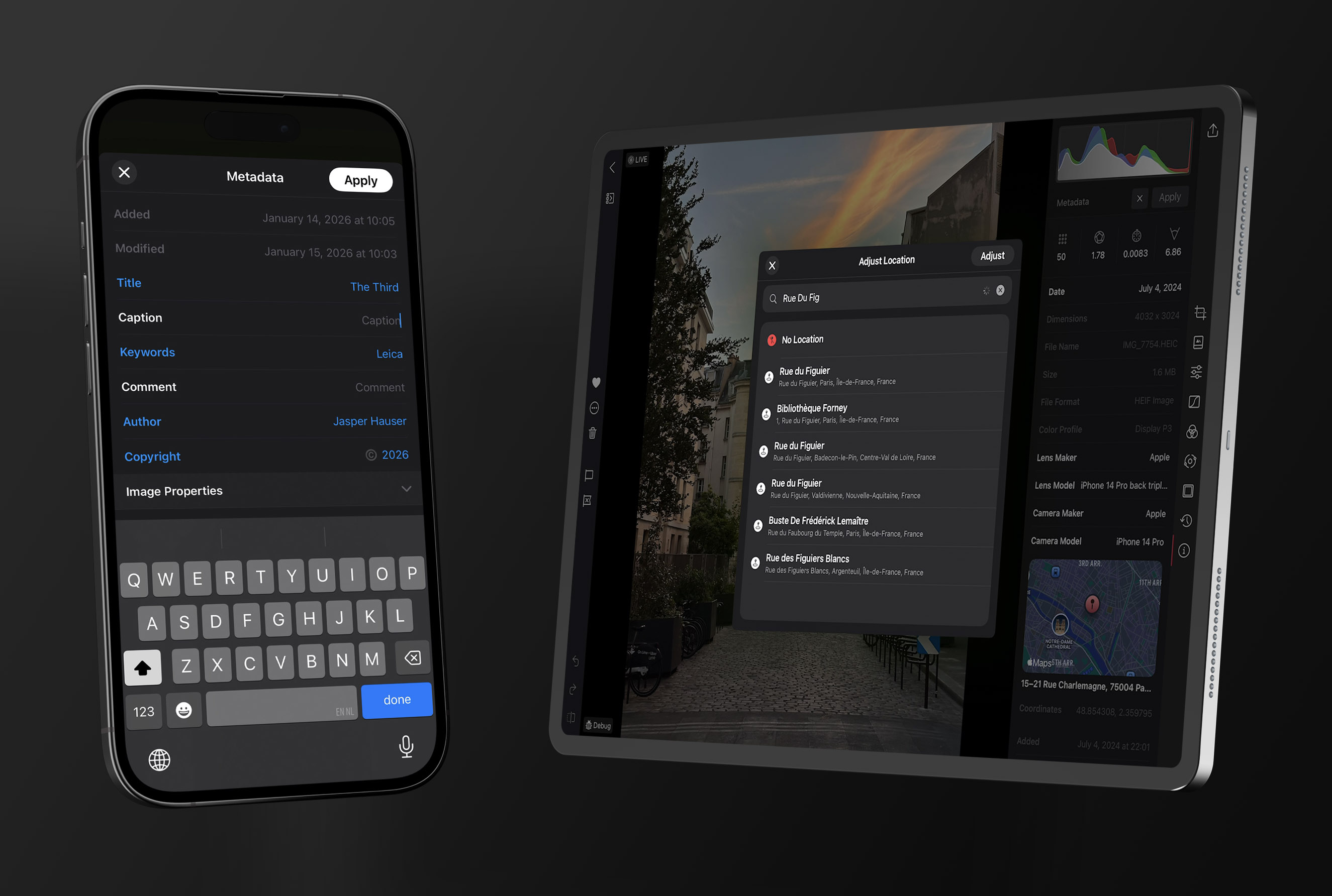
*Metadata Editing is accessible on all devices, from both the library and photo editing views.*
Editing is split into two simple flows. When a value is **missing** — common with manual lenses, film scans, or images imported from other sources — Darkroom lets you add it directly from the metadata view. When you need to **update existing** fields, enter the dedicated edit state to change multiple values at once, then tap **Apply** to write your changes back to the image so they stay consistent across your library and any other apps that read the same data.
When editing RAW metadata, Darkroom saves a new version of the photo to apply the changes — an Apple restriction — but your original is preserved and loaded the next time you open it in Darkroom.
## Control what you share
Metadata is also about privacy and attribution at export time. You can **include or strip location** data and add a **copyright** field to exported files — keep the full record for your archive, and remove sensitive fields when posting publicly.
## Related
- [Metadata Editing](/blog/2026-05-19-metadata-editor) — edit capture and descriptive metadata, in detail
- [Extended Metadata](/blog/2026-02-24-extended-metadata) — the viewer rewrite, in detail
- [Histogram](/help/edit/histogram) for objective exposure and color reads
- [Export Settings](/help/export/export-settings) for location and copyright controls
---
# History
> Edit fearlessly and move fast — undo and redo freely, reset to start clean, and copy a look from one photo to an entire shoot with selective paste.
Source: https://darkroom.co/help/edit/history
Section: Edit
Updated: 2026-06-10
Editing in Darkroom is non-destructive: every adjustment renders live on top of your original, and nothing is ever permanently changed. History is what lets you take advantage of that — step backward and forward through your decisions, wipe the slate clean, and carry a finished look from one photo across a whole shoot. It's freedom to experiment without fear, and the engine behind fast, consistent batch editing. You'll find it in the Edit view toolbar, with copy, paste, and reset also available from the **•••** action menu (and `⌘C` / `⌘V` on a keyboard).
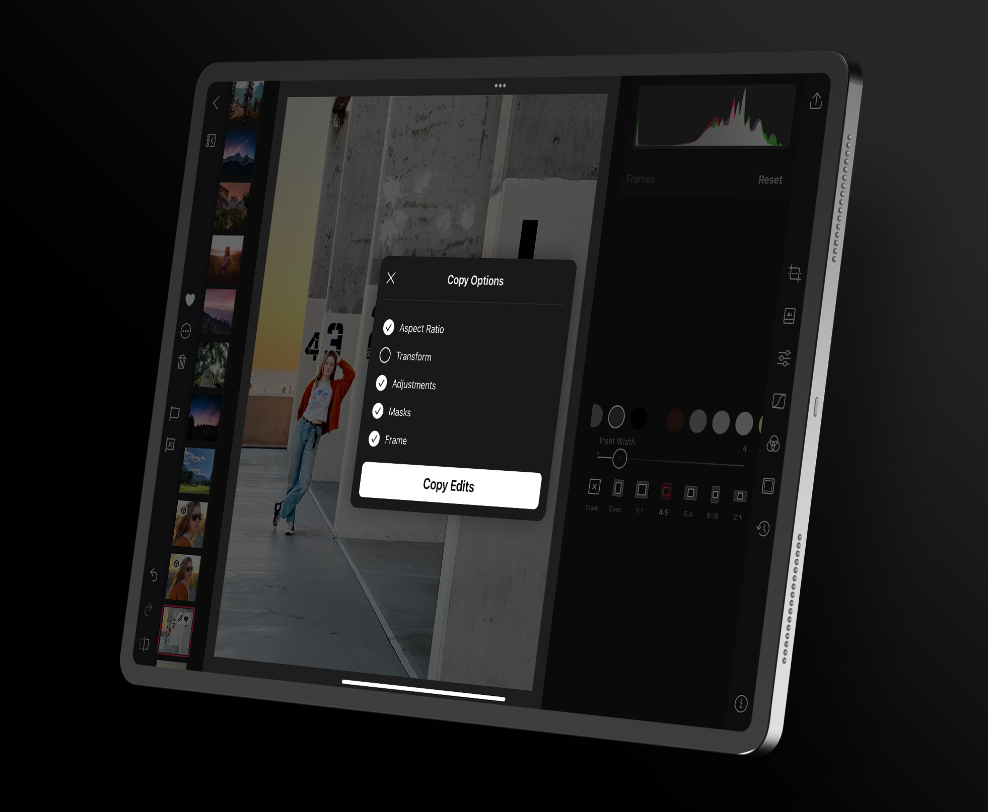
*Selective paste lets you choose exactly which categories travel — adjustments, aspect ratio, transform, masks, or frames.*
## Undo, redo, and reset
As you work, undo and redo move you through recent steps so you can compare two directions or back out of one that isn't working. When an edit branch gets tangled, **Reset Edits** clears everything and returns the photo to its original state — often the fastest way forward is to start clean and rebuild in deliberate passes (tone, then color, then finishing).
## Copy a look across many photos
The real power shows up across a set. Copy the edits from one image and paste them onto another — or onto a whole batch at once, ideal for an event, a travel set, or a multi-clip video project. Rather than drift photo to photo, build one strong "reference" edit and propagate it.
The key is **selective paste**: when you copy, choose which categories come along — Adjustments, Aspect Ratio, Transform, Masks, or Frames. Carry the *look* (your adjustments, curves, grading, and color) while leaving composition and image-specific masks behind, since a crop or a subject mask that's perfect for one frame rarely fits the next. That's how you keep a set visually unified without forcing mismatched crops onto every shot.
## Turn a look into a preset
When an edit stack is worth keeping for the long term, save it as a [preset](/help/edit/presets) instead of copy-pasting it forever. A preset is the durable, reusable version of the same idea — one tap on any future photo.
## Related
- [Presets](/help/edit/presets) to save a finished look permanently
- [Masks](/help/edit/masks-local-adjustments) — usually excluded from a paste unless framing matches
- [Batch Actions](/help/manage/batch-actions) for working across many photos at once
- [Keyboard Shortcuts](/help/app/keyboard-shortcuts) to speed up copy and paste
---
# Export, Save or Share
> The handoff point from editing to delivery — save over an original, make a copy, or send a finished photo or video straight to another app.
Source: https://darkroom.co/help/export/export-view
Section: Export
Updated: 2026-06-10
Every edit you make in Darkroom is non-destructive — rendered live on top of your original rather than baked into it. That's what makes experimenting safe, but it also means your edits live *inside* Darkroom until you export. The Export view is where that happens: the moment a live edit becomes a real file that the rest of the world can see.
It's built to keep your rhythm fast — edit, review, export, move on. Open any photo or video in the editor and tap the **share/export** action to get here. You don't even have to enter a full edit session first: the same export actions live in the library context menus (tap-and-hold on iPhone or iPad, right-click on Mac), which is handy when you just want to push an already-finished shot out the door.

*The Export view gathers your output choice, quick export tools, and a summary of your settings in one place.*
## Choosing how your edit lands
The first decision is what kind of file you want out, and it usually comes down to two options. **Save** (Modify Original) writes your latest edit back to the existing library item without spawning a duplicate — still fully reversible later, and the cleanest choice when you're culling and delivering a lot of images and don't want your library cluttered with copies. **Save Copy** creates a separate exported file instead, which is what you want when the same source needs to exist in more than one form: a watermarked version and a clean one, a full-resolution master and a web-sized share.
From the same screen you can also **share** the result straight into another app or service — Messages, Mail, Files, a social app, or a Shortcuts-based workflow — so the exported file goes exactly where it's headed next without a detour through your library. Need a physical copy? Printing sits alongside those options too — on Mac via **File → Print**, and on iPhone or iPad through the system **share sheet → Print**.
## The export-time extras
Two finishing tools sit right here so you don't have to leave the flow. **Add Frame** applies an export frame in the aspect ratio you've set up, which is the quickest way to get story- and feed-ready layouts; Darkroom reuses your most recent frame inset, so a campaign stays visually consistent across a batch. On iOS, **Copy Hashtags** drops a saved [hashtag set](/help/app/settings) onto your clipboard as you export, so posting is one paste away. And **Export Options** opens [format, metadata, watermark, and quality settings](/help/export/export-settings) for a last check before the file is written.
## Fitting it into a workflow
For day-to-day sharing the path is short: finish the edit, open Export, pick **Save Copy** or **Save**, and tap your destination. If you post often, fold **Add Frame** and **Copy Hashtags** into that same pass so there's nothing left to do once you're in the posting app.
At higher volume, lean on **Save / Modify Original** while culling and delivering many assets — it keeps the library clean — and pair the Export view with [Batch Actions](/help/manage/batch-actions) to process a consistent set in one go. For genuinely repeatable production, [Shortcuts automation](/help/app/shortcuts-automation) can chain editing and export together so the whole handoff runs with a single tap. This export flow extends to video as well, [introduced when video editing came to Darkroom](/blog/2020-04-video) — the same actions, the same options, just longer renders.
One thing worth remembering: if an export feels slow, Darkroom may be pulling the full-resolution original down from iCloud before it can process it. And for anything you're publishing, glance at your [metadata settings](/help/export/export-settings) first so you're not sharing location data you'd rather keep private.
## Related
- [Export Settings](/help/export/export-settings) — format, metadata, copyright, and quality choices
- [Watermark](/help/export/watermark) — add visible attribution on export
- [Batch Actions](/help/manage/batch-actions) — export many photos at once
- [Shortcuts Automation](/help/app/shortcuts-automation) — automate edit-and-export pipelines
---
# Export Settings
> Decide what kind of file Darkroom actually writes — format, video encoding, metadata privacy, copyright, and hashtags — so quality, compatibility, and privacy all land where you want them.
Source: https://darkroom.co/help/export/export-settings
Section: Export
Updated: 2026-06-10
Two photos can have identical edits and still come out as very different files. Export Settings is where that difference is decided: the format, the compression, whether your location rides along in the metadata, and what copyright you stamp on it. A throwaway social post and a client delivery rarely want the same answers, which is exactly why these settings are worth understanding rather than leaving to chance.
You reach them from the [Export view](/help/export/export-view) by tapping **Export Options**, or from the app's [Settings](/help/app/settings) under the same name. Change them in the moment for a one-off, or set them once as the default that every export inherits.
## Picking a format
The format you choose trades quality, file size, and compatibility against each other. For stills, **JPEG** is the dependable everyday choice — small, lossy, and readable everywhere. **HEIF** delivers similar quality at noticeably smaller sizes and shines in Apple-centric workflows, though older platforms may not accept it. **PNG** is lossless and best for graphics, screenshots, and clean flat-color edges. **TIFF** is the heavyweight: large, essentially artifact-free, and the right call for archival or professional handoff into further post-production.
Video splits the same way. **H.264** is the broadly compatible option that plays nearly anywhere; **HEVC** compresses more efficiently at comparable quality on supported devices. Video also exposes bitrate, expressed relative to the original — a higher bitrate keeps more detail but grows the file. If you want the deeper story on how Darkroom handles video output, the [video processing announcement](/blog/2020-04-video) covers the encoding work behind it.
## Metadata and privacy
Exported files carry more than pixels. Darkroom leans toward safer sharing by **leaving location metadata off by default**, so you don't accidentally broadcast where a photo was taken every time you post it — but you can keep GPS data embedded when a workflow genuinely needs it. Alongside that, **copyright metadata** writes your name and rights information into the file's EXIF, a quiet, machine-readable claim of ownership that pairs well with a visible [watermark](/help/export/watermark) for layered attribution.
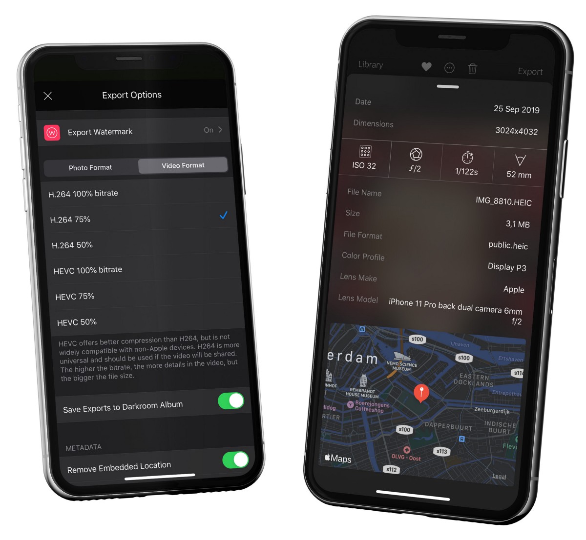
*Darkroom reads and writes rich metadata for both photos and video — including the location and copyright fields you control at export.*
## Hashtags on iOS
On iOS, Export Settings can also manage **hashtag sets**: save the groups you post with most, and Darkroom copies the chosen set to your clipboard as you export, turning a tedious part of social posting into a single paste.
## Choosing settings for the job
A reliable default for most people is straightforward — **JPEG** for stills (or **H.264** for video) for maximum compatibility, **location metadata off** for anything headed to social, **copyright on** if you publish publicly, and hashtag copy enabled only if you actually reuse hashtag sets. That combination is hard to get wrong.
From there, let the destination steer you. Client review and collaboration are happy with JPEG or HEIF at moderate-to-high quality with copyright on. Archival or further editing wants **TIFF** for stills and a higher-bitrate setting for video. Cross-platform delivery is safest on JPEG and H.264, where compatibility surprises are rare. And for privacy-first publishing, make location-stripping your standing default on everything outbound.
A few habits keep this painless: don't over-size exports for a platform that's going to recompress them anyway, only reach for HEVC when you're sure the receiving app supports it end to end, and recheck format and metadata before a [batch export](/help/manage/batch-actions) so you're not re-running a large set to fix one setting. The privacy-first direction behind these defaults was introduced gradually in earlier releases, including [Darkroom Everywhere](/blog/2019-03-everywhere).
## Related
- [Export, Save or Share](/help/export/export-view) — the export flow these settings feed into
- [Watermark](/help/export/watermark) — visible attribution to pair with copyright metadata
- [Settings](/help/app/settings) — set your export defaults app-wide
---
# Watermark
> Add visible attribution to exported photos and videos — text or logo — and control its placement, size, and opacity so it protects without overpowering the image.
Source: https://darkroom.co/help/export/watermark
Section: Export
Updated: 2026-06-10
On a platform where images get reposted without credit constantly, a watermark is often the last layer of protection before you publish. Darkroom's is a proper, full-featured one: place either a text mark — your name, an @handle, a copyright line — or an image mark like a brand logo, then tune exactly how it sits on the photo. It's been a dedicated export feature since the [watermarking release](/blog/2020-02-watermark-subscription), and it's available to [Darkroom+](/help/membership/darkroom+) members.
You'll find it inside the [Export view](/help/export/export-view): open **Export Options** and enable **Watermark**. Once it's configured, Darkroom remembers the setup and reuses it across exports, so your output stays consistent without re-creating the mark each time.
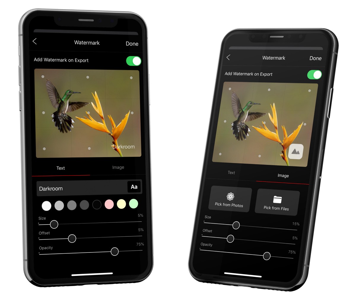
*To position your text or logo, tap one of the nine anchor points or drag it exactly where you want it.*
## Setting it up
A **text watermark** is the fastest path and ideal for names, handles, and copyright lines — you can set its color to stay readable against your photo and choose a typeface that matches your tone. An **image watermark** is the better choice for a brand logo or a custom mark with its own visual identity; use a transparent PNG so only the mark itself shows.
Placement and weight are where a watermark either disappears tastefully or shouts. You can drop it into any of nine anchor points or drag it freely, then dial in its **size**, an **offset** to fine-tune the distance from the edges, and an **opacity** that balances visibility against subtlety. Corners are usually the least distracting spot — keep the mark clear of faces and the key subject.
## Getting the balance right
The right settings depend on what the watermark is *for*. If the goal is genuinely deterring theft, don't drop the opacity so low that the mark is trivial to crop or clone out. If the goal is mostly aesthetic — a quiet signature on a portfolio piece — reduce the size before you reach for lower opacity, which keeps it crisp rather than washed out. Either way, test legibility on both bright and dark scenes, since a mark that reads cleanly on one can vanish or glare on another, and platform recompression can eat a faint mark entirely.
For brand and production work, it pays to keep more than one style on hand: a heavier, harder-to-remove mark for public, repost-prone feeds, and a subtler one for client previews. Pairing a visible watermark with [copyright metadata](/help/export/export-settings) gives you attribution that's both human-readable and machine-readable. And when you're delivering at volume, fold the watermark into your [batch exports](/help/manage/batch-actions) so an entire campaign goes out marked consistently. One last habit worth keeping: after a crop- or transform-heavy edit, recheck placement — shifting the composition can throw the mark's visual balance off.
## Related
- [Export Settings](/help/export/export-settings) — pair watermarking with copyright metadata
- [Export, Save or Share](/help/export/export-view) — where watermarking happens
- [Batch Actions](/help/manage/batch-actions) — apply a watermark across many exports
---
# Settings
> Where to manage your membership, set export defaults, and tune how Darkroom looks and behaves before, during, and after an edit.
Source: https://darkroom.co/help/app/settings
Section: App
Updated: 2026-06-10
Settings is where you teach Darkroom how *you* want to work. It's less about editing a single photo and more about the defaults that quietly shape every session — what format your exports take, whether location data leaves your device, which app icon greets you on the Home Screen, and where your membership stands. Set these once and the rest of the app gets out of your way.
You'll find them in the natural spot for each platform: on iPhone, iPad, and Vision Pro, tap the **gear icon** in the top-left of the library grid; on Mac, open the **Darkroom** menu and choose **Settings…**. It's worth a slow scroll the first time — there are more useful options tucked in here than most people expect.

*Settings opens from the gear icon at the top-left of the library on iPhone and iPad, or from the Darkroom menu on Mac.*
## Your membership
The top of Settings is home base for [Darkroom+](/help/membership/darkroom+). It shows your current membership status and gives you a place to **unlock Darkroom+** if you're still on the free tier, **restore a previous purchase** when you've moved to a new device or signed in with a different Apple ID, and **redeem an offer code** from a promotion. Billing itself is handled by Apple, so if access ever looks wrong, restoring here is the first thing to try.
## Export defaults
Most of Settings is given over to **Export Options** — the same controls you can reach from the [Export view](/help/export/export-view), gathered in one place so you can set sensible defaults once instead of fiddling with them on every share. For the full reasoning behind each choice, see [Export Settings](/help/export/export-settings); in short, this is where you decide:
- **Photo format** — JPEG (at 80%, 95%, or 100% quality), HEIF (likewise), PNG, or TIFF. HEIF gives you smaller files at the same quality; JPEG is the safe, universally compatible choice.
- **Video format** — H.264 or HEVC, each at a few quality levels. HEVC is more efficient, H.264 is more broadly compatible.
- **Metadata** — whether to embed location data (off by default, to keep your whereabouts out of files you share) and whether to include a small Darkroom attribution.
- **Copyright metadata** — your name and a copyright notice, written into the file's EXIF data to discourage uncredited reuse.
- **[Watermark](/help/export/watermark)** — a reusable text or logo mark applied on export.
- **Hashtag sets** (iOS) — saved groups of hashtags you can copy to the clipboard as you export, to speed up posting.
## Look & feel
A second cluster of settings is about the app itself rather than your output. You can turn the **Histogram** on and decide whether it shows **clipping indicators**, so you always know when highlights or shadows are pushed past the edge. You'll also find a **Screenshots** option, controls for the [partner Camera App](/help/app/camera-integration) that appears above your library, and **RAW + JPEG** handling, which decides whether Darkroom prefers the RAW or the JPEG variant when a photo was captured as both.
### Light and Dark mode
**Appearance** controls how Darkroom itself looks. You can lock the interface to **Light** or **Dark**, or let it follow your system setting — a dark canvas keeps your eyes on the photo for evening editing, while light mode can read better in a bright room.
### App icon
Appearance is also where you change Darkroom's **app icon**. As a [Darkroom+](/help/membership/darkroom+) perk, you can swap the Home Screen icon for any of the dozens of variants we've designed over the years — from the clean Shadow and Panda monochromes to Pride, Vintage, the brushed-metal M1, and even a pixel-art 1-bit throwback. On iPhone and iPad, open Settings, tap **App Icon**, and pick the one you want. On Mac the icon can't be changed from inside the app, so we put together a [manual guide for Mac app icons](/help/app/mac-app-icon).
*A Darkroom+ membership unlocks dozens of alternate app icons — switch anytime under Settings → App Icon.*
## Maintenance and the boring-but-useful
At the bottom sit the housekeeping tools. **Clear Photo Cache** and **Clear Sync Cache** reclaim storage and resolve the occasional stale-thumbnail or sync hiccup without touching your actual photos — your originals always live safely in iCloud Photos. And the **Build Number** is the small detail worth knowing about: when you write in with a question or bug report, including it tells us exactly which version you're running.
## Related
- [Export Settings](/help/export/export-settings) — the full guide to format, metadata, and quality choices
- [Watermark](/help/export/watermark) — set up reusable text or logo marks
- [Darkroom+ Membership](/help/membership/darkroom+) — pricing, restoring purchases, and family sharing
- [Camera Integrations](/help/app/camera-integration) — connect partner camera apps
---
# Camera Integrations
> Shoot in partner camera apps like Leica, Halide, or Moment, then jump straight into Darkroom to edit — no export or import step.
Source: https://darkroom.co/help/app/camera-integration
Section: App
Updated: 2026-04-09
At Darkroom we pride ourselves on being a platform for photographers, not just a photo editor. The capture and the edit are two halves of the same craft, and the handoff between them shouldn't cost you anything — no exporting, no importing, no hunting through folders to find the frame you just shot.
Camera Integrations close that gap by connecting Darkroom with a reputable selection of third-party partner camera apps — Leica, Halide, and Moment among them — on iPhone and iPad. The result is a fast capture-to-edit loop: shoot in the camera app you already trust, then step straight into Darkroom to edit, with the shot waiting for you in your library rather than buried behind an import step. When you're done and want to keep shooting, a single tap takes you right back to the camera app where you left off.
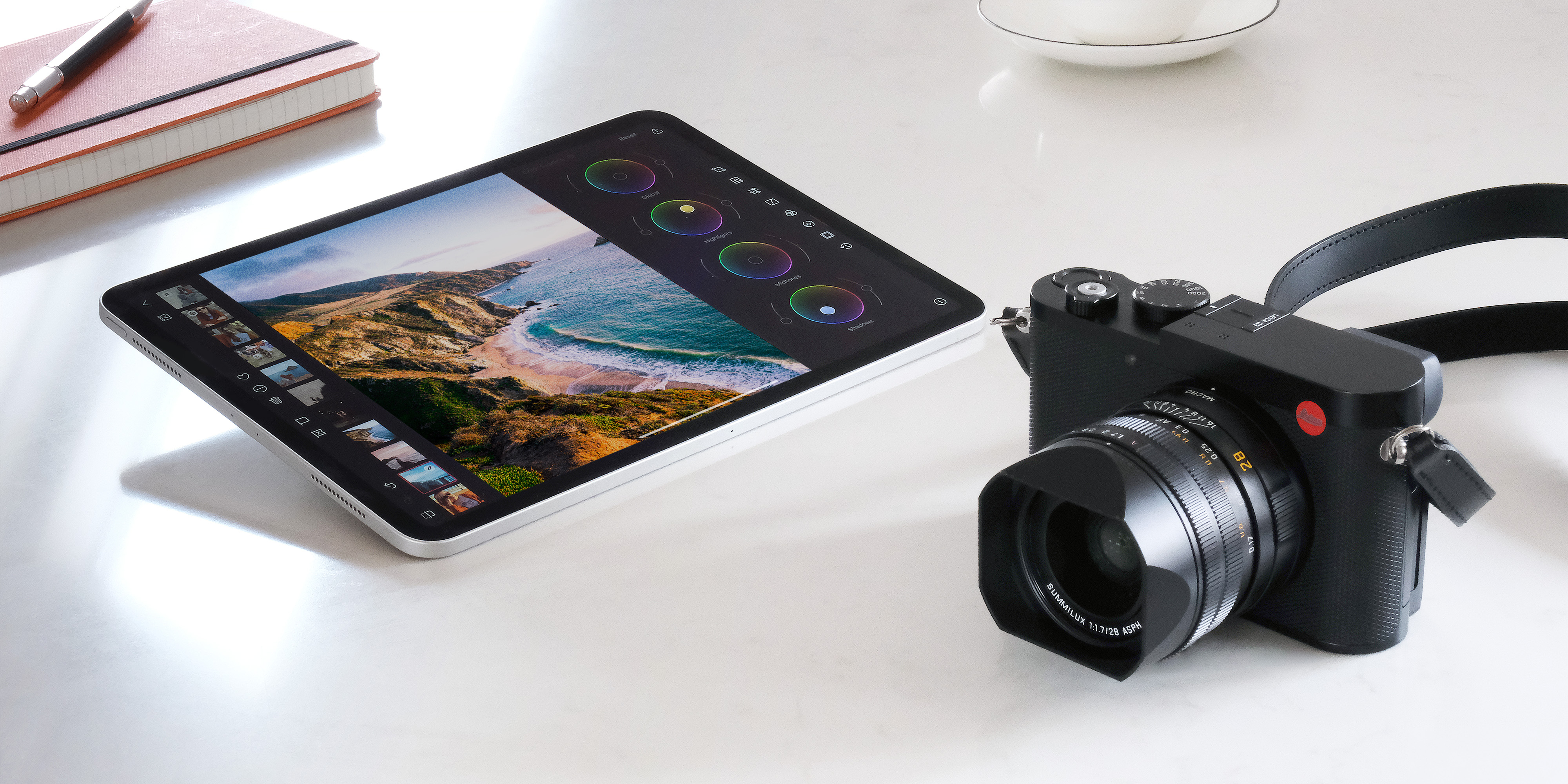
*Partner camera apps like Leica sit one tap away, so you can move between capturing and editing without breaking your rhythm.*
## How to Use It
On iOS and iPadOS your preferred camera app appears automatically at the top of the library grid, ready whenever inspiration strikes. To switch which app lives there, tap and hold the camera icon and pick a different partner — handy if you shoot with one app for street work and another for portraits. You can manage the full set of integrated camera apps anytime from Darkroom **Settings**, and you can see which partners are currently supported on the [Integrations page](/integrations).
---
# Keyboard Shortcuts
> Speed up culling, editing, and export on Mac and iPad with keyboard shortcuts for navigation, ratings, and tools.
Source: https://darkroom.co/help/app/keyboard-shortcuts
Section: App
Updated: 2026-04-09
Keyboard shortcuts help you move through Darkroom faster, especially when culling, batch-editing, and exporting many assets. They are available on Mac and on iPad when using a hardware keyboard, and for many users a keyboard-first workflow dramatically cuts the repetitive UI navigation out of a session.
You don't need to memorize the whole list at once — learn them in layers, starting with the keys you reach for most. If one slips your mind, hold the **Command** key on iPad to surface the shortcut overlay, or check the menu bar labels on Mac. The biggest speed gains come during review and culling sessions: keep one hand on the arrow keys to navigate and the other on the rating and review keys, and you can fly through a large set without touching the screen.
---
### View and navigate
| Action | Shortcut |
|---|---|
| Open photo | `Space` or `Return` |
| Back to Library | `G`, `Space`, or `Return` |
| Next photo | `Right Arrow` |
| Previous photo | `Left Arrow` |
| Play/Pause video | `Option + Space` |
| Show original (without edits) | `/` |
| Toggle photo strip | `S` |
| Toggle chrome | `Shift + F` |
| Toggle tool interface | `T` |
| Zoom in | `Command + +` |
| Zoom out | `Command + -` |
| Zoom to fit | `Command + 1` |
| Zoom to actual size | `Command + 0` |
| Quick zoom max | `Z` |
### Edit and review
| Action | Shortcut |
|---|---|
| Toggle Batch (iPad) | `B` |
| Copy edits | `Command + C` |
| Paste edits | `Command + V` |
| Reset edits | `R` |
| Toggle favorite | `F` |
| Toggle pick/review state | `P` |
| Toggle pick and advance | `Shift + P` |
| Toggle flagged | `X` |
| Toggle flagged and advance | `Shift + X` |
| Toggle hidden | `H` |
| Rotate clockwise | `Command + R` |
| Rotate counter-clockwise | `Option + Command + R` |
| Flip horizontally | `Shift + Command + F` |
### Open tools and adjust presets
| Action | Shortcut |
|---|---|
| Open Metadata | `Command + I` |
| Open Transform | `1` |
| Open Presets | `2` |
| Open Adjustments | `3` |
| Open Curves | `4` |
| Open Color | `5` |
| Open Color Grading | `6` |
| Open Frame | `7` |
| Open History | `8` |
| Next preset | `J` |
| Previous preset | `K` |
| Increase preset strength | `.` |
| Decrease preset strength | `,` |
### Library management
| Action | Shortcut |
|---|---|
| Import | `I` |
| Export selected | `E` |
| New album | `Shift + A` |
| New album with selected photo(s) | `Option + A` |
| New folder | `Option + Shift + A` |
| Add to album | `A` |
| Show Recents | `Command + 1` |
| Show Favorites | `Command + 2` |
| Show Edited | `Command + 3` |
| Show Imported | `Command + 4` |
| Search albums and folders | `Command + F` |
| Show photo in Recents | `Command + J` |
| Remove from album | `Backspace` |
| Delete | `Command + Backspace` |
| Delete all rejected | `Shift + Command + Backspace` |
---
# Shortcuts Automation
> Turn repetitive editing and export steps into one-tap pipelines with Apple Shortcuts — apply looks, crop, frame, watermark, and deliver automatically.
Source: https://darkroom.co/help/app/shortcuts-automation
Section: App
Updated: 2026-06-10
Darkroom's Shortcut Actions let you fold repetitive editing and export work into Apple Shortcuts. A single shortcut can process a photo or video, apply a look, crop to an aspect ratio, add a frame and watermark, and then save the result or hand it straight to another app. For everyday use that means fewer taps; for production work it means a full publishing pipeline that runs on its own.
*Darkroom's actions live inside Apple's Shortcuts app, ready to chain with photo input, delivery, and other apps' actions.*
You build these in Apple's **Shortcuts** app on iPhone, iPad, or Mac: create a shortcut and search for **Darkroom** actions to add them. Once a shortcut exists, you can run it from the Shortcuts app, a Home Screen or Lock Screen widget, Siri, the Action Button, or Control Center, depending on your device and OS version — so an edit-and-share flow can be a single press away from wherever you are.
## What you can automate
Darkroom's actions cover the parts of a workflow you'd otherwise repeat by hand. You can run an edit in the background with Darkroom's processing, apply a preset or filter and dial in its intensity, crop to common aspect ratios like 1:1 or 9:16, and add frames or a watermark to the output. From there a shortcut can save to Photos or Files, pass the result into another app's action, or combine with library actions like flag and favorite flows for culling and delivery.
## Building your first automation
Start simple. In Shortcuts, create a new shortcut and add a photo input action — selected photos, for example. Add one or more Darkroom actions to apply your look, crop, or watermark, then finish with an output action such as Save to Photos, Save File, or Share. Run it against a small sample set before you trust it with a batch, and save it once it behaves. That alone gives you a repeatable one-tap workflow for everyday posting.
## Scaling it into a production system
Once the basics click, shortcuts become a delivery system. Build a separate shortcut per destination — Instagram Stories, portfolio exports, client previews — each chaining Darkroom actions with that platform's delivery action so there's no manual app-hopping. Keeping the frame, crop, and watermark settings consistent across them holds a campaign visually uniform, and the same logic runs on Mac for desktop batch work. A useful habit is to keep shortcuts modular and named by their goal rather than the tool involved: one shortcut for editing and one for delivery is easier to maintain and faster to pick in a hurry.
## Related
- [Shortcut Actions](/blog/2021-06-shortcut-actions) — the original feature introduction
- [Monterey + iOS 15 update](/blog/2021-10-ios15-monterey) — expanded entry points and Mac support
- [Export, Save or Share](/help/export/export-view) — the export step these pipelines automate
- [Batch Actions](/help/manage/batch-actions) — process a consistent set in one pass
---
# Alternate Mac App Icons
> Replace the Darkroom Mac dock icon with an alternate design using Finder's Get Info paste workflow.
Source: https://darkroom.co/help/app/mac-app-icon
Section: App
Updated: 2026-04-09
Follow the below instructions to change things up. We wish we could have made it as easy as in our iPhone and iPad apps, unfortunately we couldn't on Mac. At least it is possible!
- Right-click on any of the App Icons below to get the context menu and use Copy Image.
- Open Finder and navigate to Applications, or right-click on the dock icon and choose Options → Show in Finder.
- Select the Darkroom app icon and use the ⌘ (command) I keyboard shortcut, or right-click and choose Get Info.
- Click the small thumbnail of the current app icon in the Info window at the top left.
- Use the keyboard shortcut ⌘ (command) V to paste in the new icon.
- Quit and reopen Darkroom to have the changes take effect in the Dock and Finder.
 Swoosh
 Light
Light
 Laser
Laser
 Wave
Wave
 Grid
Grid
 Stars
Stars
 Light
Light
 Chrome
 Lightspeed
 Atmo
Atmo
 Grain
Grain
 10 Years
 Rewind
 Gilded
 Vision
 Spectrum
 Dark Side
 Stealth
 Spring
 Summer
 Winter
 Explorer
 Fall
Fall
 Sunset
 Safelight
 Point Cloud
 Doodle
 Red Dot
 Highlight
 Macintosh
 Shadow
 Holo
Holo
 Album
Album
 DR 5P
DR 5P
 DR 5L
DR 5L
 DR 5D
DR 5D
 Pride
Pride
 Awake
Awake
 M1
M1
 Panda
Panda
 80s
80s
 Swirl
Swirl
 Metal
Metal
 1 Bit
1 Bit
 Vintage
 DR 4
DR 4
 DR 4L
DR 4L
 Pink
Pink
 Abberation
 Line
Line
 Oops
Oops
 DR 3
DR 3
 DR 2
DR 2
 DR 1
DR 1
---