
Welcome, Darkroom 2.8!
This month’s update is a little early. Sometimes, things just work out that way! This one is a little smaller, but it builds on the work we did in 2.7. Let me summarize the changes for you:
Changes in 2.8:
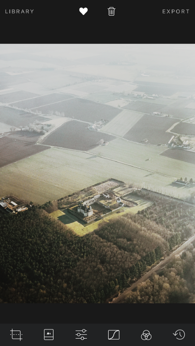
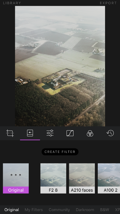
- Addressing one of the longest-running UX issues in the app, the navigation bar in Darkroom is finally persistent when in the editing view! You no longer have to swipe down to share, and you no longer have to swipe down twice to go back to the library. This change is enabled by the redesign of the Export flow in 2.7 which dropped the Save as Square photo.
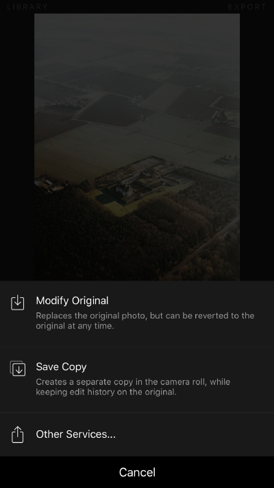
- The “Other Services” share dialog now integrates deeply with third party apps. Instead of the plain text Instagram share option, you get the “Copy to Instagram” share option which uses Instagram’s native share dialog. (Thanks @kevinshay for the tip)
- Updated the app’s interstitials to disappear faster.
With the details out of the way, I’d like to share some thoughts about why we made this change and how this update reflects our product philosophy, which you’ll see reflected in the app as we continuously update and revise it.
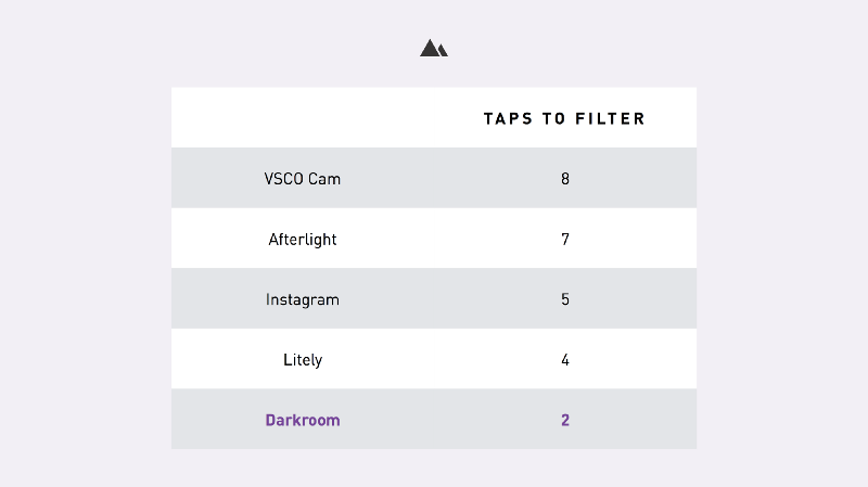
From the moment Darkroom went from a simple HSL adjustment tool to a full fledged photo editor, it was clear to me that the key to distinguishing the app in the extremely crowded field of iOS photo editors was going to be the speed of the workflow.
I spent months ensuring that the photo editor would be as powerful as Lightroom-in-your-pocket, and as fast and seamless as the native Photos app. We optimized our design process around a metric we called TTF: Time-To-Filter.
One aspect of the workflow we wanted to address as well was the number of apps we, and the photographers we were meeting, were using to get the results they wanted. Photographers were moving from app to app, using individual features from each app. One of those apps, was used to add a white letterbox around a landscape or portrait photo to circumvent Instagram’s square constraint. That app was reduced in Darkroom to a single button; A defining accomplishment of our philosophy.
However, that feature constrained us in an important way: To know what the photo would look like with the border and the inset, you had to see it, which meant the Share experience had to accommodate a full-image preview. When combined with the fact that we were building for an iPhone 5S in 2014 and our own self-imposed constraint to never overlay the photo with any UI, we were stuck. We resorted to adding the now-familiar swipe-down-to-share UI, which unfortunately ruined our linear workflow.
In 2.7, acknowledging that the 5/5S/SE form factor was now the minority device size, and that Instagram had long ago dropped its square constraint, we followed suit by removing the Save as Square option. Once we did, we quickly realized that we no longer needed to show a full image preview when sharing, which allowed us to make the navigation bar persistent in 2.8. Now, finally, the workflow in Darkroom is linear: Tap to open a photo, tap to filter, then tap to export, without having to rewind. Tada!
Moving forward, this change will continue to enable us to invest in improving the efficiency of the workflow and how fast you can navigate through your library, make changes, and reflect those edits back into your Camera Roll.
Some really exciting things are in our pipeline, and I’m dying to share them with you ❤
The Darkroom Team

