
The Try-Before-You-Buy Release
In these posts, we discuss what’s new in each update and the background behind it. We hope you find these in-depth explorations insightful.
Here in LA, actors like to say “One for you, one for me.” This update started out being a “one for me” update. That is, it’s an update to how we bundle and sell in-app purchases, and I don’t expect longtime fans of the app to be particularly excited about the update. Yet as we fleshed out what this update would include and started implementing it, it started to feel more like “One for you, AND one for me!”, making Darkroom easier than ever to use, and fulfilling our desire to help more people than ever become better photographers. Before we get into it though, let’s get the logistics out of the way:
Changes in this release
- Discover & Try: completely rethought the way to discover and try our Premium Filters and the Pro Color and Curves tools.
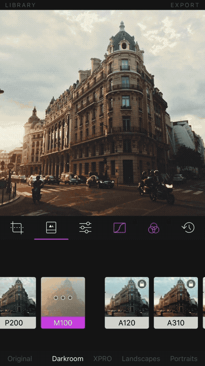
- Now when trying Darkroom’s premium filters and pro tools there’s a single, consistently accessible and discoverable location in the app to purchase the filters and tools.
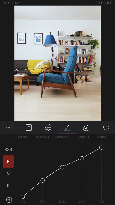
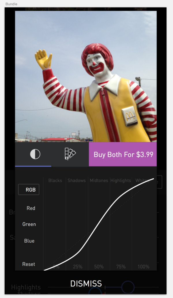
- The Curves tool now has handles on the curve line to make initial usage more intuitive, and color gradient vertical tracks to help explain the curves handles effect. (partly inspired by Denny Tang’s Tips video suggesting improvements for Tone Curves Tools).
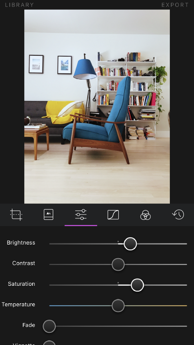
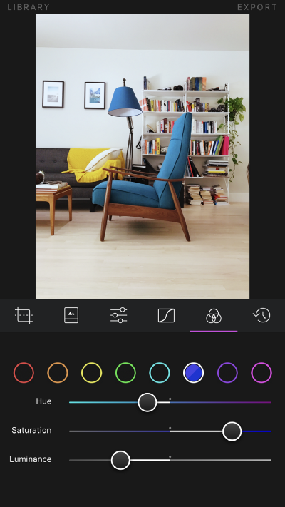
- Sliders now have color gradients to explain their effects. This is particularly powerful with the Split Tone tool, Color tool (Premium Upgrade), and Temperature sliders.
- In the Color tool it’s now also easier to understand what color has been changed, and how it has been changed.
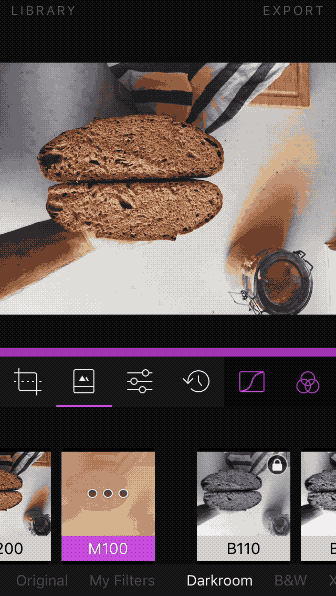
- The Filters tool now accommodates the presence of the all available premium filter even without purchasing them so they are easier to discover and try.
- The Split Tone Tool is now free, previously a premium feature, you’ll find it right at the bottom of the Adjustment tool.
Other Changes
- Made the header bars in the app smaller to reduce the chrome footprint and focus more on the photos.
- Adjusted the Crop tool to better fit in iPhone SE-sized devices.
- Improved the state in which Darkroom didn’t have Photo Access rights, making it clearer and easier to grant access.
- Improved the states for the Favorite and Edited tabs when no photos are favorited or edited yet.
- Assorted bug fixes throughout
Background
Darkroom is an independent and bootstrapped company, built and maintained by two people, and has been for much of its life (Shout-out to Matt Brown who c0-founded the company with me).

We’re blessed with Darkroom to have a very healthy and sticky product that’s repeatedly featured by Apple and experiences organic growth. However, to thrive, we need to improve the conversion of our for-pay products.
I’ll admit at this point that I’ve often left monetization to be the last task before a launch. I’m a product-minded person, and I see the world in use-cases and features and bug fixes. I’m not a business-minded person who sees the world primarily in conversion funnels and market opportunities. However, the balance of the two is where a business thrives. My product plans rarely involve monetization and sales, focusing rather on product features and workflow inefficiencies. This is the first time we decided to focus primarily on monetization.
Darkroom’s original business plan was to sell filter packs à la VSCO, and sell Pro Tools à la TouchRetouch. We created a Store and put the filter packs in it, and we put the tools in the toolbar, with a modal to unlock them. Bada-bim, bada-boom, we had a monetization strategy.
We had conversations early on to allow people to try filters and tools before buying them, but we decided against that approach for a few reasons we found convincing at the time:
- People might not know how to use Curves/Color, and if they play around with them for a few seconds and achieved an unpleasing effect, they may be turned off from exploring them anyway further.
- People would be able to just copy our filters
- People would be able to use the tools for free, screenshot the edited image, and bypass our monetization strategy.
- By using stock images to promote our tools and filters, we can create an aspirational marketing message, as opposed to the functional message we’d be sending otherwise.
That conversation happened in 2014.
The Plan
We had anticipated before starting work on Darkroom that Filter packs would be the primary sellers, and Pro Tools would sell less, but at a higher price. Since then, through natural iteration on the product, the only entry-way into the filter store became the end of the filters list in the filters tool. That meant the path for a person to discover the existence of filter packs looked like this:
Open app > Tap on a photo > Expand toolbar > Select Filters tool > Scroll past the last filter > Tap on the unlabeled Store icon.
It doesn’t take a lot of experience with product development to look at that path and assume the conversion between the first step to the last step would be near-zero, and our sales numbers confirmed the fact.
Our tools, the primary differentiator of the app, were similarly hidden. In the toolbar, we had two pink icons, tapping either would present a modal with a single sentence describing the tool, and a few stacked screenshots.
Not to state the obvious, we knew we had some low-hanging fruit to pick. Driven by the understanding that as barriers to entry are lowered, conversion increases. We decided to challenge the assumptions we made in 2014.
- If we assume the people using our app want to do the right thing, and if we give them the respect of assuming they’re intelligent and capable photographers, then we can assume that they understand what the Curves and Color tools do. Furthermore, it’s our job as designers and engineers to make the tools easier to use and understand.
- If people want to go through all the steps of transcribing the individual edits of a filter and recreate them later, they likely aren’t the kind of person who would’ve paid for any of them in the first place. We shouldn’t block dishonest people at the cost of honest people.
- We can easily detect a potentially malicious screenshot to bypass paying for the app. We chose to turn that into an opportunity to remind people that Darkroom is a small independent operation.
- The most aspirational message we can give people is the aspiration of becoming professional photographers. Those who don’t know what Curves and Color correction tools are, are the most capable of learning and growing, and we should help them by providing access to the tools.
That’s why in Darkroom 2.9, we’ve made every Pro Tool and all Premium Filters available to fully try for all people for free. We only ask you to pay when you’re happy with your photos and want to share them.
Getting there wasn’t easy. Like any other core product change, it took a lot of iteration to reach the right balance of clarity and usability. In the end, we’re really proud of what we achieved. We hope you like these changes.
You can see in this gif of the first pass how visually forceful we made the upsell. What you can’t see is that we made it lock you into the tool you were in.
Clearly, we were still worried about giving away our premium filters and tools so freely to people, but we knew that the intensity of the upsell and the disruption of the lock-in felt wrong in Darkroom. It wasn’t clear what the solution would be. Eventually, after many conversations and iterations, we settled on a color, placement, size, and behavior combination that felt native to Darkroom, and clear to the user.
The “For You” Part
That was all “For Me”. Now let’s talk about what you have to be excited about.
Since we opened up the tools to every single person who downloads Darkroom, it unleashed an unintended incentive structure.
Because the profile of the person who would be consuming the pro tools has changed, and the context under which they use them has changed, we had to update the design of those core tools to accommodate those people. In the process, we’ve refined and tightened up what was already the best-in-class Curve editor and Color Correction tool.
There were two core philosophies behind these changes:
- It should be clear to the person how they need to interact with the tools
- It should be clear to the person what the outcome of those interactions will be.
In Curves, this means knobs on tracks, similar to how sliders work. It also means that the tracks of those sliders visualize the impact of the change.
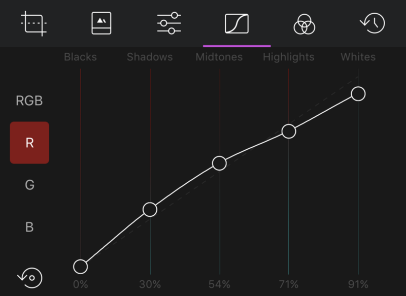
In Curves, it means gradients on the slider tracks to indicate what color you are shifting to, and increased contrast between which color channels have changed and which have not.
This philosophy really carried over to almost every other part of the app, making Darkroom easier than ever to use, and fulfilling our desire to help more people than ever become better photographers.
Please let us know what you think! We’re so excited to share this with you and have so much more in store.
The Darkroom Team

