Content-Aware Frames, Duotone Filters, and an enormous list of improvements
After months of hard work, we’re thrilled to introduce the Frame Tool, a new and free top-level tool, the Duotone premium filter pack, and an enormous list of app-wide improvements to keep Darkroom head and shoulders above the pack in quality and performance.
A new dimension of expression with the Frame tool
Frames for mobile photography grew out of the need to share non-square photos on Instagram. Since then, white frames continued to be extremely popular. We challenged ourselves to dig into that behavior and create a tool that stands as a form of creative expression on its own. We’re thrilled to introduce the Frame tool today with two industry-leading features: Content-Aware Frame Colors & Frame Inset Presets.

Content Aware Color Palette
The color of the frame itself is hugely impactful to how the viewer’s eye perceives colors in your photos. That’s why we added content-aware colors which automatically analyze the photo and pick a curated set of colors that perfectly match your photo. This ensures you always have frame colors to pick from with just a tap, that will fit the mood of your photo seamlessly.
Whether to extend the natural edges of your photo, or to make the key colors in the photo pop, it’s remarkable how much more impactful your photos can be with the right border.

Frame Inset Presets — Stories & Social-Media cards
Just as important as being able to control the color aspect of a frame, we also found it extremely important to control its size. Insetting on a square is great for Instagram specifically, but other platforms have different formats. So we added support for 9:16 ratio for Snapchat and Instagram Stories, 4:5 for Instagram portrait photos, and 2:1 for those times you need your social post attachment to look on point. Oh, we also made sure these frame inset presets are accessible when exporting, even through batch!
Pro-tip: The inset slider remembers the last used value. This enables you to efficiently maintain a consistent border across your exports, particularly with batch exports!
We felt the word “border” was actually the wrong way to talk or or even think about this feature. In our research we leaned into the historical use of frames.
"With frames we intend to help photographers extend or enhance a photo beyond its original bounds, and to gain control over the context in which it is viewed".
Duotone Filters — Premium, only $1.99
To showcase one of the coolest aspects of the Frame tool, we’re thrilled to release our newest premium filter pack: Duotone Filters. Extremely graphical and punchy, these filters will make your photos feel like they popped right out of a magazine.
We’ll also note that this Duotone look was created entirely inside our Curves tool. We think it is a great showcase of how our tools can be used in varied and creative ways. So we’d encourage all of you to take a look at the curves of these filter to see how these looks where achieved.

App-Wide Refinements
Our commitment to refinement and quality doesn’t stop with adding bleeding-edge new features. We’ve also taken a hard look across the app and added many little improvements throughout the app.
For a full list of changes, please refer to our updates page. Some highlights:

Privacy Enhancement
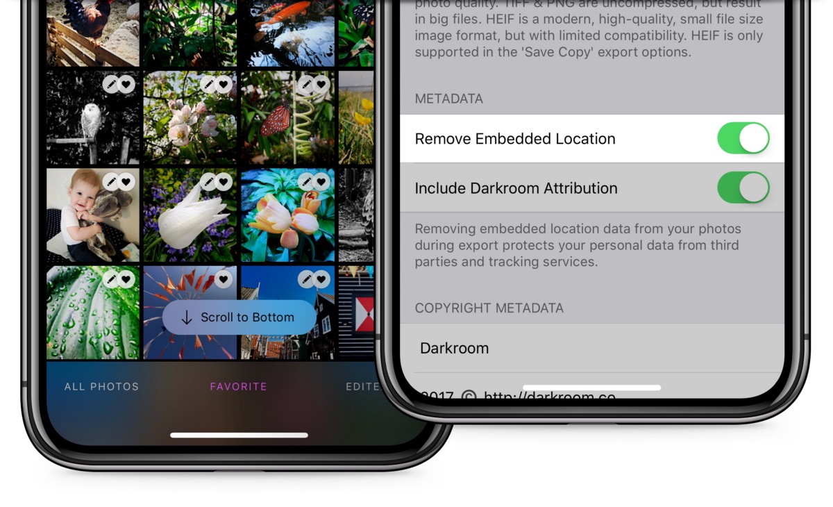
Inspired by recent debate around online privacy, and specifically Halide’s embrace of increased privacy in the context of mobile photography, Darkroom 3.6 adds a setting to enable and disable the embedding location information when exporting photos. That way location can be maintained privately on your phone for captured photos, but can be removed when sharing to third party platforms to prevent tracking.
Scroll to Bottom
Sometimes the smallest details have a huge impact. This is one of those cases. When hunting around for certain photos in our library we often need to scroll back down to our latest shots. Now that’s super easy as well as we will pop in a “Scroll to Bottom” button when you are scrolled up a bit. The devil is in the details.
Image loading and caching
We have completely revamped our image loading and caching layer to improve the performance of using Darkroom, and address a massive list of issues. As a key benefit, we now offer much deeper integration with other photo editing apps that use Modify Original.
This means you can open a photo in Darkroom, edit it, then go to another app like TouchRetouch, use it to remove an object, then come back to Darkroom and continue editing, even exporting over the same photo.
You shouldn’t notice these improvements, but Darkroom should feel faster, more stable, and more capable, which is our never-ending pursuit.
Goodness, there’s still so much to do…
The Darkroom Team


