
Meet The Color Tool
We’re back! After a short hiatus to get Darkroom 2 releases, Sunday School is back! We’ll continue exploring mobile photography through the lens of Darkroom.
Have you all gotten a chance to upgrade to Darkroom 2 yet? If you haven’t you’ll need it to follow along. While you’re at it, make sure you buy the Pro Kit. We’re running a special offer which unlocks all the premium filter packs as well, all for 50% off the full price.
Phew. Ok. Let’s dig in.
What is the Color Tool?
Generally speaking, photo editing tools slice up the photo in different ways, and allows you target your edits to those slices. For example: Curves allows you to adjust the color of different tonal regions of the photo, vignette the brightness of the corners, and Color allows you adjust the tone of individual colors in the photo. The more granular the slice, the more control you have.
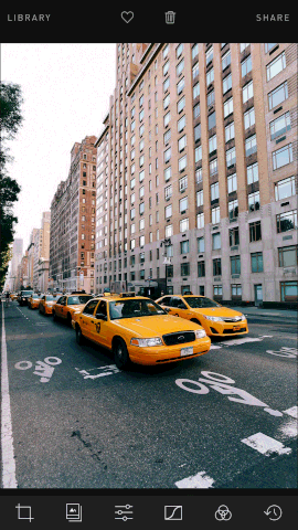
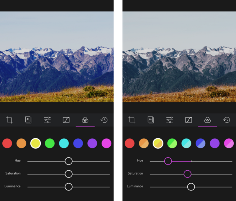
In the gif, you can see that we are adjusting the Hue and the Saturation of the yellow colors in the photos. New York City cabs being mostly yellow, they take on a very stronger orange hue in the process.
When to use Color
The ability to adjust the Hue, Saturation, and Luminance of individual colors is fundamental and central to the ability to create unique and interesting filters. Saturation and Luminance are indredibly powerful when you want to guide the viewer’s eye towards your focal point: If you shot a portrait and the trees in the background are drawing too much attention, adjusting their saturation and luminance can add contrast and focus attention on your subject.
Hue on the other hand, serves two purposes: Corrective, and artistic. Depending on the lighting conditions and white balance when you took the photo, you may need to fix a color cast in one part of the image. On the other hand, subtly shifting the hue of a color can dramatically alter the soul and the emotion of photograph.
How to use Color
The editing process in Darkroom typically starts by selecting a filter. With the 20 premium filters that launched alongside Darkroom 2, you now have over 30 filters to pick a starting look from. We categorized them based on intended use-case (A landscape filter is not going to look great on a Potrait) to make the selection process more seamless. Next, light is typically adjusted using Brightness and Contrast and Curves, and finally, Color comes in at the end to adjust the feel and tone of the photo. The process isn’t always linear, and a good deal of back and forth may be necessary, but generally speaking, the tools are laid out in the order they’re typically used.
Because the Color tool divides the photo into its various color channels, those typically correspond to the various elements in the photo. In a landscape: Look at the sky, how blue is it? How blue do you want it to be? Desaturating the sky puts more focus on the ground and gives the photo a slightly darker mood. Increasing the Luminance of the sky usually adds contrast to a photo where the sky and the ground are in the same tonal range and may be hard to separate using Curves.
The color selector is split into two halves: Original color, and Modified color. As you adjust the hue, saturation, and luminance of any, the bottom half of the circle reflects the new color. Play around with it, you have an infinite history that catches any mistakes you make :)
Pro Tip: Play around with the neighboring colors. Sometimes the color of an object is made up of multiple colors and you can separate them out using the Color tool. For example, try desaturating Aqua (between Blue and Green and see what it does to the photo!) and see what it does to the blue of the sky!
A Note on Cross Processing
Back in the days of film photography, when you were developing the strip of film from your camera into negatives you can then print, you had to follow a specific chemical formula and process that was specific to the type of film you were using. If you used a chemical process for a different type of film, you typically ended up with often-unpredictable shifts in color and hue that spawned a whole generation of artistic expression.
The Color Tool is essential for shifting the colors in your image across the hue spectrum and creating unique film-like filters. If Curves is the backbone of filters, Color is the soul, and body. We play around with this in the XPro premium filter pack.
You can read more on Lomography’s “What the hell is Cross Processing?”
Happy Editing!

