Managing Composition
This is the second installment of the weekly series exploring mobile photography and post processing. In last week’s post, we explored exposure, and how to properly control it. This week, we’ll talk about composition.
No amount of post-processing can turn a bad photo to a good photo. Editing a photo after taking it can bring out certain subjects, hide others, and give the photo a mood and an emotional dimensionality to it. Every beautifully edited photo you’ve seen started out as a beautiful photo, with care taken to identify a focal point, leading lines, and symmetry. These are the elements from which a photo forms its 1,000 words. A basic grasp of these elements and how they influence your photo can dramatically improve the quality and expressiveness of your photography.
Focal Point
A photograph derives its power from its ability to tell a story visually. The story may be as simple as “look at this beautiful house” or complex enough to start a revolution. When you’re starting out, picking a singular focal point allows you to reduce the complexity of your photos.
In this context, “Focal point” refers not to the optical focus from your lens, but to an element in your photograph that stands out as the central, most important one. You have quite a few tools in your tool belt to identify and separate you focal point from the rest of your photograph: Color, size, pattern, and leading lines. We’ll talk about leading lines in the next section, but the others are simple enough to explain.


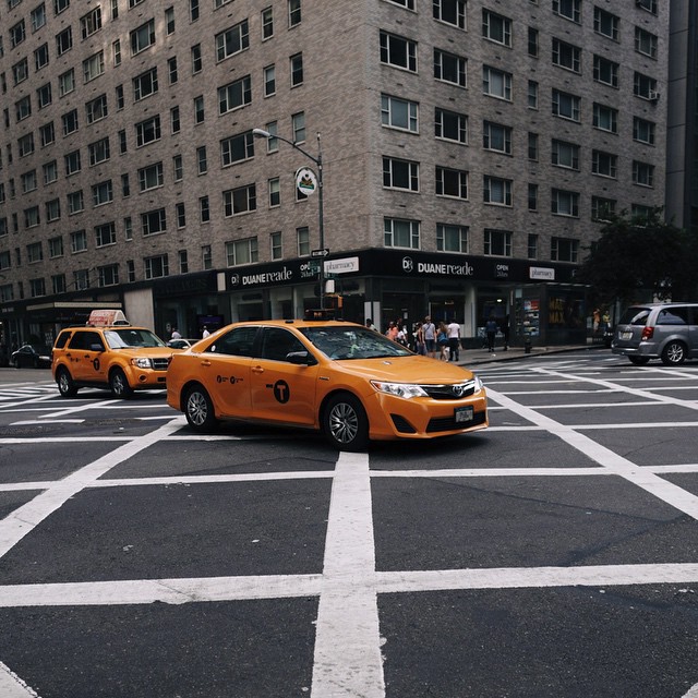
When it comes to using Color and Size to establish a focal point in your photo, what you’re going after is contrast. If you’re taking a photo in an urban environment on a drab day, a person’s yellow jacket really pops against the grayness that surrounds it. Same thing for size. If you’re taking an overhead photo of a crowd in a festival, a single person taller than everybody else becomes the focal point you can build your story around.

Establishing patterns — and more importantly — breaking them, is another very powerful method of establishing a focal point. When the brain sees a pattern, it treats it as a single object, and the individual items making the pattern recede to the background. When you break that pattern, it pops out and stands on its own. Apartment complex facades, meadows with one tree turning color before the others, etc are all examples of using pattern to establish a focal point.
I want to stress that not every photo needs a focal point. For example, you can use perspective to establish a vanishing point, and your photo might use color and proportion to tell a story. But for photos that have them, focal points become the center of attention, upon which a story is built.

Leading Lines & Vanishing Points
One of the most impactful ways of reinforcing a focal point is using leading lines. Leading lines get their name because they lead the viewer’s eye towards a point or region in the photo and create flow in a photograph.
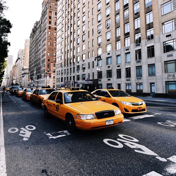
The classic example of a leading line is a tree log along a trail, the yellow dividing line on a road, or the tops of buildings on a city street. In a compositionally complex photo, leading lines can reduce the complexity, create a pattern, and give structure to your photo.


When you combine a focal point with a leading line, you can dramatically empower that focal point and push the viewer’s eyes towards it, creating a much more dramatic effect.

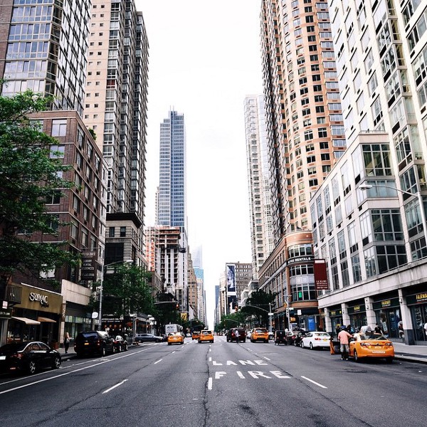
Any discussion of leading lines naturally leads to talk about perspective and vanishing points. When you use the curb of a city sidewalk as a leading line, you inevitably end up with the curb of the opposite side of the street, as well as the roofs of the buildings and all the floors and balconies. If you are taking a photo along the street, you’ll notice that they all lead towards a single point: The vanishing point. If you stand diagonally across a building, you’ll be looking down two streets, and end up with two vanishing points.
Vanishing points are the terminals, the periods at the end of the sentence. Without them, your eyes are led down an incomplete path. What you put at the end of that road if up to you. Your central subject, perhaps?


Rule of Thirds and Symmetry
Given that background and terminology, we can move forward to assembling these pieces together into a photograph. Let’s say you have your focal point, leading lines, or vanishing point. Where do you put them in your photo? Speaking very technically and prescriptively, there are two places to put these areas of focus, and choosing which depends on the story you want to tell.
The first is smack-dab in the middle. Center it, and create symmetry around it. You can center either vertically or horizontally or both. Centering along only one axis gives you the ability to use the other as a part of telling the story. For example. If you’re in New York City, walking to the center of the street and taking a photo down an avenue creates a beautiful vanishing point that you can horizontally center. However, the intersection itself is not interesting, and sliding your vanishing point down can really elongate all the buildings and get much more of them in, which improves the sense of space and proportion in the photo.


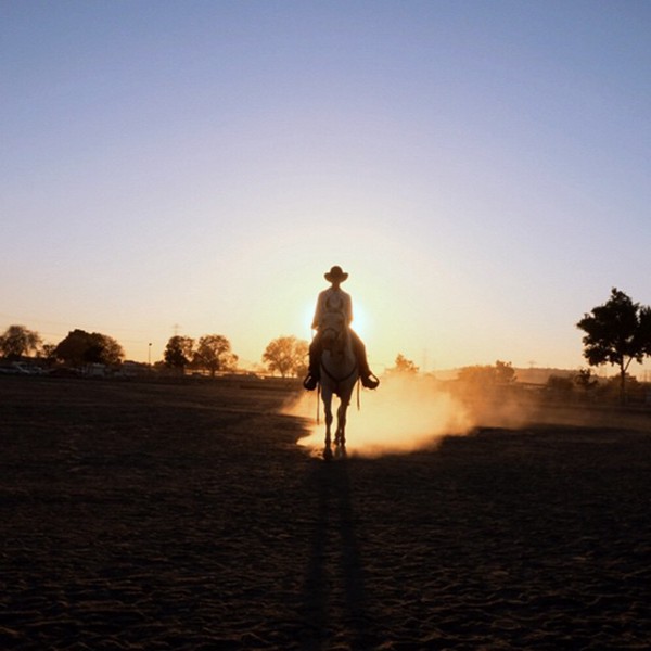
Centering is a powerful tool for establishing focus, empowering your focal point, and giving it power.
The second rule of composition is known as the Rule of Thirds, and this one you likely have heard of. The basic idea is that by dividing your frame into three equal columns and three equal rows, you establish points that your focal point can sit on. If you’re taking a landscape, you horizon could be on the bottom third line. If you’re taking a photo of a person looking to the right, they should stand on the left third line. This, like most other rules in photography, is a sure-fire way of establishing a result. Straying off the advice is encouraged, but an understanding of what the elements at play are is helpful in avoiding frustration.


To really understand when to center, when to use the rule of thirds, and when to stray from these rules, a discussion of context is important.
Context
One of the most common mistakes we see photographers make is not providing enough context in their photos. Context allows the viewer to understand the focal point in its environment, how it interacts with it, and how it lives within it. For example. A photo of a beautiful car parked with a view is much less powerful when the view is cropped out of the frame or the car takes up too much space in the frame. A beautiful building or house without its lawn or porch and some sky and surrounding buildings feels too close. Often, taking a few steps back, letting more of the surroundings into the frame while keeping the focal point centered can really let the point sit in its natural space, instead of feeling detached and aggressively cropped.
For photo of people, a form of providing context is by allowing what they are looking at to be included in the frame. For example, if your model is looking left, putting them on the right side of the photo allows more of the environment to their left into the frame, allowing the viewer to see what the model is looking at. Try this: Make your friend stand and look left. Now take two photos, one with them on the left side and one with them on the right side. Which is more expressive? Unless you’re intentionally trying to create a sense of mystery or tension, you’ll find that positioning the model on the right when they’re looking left will create a much more compelling story.
When it comes to landscapes, how much sky you choose to include in your frame is a major factor in determining the mood of your photo. The more sky, the more airy and open the landscape. Also, in landscape photography, having a foreground and a background is essential for creating depth. Without a foreground, a landscape in the distance can appear washed out, flat and distant. With a foreground to provide contrast and distance, your landscape can really pop.


Perspective
One last parting note on perspective. When lining up your photos, and particularly when centering your focal point, taking the time to properly line up your vertical and horizontal lines can make a world of difference. If you’re taking a photo of a door or the facade of a building, making sure that the right angles of the door remain right angles in your photo is extremely important. A little bit of careless perspective looks sloppy and lazy. You don’t have to worry too much about getting it absolutely right — There are a lot of photo editing applications that support perspective correction — but you should try to get it close.
As always, the first step is to remember to wipe your lens and make sure it’s not full of dust and skin-oils!


