
Black and White Editing
This is the eighth installment in our weekly series exploring mobile photography through the lens of Darkroom. You can view all the articles here.
I’ve been excited about this one for a couple of months, ever since we finalized work on the Color Tool which recently launched with Darkroom 2. With Tone and Color, Black and White editing is now supercharged in Darkroom.
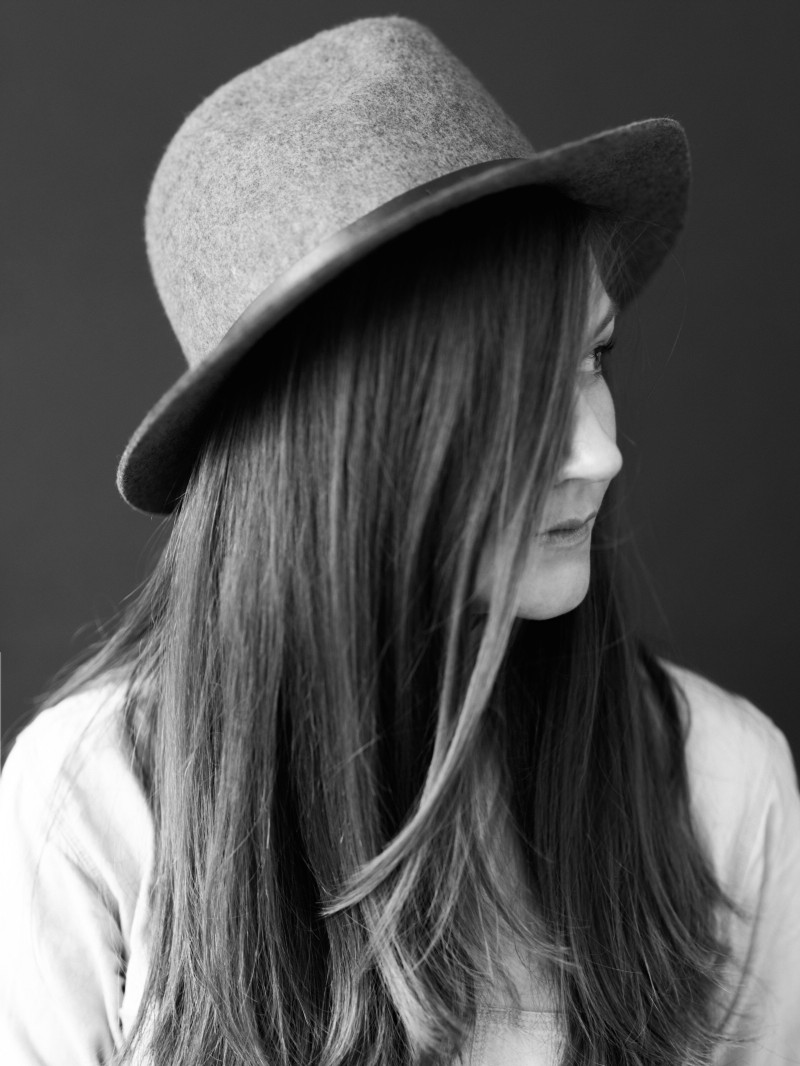
Black and White photos are a category of photos all on their own and can evoke very powerful emotional responses and elevate a photograph when done well. Mastering it puts yet another tool in your photography tool belt.
Black and White photography is particularly powerful for a couple of reasons. From a technical perspective, by reducing one of the variables in the photo (color), you eliminate an entire category of potential pitfalls and mistakes, and can focus on the value (used here in the artistic sense of “Amount of lightness and darkness”) and learn how to see and judge the value of a scene before you even take a photo. This “photographer’s eye” — An ability to imagine what the photograph will look like — is a fundamental skill.
From a more artistic sense, when you remove color from a photo, you divorce it from reality, and allow the user to project into the photo. When the photograph loses color, it becomes a representation of what the photographer was seeing, and not a documentation of the scene. This is one of the reasons why B&W movies from the pre-Technicolor days look so romantic to us.
There are two large topics that can be discussed when it comes to Black and White Photography: The technicalities of working in Black and White, and the artistic choices to make and how they influence the photo. The latter is a much broader topic that hinges on personal style and tastes. We may get into it in a future post, or multiple posts, by profiling individual photographers and their personal styles. This article will focus on the technicalities of working with Black and White photos in Darkroom.
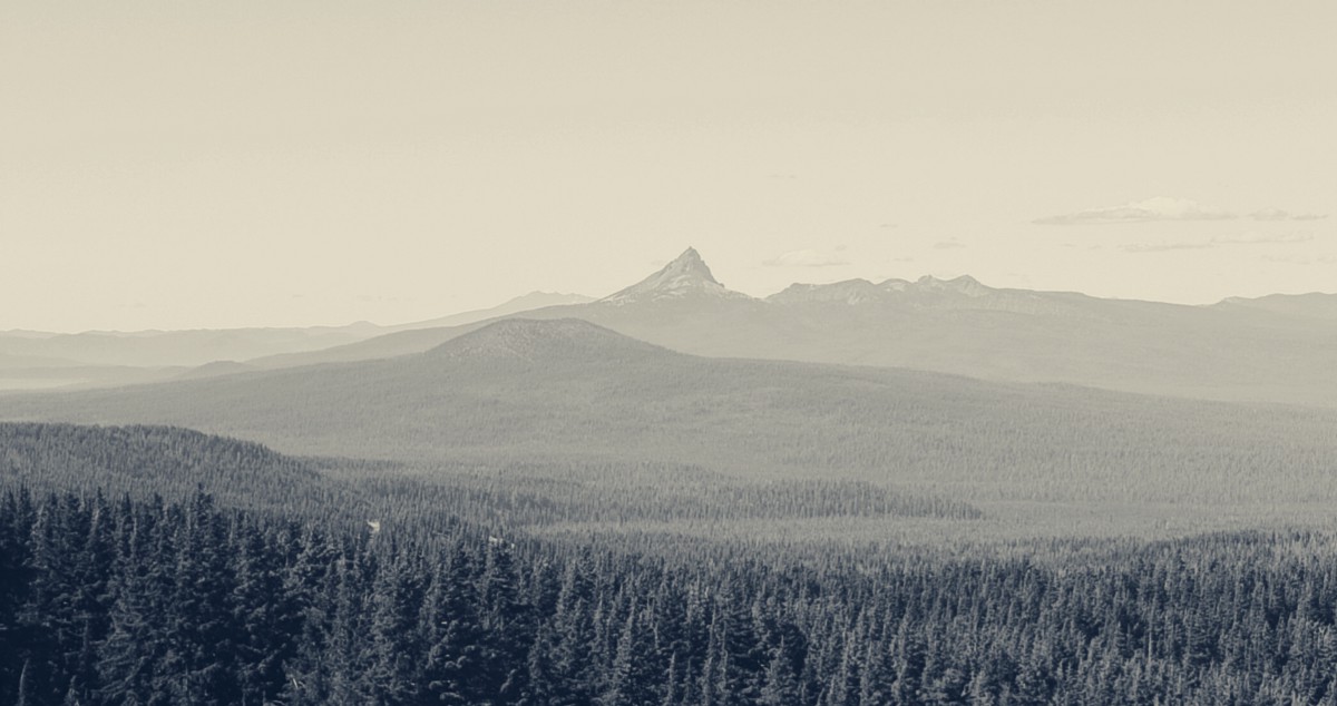
Ok, let’s get into it: Drag that Saturation slider all the way to the left and make that photo black and white.
Contrast
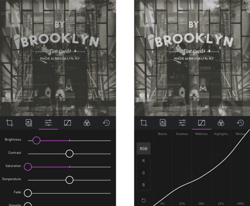
In our two-part Using Curves posts, we discussed how the RGB curve can be used to selectively add and remove contrast the various tonal ranges of the photo. The image being Black and White, you don’t have to worry about impact on saturation when editing the curve. Feel free to experiment here, you have more lattitude to make adjustments.
In the aforementioned two part series on Using Curves, we discussed the difference between using the Contrast slider and the RGB Curve. Much of that applies here. Namely: The Contrast slider is a global predefined adjustment, whereas the RGB Curve allows you to selectively apply contrast to different parts of the image by forming your own S-curve with its own steepness and it’s own steepest-point. The same applies to Brightness. Here’s an example of how the Brightness tool crushes the shadows, while the selective RGB Curve adjustment maintained the information.
Luminance
This section carries on the chat about contrast, but it’s pretty fun to play around with and it’s new in Darkroom 2, so it felt like it needed its own section.
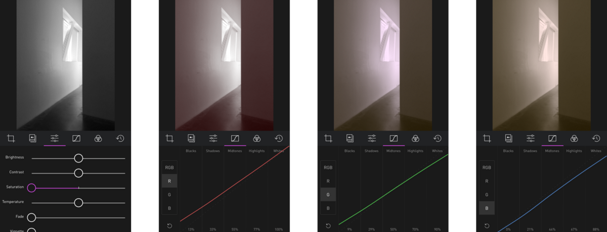
The Color tool includes one of my favorite hidden power-user features in Darkroom 2: The ability to edit the luminance of color channels in Black and White Photos.
This takes a bit of explanation. The order in which a photo editor applies the edits is very important in really taking advantage of the tool. For example, if the Color tool was applied after Saturation, then the Color tool won’t be able to differentiate between the various colors. However, the Color Tool in Darkroom 2 is applied before the Saturation tool, which means you can use it to adjust the Luminance of individual color in a black and white photo. Here’s a gif of it working:
Adding Color and Tone
When I recently asked on Twitter about what you guys wanted to know about Black and White editing, color and tone were the two standout requests. It may sound weird to talk about color in a “Black and White Editing” post, but it’s actually very powerful to add color after fully desaturating the photo. By desaturating the photo, all the colors get flattened to a gray color, which means adding color back up adds the color evenly across the entire tone range. There are multiple ways of adding color to your photo. The easiest way is to use the Temperature slider to add a blue/yellow hue to the photo.
Being constrained to global blue/yellow hue adjustments, while efficient, is very constraining. This is where the Tone Tool comes in.
Tone Tool
Also new in Darkroom 2 is the new Tone tool (Part of the Pro Kit In-App Purchase). Now, you’re no longer constrained to just Blue/Yellow hues with the temperature slider. you can pick any color on the entire color spectrum, and a different color for the highlights and for the shadows. This is also known as Split Toning (splitting the tone between highlights and shadows). You don’t need to desaturate the image to make use of it, but the two work really well together. A very traditional split tone is using yellows for the highlights, and blue for the shadows.
You can also use the same orange tone for both highlights and shadows for a sepia look, or you can add a pink hue to your shadows for a sunburnt look.
To get the ultimate control over the color of your photos however, switch over to the Curves Tool.
Curves
For the ultimate control over the exact tone in your photo in various tones, Curves is your faithful servant. Again, almost all of the details described in the two-part series on Using Curves applies here. The only real difference is that because the colors have been removed, and because the RGB curve can be used to quickly adjust the brightness and contrast, the adjustments in the various color curves become much more subtle since they’re affecting the tone in a very obvious way.
You can recreate the same split tone style using Curves, but doing so requires a lot more work. If you want to play around with it, try making the curve of each color channel shallower or steeper (but still a straight line), and play around with the angles to get the tone you want.
Addendum
We spent a lot of time thinking about whether Curves should come before or after Saturation. If Curves was applied before saturation, then by desaturating the photo, you end up with a grayscale photo regardless of what Curves was doing to the photo. On the other hand, you get the ability to really control how the Color-to-Grayscale conversion happens. If Curves comes after Saturation (As it does in Darkroom), then making adjustments to the Red, Green, and Blue curves will introduce tone to the photo. We ultimately decided that the ability to take advantage of Curves-Before-Saturation was too advanced to appeal to a wide segment of the Darkroom population, and that adding tone to a Black and White photo is common enough to win-out.

