
Using Curves (Part 1 of 2)
This is the fourth installment in our weekly series exploring mobile photography and Darkroom. The first three lessons covers basic photography techniques.
So far, all our lessons have focused on the fundamentals of photography. That was an intentional choice to reinforce the idea that post-processing does not make a bad photo good; It merely helps it tell its story better.
Now that we understand how light affects our photos, how to properly compose them to tell the right story, and how to expose them so they have a wide expressive range, it’s time to switch gears and start talking editing.
This part of the series involves Darkroom, and we’re starting it with an in-depth look at Curves (In-App Purchase). To celebrate, we’re having a 30% off sale to wet your feet with it and start playing around if you haven’t already.
A Brief Historical Tangent
The story of Curves goes back to the earliest days of Darkroom. I grew to love what certain filters on VSCO where doing to my photo, but they weren’t perfect, and my process involved multiple apps and compromises to get the look I wanted. I decided to build an app to automate that process. After a few failed attempts at figuring out what was giving the filter its unique qualities, I stumbled on tone curves, began experimenting with them in Lightroom, and was awe-struck at the power and expressiveness of those lines.
After building a traditional point-based curve editor as a prototype, I realized how hard it was to use on a small device, and spent a good long time designing various interactions until we landed on the curve editor we shipped with Darkroom.
Curves is such a powerful and central tool, that you can actually recreate many of the popular filters on iOS just using that tool. You can fix exposure issues, capture unique styles, create fades of any tone, and establish mood.
With so much power and flexibility, it goes without saying that an understanding of what Curves is as a tool, how it works, and how to use it goes a long way towards being able to use it effectively. There’s a lot to cover, so we split it into two parts. This is part one.
How Curves Work
As we mentioned back in Proper Exposure Control, a model for thinking about how your camera’s sensor sees light is buckets. Each pixel of your photo is comprised of three buckets: One for red, one for green, and one for blue. As long as your shutter is open and light is hitting your sensors, the buckets are filling up accordingly.
Photo Editing is the process of manipulating the amount of light in those buckets. You can artificially top off the blue bucket to give your photo a blue cast, or artificially drain the blue buckets in your photo to give the photo a yellow case (reducing blue means you end up with more red and green, which combine to produce yellow). Understanding this relationship provides you with a model to think about photo editing.
Simply adding and removing light across your entire photo doesn’t get you very far though. You’re constrained to giving your photo a hue-cast. Different tools give you different cuts and different ways of manipulating the buckets to create filters, fix white balance, and create emotion. Curves is one such tool.
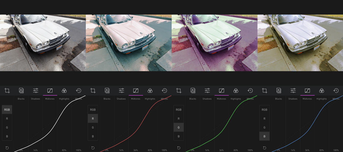
Curves takes the photo, and divides it into different tonal regions. Tone in this context refers to the amount of light. So, “Blacks” have no light, “Shadows” have a little, and so on until “Whites” have so much light it becomes indistinguishable from white. Within each tonal range, you can add more light to each of the red, green and blue buckets, or drain the buckets. In Darkroom, by swiping up within a given tone range, you are telling Darkroom to find all the pixels in the photo that fall within that tone range, and pump more red into the red bucket of that pixel. If your swipe down, Darkroom drains red from the red bucket. There’s a channel selector (RGB/Red/Green/Blue are called color channels) that lets you decide which bucket you want to add/drain color from.
The RGB channel is a special one, because it affects all three buckets simultaneously. Part 1 of the two part series will focus on the RGB curve, and explain how it can be used to edit brightness and contrast.
RGB Curves
Apart from how much easier to use, refined, and accurate Darkroom’s curve editor is, the RGB curve is where Darkroom’s Curve editor really shines and stands apart from the other curve editors available on iOS.
As we mentioned, the red, green, and blue curves allow you to add and remove those respective colors from their buckets. With RGB, however, the interpretation of how to combine the influence on the three buckets is part of the secret sauce.
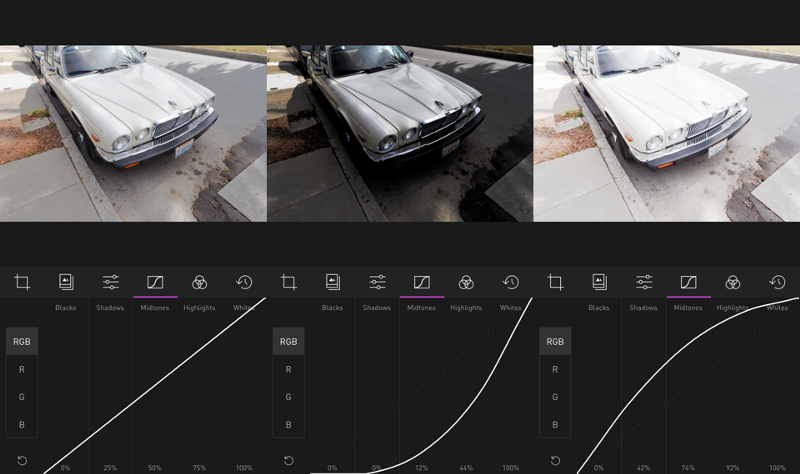
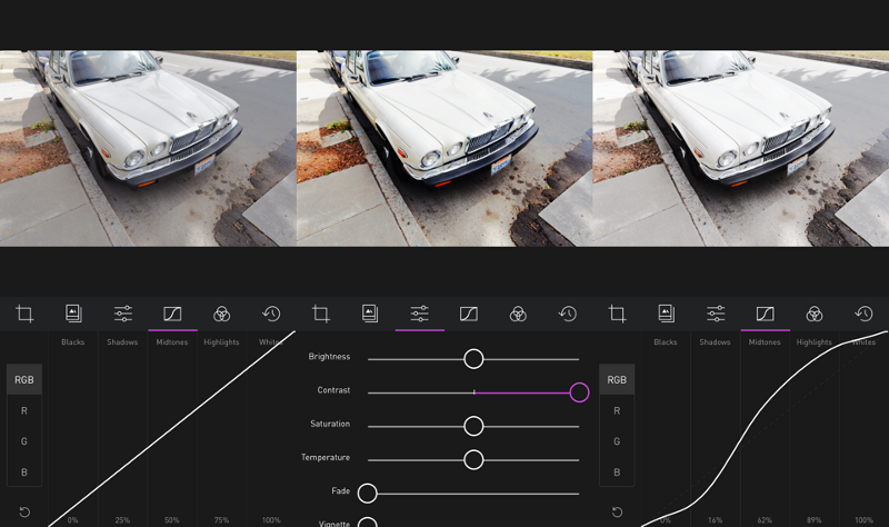
You’ll notice, in Darkroom, that by pulling the region up to 100%, it goes to white, and if you pull it down to 0%, it goes to black. This gives you the ability to “crush” your shadows and “wash out” you highlights, which can be particularly useful for silhouettes and putting the focus on other aspects of the image.
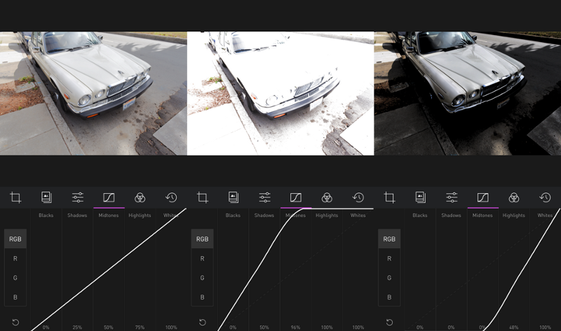
Given that understanding, the RGB curve can be described as the curve that determines the amount of light in your photo.
Selective Brightness
Brightness is also defined as the amount of light in your photo.
“Wait. Are you telling me I just paid $2.99 for a slower, more complicated way of doing brightness, which is available for free???”
My first response, which I would likely keep to myself, is the $3 is about the cost of a bad latte at Starbucks.
My second, more constructive response, however, is that by allowing you to control the amount of light per tone region, Curves allows you to selectively brighten parts of your photo, while keeping others as they are.
Let’s say you took a photo of a landscape or a bright car that included a dark ground. If you increase the brightness, your clouds could easily be lose all the details from the highlights ¡No Bueno!
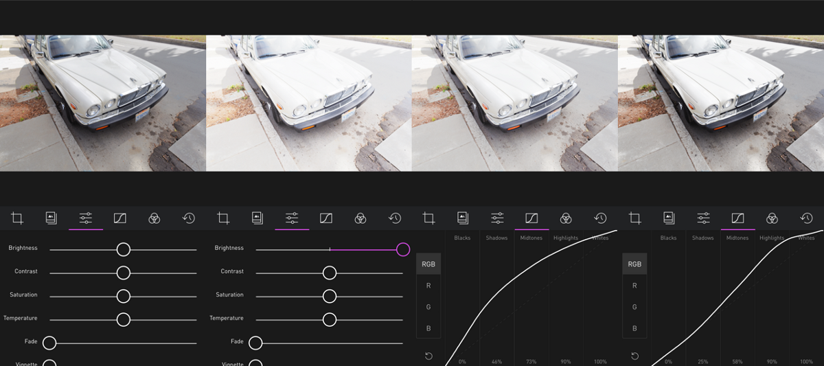
By pulling up only the shadows and mid-tones, you can brighten up your shadows, while keeping your highlights as they are. In Lightroom, you might recognize this as the “Shadows” slider. That’s right, the RGB curve in Darkroom is in many ways equivalent to the Blacks, Shadows, Highlights, and Whites sliders in Lightroom.
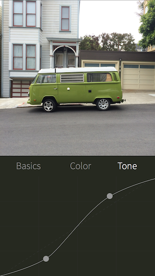
Brightness visually looks like a bow. Either a bow up, or a bow down. A bow up will increase the brightness of the photo, and a bow down will decrease the brightness. How much you bow the curve up or down is up to you, but remember that clipping occurs when you overexpose and underexpose, and the curve lets you know but flatting at the top and bottom. Unless you explicitly are trying to, make sure a dark region is not more bright than a bright region (which creates and inverted look), and make sure you’re not clipped!
Selective Contrast
Contrast, much like brightness, adjusts the amount of light in a photo. However, unlike brightness which is the amount of light across the photo, contrast can be defined as “the distance from grey”. Visually, this means contrast looks like an “S-Curve”. High contrast means the highlights are brighter, and the shadows are darker, and low contrast means the highlights are darker and the shadows and brighter.
Another way I like to describe and think about contrast, is in terms of “stretch” in the curve. In this context, stretch is vertical stretch. If you brighten the highlights and darken the shadows, you’re “stretching” the curve, and when you do the opposite, you’re “compressing” the curve. If you want to selectively apply contrast to your photo, you can stretch certain parts of the curve or compress them.
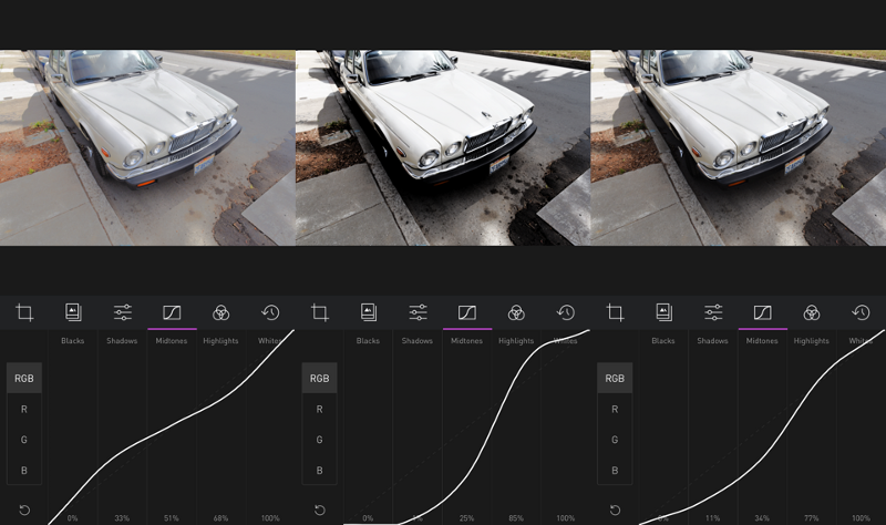
Some restraint is called for however. Curves is a tool of subtlety. Stretching too much can introduce artifacts to your photos, and compressing too much can make parts of your photo indistinguishable. Use judiciously!

