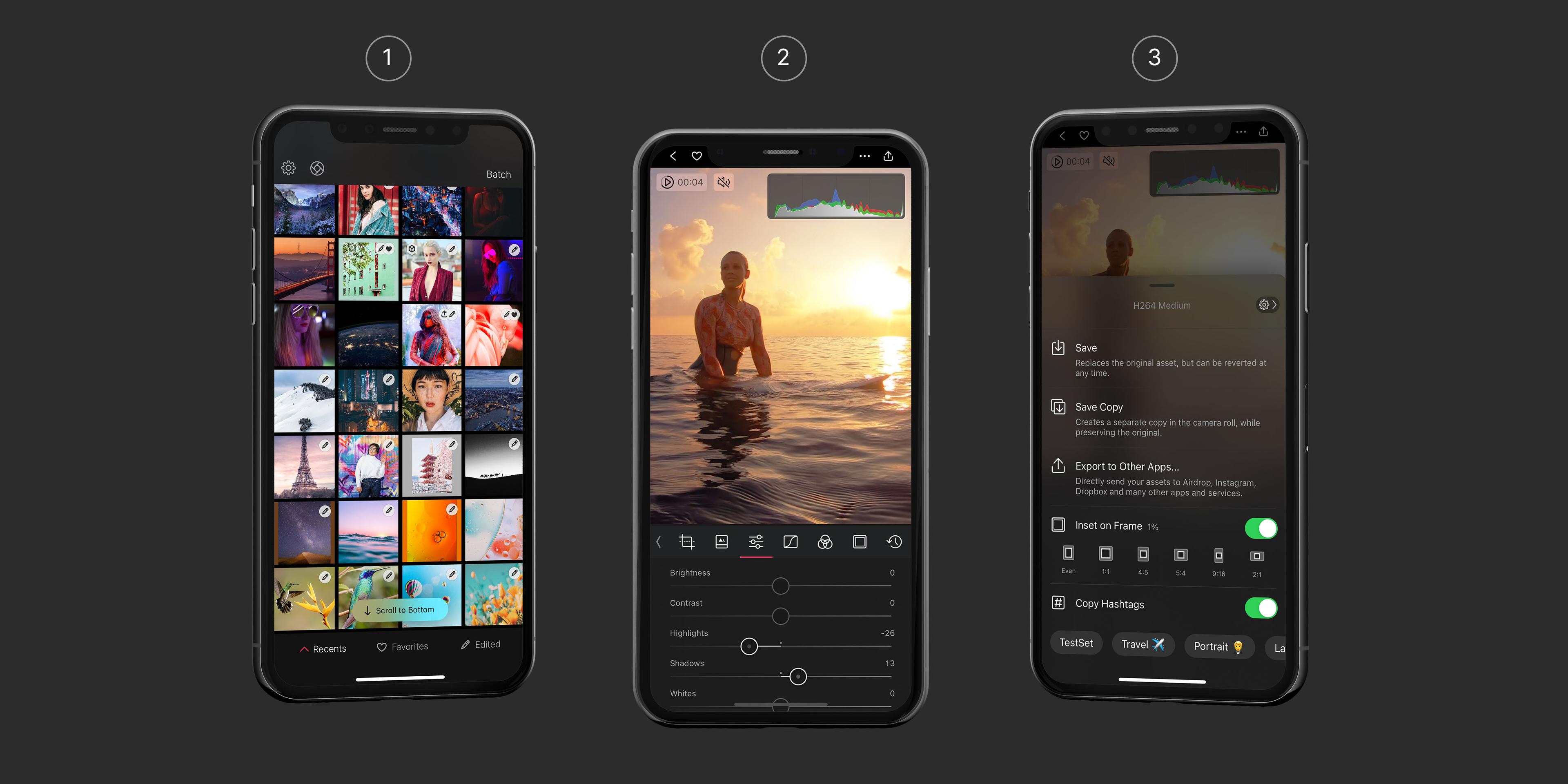
Recreating VSCO Presets in Darkroom
Note: If you want to eat the fish, without learning how to fish, feel free to jump ahead to the “How to Recreate a VSCO Preset” section below. But where’s the fun in that?
Introduction
Anyone passionate about photography is familiar with the feeling: You go on a trip, you take heaps of photos every day, then at some point you go through them, either piecemeal or all at once, and you try to identify which you want to edit and what you want them to look like, then you get to work.
What I quickly realized when I was going through that routine two years ago, was how repetitive the process was. I knew I wanted to use VSCO’s M5 preset. It was by far my favorite because of what it did to yellows/greens/blues, but it had some quirks I didn’t care for. It was too warm, and it crushed my highlights.
Putting aside the amount of work involved in identifying which of the photos I wanted to edit in the first place and how much work it took to import them, anyone familiar with VSCO understands the pain of how much work it is to edit multiple photos. I knew there was no technical reason why such a constraint and ineffeciency was necessary. Further, I knew that VSCO’s presets (And all the other preset apps, for that matter), simply operated on the premise of LUTs (Look-Up Tables). Before we continue, I think an understanding of what a LUT is and how presets work will really help demystify them.
An Explanation of Look-Up Tables
Without getting into too many details (Look up the terms for a deeper understanding, no pun intended), the basic premise behind how LUTs work is that a simple image is generated, covering every possible color in the RGB color space. For those unfamiliar with the RGB colorspace, a quick two sentence explanation goes something like this: Color Spaces can be represented as 3-dimensional shapes that contain all colors. RGB is represented as a cube, with each side ranging in value from 0 to 1.
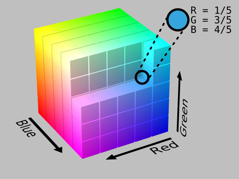
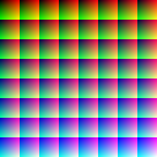
What a Look-Up Table does is it slices that RGB cube into thin slices, and arranges them into a flat image. The flat image is your table in which you “Look up” colors based on their location in the image (How a color relates to a location in the image depends on how you sliced the cube and how you arranged the slices).
How presets Were Made (Before Darkroom)
So, now that you know what a color space is, and you know what a look-up table looks like, we can get back to presets.
I’m not sure what they’re technically called, but for the sake of this article, let’s call them preset artists.
What a preset artist does traditionally, is that they open a sample photo, and then they manually edit it to accomplish a look they’re happy with. They might have a bank of images that contain multiple colors and multiple tones, so they tune the edits to each subject matter, but they’re using Photoshop tools to manipulate the image.
Once they’re happy with how their edits are affecting their bank of images, they save those edits, and they apply them to the unedited LUT, which looks a lot like the sample I showed you.
That edited LUT is suddenly valuable. It encodes all the edits of the preset artist, and it defines the preset. Remember how the RGB cube represents all the colors possible in RGB? Well, because the LUT is generated from the cube, the LUT also contains every color. Now, this is where it gets tricky.
The brilliance of the LUT image above isn’t that it contains every single color. The brilliance of the LUT is that it contains two sets of information. This nugget of information is crucial to understand. The LUT image obviously contains the colors in the pixels of the image. The second set of information a LUT image contains is how the location of the pixels in the image relate to colors as well.
Here’s an example: The top-left pixel in the LUT I shared earlier is at location (0,0). That pixel, is black. Those are the two important pieces of information. We know for a fact, that whatever pixel is at location (0,0), it was black in the unmodified LUT. If that LUT is passed through Photoshop and the shadows of a photo were brightened, then that black pixel is no longer perfectly black, it’s a little gray. There’s your two pieces of information! The knowledge that location (0,0) should be black, means the actual color at that pixel can be different. That before/after is your mapping of the filter.
When an app like VSCO ships, it ships with a set of LUTs that have been passed through a series of editing steps that make up the individual presets. When you apply one of those presets onto one of your photos, the app goes through your photo pixel by pixel and look up the color of that pixel. If that color is black, it knows to look at the LUT at location (0,0) because that’s where the original black color in the LUT should be, and it reads what color is that location in the LUT. The app then replaces the original color of the image with the one in the LUT. Ta-da! You just applied the M5 preset to your photo.
The Limitations of the LUT approach
Congratulations, you now know how to build a photo editing application. The simplicity of this approach is why there are so many photo editing applications on iOS, and why some of them have so many presets. Each app can be slightly different from the others by adding a feature here or there, or by hiring really good preset artists, but they’re all fundamentally the same:
Import > Open > Apply preset > Save
From an app developer’s perspective, this is great: Modify a LUT, send the image down to people’s devices, and they have a new preset! Charge them a few dollars for it, pop some champagne. From a photographer’s perspective however, this is less than ideal. What happens if, like my example with M5 in the intro, the preset does not match my expectations or style? You’re out of luck. You and twenty million other people are all sharing the same LUTs, and all your photos look the same. If you want to use their auxiliary tools to fix the shortcomings of the preset, then you just introduced tons of repetitive work to your editing process.
Obviously, I’m the creator of Darkroom, a photo editing app. This is where I zoom out from the technical details of how presets work, and explain to you why Darkroom is different.
The Darkroom Difference: No Look-Up Tables
The big innovation with Darkroom was to take the same tools that the preset artists use to generate the LUTs, and to port them to your phone. In Darkroom, presets are instructions for generating the color mapping on the fly.
Here’s where this comes into play: Suppose I apply Darkroom’s A100 preset on my photo, but the rich green tones in the shadows aren’t working for me. In Darkroom, I can apply the preset, then use the Curves tool to alter the preset itself. If I see myself doing the same thing repeatedly, I can save those new instructions as my very own preset. Because Darkroom skips the import flow of all the other apps, my editing flow is thus reduced to:
Open > Apply Filter > Save
Except, the Preset I’m applying is my own, containing all my custom edits.
Now that the fundamental concepts of how LUTs, colorspaces, traditional presets, and Darkroom presets all work is out of the way, let’s get back to the original point.
How to Recreate a VSCO Preset
Technically speaking, you can pass a blank LUT through any preset on any app and end up with the same LUT the app uses internally. That doesn’t really mean anything, and it isn’t really very useful. To recreate a VSCO preset in Darkroom, we’re going to need to approximate the instructions used to generate the LUT in the first place. Put another way, we have a meal, and we’re trying to guess the recipe.
To do this, we’re going to need to be familiar with the Curves tool, and the Color tool in Darkroom. The former modifies the tones, the latter modifies the colors. Since these are the primary tools used for creating presets in Photoshop and Lightroom, we will generate a specific color palette which we will use to isolate changes to those two tools.
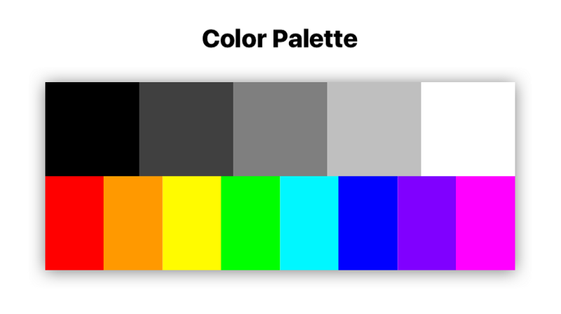
In Darkroom, the Curves tool is divided into five regions (Blacks, Shadows, Midtones, Highlights, and Whites). That’s why the first row in the palette is divided as it is. They’re desaturated, because we want to isolate the impact of tonal adjustments from color adjustments.
The Color tool however is divided into eight color channels, represented here in the second row.
Step 1: Match Tones
Simply download that palette to your phone, import it to VSCO, and pass it through your favorite preset. In this case, we’ll be recreating F2.
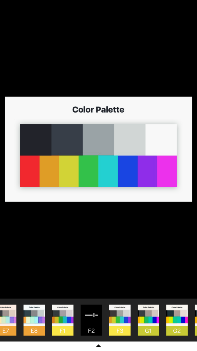
Next, move the edited image back to your computer using AirDrop. We’re going to need to read the values of those pixels. There are lots of tools available for doing just that, my favorite is xScope.
Open the edited image, and read the values of the gray boxes in order. Here’s what it looks like to use xScope on the Black square, and how the value appear:

You can see on the left, the values of R:0.13 G:0.14 B:0.17 Those numbers reflect the impact of the preset on black colors, absent any color-specific adjustments. Switch to Darkroom and go to the Curves tool, apply those numbers to the Red, Green, and Blue curves respectively:

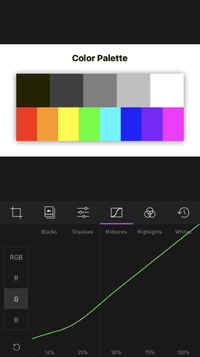
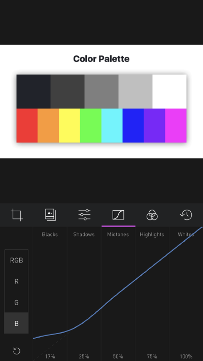
You can see how by the time I added the Blue curve adjustment, the black square already matched the VSCO-edited palette.
Now, repeat the process for the four other tone regions:

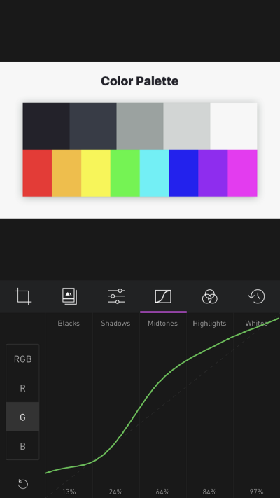

Et Voila! We’ve already gotten pretty far!
This is the end of the robotic part of the process. Now we’re on to the subjective and more intuitive part of the process.
Step 2: Match Colors
After matching the Red, Green, and Blue curves in Darkroom, export the palette onto your computer. Name the two images (VSCO F2 and Darkroom F2) so you can differentiate them. Open both in a photo viewing app (I’m using Sketch.app, and compare:
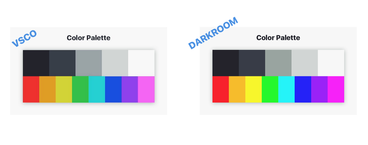
You can see the top bar matches closely, but the colors at the bottom are off. The colors in the VSCO preset appear less saturated across the board, and they appear darker across the board as well. This is where we start experimenting. Since we have no way of knowing what the recipe is, we have to keep guessing until we get close enough.
It’s important to remember when you’re doing this activity that your goal isn’t to recreate the VSCO preset exactly. You want to emulate the VSCO preset's character. It doesn’t have to match. Looking at the palette, the difference is huge, and that’s good, because we’re using it as a tool, yet even without adjusting for the colors, the curves get us most of the way through to the final character of the F2 preset:
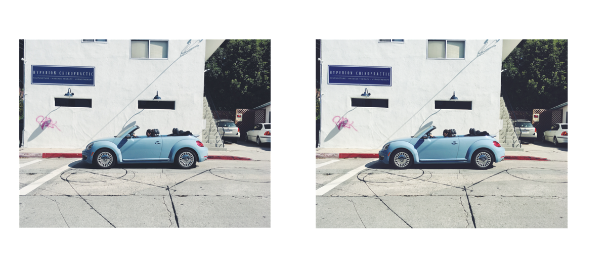
There are some differences, notably the saturation of the shadow that the side mirror is casting on the door, but it’s the same in character.
With a little bit more work, we can get much closer though. Since saturation appears to be low across the board, let’s knock it down in Darkroom’s Basic Adjustments tool (The default one with all the sliders). We don’t know how much to adjust it, so it could take a couple of back-and-forths of AirDrop’ing the updated palette and comparing again.
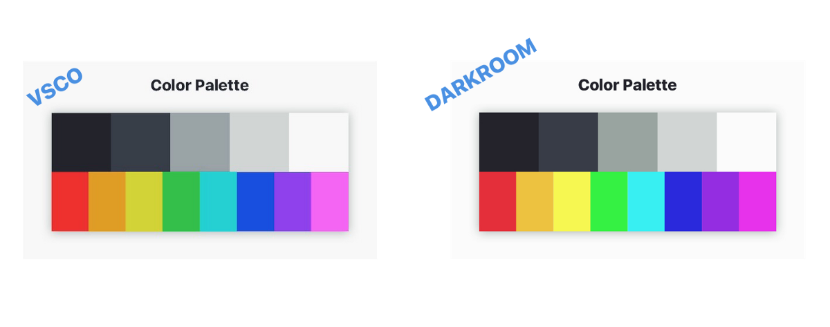
Now, we can see that the Red, Purple, and Pink colors are fairly close, but the Yellow and Green colors are noticeably darker in VSCO, and the blue appears even more desaturated.
To fix the color-specific channels, go to the Color tool, and adjust the Saturation and Luminance of the ones with differences. Again, it might take a few iterations to get it right, but take your time, you’ll see progress quickly!
Here are the changes I ended up making to match:
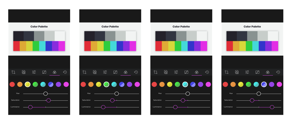
And here’s how they stand next to the original VSCO Palette:
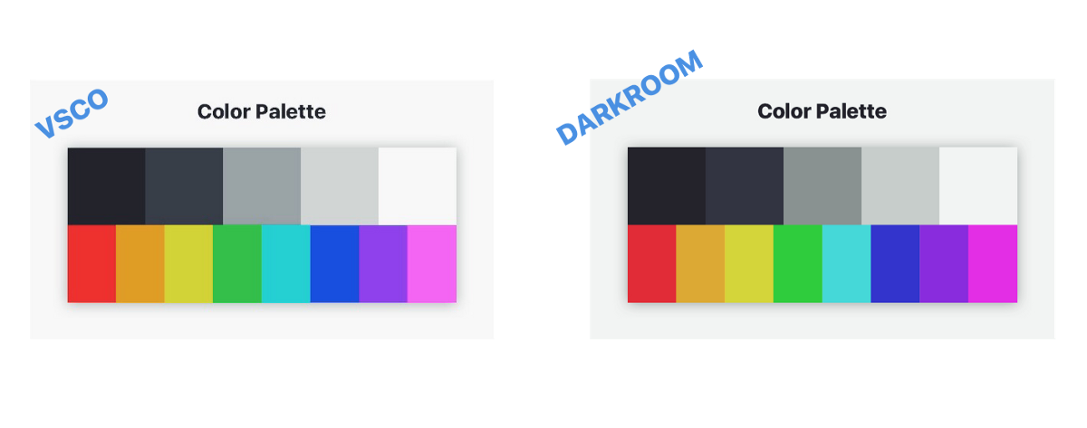
Quite close! Not bad for a few minutes of work. But, there’s one crucial step left!
Step 3: Matching The Character
When I was making the edits, I was uncomfortable by how hard I had to push the luminance on the yellow and green channels to match the VSCO palette. I wanted my first test to be with a green-heavy photo:
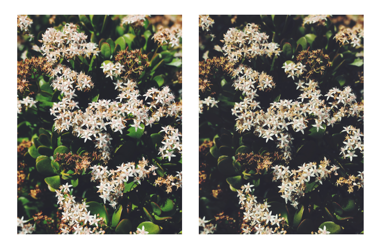
Just as I had suspected, the greens and yellows are far too dark.
The thing to remember, is that Darkroom is a tool. Toolmakers, by their very nature, have to make decisions along the process of building tools that impact the behavior of the tools. For some things, standard mathematical definitions exist to define a tool. Those tools behave identically everywhere. Most of the time however, the tools behave subjectively. For example, a developer building a Saturation tool needs to define how colors get desaturation. We have an intuitive understanding of how it works, but at the end of the day, what does a desaturated yellow look like, and how does it look different from a desaturation red?
That’s where the conversation of character of a preset comes back. We want to match the preset by feel, not by technicality.
I upped the luminance of the green and yellow, et voila!
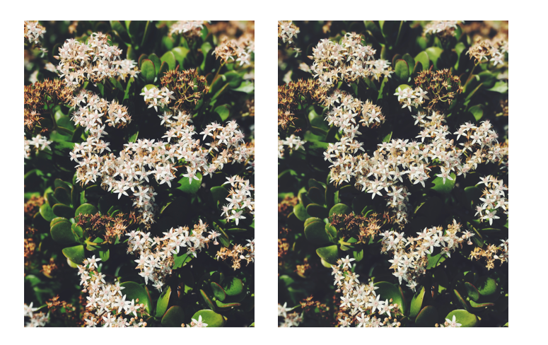
It’s still not exact, to be clear, but it doesn’t have to be, not should it be. This is a base, a foundation, on which you build, iterate, make your own. You have learned how to fish, now go catch a big one and feed your whole photography family!
Conclusion
I’ve uploaded the preset created in this tutorial to our server so you can download it and play with it. I named the preset “Charlie” after the Twitter user who turned me onto this rant in the first place. If you have the Darkroom app installed on your phone, tap the link below and it’ll open the app and install the preset.
To install the Charlie preset, paste this in MobileSafari on a phone with Darkroom installed:
darkroom:///install_filter?id=547
p.s. One last tip when doing something like this: I suggest creating presets every time you export a photo with changes from Darkroom, and matching the file name to the name of the preset. I number my attempts like commits in a git code repository. It took 9 attempts to match this preset. Enjoy the process!
The Darkroom Team

