
Assets and Guidelines
Download Brand Assets1.4 MB — darkroom-brand-kit.zipNaming
“Darkroom” is one word, always spelled with a capital “D”. It is the name of both our company and our application — not “Dark Room”, “darkroom app”, or “DR” in public writing. When referring to membership, capitalize it as Darkroom+.
Usage
You’re free to use these assets on personal sites, professional work, press, or pretty much anywhere you’re talking about Darkroom. Please use them consistently, give the marks room to breathe, and kindly link back to darkroom.co when you do.
Don’t alter the files, stretch them, add effects, or display them in a way that implies partnership, affiliation, or endorsement. Don’t use Darkroom marks as part of your own product or company name.
Wordmark
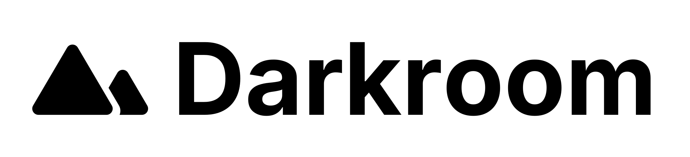
Use the Darkroom wordmark in all references to Darkroom whenever space allows. Monochrome is preferred — black on light fields, white on dark fields.

Logo
Our mountain mark — two peaks — is the concise way to refer to Darkroom in tight layouts, favicons, and logo-only grids. The wordmark carries stronger recognition when space allows; use the mark alone when it doesn’t. Dark on light fields, light on dark.

App icons
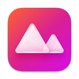
Use the app icon when referring to Darkroom on the App Store, home screens, or social avatars. Colored is the default. Light is for brighter contexts where a quieter mark fits better. Over the years we’ve redesigned it with every major release — and collected dozens of alternate styles along the way, as showcased in the header at the top of this page. Read the story behind the icons.


Colors
We keep it simple. Brand red is the accent — a deeper red on light fields, a brighter red on dark. Black and white carry the marks.