Create a Custom Preset
A preset is a look you can apply in one tap — but a good preset is something more specific than that: a set of stylistic decisions that holds up across many different photos. That distinction is the whole craft. Anyone can save their last edit; the work is making something that still looks right on the next twenty frames.
This guide is about that work. For the mechanics — installing, syncing, sharing, organizing — see Presets.
The short version of how to save one: edit a photo, open the Presets tool, tap Create a New Preset, and name it. It appears under My Presets immediately. Everything below is about making that preset worth keeping.
Start with a look, not with sliders
Dragging sliders until something looks nice is the slowest possible way to build a preset, because you have no way of knowing when you're finished. Starting with a target — even a vague one — gives every adjustment a purpose and tells you when to stop.
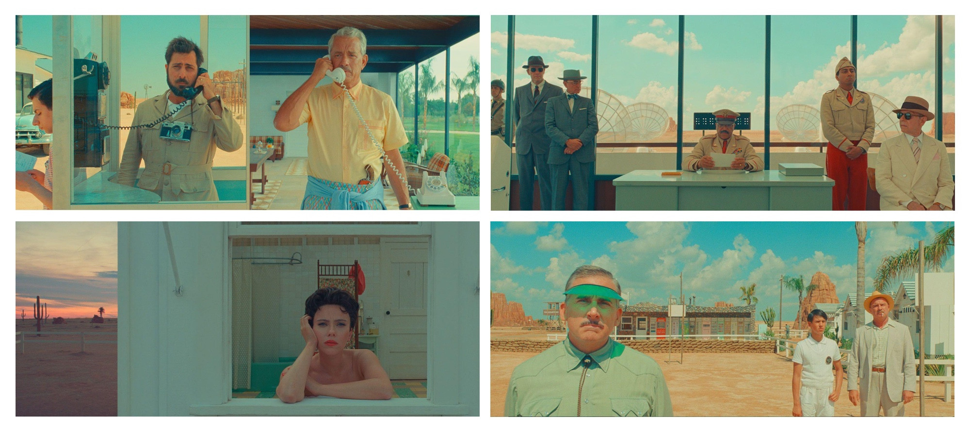
So decide what you're after before you touch anything. Vivid and saturated, or muted and restrained? Bright and open, or dark and moody? Clean and minimal, or bold and heavily graded? Are you chasing a particular film stock, a film still, a photographer whose work you keep coming back to? None of these have right answers — the point is to have an answer.
Collecting reference images helps more than you'd expect. A handful of photos you admire, gathered in one place, turns a vague preference into something you can actually aim at and compare against.
Learn by taking presets apart
The fastest way to understand how a look is constructed is to open one someone else built. Every bundled and community preset in Darkroom is fully transparent — apply one and you can open each tool to see the exact adjustments behind it. Reverse-engineering a look you admire teaches you more about color grading in an afternoon than experimenting blindly does in a month.
Try it with a few of these, which span a wide range of approaches:
Overshoot, then pull back
Make your first pass too strong. Push each tool past where you think it should sit, because a preset that's obviously too much is easy to tone down, while a timid one gives you nothing to react to — and most first attempts fail by being too subtle to read as a look at all.
It's also worth abandoning the idea of one preset that works on everything. A look tuned for bright, flat frames will fight a dark contrasty one. Build the version you actually want, then make variants of it for the lighting conditions you shoot in most.
Which tools to build from
This is the decision that determines whether your preset travels, and it's where most homemade presets go wrong.
Build from the stylistic tools — Curves, Color Grading, Selective Color, and Masks — and leave the corrective ones out. Brightness, contrast, blacks, and whites need to be different for every photo, because every photo was shot in different light. Bake them into a preset and one of two things happens: the adjustments already on the photo take priority and your preset appears not to work, or the preset lands first and leaves you much less room to correct afterward. Either way, the look fights the photo instead of sitting on top of it.
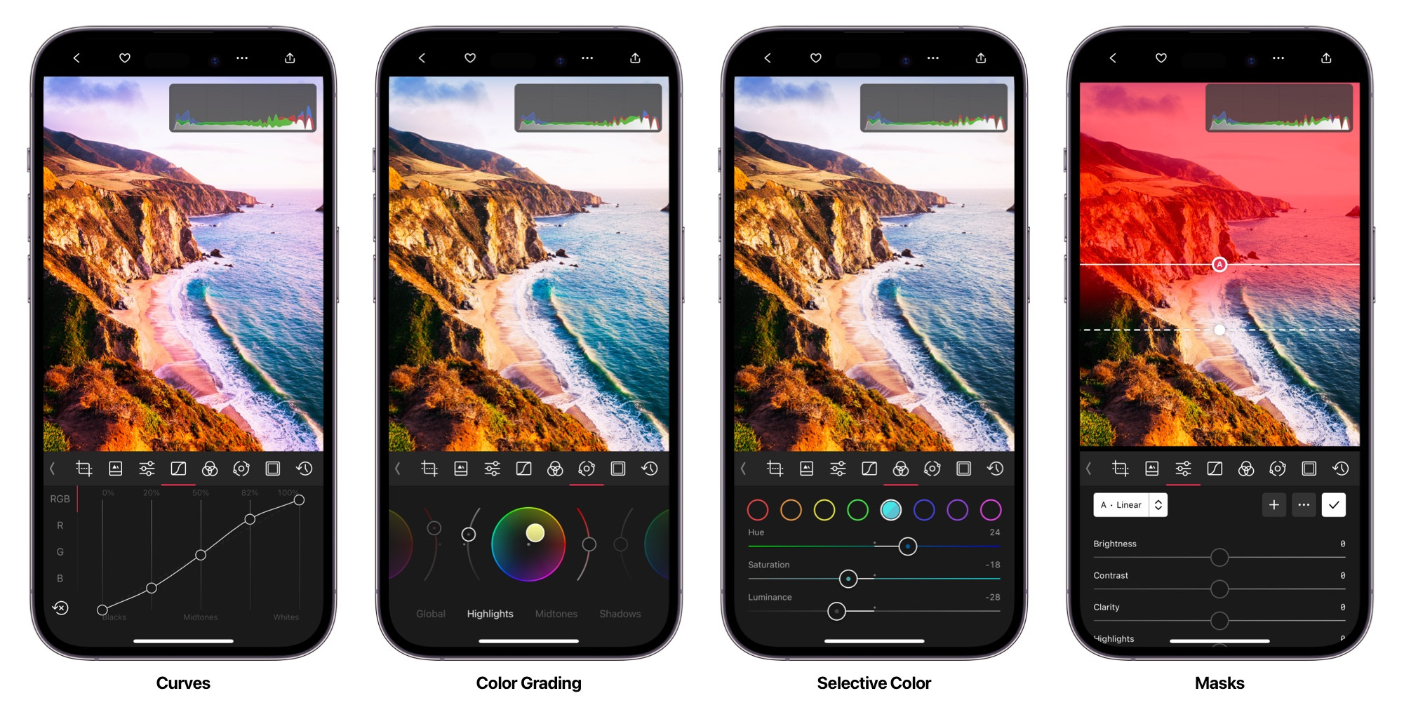
Curves is where to start. The RGB curve shapes overall tone and contrast with far more nuance than a contrast slider — a gentle S-curve for punch, a lifted black point for a faded matte shadow. The per-channel curves are also the most precise color tool available, and lifting the blue channel's shadow end is the classic route to cool, filmic shadows. The same tool also has HSL Curves — Hue vs Hue, Saturation vs Saturation, Luminance vs Saturation, and the rest — which shift color continuously rather than in Color's eight buckets. They're especially useful when a look needs to quiet only the loudest colors, or push greens all the way toward another hue.
Color Grading gives you the same kind of control more intuitively. Its three wheels push color independently into shadows, midtones, and highlights, so you can put cool teal in the shadows under warm highlights — the split-tone that reads as cinematic — by dragging two points.
Selective Color targets individual color ranges: make a summer sky deeper without touching skin, or shift grass from yellow-green toward something richer. Be careful with reds and oranges, since those are where skin tones live and small moves show up immediately on faces.
Masks are the advanced option, and they're genuinely powerful inside a preset — a mask lets one set of adjustments apply to the background and another to the subject, which is effectively two presets in one. Desaturating a background while leaving your subject in full color is a single-mask edit that creates real depth.
Finishing texture
Once the color works, a little texture makes it feel considered: a subtle vignette to pull the eye inward, grain to lend an analog quality, or a touch of clarity for bite. These are the details that distinguish a deliberate look from a color shift, but they're also the easiest place to overdo it — apply less than you think you want.
Test it before you trust it
A preset that looks perfect on the photo you built it on tells you almost nothing. The only way to know whether it works is to try it on photos it wasn't designed for.
Keep a test album of a dozen or so images that vary deliberately — bright and dark, warm and cool interiors, a landscape, a portrait, something backlit. Apply your preset across the set and look for where it breaks. Tap and hold any photo to flash the original underneath, which is the fastest way to see what your preset is actually doing rather than what you remember it doing.
Skin tones are the real test. They're the thing viewers judge most harshly and the first casualty of an aggressive preset, because the reds and oranges that carry a strong look are also the range skin occupies. If a look ruins faces, it isn't finished — that usually means easing off the orange adjustments or masking your color work away from your subject.
As you refine, a • appears next to the preset name whenever the current photo has changes the preset doesn't include. Tap the ••• actions and choose Update to fold them in.
Finally: leave it alone for a few days. Coming back to a look with fresh eyes reveals things you stopped being able to see, and there's no reason to rush.
Naming and sharing
Names are short, so they force you to be economical. For a one-off look, something memorable is enough.
If you're building a set, a system pays off. Darkroom's bundled presets use one you're welcome to borrow: a letter for the family, a first number for the main variant, a second for a stronger or subtler version of it. C100 is the base Cinematic look; C110 is a variation on it. Once you have variants for different lighting conditions, this is what lets you find the right one without applying four of them to check.
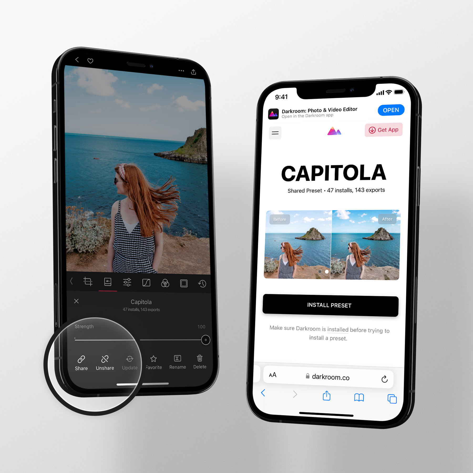
Sharing is a link: open the ••• preset actions, choose Share, and Darkroom uploads the preset and gives you a URL that works for anyone. It's worth doing before you feel ready — other people's photos will find the weaknesses in a look far faster than your own will, since they'll apply it to subjects and lighting you never tested. You can unshare, revise, and share again at any time, and the original link keeps working, so nothing is locked in by publishing early.
Frequently Asked Questions
How do I save my edits as a preset?
Edit a photo, open the Presets tool, tap Create a New Preset, and give it a name. It appears under My Presets right away and syncs to your other devices.
My preset looks great on one photo and terrible on others. Why?
Almost always because corrective adjustments got baked in. Brightness, contrast, blacks, and whites have to differ per photo, so a preset that carries them will fight every image shot in different light. Rebuild using Curves (including HSL Curves), Color Grading, Selective Color, and Masks, and leave exposure and white balance to be set per photo.
Which tools should a preset be built from?
The stylistic ones: Curves for tone and per-channel color, HSL Curves for continuous hue/sat/luminance shifts, Color Grading for split-toning shadows and highlights, Selective Color for individual hues, and Masks for treating subject and background differently. Add grain, vignette, or clarity as finishing texture.
My preset makes skin look wrong. How do I fix it?
Ease off the red and orange adjustments — that's the range skin occupies, so strong moves there show up on faces immediately. If the look depends on those colors, use a mask so the color work applies to the background and leaves your subject alone. Always test a preset on portraits before sharing it.
How can I learn what makes a good look?
Take existing presets apart. Every bundled and community preset is fully transparent — apply one, then open each tool to see exactly which adjustments produce the result. Recreating a look you admire is the fastest way to learn how it was constructed.
I kept editing after saving. How do I fold those changes in?
A • next to the preset name means the photo has changes the preset doesn't include yet. Tap the ••• actions and choose Update.
Related
- Presets — installing, syncing, organizing, and sharing
- Curves (RGB) — the foundation of most custom looks
- HSL Curves — continuous color shifts for looks that Color's buckets can't hold
- Color Grading — split-toning shadows, midtones, and highlights
- Create a Vintage Film Look — a worked example, start to finish
- Community Presets — thousands of looks to learn from